

Android BottomNavigation底部导航栏使用 - Stars-one
source link: https://www.cnblogs.com/stars-one/p/17527112.html
Go to the source link to view the article. You can view the picture content, updated content and better typesetting reading experience. If the link is broken, please click the button below to view the snapshot at that time.

本文为作者原创,允许转载,不过请在文章开头明显处注明链接和出处!!! 谢谢配合~
作者:stars-one
链接:https://www.cnblogs.com/stars-one/p/17527112.html
本篇大约有2741个字,阅读预计需要3.43分钟
原文地址: Android BottomNavigation底部导航栏使用 - Stars-One的杂货小窝
本文侧重点记录一些特殊的样式设置,所以基本使用这里就简单概述一下,详细图文可以去找其他人的博文
1.创建对应的menu菜单文件
2.xml布局引用menu菜单
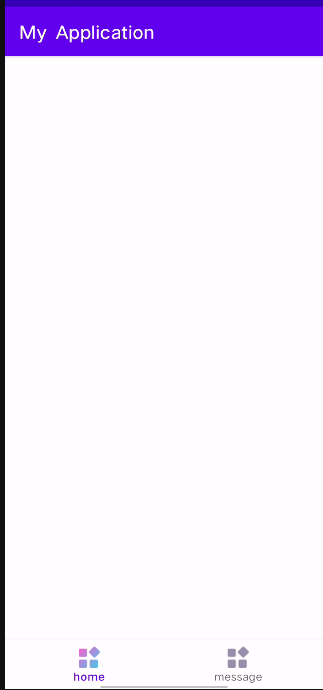
3.启动Activity预览效果
可以使用setOnItemSelectedListener方法监听当前选中的item项,可以配合viewpager绑定使用
显示模式更改
BottomNavigation默认是菜单超过3个后,就只会显示已选择的item的底部文字,我们可以通过BottomNavigation进行更改
可选项有以下4个:
auto默认的逻辑(菜单超过3个后,就只会显示已选择的item的底部文字,否则就是全部item的文本都显示)labeled全部item的文本都显示selected只有选中item底部文字才显示unlabeled所有item底部不显示文字
修改图标颜色
需要你使用的是drawable类型的图片,才使用这种方法(一般去找个svg生成就好,如果你是有两种不同的图片,可以看下一节的方法)
在color文件夹创建selector文件来实现
<?xml version="1.0" encoding="utf-8"?>
<selector xmlns:android="http://schemas.android.com/apk/res/android">
    <item android:color="@color/white" android:state_checked="true" />
    <item android:color="@color/grayDeep" android:state_checked="false" />
</selector>
之后给bottomnav设置即可
app:itemIconTint="@color/selector_nav_icon_color"
修改选中和未选中图标
和上面的颜色步骤差不多,不过selector文件所在的文件夹不同
先直接上效果
- 准备两张不同状态显示的图标
- 在
drawable文件夹中创建selector_icon_home.xml文件
<?xml version="1.0" encoding="utf-8"?>
<selector xmlns:android="http://schemas.android.com/apk/res/android">
    <item android:drawable="@mipmap/founction" android:state_checked="false"/>
    <item android:drawable="@mipmap/founction2" android:state_checked="true"/>
</selector>
state_checked为false就是正常状态显示的图标,true则是选中状态
菜单文件中,使用上面的图标文件
<?xml version="1.0" encoding="utf-8"?>
<menu xmlns:android="http://schemas.android.com/apk/res/android">
    <item android:id="@+id/menu_home" android:title="home" android:icon="@drawable/selector_icon_home"/>
    <item android:id="@+id/menu_message" android:title="message" android:icon="@drawable/selector_icon_home"/>
</menu>
为了测试方便,两个选项都是使用的上面的那个图片资源
- 取消着色
由于BottomNavigationView默认会对图标进行着色处理,我们导致我们设置的图片不同状态效果不生效,所以要设置一下
val bottomNavigationView = findViewById<BottomNavigationView>(R.id.nav)
//取消给图标的自动着色
bottomNavigationView.itemIconTintList = null
之后就是上面的那个效果图了
使用Material You主题
上面的是之前Material Design 2的设计风格,之后Material Design 3页退出了(也就是Material You)主题,我们想使用这个主题,怎么使用呢?
其实只需要改变下BottomNavigationView的主题就可
 <com.google.android.material.bottomnavigation.BottomNavigationView
        style="@style/Widget.Material3.BottomNavigationView"
        app:layout_constraintBottom_toBottomOf="parent"
        app:layout_constraintStart_toStartOf="parent"
        app:layout_constraintEnd_toEndOf="parent"
        android:layout_width="match_parent"
        android:layout_height="wrap_content"
        app:menu="@menu/menu_nav"/>
效果如下:

注意:应该是material库的1.5.0版本之后才有的Material3的主题
implementation 'com.google.android.material:material:1.5.0-alpha04'
不过material版本更新,对gradle版本,androidx版本等都会有要求,所以升级版本可以githhub的Releases · material-components/material-components-android页面查看版本要求,不然就是容易出现版本冲突异常导致项目编译失败
Recommend
About Joyk
Aggregate valuable and interesting links.
Joyk means Joy of geeK