

What’s New in Figma’s Auto Layout
source link: https://uxplanet.org/whats-new-in-figma-s-auto-layout-7b7ede5ad2b9
Go to the source link to view the article. You can view the picture content, updated content and better typesetting reading experience. If the link is broken, please click the button below to view the snapshot at that time.

What’s New in Figma’s Auto Layout
The Ultimate Guide to Figma’s Auto Layout Update 2023

Figma just got an update. I have read many articles explaining the updates, but nobody got into the features.
Therefore, I decided to write this article in which we will learn about the New Auto-Layout feature with examples and visuals.
Figma config updates have come a few days back, and one of the most significant updates is the Auto Layout, where two of the most essential features that were present in web and app development but lacked in the design are included by Figma, namely:
- Wrap: When you shrink the Auto Layout, the content in the Auto Layout will move to the next row.
- Min/Max (Width and Height): This is important for the spacing and making sure the content will not compromise when shrinking the content.
In this article, we will learn about Wrap, Min/Max (Width and Height)

When you previously shrink the Auto layout, it’ll just reduce the width or height instead of adjusting the content, and to solve that, designers have to create multiple auto layout sections.
To solve this problem, Figma has introduced the new Wrap feature, with which you can adjust the content according to the width.

And one more thing to say is that a new Auto Layout section will appear when you set the wrap property, which will show you how your content will be aligned, and you can choose to change the alignment.

And to make the Wrap more accurate and effective, Figma has also introduced the features of Min and Max height and width, which we are going to learn about next in the article.
Min/Max

When making responsive designs, these two features of the new Auto Layout will help designers a lot.
Basically, Min/Max width or height is used to set the minimum width/height or maximum width/height of the element of shape.
This is helpful because when you shrink the website view to the mobile preview, elements will shrink but will stop shrinking at the minimum height to prevent UI leakage or design distortion.
Same case when increasing the height.

By using it, we can make the website flexible as well as make the elements rigid so that the design doesn’t get disturbed.
You can learn more about Auto Layout from Figma’s Official file on Figma Community:
Advance Wrapping
We have covered some basics about Auto Layout’s Wrap and Min/Max features, but now let’s dive a little deeper into them and create a card using the Wrap feature that would be responsive when shrunk.
Building A Responsive Card using Wrap & Min/Max

Responsive card using the wrap feature by setting the min and max width and height.
I have chosen the card for this mini tutorial as it would be complex and easy to explain, and I’m sure by the end you’ll be able to create wrap designs using Figma.
1. Making the Content Fill Container
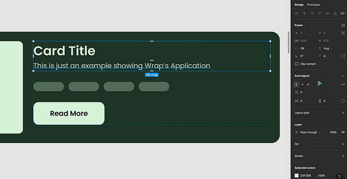
After building the basic card structure, I made the content fill the container so that it would move when shrinking the parent container.
Do this for all the items you want to set to Wrap, as they will not move when shrinking the container if they are not set to fill the container.
2. Making the Auto Layout > Wrap
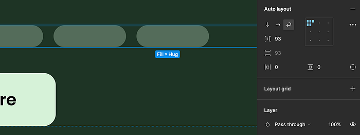
After that, Choose the Wrap ⏎ icon inside the Auto Layout Section. By doing this, you’re telling Figma to make this container wrap.
Figma’s default auto layout will not have the wrap property, which is a great thing as we don’t always use the Wrap feature. We mainly use it when making content responsive or building grid cards.
3. Setting up Min/Max height for Image, Tags, and Text
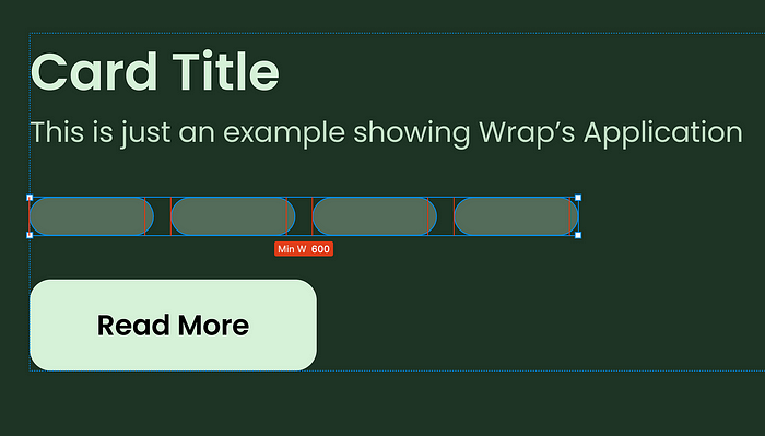
After that, I set up the minimum Width and Height for the tags, Images, and Text.
As Minimum width would help me move the content to the next row only when the user shrinks the card to a limit that now the content will not fit right, this will not be automatic, but I did it manually.
And Max width so that the content will not expand so much that it disturbs the layout of the design.
Now it’s time for the results...
Result: Smooth + Responsive Auto Layout Card

The red line shows the Minimum and maximum width for Shrinking and Expanding the Card
You can now try more complex and advanced designs with Auto-Layout. If you have any doubts, comment below, and I or someone else will definitely clear your doubt.
Now, let’s see if this feature is actually of any use in the real world or just a gimmick for Figma.
Real-World Application
You may ask, What would be the real-world application of this? I asked myself this question and started stretching the websites, and I found two examples for this article.
Basically, these examples show how you can use the feature of wrap with min and max width and height to make the design similar to the actual working of the web responsiveness.
Cadence
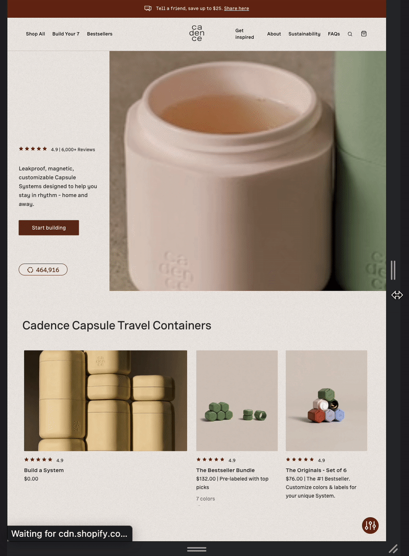
A Great example of responsiveness, It can be designed in Figma using Auto Layout without using the Breakpoint plugin.
The cards will be set as Fill-Container, and when you shrink the parent container, the content will move to the next row.
Min and Max Width are a Must

When the container gets to the minimum width, the auto layout will make the card wrap to the next line.
2 Child inside 1 Parent Auto-Layout

Nesting auto-layout is the way to create this kind of responsive design. It may seem complex to design, but Figma really made it very simple for designers, and the best way to learn is by doing. So start designing...
Website:https://keepyourcadence.com/
Bonus: Shortcuts for Auto Layout
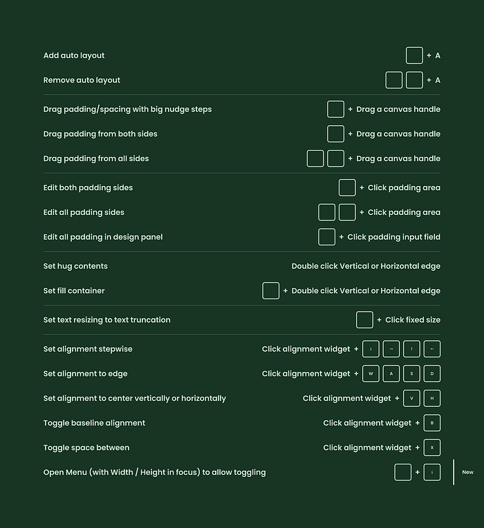
Shortcuts can really make your design workflow easier.
I have learned some cool shortcuts from above, like Shift+Drag, whichwill add the spacing in the nudge value,and Cmd+Click on Padding, whichwill make you adjust all the padding at the same time no matter if you have different values or not.
Also, Don’t forget to check out Figma’s official Auto Layout Playground:
Thanks for Your Time and Appreciation
So to conclude the new update of Auto Layout, I have to say it’s a great upgrade to Auto Layout and will make the workflow of design easy and convenient.
I have tried to explain the basics of it, but you can really create much more complex auto-layout designs using the wrap feature, with content and text adjusting according to the shrink of the screen.
Note: There are some things missing from the auto layout, like when shrinked items always go down. What if you have to move items to the top. I hope Figma will definitely add them in the future. It’s still a great update by Figma 👏
Don’t forget to clap and share it with your Figma friend. I am working on an article on the Advance Prototyping Update by Figma coming next week, so follow me and stay updated.
Subscribe here to get new articles delivered right to your inbox!
If you want to support me I will be grateful “referral link”
Follow me onTwitter for quick and insightful design tweets.
I’ll see you soon. Keep Designing.
Recommend
About Joyk
Aggregate valuable and interesting links.
Joyk means Joy of geeK