

10 Figma Design Systems to build products 10x faster.
source link: https://uxplanet.org/10-figma-design-systems-to-build-products-10x-faster-c1c168583090
Go to the source link to view the article. You can view the picture content, updated content and better typesetting reading experience. If the link is broken, please click the button below to view the snapshot at that time.

10 Figma Design Systems to build products 10x faster.
A look at the latest design systems on Figma
As a designer, I constantly strive for efficiency and consistency in my projects, and that’s where design systems come in to save the day. They act as a compass, guiding me through the vast landscape of design, and providing a solid foundation for creating remarkable user experiences.
Design Systems have become an essential pillar that has seamlessly integrated into every aspect of my design process.
Speaking of design systems, Figma has proven to be my steadfast companion for a wide range of design-related tasks. From powerful prototyping plugins to automated style guide generators, the Figma community has developed an array of solutions that have elevated my design process to new heights.
Now, let’s delve into some exciting new design systems I discovered on Figma in the past month.
1. Mode UI


If you looking to create fast and visually appealing landing pages, Mode UI can help. This Figma design system offers pre-designed components, sections, and all device breakpoints to make the process seamless. Plus, you can save even more time by utilizing their pre-built landing pages.
- Over 800 pre-designed components, all optimized for speed and efficiency to ensure the landing pages will load quickly
- Over 500 sections for landing page layouts that are fully customizable, so that the landing page looks exactly the way you want them to
- Its components and sections are all responsive, so your landing pages will look great on any device
2. Blank
Blank is an exceptional Figma design system that enables you to create high-quality landing pages effortlessly in just a few minutes. It features a vast layout library, along with components and styles that can be personalized to match your pages. Blank comes in both a free and paid version. The free version offers basic styles and components, while the paid version provides more advanced features like global styles, ready-to-use templates, and lifetime updates.
- A huge library of layouts that can be used to create high-quality landing pages in minutes
- It comes with a variety of customizable components and styles
- It is a free-to-use open-source
3. Frames X

Frames X is a user-friendly and well-supported design system for Figma that comes with a comprehensive eBook. With Frames X, you can effortlessly create stunning and sturdy interfaces and UI systems, while adhering to best design practices. This design system comprises of perfectly designed blocks and layouts, versatile chart components, functionality-first assets, 100% resizable components, a practical multi-brand color system, and a designed typography system. Moreover, the included eBook is a complete guide on using Frames X, covering design principles, best practices, and how to personalize the system to suit your requirements.
- 100+ ready-made fully-customizable components that can be used to build any type of interface
- A comprehensive color system with over 100 colors and gradients to be used to create consistent and visually appealing designs
- It comes with an eBook that provides step-by-step instructions on how to use Frames X
4. System 22


Looking for an easy-to-use and free UI kit? System 22 is an excellent option! It provides a wide range of reusable and user-friendly UI components, templates, styles, and other digital assets that can be used to create stunning UI designs and websites. The kit is accessible to everyone, and it includes everything from basic buttons and text fields to more complex elements like modals and progress bars. All of the components are well-documented and easy to customize, making it a great resource for both beginners and experienced designers. Furthermore, System 22 also includes other useful resources such as a color palette, typography guidelines, and icons to ensure your designs are consistent and cohesive.
- It is designed with a modern and minimalist aesthetic, making it a great choice for projects that are looking for a clean and stylish look
- It includes a wide range of reusable components that are easy to customize, so you can quickly and easily create complex designs that are matched to your specific needs
- It is a completely free-to-use UI kit
5. Flowbite

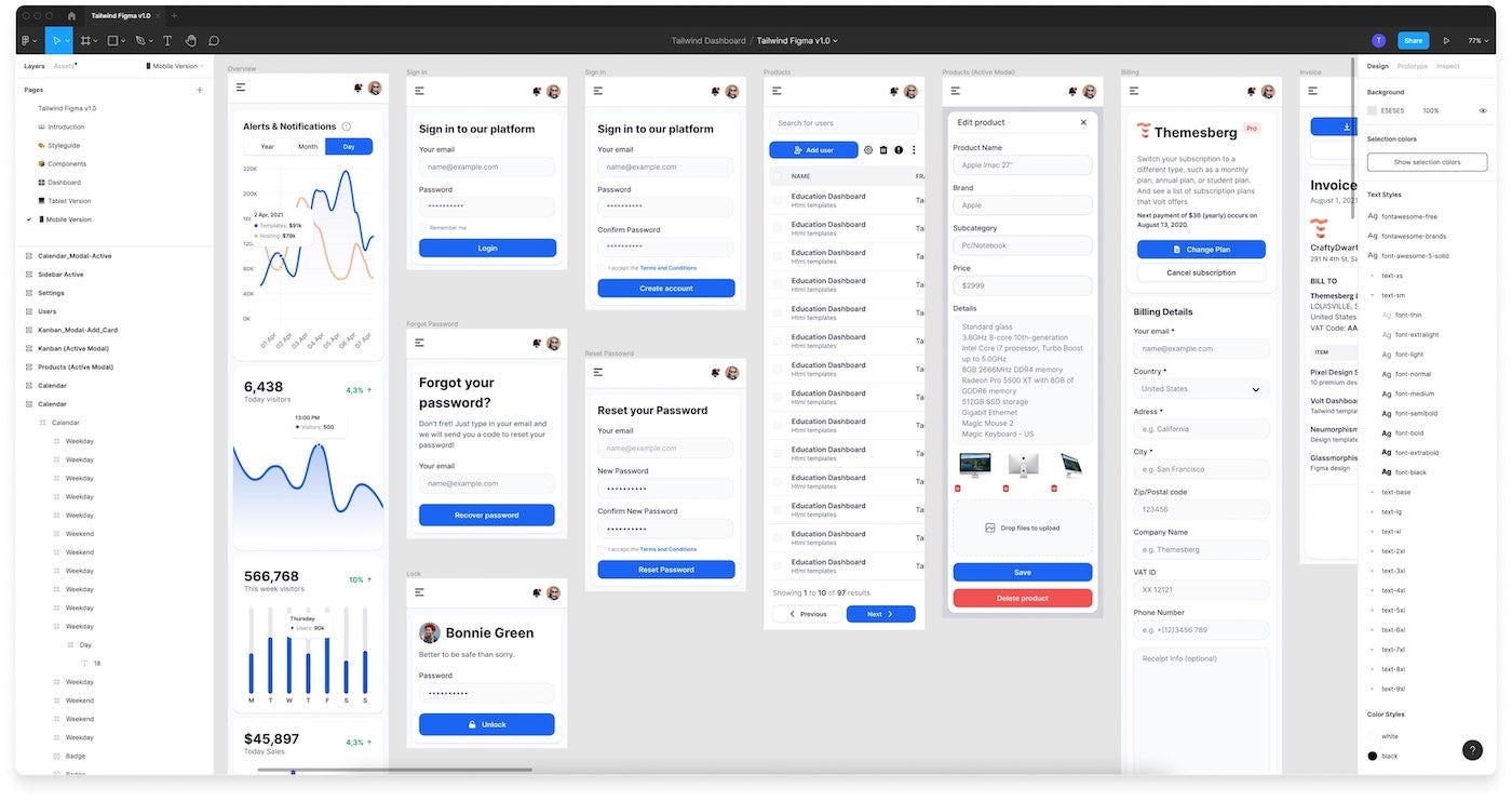
Flowbite is a library of UI components that are open-source and built with Tailwind CSS’s utility-first classes. It provides pre-built components such as dropdowns, modals, and datepickers, as well as interactive elements. With Flowbite, you can build websites faster by using these pre-built components as a starting point. All components are built using Tailwind CSS’s utility classes, ensuring that they look and work the same way on any device or screen size. Additionally, Flowbite includes a Figma design system that you can customize to create your own custom components. If you happen to use Tailwind CSS in your web development projects, the Flowbite library is highly recommended. With its assistance, you can effortlessly speed up your workflow and design visually stunning and responsive websites.
- All of the components in Flowbite are built using the utility classes from Tailwind CSS, ensuring they will look and behave the same way on any device or screen size
- It is an open-source library, so you can contribute to the code or design if you want
- The pro version of Flowbite includes a code version of the components, which means you can easily integrate components with your own code
6. Saas Blocks

SaaS Blocks is a collection of UI blocks and components that can be used to quickly and easily create a professional-looking SaaS website. It offers a collection of over 70 UI blocks and components that can be easily customized to fit your specific needs. Whether you prefer a dark or light mode, this affordable and user-friendly kit has got you covered. With SaaS Blocks, you can quickly and easily build a website that looks polished and professional. If you’re a developer who is looking to build a SaaS application, I recommend checking out SaaS Blocks. It’s a great way to speed up the development process and improve the quality of your application.
- The blocks on SaaS Blocks are all pre-configured and tested, so you can be confident that they will work well in your application
- The blocks are all fully customizable, so you can change the colors, fonts, and other elements to match your brand or add your own content to the blocks
- There is an active community of Saas Blocks users who can help you with any questions you have
7. Ant Design


Ant Design is an open-source design system that provides a range of components that can be used to build user interfaces. Its many features include a huge library of components, theming system that is flexible enough to allow customization of application looks and feels, support for dozens of languages, and a well-documented API. Ant Design is a well-maintained and well-documented library that provides a range of features, making it a powerful tool for building user interfaces. If you're searching for a comprehensive and well-maintained React UI library, then Ant Design is definitely worth considering.
- It includes over 400 components, covering everything from basic layout elements to complex data visualizations
- It is localized into over 20 languages, making it easy to build applications that can be used by users all over the world
- It is actively maintained by the Ant Group with regular updates on new features and bug fixes
8. IBM Carbon Design System

The IBM Carbon Design System is a freely available open-source design system and library developed by IBM. The system is composed of components, code, and design tools that aid developers and designers in creating consistent, accessible, and user-friendly experiences. IBM Design Language offers a set of principles and guidelines for the development of effective user interfaces, which Carbon is built upon. The Carbon Design System is an invaluable resource for anyone seeking to create consistent, accessible, and user-friendly experiences. Look no further than the IBM Carbon Design System if you are in search of a way to create consistent, accessible, and user-friendly experiences.
- It is built on open web standards, such as HTML, CSS, and JavaScript, which means that it can be used with any web development framework or library
- It is designed to be scalable, so you can use it to build small and large applications.
- It is accessible to users with disabilities and can be reused across multiple projects, saving you time and effort.
9. Designership Design systems


Designership is a Figma design system that provides designers with an extensive library of components, styles, and templates. The system is based on atomic design principles, which organizes it into small, reusable components, making it highly customizable and adaptable to meet specific project requirements. Designership Design Systems is a well-documented resource that comes with written instructions for every key component, which allows designers to easily learn how to use the system and create high-quality UIs efficiently. Whether you want to learn about atomic design concepts or create consistent and user-friendly UIs, Designership Design Systems is a valuable resource for any designer.
- A comprehensive library of over 6,000 components, 150 global design styles, 2,800 media assets, and 140 templates
- A flexible and customizable design system that can be adapted to the specific needs of your project
- Regularly updated with new features and components, ensuring accessibility to the latest and greatest features.
10. Untitled UI


Untitled UI is a comprehensive UI kit and design system for Figma that is considered the largest in the world. With a whopping 4,000 components, 1,000 icons, and 200 templates, it provides an array of resources, enabling users to effortlessly create stunning and polished designs. Untitled UI caters to both novice and seasoned designers alike and continually enhances its offerings with new components and features. If you’re looking for a way to improve your Figma designs, Untitled UI is a great option.
- A massive library of over 4,000 components, and over 1,000 icons, and also includes 200 templates, which you can use to get started with your designs quickly and easily.
- 100% Figma native, which means that it works seamlessly with Figma’s features.
- Uses Auto Layout 4.0, which makes it easy to create complex and responsive designs that will look great on any device.
That’s it, folks! I hope you found this piece helpful.
See you in the next one!
Recommend
About Joyk
Aggregate valuable and interesting links.
Joyk means Joy of geeK