

How to Use CSS background-size and background-position
source link: https://www.sitepoint.com/how-to-use-css-background-size-and-background-position/?
Go to the source link to view the article. You can view the picture content, updated content and better typesetting reading experience. If the link is broken, please click the button below to view the snapshot at that time.

How to Use CSS background-size and background-position
There’s a lot we can do with the CSS background properties. In this article, we’ll explore how to use the background-size property to set the size of a background image, and we’ll also explore options for positioning that background image with background-position.
Table of Contents
Setting Up
For our background image demos, we’ll use the following image (of Oia on Santorini, Greece). Its natural dimensions are 400px by 600px.

Here’s our base CodePen demo, with a <div> centered in the middle of an <article>. (You can read more about centering elements with CSS Grid here.) The div measures 300px by 200px.
The div has a yellow background, and the background image will sit above this yellow background (as background colors always sit beneath any background image).
If we simply add the image as a background now, we’ll notice that only part of it is visible. That’s because the image is wider and taller than the div.
The image below gives a sense of the parts of the background image that aren’t seen outside the div.
This obviously isn’t a very satisfying result, so let’s see how the background-size property can help us out.
Setting Background Dimensions with background-size
Over the years, new properties have become available for manipulating background images in CSS, including background-size. It lets us set the size of a background image, just as we’ve always been able to do with inline images.
The background-size property offers a choice of two keyword values — cover and contain — and it can also take numerical values with units such as px, em, and %, along with auto. Let’s look at examples of each.
background-size: contain
The contain value forces the entire image to fit within its container, even though its natural dimensions are larger than the container.
In this example, we’ve added the following CSS:
div {
  background-size: contain;
  background-repeat: no-repeat;
}
By default, a background image will repeat as many times as needed to fill the container, so background-repeat: no-repeat; stops this behavior. (Try removing it to see the image repeating.)
background-size: cover
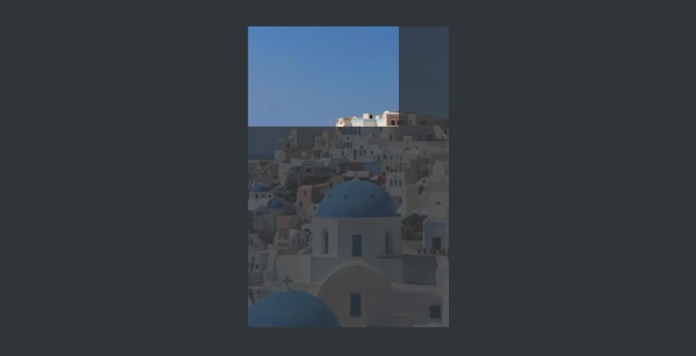
The cover value forces the image to completely cover the area of container, showing as much of the image as possible but without distorting it. Because the image is quite tall, we see its full width but not its full height.
By default, the top left corner of the background image is placed in the top left corner of the div, so it’s the bottom part of the image that we can’t see, as represented in the image below.
When we look at the background-position property, we’ll learn how to specify which part of the image is visible.
background-size with other values
Let’s see what other values we can use with the background-size property.
If we add a single percentage value of 50%, this is what happens:
The background image is now 50% of the width of the div, but is still taller than the div, so the bottom part of the image is hidden. So one percentage value applies to the x-axis. The y-axis defaults to auto, meaning that the image retains its natural aspect ratio.
Here’s what happens if we add two percentage values (50% 50%):
Whoah! Now the image covers 50% of the width of the div, and 50% of the height — which means that its aspect ratio is significantly distorted.
We’ll get similar results if we swap out % for px or other unit values. We could, for example, do something like background-size: 50px 50px, or background-size: 200px 3em and so on. We can experiment with these values in the Pen above … although this approach will rarely be of much use, because it will distort the background image unless we carefully pick values that preserve its aspect ratio.
Of far more use for refining our background image settings is the background-position property, so let’s look at that next.
Setting the Position of Background Images with background-position
We’ve seen above that, by default, the top left corner of our background image is placed in the top left corner of its container. That is, the default background-position setting looks like this:
div {
  background-position: left top; /* or 0 0 etc.*/
}
The background-position property gives us a lot of control over where our background image is placed, and it works really nicely in conjunction with background-size: cover, so we’ll use them together in the next couple of examples.
Using background-position with keywords
Our example image has a lot of blue sky at the top left, so let’s instead position it from the bottom right:
div {
  background-size: cover;
  background-position: right bottom;
}
In addition to the various combinations of top, bottom, left and right, there’s also center, which nicely centers the image. (Try replacing background-position: right bottom; with background-position: center; in the Pen above.)
Using background-position with length values
We can position our background image with length values such as pixels and ems. This allows us to push and pull the image away from the edges of the container. For example:
div {
  background-size: cover;
  background-position: 20px 2em;
}
Here, the image is set to cover the container, but it’s then pushed 20px from the left of the container and 2em from the top.
Length values can be combined with keyword values. For example, bottom 20px right 2em moves the image 20px from the bottom and 2em from the right.
We can also use negative values to further nudge and pull our background image into the desired position.
Using background-position with percentage values
Using the background-position percentage values gives us a lot of control over our image positioning, but it can be a little hard to understand. For this demonstration, we’ll remove background size and just work with the natural dimensions of the image:
div {
  background-position: 50% 50%;
}
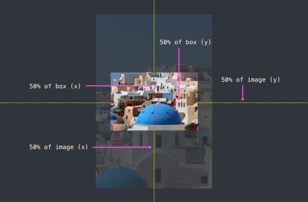
So what does 50% mean? 50% of what? It means that the 50% mark of the image matches the 50% mark of the container. That is, if we draw vertical and horizontal lines through the center of the image and the center of the container, those lines will match up, as pictured below.
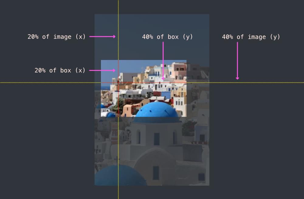
If we set the background-position to 20% 40%, it means that a vertical line 20% from the left of the image matches a vertical line 20% from the left of the container box, and a horizontal line 40% from the top of the image matches a vertical line 40% from the top of the container box, as illustrated below.
Conclusion
The background-size property is a really useful addition to CSS, and often comes in handy — especially when containers change size across responsive layouts. The background-position property adds further power by allowing us to choose how backgrounds images are positioned within a container.
There’s a lot more to learn about these two properties, although what we’ve covered here will probably serve the most common use cases.
To learn more, check out the MDN pages for these properties:
They cover some other options we haven’t covered here, such as how to work with multiple background images.
Finally, it’s worth comparing the background-size and background-position properties for background images with the object-fit and object-position properties for inline images — another super useful addition to our CSS toolbox. Check out How to Use CSS object-fit and object-position to get up to speed with them.
Recommend
-
10
CSS position:stickyTable of Contents大约两年看在看 ECMA 2015 的时候,发现在滚动时每个章节的标题都会固定在页面的顶端,好奇的我看了下它的 CSS,发现只...
-
17
CSS position 属性总结CSS的position总是属性很容易让人弄混~ 为了仔细区别它们,所以今天总结一下CSS的position属性~ 下面是总结内容~ 有疏漏、错误之处敬请指出!o(^▽^)o 定义:position属性规定元素的定...
-
11
Refactoring CSS: Optimizing Size And Performance (Part 3) ...
-
4
How do you set the background image to keep its position while the width of the browser changes? advertisements I am wondering how I could set...
-
6
A Deep Dive Into object-fit And background-size In CSS ...
-
10
You can download the source code for this tutorial here: Download the Source Code In this article, we are going to focus on how to defi...
-
3
Dynamic size of the background image to fit the window advertisements I have what I thought would be a common issue diagnosed on...
-
4
使用JavaScript达成 background-size: cover 的效果 作者: 一个球 发布时间: 2019-10-28 最近有一个项目,领导要求:要让一个...
-
14
Podcasts app not remembering window position/size since Monterey 12.4
-
2
How to change the size and position of your Dock on a Mac Apple computers are solid, future-proof machines for productivity, entertainment, studies, and more. The expanding fami...
About Joyk
Aggregate valuable and interesting links.
Joyk means Joy of geeK