

The Maserati Logo History, Colors, Font, and Meaning
source link: https://www.designyourway.net/blog/maserati-logo/
Go to the source link to view the article. You can view the picture content, updated content and better typesetting reading experience. If the link is broken, please click the button below to view the snapshot at that time.


The Maserati Logo History, Colors, Font, and Meaning
You’re cruising down the highway of design, and there it is your next pit stop. The mighty trident. The emblem of Neptune. That sleek, unmistakable icon of Italian prestige. You’ve guessed it, we’re diving head-first into the luxurious world of the Maserati logo.
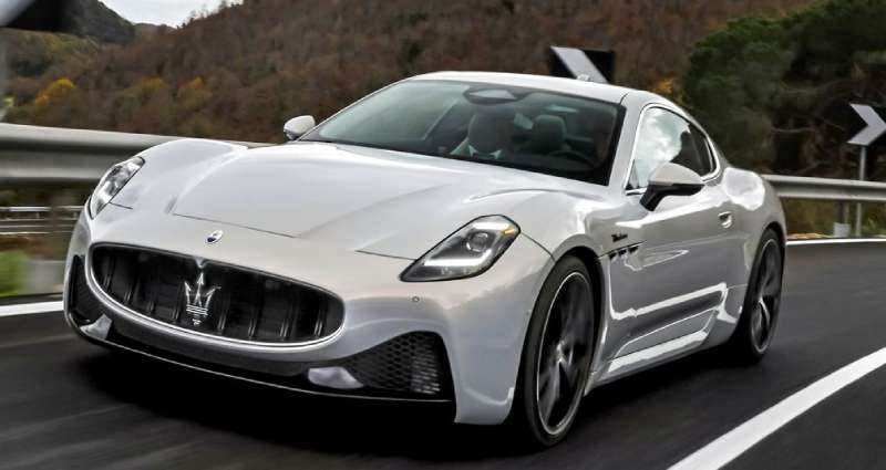
Just like a Maserati GranTurismo, this emblem is more than a flashy hood ornament. It’s a symbol that carries a hefty load of history and heritage. A testament to Italian craftsmanship and style.
Take a moment. Visualize the trident.
Three prongs, sharp and elegant, cutting through the air like a Maserati through the coastal roads of the Italian Riviera. Each prong telling a story – strength, elegance, and speed.
In this deep dive, we’ll peel back the layers of this iconic logo, examining its curves, dissecting its design principles, and exploring how it came to be the symbol of one of the most prestigious car manufacturers in the world. Buckle up, it’s gonna be a thrilling ride.
The Meaning Behind the Maserati Logo
Visuals Speak Louder
Grit, power, and elegance. The Maserati logo carries a whirlwind of symbolism that goes beyond the obvious.
The Trident is Mightier
The Maserati logo, with its unmistakable trident, is drawn from mythology. Neptune’s trident, to be precise. Yep, the God of the Sea himself.
The trident symbolizes strength and vigor, embodying the raw power that Maserati engines are known for.
City Pride
And then, there’s the tribute to the brand’s origins. Neptune’s statue stands tall in Bologna, the city where the Maserati brothers started their journey. The trident on the logo is a nod to their roots, a symbol of city pride.
The History of the Maserati Logo
The Birth of a Logo
Back in 1914, when the Maserati brothers set their hearts on crafting high-performance cars, they needed an emblem as powerful as their vision.
The Brainchild of a Brother
Mario Maserati, the only sibling not engrossed in the engineering world, took on the challenge. An artist by profession, he drew inspiration from Neptune’s statue in Bologna’s Piazza Maggiore.
Standing the Test of Time
From then till now, the logo has largely stayed the same, its essence untouched, its power undiluted. A few minor tweaks here and there, but the core remains – the mighty trident standing tall and proud.
The Colors of the Maserati Logo
The black in Maserati’s logo? It’s not just a color. It’s boldness. It’s luxury. It screams prestige, class, and power. A color so intense, it can’t be ignored.
Switch to white. The purity, the elegance, the simplicity. In Maserati’s logo, the white brings balance to the intensity of the black. It’s the canvas upon which the magic of black takes shape. It’s peace meeting power. Harmony in contrast.
Get 300+ freebies in your inbox!
Subscribe to our newsletter and receive 300+ design resources in your first 5 minutes as a subscriber.
The Font Used in the Maserati Logo
The Typeface Tells a Tale
The Maserati logo is not just about the trident. It’s also about the name that sits below it, written in a font as distinctive as the brand itself.
Simplicity Meets Sophistication
The Maserati name, in its simple yet sophisticated typography, speaks volumes about the brand’s design philosophy. The typeface is sleek, clean, and modern, reflecting the brand’s forward-thinking approach.
Class and Confidence
The uppercase letters exude class and confidence, mirroring the brand’s high standards and its assured step in the world of luxury cars.
The Evolution of the Maserati Logo
Subtle Shifts, Significant Impact
Over the years, the Maserati logo has seen changes. Subtle, yes, but each carrying a certain significance.
The Flicker of Modernity
Modern iterations added a touch of metallic sheen, a nod to the brand’s evolution in sync with changing times. The trident retained its classic appeal, but with a fresh, contemporary twist.
Consistency is Key
Despite the tweaks, the logo’s core identity remained consistent. The strong trident, the clean typography, the classic color scheme – all standing testament to the brand’s unwavering vision.
Advertisement
The Impact of the Maserati Logo
A Logo that Lingers
What makes the Maserati logo so impactful? Let’s dive in.
The Power of Association
Maserati’s logo, with its unique trident, instantly stands out in a sea of car logos. The trident is not just a symbol; it’s a powerful association that people instantly connect with Maserati.
Prestige and Perception
The logo carries an air of prestige, reflecting the brand’s luxurious appeal. It’s a symbol that speaks volumes about the owner’s taste and status, making it more than just a car logo.
Brand Identity and Recall
The logo plays a crucial role in building Maserati’s brand identity. It’s not just recognizable; it’s memorable, ensuring the brand stays at the top of people’s minds.
How the Maserati Logo Influences Design
Logo as a Guiding Light
The logo is not just a symbol; it’s a guiding light for Maserati’s design philosophy.
The Trident’s Triad
The trident inspires a sense of balance, power, and precision, principles that Maserati incorporates in its car designs. The cars, like the trident, are crafted to exude strength and elegance.
Color and Class
The logo’s color scheme also plays a role. The blue and white palette reflects in Maserati’s design aesthetics, with their cars often showcasing a similar color play.
FAQ on the Maserati Logo
What’s the history behind the Maserati logo?
Well, the Maserati logo has an interesting history. It features a trident, inspired by the Fountain of Neptune in Bologna, Italy. The founders, the Maserati brothers, chose the trident as a symbol of strength and power.
The city of Bologna was their birthplace, so they wanted to pay homage to it. The logo has evolved a bit over time but the trident remains a key element of the design.
How did they come up with the name “Maserati”?
The name “Maserati” comes from the last name of the founders, Alfieri, Ettore, and Ernesto Maserati. They were Italian brothers who had a passion for automobiles and engineering.
The company was founded in 1914, and the Maserati brothers decided to use their family name as the brand name for their luxurious automobiles.
What do the colors on the Maserati logo represent?
The colors on the Maserati logo represent the brand’s Italian heritage. The red and blue colors are derived from the official Bologna city colors. Red symbolizes passion, power, and excitement, while blue represents elegance and sophistication.
These colors are meant to convey the luxurious and sporty nature of the Maserati vehicles.
What does the trident symbolize in the logo?
The trident in the Maserati logo is a symbol of strength, power, and performance. It’s inspired by the Fountain of Neptune in Bologna, Italy.
The trident was chosen by the Maserati brothers because it was a strong, distinctive symbol that represented the quality and performance of their vehicles. The trident also ties in with the company’s Italian heritage and the founders’ connection to Bologna.
Has the Maserati logo changed over the years?
Yes, the Maserati logo has changed a few times over the years, but the core elements have remained the same. The trident has always been at the center of the design, and the colors have stayed consistent.
However, the font and overall style have evolved to reflect the company’s growth and changing image. The current logo is a modernized version of the classic trident design.
Is there any hidden meaning in the Maserati logo?
There isn’t really any hidden meaning in the Maserati logo, but it does have a strong connection to the company’s Italian roots and the city of Bologna. The trident represents strength, power, and performance, while the colors symbolize passion and elegance.
These elements combine to create a logo that reflects the luxurious and high-performance nature of Maserati vehicles.
Who designed the original Maserati logo?
The original Maserati logo was designed by one of the Maserati brothers, Mario Maserati. He was an artist, and he drew inspiration from the Fountain of Neptune in Bologna when he created the iconic trident symbol.
The design has since evolved, but the trident remains a key element of the logo, paying tribute to the company’s origins and Italian heritage.
Are there any special editions of the Maserati logo?
There have been some special editions of the Maserati logo over the years, usually to commemorate specific events or anniversaries.
These special edition logos might feature unique colors or design elements, but they always retain the core features of the trident and the Italian-inspired colors. The special edition logos are typically used for a limited time or on specific models.
What does the Maserati logo mean to the brand?
The Maserati logo is an important representation of the brand’s identity and values. The trident symbolizes strength, power, and performance, while the red and blue colors convey passion and elegance.
Ending Thoughts on the Maserati Logo
We’ve embarked on an aesthetic journey, right? It’s been a ride, dissecting the Maserati Logo.
You’ve seen it, right? That trident, an emblem of poise, speaking volumes in lines and curves. It’s not just a logo, folks, it’s a masterpiece. A storyteller.
A logo is a silent ambassador, yeah?
The Maserati logo? It’s a symphony of design elements. Carries a legacy, a heritage. Each detail, each stroke, telling a tale of Italian craftsmanship.
But what does it really mean?
- Boldness – the trident, straight from Neptune’s arsenal.
- Grace – the elegant lines, whispering luxury.
- Heritage – the name ‘Maserati’, a signature of excellence.
This logo, folks, it doesn’t just represent a brand. It’s a badge of honor, a statement. Maserati didn’t just create a logo. They sculpted an identity.
Remember, good design is obvious. Great design? That’s transparent. The Maserati logo, it’s not just transparent, it’s transcendent.
So next time you see that trident, you’ll know. It’s not just a logo, it’s a legend.
And that’s the beauty of graphic design. It’s not just about the looks. It’s about the story. The Maserati logo, folks, is one story that’s definitely worth a second look.
If you enjoyed reading this article about the Maserati Logo, you should read these as well:
Recommend
About Joyk
Aggregate valuable and interesting links.
Joyk means Joy of geeK