
UX/UI case study — Translate Labs
source link: https://uxplanet.org/ux-ui-case-study-translate-labs-98f7cb33c578
Go to the source link to view the article. You can view the picture content, updated content and better typesetting reading experience. If the link is broken, please click the button below to view the snapshot at that time.


This is for a design challenge that I’ve completed recently as a part of a job application process. It took me 3 days from translate requirement into user stories, and brainstorm solutions to final prototype.
The task
For whom? A fake company called “Translate Labs” that provides professional translation service with excellent turnarounds across a multitude of languages.
Why? The workload at the order processing team increases. They want to make it easy for the team to assign orders to the right translator and not overload a single translator with too much work.
How does it work? The order processing team will receive an email order from customers, which contains the document to be translated, requested languages, the desired delivery date and other details. They will try to schedule the work with their pool of translators based on the language desired and the availability of translators.
What data does the order collect?
- Placement date
- Order reference
- Customer’s name & email
- Title of document
- Link to the document attached
- Word count
- Language of source document
- Language to be translated to
- Estimate price
- Delivery date
- Customer’s notes
My approach
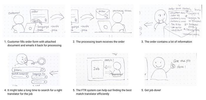
To begin, I started the process by translating the provided information into a user storyboard and profile. This approach allowed me to gain a comprehensive understanding of the users, their specific tasks, goals and any potential pain points they might encounter.
Story board

User profile
Jess- the team member of the order processing team
Her tasks:
- Receive orders
- Read every details of orders
- Search in the system to find a best match translator
- Review and double-check the order
- Assign the order to the translator
Her goals:
- Process orders on time
- Find right translators and assign the task to them
- No mistake when assigning the task
Her pain points:
- Have to pay attention to a lot of details
- Take a long time to search for translators
- Make sure not to overload a single translator
My design hypothesis
The order process team receives pre-filled orders with attached documents. The system will do the magic such as order process, maintaining the list of translators, signup, login, reporting etc.
The design only focus on the desktop solution.
My solutions
- A dashboard to receive and view orders
- A table that has a list of all translators which can be filtered by languages/capacities
- A feature that allows the team to process/assign the orders
- Before assigning, the team can review the order and choose to release or return it
The happy path of assigning the task to a translator

User flow of the happy path
Wireframes

Wireframe — home page

Wireframe — order listing page

Wireframe — order details
Key features
- Home dashboard

2. Order dashboard

3. Modal of order details

Prototype mockup

Self-reflection
- I really enjoyed the whole process of completing the design challenge. However, if I had more time, I would have liked to explore different ideas instead of just sticking to one solution. For example, what if we allowed users to search and find the translator within the order list table? I wonder what limitations or constraints we might encounter with that approach.
- I also wish I had the opportunity to directly interact with users through user research or usability testing. This would have helped me understand their thoughts and feelings better. By gaining insights from users, I could have designed the solution to effectively assist them in completing tasks efficiently and reduce the chance of making mistakes.
- Currently, the design is only optimized for desktop-sized screens. I wonder if it would be possible to make it fully responsive, so it can adapt to different screen sizes. This way, users would be able to use it in various situations and on different devices.
Recommend
About Joyk
Aggregate valuable and interesting links.
Joyk means Joy of geeK