

Notes and tips on Spatial UI
source link: https://uxdesign.cc/notes-and-tips-on-spatial-ui-ebfea009bfce
Go to the source link to view the article. You can view the picture content, updated content and better typesetting reading experience. If the link is broken, please click the button below to view the snapshot at that time.

Notes and tips on Spatial UI
No more dark mode? And all curves baby.
Hi everyone, I recently caught up with WWDC’23 videos on Spatial UI and was intrigued by the mixed reality direction UI is heading towards. This new mode of interaction opens up new opportunities for delightful and novel interactions.
Here are some quick differences I’ve identified between Spatial UI and Screen UI:
1. Field of view
With Spatial UI, the design canvas transcends the boundaries of a digital screen. Our environment is the new canvas. Design considerations expand beyond eye-scanning patterns and encompass our field of vision.
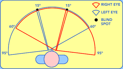
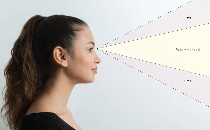
For Spatial UI, apps should be designed to fit within the field of view and minimize neck and body movement. Try to keep the main content of the app in the center of the field of view, the most comfortable area for your eyes.
Design Tips:
- Place primary information in the center
- Place secondary information at the edges of the field of view, which remain accessible and doesn’t interfere with the main content
- If you need a large canvas for your app, go with a wider aspect ratio than taller
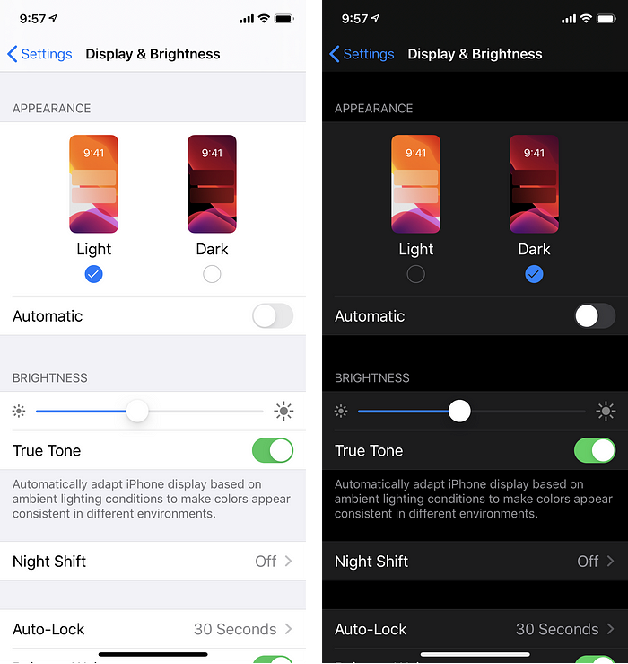
2. Say Bye to Light and Dark Modes
Introducing Glass, a new material that dynamically responds to lighting conditions. Unlike iOS and macOS, Spatial UI does not have a distinct light or dark appearance.
The contrast and color balance of the UI elements are adjusted to seamlessly integrate with the user’s environment, adapting to transitions from day to night. This adaptability ensures that the UI looks exceptional across various scenarios and lighting conditions.
It responds dynamically to lighting, adjusting the contrast and color balance to feel part of your space, like in this transition from day to night.


3. Limit opaque colours
Spatial UI embraces translucent materials that blend with the surroundings, allowing light to pass through the interface. This approach uses layered depth to convey hierarchy and meaning.
Opaque colors should be used sparingly to avoid hindering the immersive spatial experience. Too many opaque windows can feel constricting and make the interface feel heavy.
Design Tips:
- Avoid using buttons with opaque backgrounds unless they are selected, instead use darker or light layers with depth buttons.
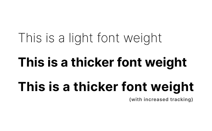
4. Use thicker font weights
To improve contrast against vibrant materials, font weights have been modified to be slightly heavier in Spatial UI.
For instance, on iOS, regular weight is used as the body text style, while Spatial UI adopts medium font weight. Similarly, bold font weight is utilized for titles, ensuring legibility at all times. Slightly increased tracking also aids in improving the clarity of the text.
Design Tips:
- Increase font weight and tracking for legibility
5. Embrace round corners

Spatial UI widely employs round shapes such as circles, pills, and rounded rectangles due to their ease on the eyes. Sharp edges tend to draw attention away from the content and decrease eye precision.
Design Tips:
- Avoid using shapes with sharp edges
- Keep the shapes flat and avoid thick outlines or effects that call attention to the edges.
- Make sure to center the text and the glyphs in your elements using generous padding.
6. Minimum 60pt target area (vs 44px for mobile screen UI)
Since Spatial UI relies on eye-based input, it is crucial to ensure that interactive elements have a target area of at least 60 points for easy selection.
This is similar to the concept of a minimum button size for mobile of 44px in traditional Screen UI, which caters to touch input.

By providing sufficient padding around UI elements, even smaller visual elements can meet the minimum target area requirement. Eg. For a standard 44 pt button, as long as you add enough space around it — at least 8 pt of empty space around it — it meets the minimum target area of 60 points.
Design Tips:
- Give all interactive elements at least 60 points of space.
- Even though the UI element can be smaller, as long as it has 60 points of space around it, it’s easy to select.
7. Focus feedback = Hover state?
One of the powerful aspects of Spatial UI is its ability to respond intelligently to user interaction. When your eyes rest on a component, they target the element and change the element state to ‘Focused’. It’s akin to hovering on an element with your mouse cursor.
This is a really powerful aspect of the new input model that allows Spatial UI to respond to interaction in a much more intelligent way. Eyes drive the interaction.

For example, buttons can have tooltips that reveal as you look at them. Also, tab bars expand when you focus on them, showing a label for each tab.
Design Tips:
- Leverage this ‘focused’ state to provide additional information/cues for users to take action
8. Point-based unit system
Similar to responsive web design, which employs relative units like %, EM, and REM instead of absolute values like pixels, Spatial UI utilizes a point-based unit system.

This ensures content remains legible at any distance and provides scalability across different devices. Relative units have demonstrated superior scaling capabilities as they adjust according to the size of other elements, offering better adaptability.
Design Tips:
- Use point-based unit system
9. Vibrancy 🔦
Think of vibrancy as a spotlight for your content. It brightens foreground content on top of the material and works by pulling light and color forward from what lies behind it.

Since the background in Spatial UI can be dynamic and constantly changing, vibrancy updates in real-time to ensure text legibility. This feature enhances the richness and sophistication of system materials while improving overall readability.
10. Unbounded by screen
With Spatial UI, we’re not bounded by a screen. This liberation offers new possibilities for interface placement and interaction.
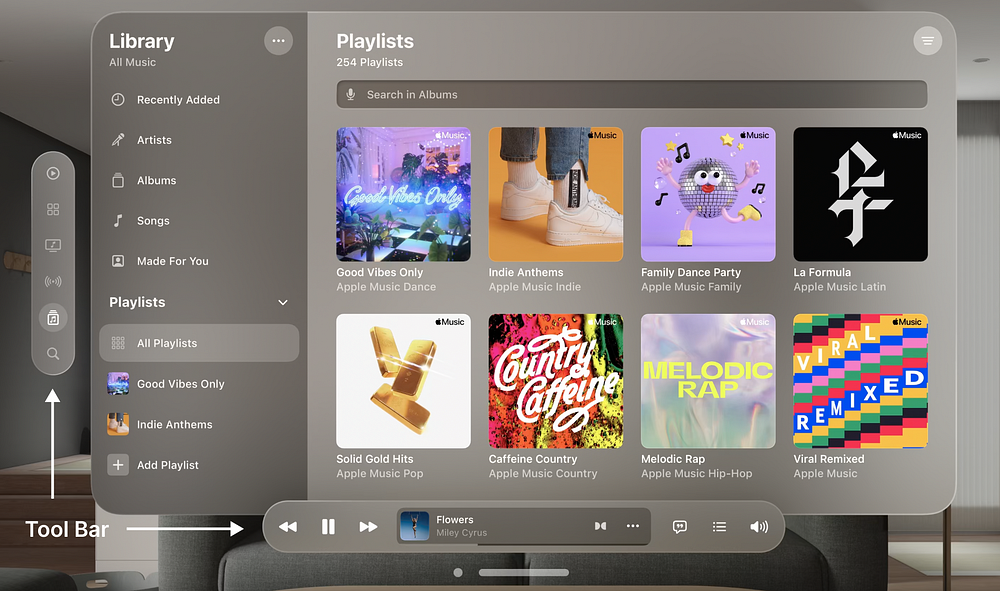
Traditional toolbars can now be positioned as ornaments at the bottom, slightly in front of the window, providing users with persistent controls that are easily accessible.

Popovers, instead of aligning to the leading edge of the invoking button, expand centered by default and outside the window, ensuring that content appears precisely where the user is looking.
Spatial UI has really changed the game. While the sight of people wearing goggles and interacting alone in their living rooms may seem dystopian, I can’t help but feel a little excited to start designing for this new medium.
Our ability to use eyes as the foundation of the input model opens up opportunities to respond to interaction with magical precision.
For further insights, I recommend checking out the WWDC talks on designing for spatial input and spatial user interfaces. Happy designing in this immersive realm of Spatial UI!
WWDC Talks:
Recommend
About Joyk
Aggregate valuable and interesting links.
Joyk means Joy of geeK