

How Canva, a $40 Billion Design Startup, Optimizes its Landing Page to Increase...
source link: https://uxplanet.org/how-canva-a-40-billion-design-startup-optimizes-its-landing-page-to-increase-conversions-12faa82f6824
Go to the source link to view the article. You can view the picture content, updated content and better typesetting reading experience. If the link is broken, please click the button below to view the snapshot at that time.

How Canva, a $40 Billion Design Startup, Optimizes its Landing Page to Increase Conversions
Canva’s landing page strategy is a clear example of how to create a great user experience for potential and existing customers. It is a high-converting, well-designed page that has been iterated on over time on its road to becoming a $40 billion startup. This article breaks down step-by-step what they are doing. All product teams, businesses, and entrepreneurs — stay tuned.
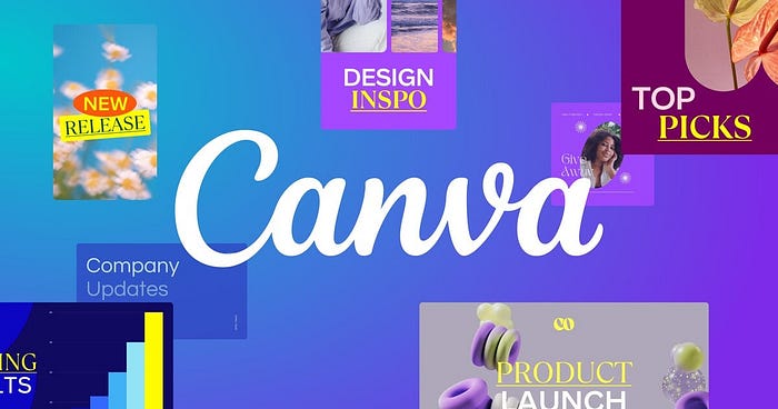
Have you heard of Canva? In 2021, Canva reached a $40 billion valuation. Canva is one of the industry-leading standards when it comes to designing great products and experiences, as well as launching product growth initiatives. Their product design and focus on conversion optimization has made them industry leaders.
They are disrupting how we see design today and making it accessible to anyone and everyone. Now, how is Canva growing? How are they trying to create the best experiences for their customers and even become bigger? First, they have created a phenomenal landing page that in itself is a case of great design.
Landing pages are so important because they create initial top of funnel awareness for customers. Most, if not all, new customers see Canva’s landing page before they engage with the product. Before they make a purchase decision, they are learning — and then engaging and interacting with its core features. A lot of businesses, entrepreneurs, and more can learn from the strategies Canva uses.
This is how they are using their landing page to convert more and more users over time. This is a breakdown of all design and conversion rate optimization strategies they are using on their landing page.

Canva’s Navigation Menu and Immediate Landing Page Preview Strategy
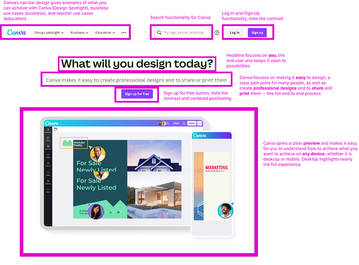
Canva’s navigation bar design is key to understanding the hiearchy of its landing page strategy. The navigation bar gives examples of what you can achieve with Canva. The core value proposition Canva provides can be found when interacting with the navigation bar, which allows you to find almost anything within a few clicks and within seconds.
There are three categories: the starting templates available (Design Spotlight), business use cases (business), and teacher use cases (education). In the nav bar, they also highlight the search functionality for Canva as well. They have Log In and Sign Up functionality: note the contrast as well for the header to encourage sign ups. Further, as you scroll down, the navigation menu remains on top as you continue to learn more and more about the product. This is done in order to give customers the opportunity to make a decision to sign up, log in, or eventually purchase the product.
Canva has 15+ buttons and hyperlinks immediately available to customers on the landing page. This does not include hovering over navigation menu or scrolling to the bottom where they have several links. They are trying as much as possible to get any potential or existing customer to click and convert, without making it overwhelming. Their balance of good design and volume of potential actions you can take — is what makes Canva a masterpiece.
The headline focuses on you, the end user and keeps it open to possibilities. Canva focuses on making it easy to design, a clear pain point for many people, as well as create professional designs and to share and print them — the full end to end process. There is a sign up for free button, and you can note the contrast and centered positioning. Canva gives a clear preview and makes it easy for you to understand how to achieve what you want to achieve on any device, whether it is desktop or mobile. The desktop highlights preview nearly the full experience. It also emphasizes the end product. Canva’s images on its landing page focus on providing a preview of the end vision you can expect to deliver using the product.
Source: Canva.com | Comments by Manan Modi
Canva’s Inclusivity, Customer Targeting, and Social Proof
In the next section, we begin to see Canva’s versatility for different target customers. They hone in on being able to solve problems for multiple customer bases. What makes Canva unique is its core focus on offering its customers many options and alternatives—from the beginning.
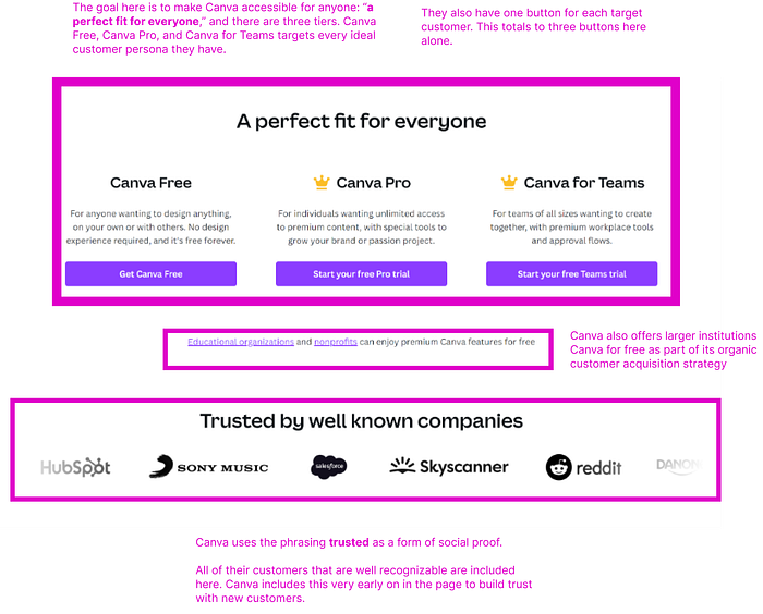
The goal here is to make Canva accessible for anyone: “a perfect fit for everyone,” and there are three tiers. Canva Free, Canva Pro, and Canva for Teams targets every ideal customer persona they have. They also have one button for each target customer. This totals to three buttons here alone.
Canva also offers larger institutions Canva for free as part of its organic customer acquisition strategy. Canva uses the phrasing trusted as a form of social proof. All of their customers that are well recognizable are included here. Canva includes this very early on in the page to build trust with new customers.
Source: Canva.com | Comments by Manan Modi
Canva’s Hidden Customer Journey Strategy
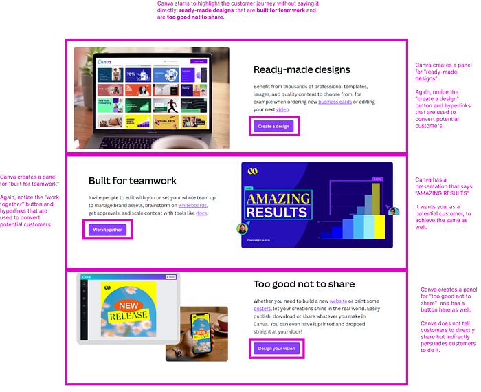
Canva starts to highlight the customer journey without saying it directly: ready-made designs that are built for teamwork and are too good not to share.
They were able to explain the end to end customer journey in a way that they did not have to say that the steps are 1) …, 2) …, 3) …
They outlined the steps in an indirect way that encourages users to read, interact with each step as a button, and click on potential links.
Canva creates a panel for “ready-made designs.” Again, notice the “create a design” button and hyperlinks that are used to convert potential customers. Canva creates a panel for “built for teamwork.” Again, notice the “work together” button and hyperlinks that are used to convert potential customers. Canva has a presentation that says “AMAZING RESULTS.” It wants you, as a potential customer, to achieve the same as well. Canva creates a panel for “too good not to share” and has a button here as well. Canva does not tell customers to directly share but indirectly persuades customers to do it.
Source: Canva.com | Comments by Manan Modi
Canva’s “Achieve Anything” Strategy
Once Canva builds initial interest from potential customers, they aim to sell the customers on the full vision. They want Canva to be an end-to-end tool for creating anything that they desire.
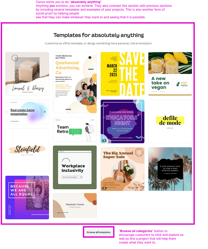
Canva wants you to do “absolutely anything.” Anything you envision, you can achieve. They also contrast this section with previous sections
by including several templates and examples of past projects. This is also another form of social proof by helping people see that they can make whatever they want to and seeing that it is possible. The “Browse all categories” button to encourage customers to click and explore as well as find a project that will help them create what they want to.
Source: Canva.com | Comments by Manan Modi
Canva’s Teams Strategy
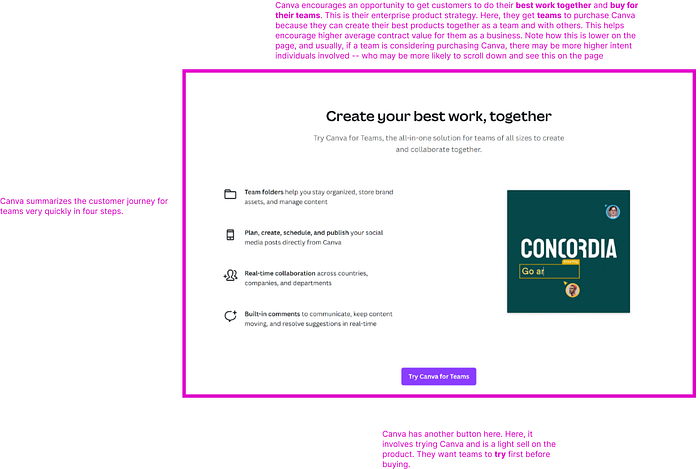
Canva encourages an opportunity to get customers to do their best work together and buy for their teams. This is their enterprise product strategy. Here, they get teams to purchase Canva because they can create their best products together as a team and with others. This helps encourage higher average contract value for them as a business. Note how this is lower on the page, and usually, if a team is considering purchasing Canva, there may be more higher intent individuals involved — who may be more likely to scroll down and see this on the page. Canva summarizes the customer journey for teams very quickly in four steps. Canva has another button here. Here, it involves trying Canva and is a light sell on the product. They want teams to try first before buying.
Source: Canva.com | Comments by Manan Modi
Canva’s “Best Traits” Strategy
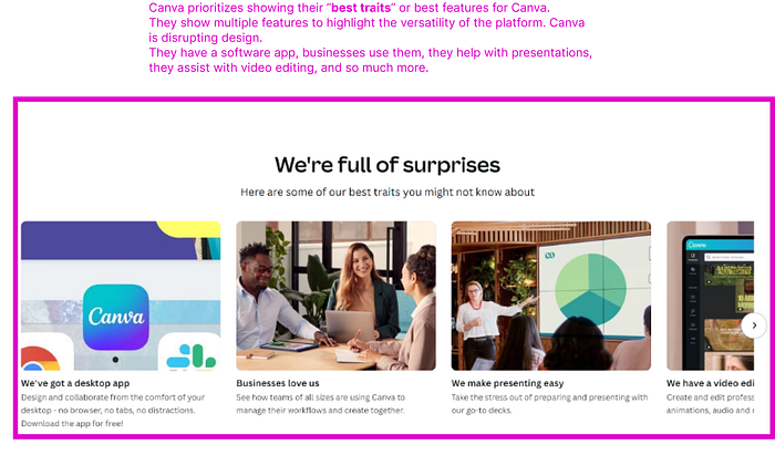
Canva prioritizes showing their “best traits” or best features for Canva.
They show multiple features to highlight the versatility of the platform. Canva is disrupting design. They have a software app, businesses use them, they help with presentations, they assist with video editing, and so much more.
Source: Canva.com | Comments by Manan Modi
Canva’s Bottom Page Design
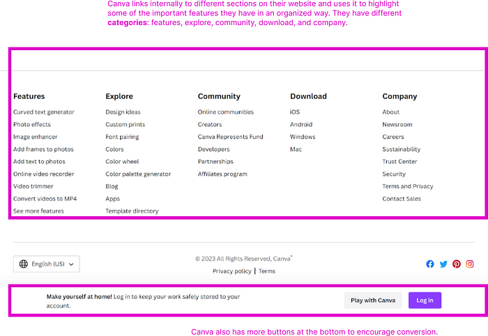
Canva links internally to different sections on their website and uses it to highlight some of the important features they have in an organized way. They have different categories: features, explore, community, download, and company.
Source: Canva.com | Comments by Manan Modi
Recommend
-
14
Landing Page Design Trends That Increase Conversion
-
8
News » News & Analysis » Canva’s doing something really cool to end 2020 – and you’re invited to join...
-
9
Australian graphic design tool startup Canva raises $71M on $15B valuation
-
7
Design Beautiful Email and Landing Page Images with Canva and AWeber By Kelly Forst April 15, 2021 Tap into millions of images, videos, graphics, templates, ic...
-
7
Does Canva Hurt or Help Graphic Designers? Hacker Noon on DesignDoes Canva Hurt or Help Graphic Designers? Hacker Noon on Design by@linh
-
5
News » Insights » Ignition Lane’s Weekly Wrap: Canva’s cloud, tech lobbies up, LaunchVic’s 4-year plan...
-
2
Site ColorhexText ColorAd ColorhexText Color
-
4
News » Topics »
-
8
Premium ...
-
4
News » Other » Malcolm Turnbull and Atlassian, Tesla and Canva...
About Joyk
Aggregate valuable and interesting links.
Joyk means Joy of geeK