

The Maybach Logo History, Colors, Font, and Meaning
source link: https://www.designyourway.net/blog/maybach-logo/
Go to the source link to view the article. You can view the picture content, updated content and better typesetting reading experience. If the link is broken, please click the button below to view the snapshot at that time.

The Maybach Logo History, Colors, Font, and Meaning
Maybach Logo. A symbol. An emblem. No, wait—it’s more than that.
It’s a story.
You know, it’s like a secret handshake. A coded message. It speaks to those in the know. The elite. The connoisseurs. But it’s not about arrogance. Nah. It’s about appreciation.
You see, that logo—it’s like an abstract painting. On the surface, it’s just lines, shapes, right? But when you dig deeper… Woah. There’s a universe within.
It’s not just about luxury. It’s not just about speed. It’s about heritage. It’s about craftsmanship. It’s about perfection.
This article? It’s not just about analyzing the Maybach Logo. Nah, it’s more like an adventure. We’re going on a journey into the soul of a brand. We’ll dive into the history, the legacy, the hidden meanings.
Ready to decode the secrets of the Maybach Logo with me? Let’s roll.
The Meaning Behind the Maybach Logo
Ever wonder what the Maybach logo represents? It’s more than just a fancy badge – it’s a symbol of opulence, history, and top-tier engineering.
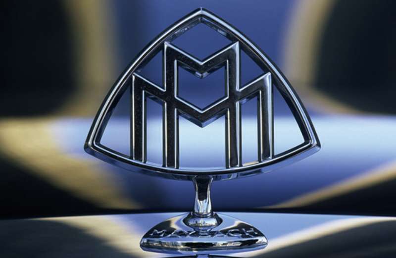
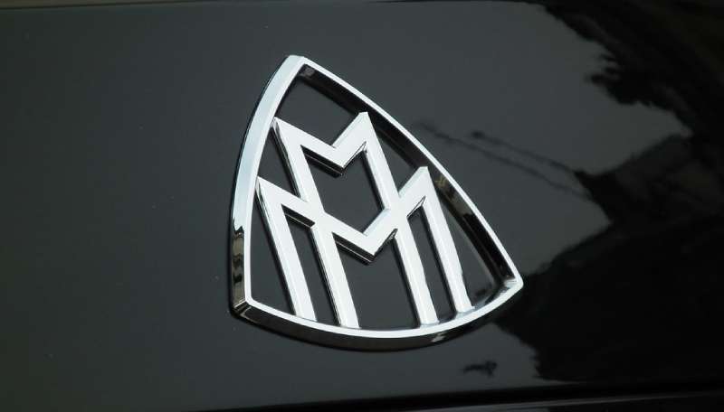
The Double M Design
See that double M? That’s a nod to the company’s founder, Wilhelm Maybach. But it’s more than just initials. These mirrored M’s also symbolize “Maybach Motorenbau,” the original company name. This design is also reminiscent of the gears of a finely tuned machine, subtly hinting at the brand’s commitment to precision engineering.
The Laurel Wreath
Surrounding those M’s is a classic laurel wreath. Historically, laurels symbolized victory and status in ancient Rome. In the Maybach logo, they represent the brand’s dedication to excellence and its standing in the luxury car market.
The History of the Maybach Logo
Just like a vintage wine, the Maybach logo has matured and refined over time.
The Early Years
When Wilhelm Maybach first launched his company, the logo was fairly simple. It was just a stylized version of his name. But as the company began to focus more on luxury vehicles, they needed a logo that could communicate their brand’s values.
Get 300+ freebies in your inbox!
Subscribe to our newsletter and receive 300+ design resources in your first 5 minutes as a subscriber.
The Modern Era
The double-M design we’re familiar with today came into existence in the 1930s. This was when Maybach started to produce opulent vehicles that were as much about comfort and luxury as they were about performance. The logo had to evolve to reflect this shift.
The Colors of the Maybach Logo
Color isn’t just about aesthetics; it’s also a form of communication. The Maybach logo speaks volumes through its simple yet elegant color scheme.
Silver and Black
Silver stands for sophistication, modernity, and high-tech. Black, on the other hand, represents power, elegance, and mystery. Together, they create a timeless color combination that perfectly represents Maybach’s brand identity.
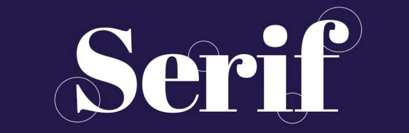
The Font Used in the Maybach Logo
Typography can tell a story just as much as images can. The typeface in the Maybach logo plays a big part in its overall design.
Classic Serifs
Advertisement
Maybach uses a serif font in its logo, which adds a sense of tradition, reliability, and authority. The letterforms are elegant and balanced, reinforcing the brand’s focus on harmony and precision.
The Evolution of the Maybach Logo
Change is an integral part of any brand’s journey, and Maybach is no exception.
Adapting to the Times
As the brand evolved and diversified, so did the logo. It became sleeker and more streamlined, mirroring the design philosophy of the cars themselves.
Modern Interpretations
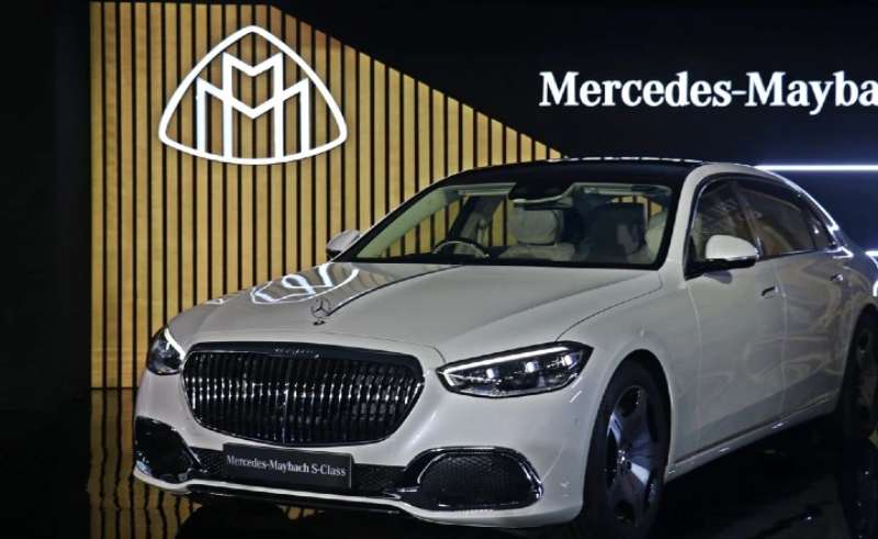
In recent years, we’ve seen the Maybach logo incorporated into the Mercedes-Benz brand as “Mercedes-Maybach.” While the double-M design remains, it’s often seen in a more simplified, modern aesthetic.
The Impact of the Maybach Logo on Brand Perception
A logo can make or break a brand’s image, and in the case of Maybach, it definitely makes it.
Creating a Luxury Image
The Maybach logo’s design elements all contribute to an image of luxury and refinement. It’s instantly recognizable and sets the brand apart in a crowded market.
Inspiring Trust and Confidence
The consistency in the logo’s design over the years has helped establish trust and confidence in the brand. It’s a symbol of the company’s long-standing commitment to quality and luxury.
FAQ on the Maybach Logo
What’s the story behind the Maybach Logo?
Ah, the Maybach logo. It carries a rich history. The double M in the logo stands for Maybach Motorenbau, which translates to “Maybach Engine Construction”. Interestingly, it’s not just two random Ms.
They’re designed to resemble a propeller from above, symbolizing the brand’s early roots in the aviation industry. It’s a fantastic blend of elegance and a nod to their heritage.
Can you explain the evolution of the Maybach Logo?
Absolutely, although there’s not a ton of evolution to talk about. Maybach has remained pretty consistent in its brand image. Since the brand was resurrected by Daimler in the 2000s, it has used a double M logo.
Despite this, the contemporary logo has been refined over time, with modern design cues to make it sleek and sophisticated, much like the vehicles themselves.
Why does the Maybach Logo have two “M”s?
Great question. The two “M”s in the Maybach logo aren’t just for show. They represent “Maybach Motorenbau”, the original name of the brand.
The interlocking design is more than just aesthetic appeal, it’s a tribute to the company’s rich history and the innovative spirit that propelled them to fame. The M’s are also arranged to look like a propeller when seen from above, indicating the brand’s aeronautical origins.
How does the Maybach logo reflect the brand’s image?
The Maybach logo is a true representation of its brand image. The double M’s, standing for Maybach Motorenbau, hint at the brand’s storied past and technological prowess. The sleek, silver design speaks to the sophistication and modernity of their vehicles.
Furthermore, the logo’s resemblance to a propeller subtly reflects their roots in aviation, embodying a sense of adventure and progress.
What’s the meaning of the color in the Maybach logo?
The Maybach logo is typically represented in silver, and that’s no random choice. Silver is associated with sophistication, modernity, and high technology — all characteristics that Maybach wants to express.
Plus, silver is often used in the auto industry to signify sleekness and luxury, and Maybach certainly falls into that category. It’s the perfect color for a brand that prides itself on top-tier engineering and exquisite design.
Has the Maybach logo ever been controversial?
To the best of my knowledge, no, the Maybach logo has never been the center of any major controversies. Its design is elegant, and it pays homage to the brand’s roots without being overly complex or potentially offensive.
It stands as a perfect reflection of the brand’s commitment to luxury, quality, and technological innovation.
Why hasn’t the Maybach logo changed much over the years?
The Maybach logo has remained relatively consistent because it embodies the timeless elegance and pioneering spirit of the brand.
The double M’s and the propeller design pay tribute to the brand’s origins, while the sleek modern design aligns with their image of luxury and sophistication. When you’ve got a logo that so perfectly encapsulates your brand’s essence, there’s really no need to change it.
What’s the design process behind the Maybach logo?
While I can’t provide an exact step-by-step account of the design process behind the Maybach logo, I can say that it’s undoubtedly a meticulous one. The logo’s design needed to resonate with the brand’s identity — combining elegance, a nod to its history, and an aura of luxury.
The final product is a testament to careful consideration of these factors and a balance of simplicity and sophistication.
How does the Maybach logo compare to other luxury car logos?
In the world of luxury car logos, the Maybach logo holds its own. It’s a blend of simplicity and elegance. Unlike others that use animals, crests, or shields, Maybach uses the double M design, which is simple yet effective.
It stands out due to its unique representation of the brand’s history and its sleek, modern aesthetic. This blend of historical tribute and forward-thinking design sets it apart in a sea of luxury car logos.
Is there any hidden symbolism in the Maybach logo?
While “hidden” might be a bit of a stretch, there is subtle symbolism in the Maybach logo that isn’t immediately obvious. The double M’s, standing for Maybach Motorenbau, are arranged to resemble a propeller when viewed from above.
This isn’t just a neat design trick. It’s a nod to the brand’s origins in the aviation industry. So, beneath the surface, there’s a piece of Maybach’s history embedded right into the logo.
Ending thoughts on the Maybach Logo
Maybach Logo – ya know, it ain’t just a symbol. It’s a statement. A legacy.
Imagine it, right? That double-M, nested snugly in a diamond. Pure elegance. That’s a monogram that carries weight. Weight of history. Weight of luxury.
It ain’t just ink on paper, or pixels on a screen. It’s about the craft, the care. It’s a tale of design evolution, year after year.
- It whispers: Tradition.
- It shouts: Excellence.
- It promises: Luxury.
Now, that’s a real logo – a work of art, a badge of honor. It carries the essence of what Maybach is all about.
A graphic designer’s dream, that logo. It’s a masterclass in design – a lesson in simplicity, subtlety, and sophistication.
So there you have it, the Maybach Logo. It ain’t just a logo, it’s a symbol of grandeur, an emblem of a grand lineage. A testament to the power of design to tell a story, to create an identity, to convey a feeling.
Always remember, in the world of design, we ain’t just creating logos. Nah, we’re creating symbols that transcend time. Just like the Maybach Logo, a class act in the grand theatre of design.
If you enjoyed reading this article about the Maybach Logo, you should read these as well:
Recommend
-
16
The JP Morgan Chase Log...
-
37
The Barclays Logo...
-
21
The BNP Paribas Logo...
-
9
The UBS Logo History,...
-
4
The Standard Charte...
-
5
The UniCredit Logo...
-
8
The HSBC Logo Hist...
-
11
The Deutsche Bank L...
-
13
The Citigroup Logo...
-
13
The Societe General...
About Joyk
Aggregate valuable and interesting links.
Joyk means Joy of geeK