

Ultimate guide to baseline alignment using Figma’s auto layout
source link: https://uxdesign.cc/ultimate-guide-to-baseline-aligment-using-figmas-auto-layout-3f2f99f976e9
Go to the source link to view the article. You can view the picture content, updated content and better typesetting reading experience. If the link is broken, please click the button below to view the snapshot at that time.

Ultimate guide to baseline alignment using Figma’s auto layout
An in-depth analysis of implementing the overlooked baseline grids in Figma
It’s been a few years since Figma introduced its first version of the auto layout feature. I wanted to write about my experience with it since then, so I started a draft, but it’s taken me some time to get back to it.
Now, that Figma recently implemented vertical trim, I came to the realization that if I don’t write this now, someone will eventually come up with a better solution. Or Figma might actually implement something even better than vertical trim, so my method will be rendered useless 😅.
The goal of the article is to showcase and propose a quick solution for using and documenting baseline grids in design systems.
Since this is my first article, I’m looking forward to feedback on the writing and the method presented here, so don’t hesitate to leave your comments.
How it started
Before I jump into baseline grids, here are a few words on how exactly I stumbled on this issue.
Prior to my transition to UX design, I worked as a brand designer. I always believed that I could have created more valuable work if I hadn’t been so preoccupied with geometry and grids in my designs 🤓.
My interest in geometry, and particularly in grids, was further fueled after reading “Grid Systems In Graphic Design”. The book not only helped me deepen my understanding of leveraging grids, but also inspired me to make the jump from brand to product design.
As the book puts it:
By arranging the surface and spaces in the form of a grid the designer if favorably placed to dispose his text, photographs and diagrams in conformity with objective and functional criteria. The pictorial elements are reduced to a few formats of the same size.
I was then convinced that working on products would allow me to focus more on geometry and grids in design. At the time, I was also drawn to some well-documented design systems, such as Material 2, which offered clear guidelines for creating consistent layouts.
Still, something needed to be added to these guidelines. Responsive 12-column grids were, and still are, extensively used for the web. Baseline grids, on the other hand, are sometimes mentioned and documented, but rarely implemented or used when designing digital products.
This topic haunted me and presented an unhealthy interest for me for a long time. I kept tweaking the method presented here over time, and now with Figma’s vertical trim and auto layout, I had a method and process that presumed easy implementation, had no manual shifting of text elements, and was easy to be documented and included in design systems.
What are baseline grids again?
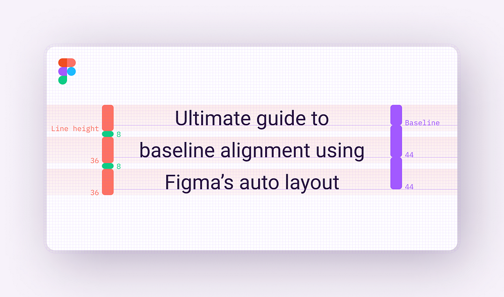
By definition, the baseline can be considered the invisible line upon which a line of text is seated. It plays an essential role in determining the vertical distance between text and other elements in the design.
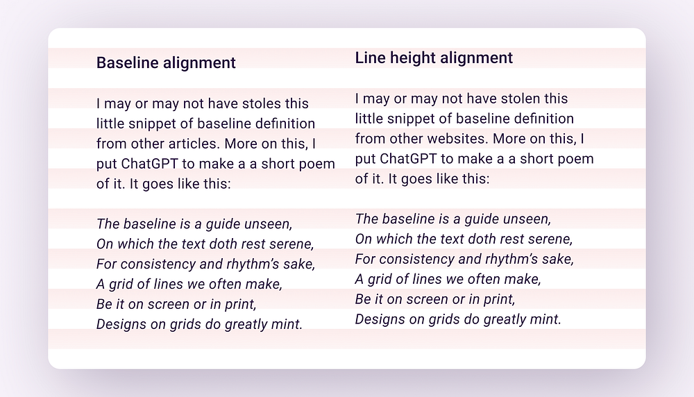
Baseline grids are also a popular technique for maintaining consistency in layout and establishing vertical rhythm in design. Oversimplified, baseline grids are used to set the distance (leading) between text lines. On the web (and mostly all UI design tools), this distance is calculated using line heights instead of baselines.
There is no correlation between a typeface's baseline and the line height.
The problem
Baseline grids are often specified in design system libraries and kits to ensure that text and other elements align consistently and accurately between them. Two popular design system libraries, Material Design (version 3) and Fluent UI, provide clear and well-documented guidelines for baseline alignment.
However, despite this guidance, baseline alignment is more than often ignored in public UI kits and libraries.
Why are baseline grids challenging to set up?
Files are big and designs are complex. This can be especially difficult when checking thousands of lines of text manually. It’s a tedious job to make sure that the baseline of each text element falls on the grid.
The process is difficult to set up and most of the time not important enough for the purpose of a UI kit or design system library. We download UI kits, play with them, and probably detach the components… in the end, nothing relates to anything no more… you know how this usually goes.
The baseline of a typeface is also specific to the typeface itself, making it challenging and time-consuming to align text elements across multiple typefaces. It needs to be done for each of them.
The solution
Wrap text elements in components with auto layout. Use vertical trim to cut the vertical space that’s above and below the text. Add some vertical padding, and that’s it.
The resulting components will then be included in the design system library. The use of these components will be documented, similar to other major components in the design system.
So, without any further ado, let’s jump straight into it.
Getting started
Since I mentioned Material 3 earlier, let’s continue with some text styles from the kit. This will help us have a better understanding of how everything works (while also having the examples supported in Material).
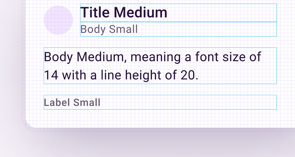
We’ll start with four basic styles from the Material 3 kit: Title Medium, Body Medium, Body Small, and Label Small.
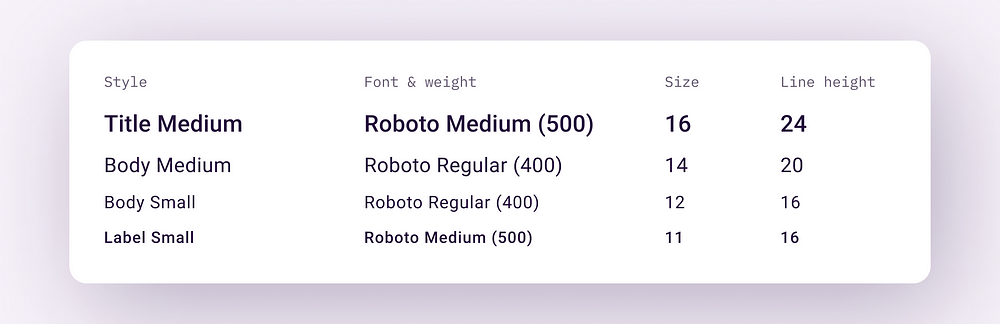
Leveraging auto layout, we’ll create a simple card using these styles. We’ll use a similar layout to the one used in the Material 3 typography guidelines. We’ll align everything to a 4px grid. Each value for padding, the distance between elements, and line height will be multiples of 4px.
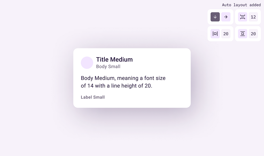
Putting this under the 4px grid, we can see that every element perfectly aligns with it.
Recommend
About Joyk
Aggregate valuable and interesting links.
Joyk means Joy of geeK