

Tremor • Changelog
source link: https://www.tremor.so/changelog
Go to the source link to view the article. You can view the picture content, updated content and better typesetting reading experience. If the link is broken, please click the button below to view the snapshot at that time.

Tremor • Changelog
Jun 8, 2023
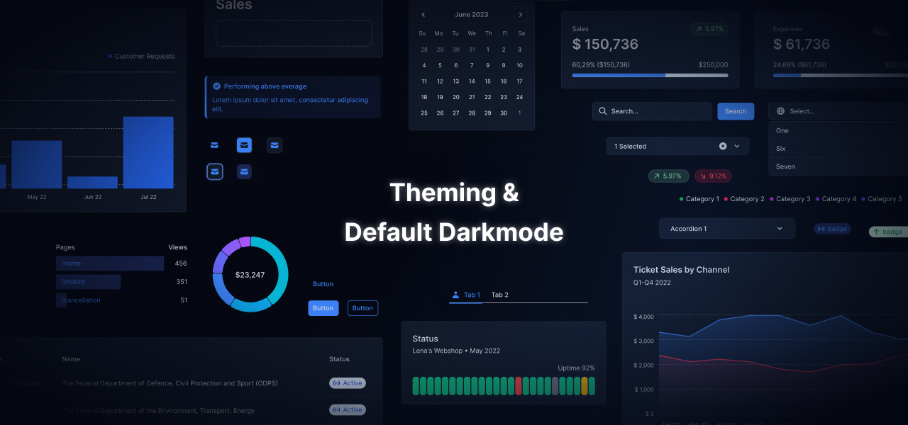
Out of the blue. Introducing: Theming & Darkmode
Hello, Grüezi, Γεια σας. It’s the Tremor team coming to you live from around the globe. We were super busy the last weeks working on our next major release – bringing a bunch of new features people have been asking for a long time. In brief, we are adding:
Comprehensive global theming via tailwind.config.js
An out-of-the-box darkmode
A new tremor CLI helping you setting up projects faster
If you encounter any issue, feel free to message us on our Slack Community channel.
Migration Info
- Theming: If you use Tremor in an existing project, you have to add/extend your `tailwind.config.js` with Tremor's `tailwind.config.js`. See first bullet point below.
- `tailwind.config.js`: Our theming works by extending the tailwind config theme. In order to get the correct styles, please see the tailwind.config.js example in the new Theming page in our docs.
Action: Add Tremor's theme styles to your `tailwind.config.js` theme section.
Attention: See Theming with Tremor for more.
- Breaking Toggle: This component has been removed. The Tabs component now has two variants: "line" and "solid". The solid variant mimics the look of the Toggle component.
Action: Replace <Toggle> and <ToggleItem> with <TabList variant="solid">. Note that the API for the tabs has changed significantly.
- Breaking Tabs: The Tabs component and its API has been completely redesigned.
Action: Replace <Tab> and <TabItem>, as well as the state logic (index and onIndexChange) with <TabGroup>, <TabList>, <Tab>, <TabPanels>, <TabPanel>. Please refer to the tabs documentation.
- Breaking Dropdown: This component has been removed. The use new `Select` component.
Action: Replace <Dropdown> and <DropdownItem> with <Select> and <SelectItem> Note that the API for Select has changed.
- Breaking DateRangePicker: API changed significantly.The value prop uses Object instead of Array. The select options now use children.
Action: Replace the value array with the object.
Action: Replace enableDropdown with enableSelect.
Action: Replace dropdownPlaceholder with selectPlacehoder.
- Breaking Select, SearchSelect, MultiSelectBox: The type of the value property has been changed to string .
Action: Cast the input for value to string
- Breaking Grid: Properties with numCol have been renamed.
Action: Replace <Grid numColsSm={2}> with <Grid numItemsSm={2}>
- Breaking ProgressBar: Properties have been renamed.
Action: Replace percentageValue with value
- Breaking MarkerBar: Properties have been renamed.
Action: Replace percentageValue with markerValue
- Breaking DeltaBar: Properties have been renamed.
Action: Replace percentageValue with value
- Breaking CategoryBar: Properties have been renamed.
Action: Replace percentageValue with value
Action: Replace categoryPercentageValues with values
- Breaking RangeBar: Has been removed. Use the MarkerBar with it's new minValue and maxValue props.
Action: Replace RangeBar with <MarkerBar minValue={XX} maxValue={XX}>
Recommend
About Joyk
Aggregate valuable and interesting links.
Joyk means Joy of geeK