

Animation using SGPLOT
source link: https://blogs.sas.com/content/graphicallyspeaking/2013/05/23/animation-using-sgplot/
Go to the source link to view the article. You can view the picture content, updated content and better typesetting reading experience. If the link is broken, please click the button below to view the snapshot at that time.

Animation using SGPLOT
Often we want to visualize the relationship between variables over time. The understanding of such data can be improved by viewing the animated graph over time. With SAS 9.4, you can create animated graphs using the new animation options on the OPTIONS statement and the PRINTER destination.
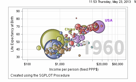
A popular example an animated graph is the GapMinder demo presented by Hans Rosling. Using the data from the web site, Pratik has created a SAS data set for life expectancy, income and population by country and year. Here is a bubble plot animation created using the SGPLOT procedure, stepping through the data for each year from 1960 to 2007.
Here is the graph:
The key options used are the following:
options papersize=('5 in', '3 in') printerpath=gif animation=start
        animduration=0.1 animloop=yes noanimoverlay;
ods printer file='GapMinder.gif';

ods graphics / width=5in height=3in imagefmt=GIF;
  Create multiple graphs using SGPLOT procedure;

options printerpath=gif animation=stop;
ods printer close; |
In this example, I wrote a macro that loops through all the values for "Year", from 1960 to 2006. To maintain the axis ranges, it is important to set these so they will be consistent over all the frames. The resulting GIF file can quickly get too large to include in a blog article. So to keep the size within the limits allowed for a blog article, I used a step of 2 years, and a smaller image size. The bubbles are colored by region of the world, but I dropped the legend to save space.
The full code is attached below. Along with animations, bubble skins are supported in SAS 9.4 SGPLOT procedure.
SAS 9.4 Code: GapMinder
The animation can likely be improved by generating intermediate frames by interpolating the data from one year to the next. That will smooth out the "jerkiness" of the animation where there are large changes from year to year. Here is an example of data interpolation with the SASHELP.CLASS data set.
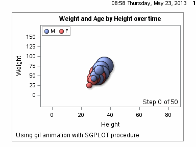
SAS 9.4 code: ClassBubble
Recommend
About Joyk
Aggregate valuable and interesting links.
Joyk means Joy of geeK