

Flipper Taps logo, by Red Dot Studio | Logo Design Love
source link: https://www.logodesignlove.com/flipper-taps?ref=sidebar
Go to the source link to view the article. You can view the picture content, updated content and better typesetting reading experience. If the link is broken, please click the button below to view the snapshot at that time.

Flipper Taps
A clever logo for a new range of versatile taps.
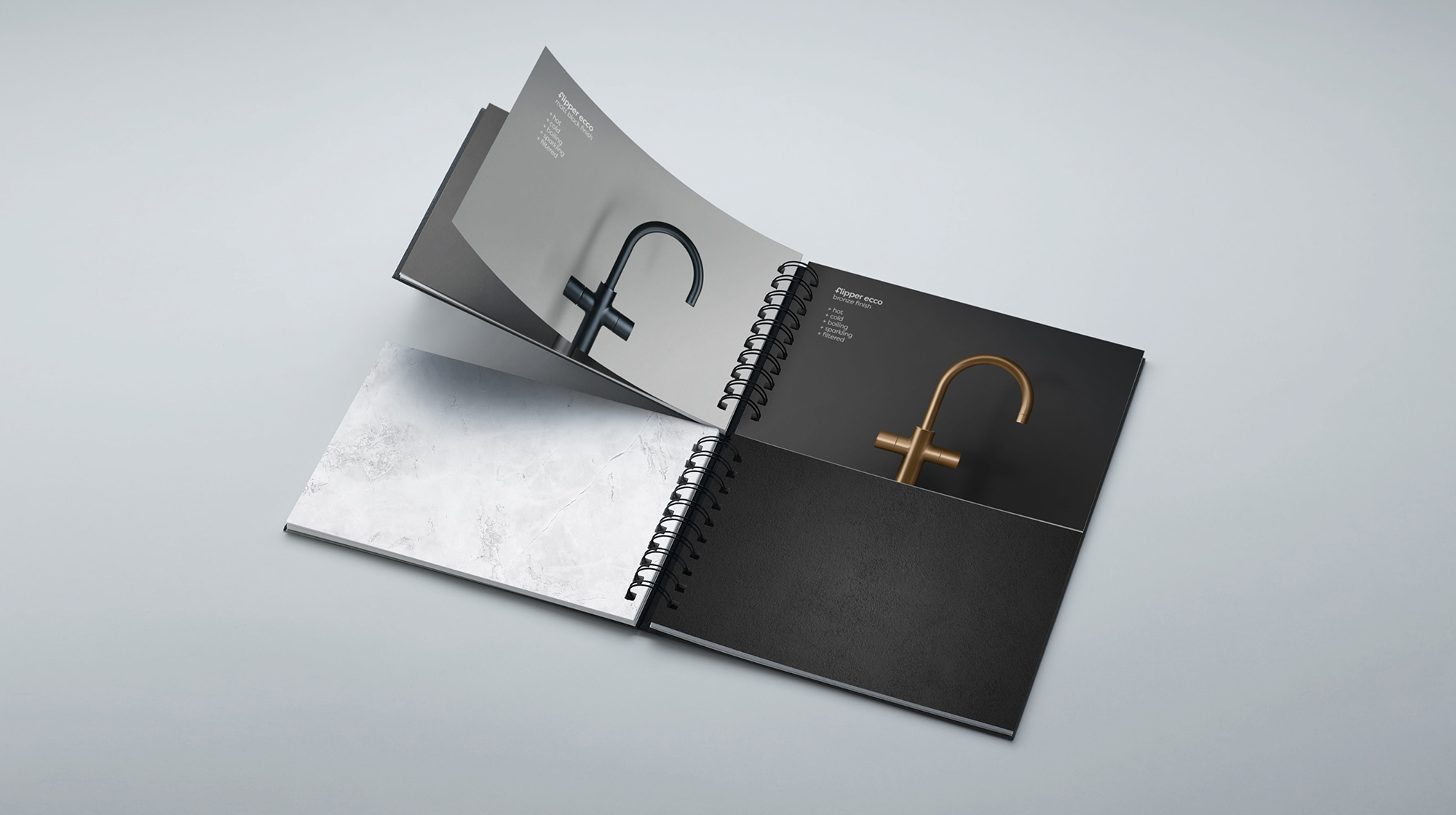
Red Dot Studio in London were tasked with the naming and identity creation for a new range of taps. The 5-in-1 taps flip between delivering hot, cold, filtered, sparkling, and boiling water, so the name Flipper was coined to articulate versatility. The Flipper Taps logo combines the letter F with the shape of the tap (and a plus symbol, because “more”). It’s the type of design that, in my experience, often takes considerably more persuasion when it comes to achieving client consensus than it would with a more detailed logo. A nice touch with the positioning of the trademark symbol, too.


The F monogram is the primary identity element, showcased on stationery, packaging, communications, and engraved as a hallmark on products.
Congratulations to all involved for winning a D&AD pencil. Here’s to the next one.
Creative director: Sam Lachlan, Christian Eager
Designer: Angus Meikle
Senior visualiser: Tim Stayne
Photographer: Anna Lachlan

More creative designs in the archives with this small sampling of Woody Pirtle logos.
Share a thought Cancel reply
Recommend
About Joyk
Aggregate valuable and interesting links.
Joyk means Joy of geeK