

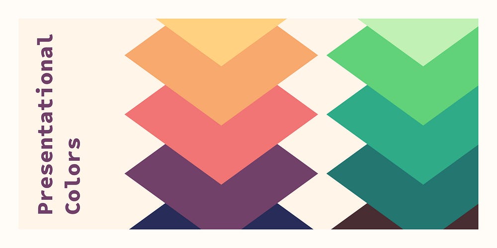
Presentational colors. Design tokens for data visualization… | by Lukas Opperman...
source link: https://uxdesign.cc/presentational-colors-d2b0dfedeee9
Go to the source link to view the article. You can view the picture content, updated content and better typesetting reading experience. If the link is broken, please click the button below to view the snapshot at that time.

Presentational colors
Design tokens for data visualization and more
Presentational tokens bring the color into data visualisation¹ and customizable UI elements. They are the colors used for labels or folders and similar elements. What makes them specific in design token terms is, that they don’t have a semantic meaning. Unlike danger and success color tokens, presentational color tokens are used for anything.
However, unlike the base tokens in your color scales, presentational colors still change depending on the current theme. There may also be a need for a specific contrast between presentational colors. This makes them a specific edge case that sits between base tokens and semantic tokens².
What makes a presentational color?
Presentational colors are visually distinct. But they don’t have a specific meaning in the UI or company context.
They differentiate elements on a decorative level. For example, labels may use different colors to differentiate them better. This only works for people without cvd (color vision deficiency). In most cases, this is acceptable, as the color does not communicate any meaning. Users with cvd can still read the label text.
You should be able to exchange presentational colors without functionally affecting the UI. If you can’t it is not a presentational color.³
Use cases for presentational colors
Data visualization (dataviz) is arguably the most common use case for presentational colors. Up- and downwards trends normally use green⁴ and red⁵. Apart from this, we choose colors somewhat randomly to represent data.
This is actually beneficial for users with cvd. Since you don’t lose information if you see purely decorative colors in a different way⁶.
Tags, labels and other organisational elements like folders, lists or groups⁷ also use colors. Assigned at random or by the user, they help differentiate the items. While colors help quickly find what you are looking for, they are not essential.

UI elements like shortcuts, icons, the profile or the accent colors can be customized by the user⁸. This allows to personalize their experience within boundaries. This change is solely visual and has no influence on the functional aspects of the UI. But it may allow users with cvd to choose colors they can differentiate rather than being stuck with defaults.
Requirements
Depending on your use case, there may be different requirements you need to fulfill. Those use cases may include:
Non-functional colors scales like green, blue or yellow. You can’t always create functional color tokens for all situations. Presentational color scales allow designers to choose colors from a scale, but they can still react to dark and light modes⁹.
For example, you can create a presentational.blue from base.blue. In light mode this may be a simple reference as is, whereas in dark mode it will be an inverse reference of the scale. You may not have enough steps in your base scale to create a dark and light scale. Consider creating a bigger base scale, e.g., with sixteen steps and use only ten of them in the presentational scale.
Accessible contrast between colors allows designers to safely place colored text on backgrounds¹⁰. For example, in labels or alerts. Make sure that certain steps in each scale pair well with black, white or another specific step. This makes it easy for designers to work with your presentational colors.
For example, you could create the scales so that any step above step 5 as well as black always has a 4.5:1 contrast with step 1.
Or you can create a collection with a background, border, and text color for each scale. While the latter method is more work, it is also more explicit. You don’t need to read the documentation to understand it, which makes it easier for users.
Color collections
Color collections are small subsets of colors from the palette. They can add structure and meaning by defining use cases or intensity levels.
Mode-aware scales
The most basic form of a collection defines a color scale for dark or light mode¹¹. You do this by choosing ten colors from the light or dark end of a sixteen color scale. This will allow for enough difference within the scale and good contrast in each color mode. Just like discussed in the previous section.

State / component Collections
Collections that represent a specific state are another common case. Red for error, orange for warning, green for success and so on. It's best to choose three to five colors from light to intense. This should be enough for backgrounds, borders, and text on light backgrounds. You may also add an intense background used for buttons with white text.
You can do this for neutral colors or ones that don’t represent a specific state as well.

Those small collections are easy to understand and use for people.
These collections also allow us to make sure that we have adequate contrast. For example, 4.5:1 between text and background colors.

Contrast based collection
In design systems we often generate scales with ten or even twenty steps. But in 99% of the cases only a handful get used in the UI. Contrast-based collections provide clarity by promoting a few shades and tints. Instead of choosing between lime-0 to lime-4, designers use lime-subtle for light backgrounds. This makes choosing the correct color easier and promotes consistency. It's also easy to adapt smaller collections to dark and light mode.

Data visualization collections
Contrast is a big part of making data visualizations accessible¹².
Depending on your company branding, you can keep to a single hue or use complementing ones. In both cases, the colors should vary in lightness to provide contrast for users with cvd. Always test your collection with a color vision deficiency simulator.

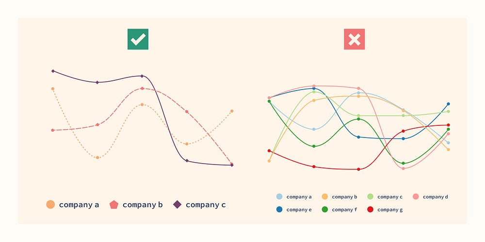
You should limit your graphs to 5–6 cases most of the time, to make them easy to consume.
This number allows us to create collections with good contrast between colors. However it is very hard to get 3:1 between all items and the background as well.

Color mode adjustment
You should make sure your presentational color scales work well in all color modes.
In rare cases you can define a collection of colors that has adequate contrast in dark and light modes.
If you are trying to achieve this, make sure to avoid both too low and too high contrast. This gets especially problematic in dark mode. Large colored surfaces of high contrast may lead to unconformable contrast.
It is much more common to create a dark and a light collection of colors from the same scales. This allows you to have great low, medium, and high contrast colors in all modes.
Naming
Presentational colors are like semantic tokens¹³ without a specific use case. This means their name may be the color rather than a semantic name. Presentational colors represent a color and not a use.

Naming in Collections
With presentational color collections, you can define a use case for each color. You should reflect this in the names.
As an example, let’s assume you create collections for data visualization. Good names could be dataviz-01, dataviz-02, dataviz-03 and dataviz-highlight. Users understand that those colors are for data visualization. Other common names are label-01 or userColor-01.
Sometimes presentational tokens have a specific use case like dataviz-03. But often they represent a vague concept like userColor-01. The first token is strictly meant for graphs and charts. But a userColor token gets applied to several UI elements from icons to buttons. Anything that a user can customize.
Mode independent naming
Just like with semantic tokens, avoiding any term that relates to a color mode is key¹³.
Colors like blue-light or dataviz-darkest are hard to use across themes.
Use something light blue-low-contrast or blue-subtle instead. This will be the lightest blue in light mode but will change to be the darkest one in dark mode. This makes theming work automatically, no need for a media query to change those blues around.
Great terms to use are contrast, subtle, medium, emphasis, strong and weak or a scale from low to high.

Best practices for color usage in graphs
Associate color with data
It is good practice to use the same color for the same data within one page or view.
For example, let’s assume you use blue to represent the market share of a specific browser in a pie chart.
If you add a bar chart of users per device type for this browser, you should use shades of blue.
This helps users associate the bar chart with the specific section from the pie chart.

If you use bar charts, scatter plot or similar it is often best to use a single color.
If you don’t need to associate the items with other graphs on your page, color does not help. The individual bars or dots are already separated by space and labels are applied via the x and y axis.
If it helps your point to highlight big vs. small dots in a plot you may use different shades of the same color.
This creates a calm visual and allows users to focus on the actual data presented.

In some cases, using distinct colors to represent various items can be useful. For instance, when using a pie chart without space between items. Color-coding is an effective way to distinguish items and connect them with their labels. This is especially important when association with labels via position is not possible.

If you need distinct colors to visualize the data, try to limit the number of items shown. You should also prefer a minimal palette like shades of the same color. This helps users to focus on the content without visually distracting them.
Note: Always provide a tabular view of the data if you can’t explain it in an alt text. This makes your data visualization screen reader accessible.
A graph with the following alt text does not need a table.
“34% of Americans prefer black coffee, 17% prefer espresso and 49% prefer cappuccino or latte.”
However, if you have many items or data points, use a table, and add a summary as an alt text.
Accessibility
With presentational color collections you can provide accessibility out of the box¹⁴ for many use cases. For example, by ensuring contrast between data visualization colors meet the standard. This makes it easier for designers and developers to build accessible products.
Pattern fills and different lines styles in data visualization components¹⁴ are another improvement. These methods provide alternatives to color-based differentiation.

Labels (or tags, chips, tokens) don’t need to be distinguishable by color. The label text already makes them distinguishable. The color is decorative¹⁵.
However, in some products, like ticketing system, quickly differentiating labels is important.
In those cases, adding other ways to distinguish labels is great. For example, allowing users to add emojis or icons to the labels to make them more distinct.
Summary
Presentational color tokens sit between base tokens and semantic tokens. In contrast to base scales, they do react to dark and light mode. But they have a vaguer use case than semantic tokens.
They are used for data visualization. And for user defined colors like in labels/tags or to customize a UI.
Collections are a powerful method to organize presentational colors into more semantic groups. This allows you to build accessibility in from the start.
In short, presentational color tokens are the better alternative to letting designers and developers use base tokens.
References
Recommend
About Joyk
Aggregate valuable and interesting links.
Joyk means Joy of geeK