
The problem with sticky menus and what to do instead
source link: https://adamsilver.io/blog/the-problem-with-sticky-menus-and-what-to-do-instead/?ref=sidebar
Go to the source link to view the article. You can view the picture content, updated content and better typesetting reading experience. If the link is broken, please click the button below to view the snapshot at that time.

The problem with sticky menus and what to do instead
Designers use sticky menus (menus that stick to the edge of the viewport) to make them easy to access on long pages.
But this fancy pattern hurts UX far more than it improves it.
Here’s why:
Problem #1: They constantly take up space
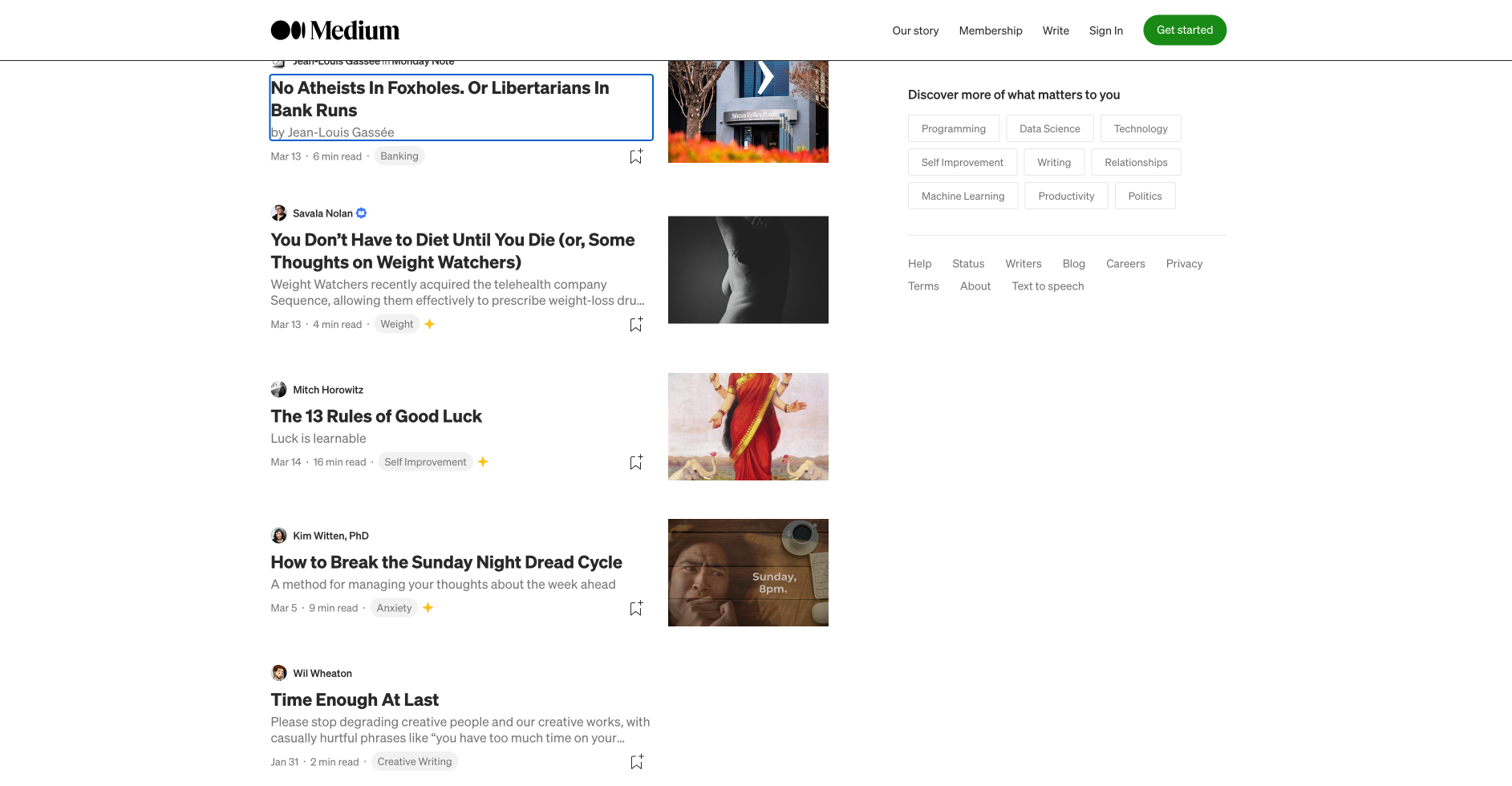
They get in the way of the actual content. And it’s worse on small screens where space is more limited.

Problem #2: They obscure content
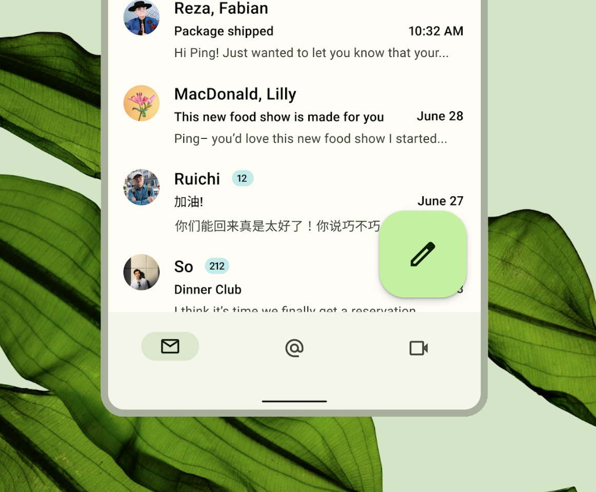
For example, Material Design’s floating action button always gets in the way of the content behind it.

Problem #3: They break when you zoom in
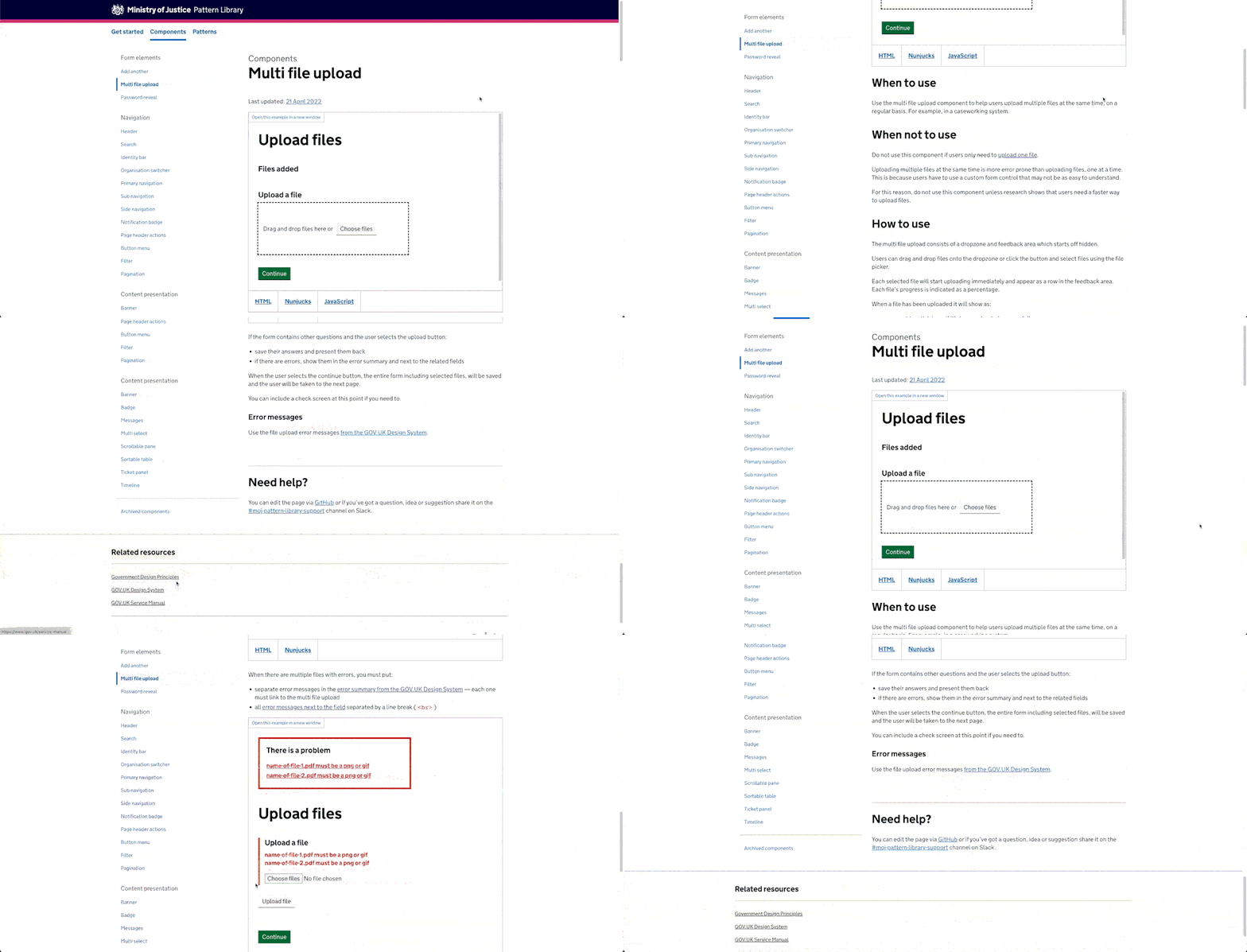
When zooming in, the size of the sticky menu can increase to a point where there’s little space for the content.

On mobile, sticky menus may disappear upwards. They may also become misaligned or slightly cropped.
Problem #4: They’re difficult to access
If a sticky menu is taller than the content and viewport, users will be unable to access the bottom of the menu (in some browsers).
Even if the content is taller than the menu, users still have to scroll to the bottom of the content to see the menu which is long winded.

You could add an inner scroll bar to the menu. But multiple scroll bars are hard to use.
Problem #5: Internal page anchors feel broken when clicked twice
Some sticky menus contain links that take users to content down the page.
When the user clicks the same link for a second time nothing happens, which makes the interface feel broken.

Problem #6: They appear closer than they are
Sticky menus are always visually accessible, but in reality are far away for keyboard users navigating with the tab key.

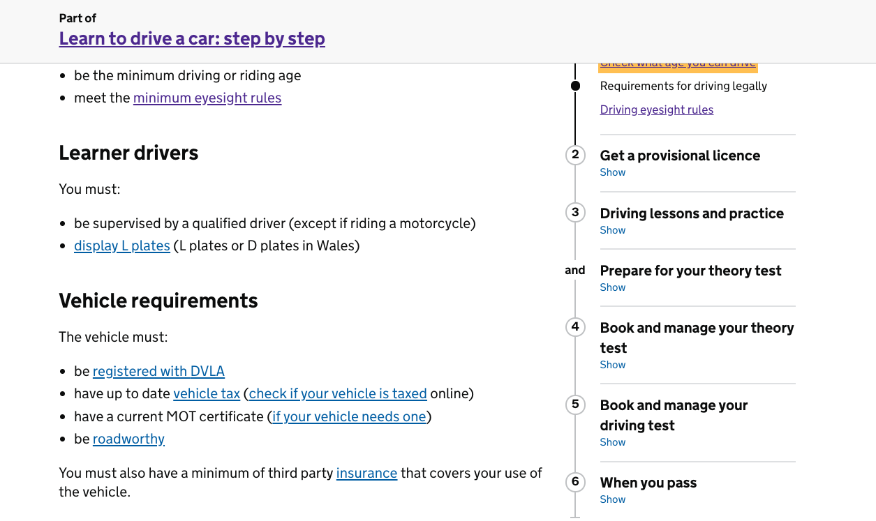
Problem #7: They obscure links and other focusable elements
Users who navigate back up the page by keyboard may end up focusing on a link that’s obscured by the sticky menu.

What to do instead
- Keep pages short: Sticky menus are a symptom of long pages so fix the root cause.
- Just let users scroll: It’s a myth that scrolling is a problem. Even on mobile, the top of the page is a flick or 2 away mostly.
- Put relevant links in context: For example, add a subscribe form to the end of a post or add a CTA to a pricing section.
- Use a back-to-top link: They’re relatively unobtrusive (but only do this once you exhaust the other options).
Learn UX that actually works (mostly about forms) in 5 mins or less
Join 4000 UXers in my weekly newsletter. Every Sunday morning, you'll get 1 design tip that shuns ‘best practice’ and actually works. Mostly about forms but not always.
Recommend
About Joyk
Aggregate valuable and interesting links.
Joyk means Joy of geeK