

UX cheat sheet: Preview and full display
source link: https://uxdesign.cc/ux-cheat-sheet-preview-and-full-display-a912aad49da7
Go to the source link to view the article. You can view the picture content, updated content and better typesetting reading experience. If the link is broken, please click the button below to view the snapshot at that time.

UX cheat sheet: Preview and full display
Explore the different ways you can preview and display content to make navigation easier for your users.
My dad once told me that graphic design is the art of fitting a newspaper inside a matchbox, and I would say a lot of interface design is the same.
In this cheat sheet, we will look at different patterns to preview and display content items.
- Preview and full display
- Preview
- Full display
- Mix and match combos
- Closing thoughts
1. Preview vs Full display
Good design shows the right amount of information at the right time.
For example, let’s say that we have a banking platform, and we need to show the user their transactions. We have two options when showing them stuff, we can either show them (a) everything about all their transactions for the last 23 years, or (b) just what they need to know, and then they can click to see more if needed.
The solution is usually (b), to show the user just as much as they need and they can investigate further if needed. Why do we choose this? Well, it comes back to some basic laws of UX:
- Hick’s Law: The time it takes to make a decision increases with the number and complexity of choices. The more complex a list of items is, the harder it is to make a decision, and it would be easier if the list was simpler.
- Pareto Principle (similar to the 80/20 rule). The Pareto principle states that, for many events, roughly 80% of the effects come from 20% of the causes. This means that the more we focus on the most likely actions, the better we can make the experience.
- Cognitive load. Cognitive load is the amount of brain power you have to use to understand something. The less information there is, or the more clearly it is communicated, the less thinking someone has to do.
So what does this all mean? Well, in this case, the simpler and more targeted we can make an experience, the better it will be for our users. To keep our user journey as efficient as possible and reduce cognitive load, we can reduce or hide some of the data that isn’t necessary.
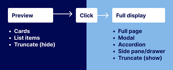
We separate these two views into ‘preview’ and ‘full display’. Preview as the name suggests, is just the highlighted data that would give the user an overview at a quick glance. The full display is all the data about the item, which would only be shown when the user requests it. For example, the preview is looking at the ice cream in the metal containers at the store, and the full display is the full ice cream on a cone.
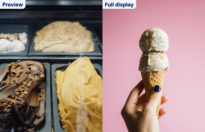
(In an unrelated tangent, when choosing places to buy ice cream, look for ones where it isn’t taller than the container it is in. For example, the image in this example would be one of the ones to avoid. Just trying to help you make better dairy choices in the future ✌. ️Read more)
In the next sections, we will look at different examples of previews and full displays.
2. Preview
The idea of a preview is pretty standard, but comes in different styles.
A good preview item must:
- Summarize the item
- Display the most important bits of data, and hide the rest
- Let the user know that they can click/tap to see more
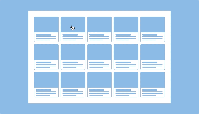
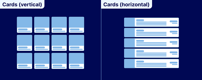
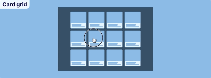
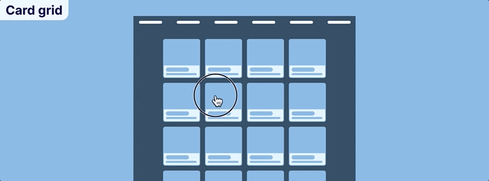
Cards
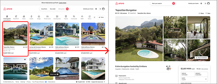
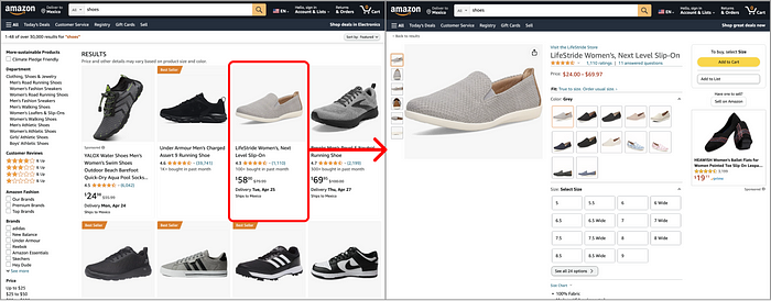
A card is usually, but not always, a vertically aligned block of information. Cards are often used to display things you can buy, like clothes, online courses, or time at rental accommodation.
A card will usually contain an image, a price, and a name. Some might have a description, but it isn’t very often. One of the most important things about card designs is that they should encourage the user to click it.
Who uses them: Pinterest, Airbnb, and fashion retailers.
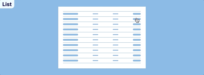
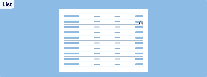
A list item is usually a horizontal line of data, that when it is with other list items, can look like a table.
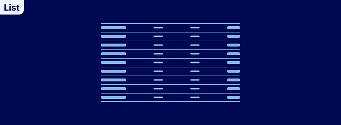
Who uses them: Email providers, banking transactions, to-do lists, etc.
Truncate (hidden)
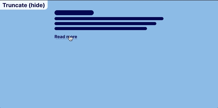
Truncate is when you stop a paragraph from revealing the whole text by cutting it off after a certain character/word/line count. This is often used on blog pages to display part of the post, and the user can select ‘read more’ to see the whole post.
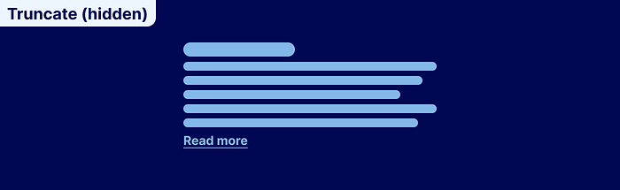
Side note: For years, I thought this pattern was called ‘tourniquet’ because you stop the flow of text like you would stop the flow of blood to a limb. Please tell me that I’m not the only morbid one?
3. Full display
The full display view is when the user has clicked on the preview item and now wants to see all the item’s details.
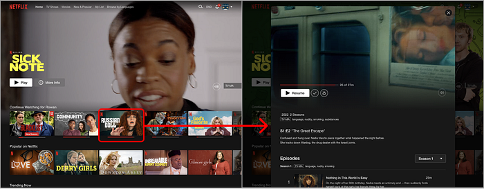
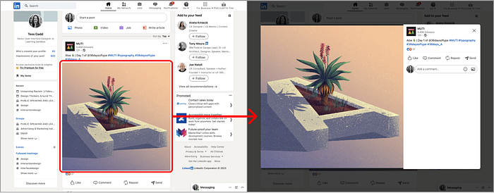
Modal
A modal (which is like a pop-up except the user triggers it as opposed to page load), can be used to show more details about something.
Modals are a great way of revealing more information while also keeping the user situated, and they don’t feel like they are bouncing around.
Best for: Entertainment and sometimes social media.
Bad for: eCommerce or something where you would want to send a link to a direct result.
Full page
A full-page display is when you select an item from a previous page, and it opens a brand new page to display the information. This is probably the most common pattern for things like online stores, or search engines.
The advantage of showing things on a full page is that you have so much more space to display details, photos, and anything else you could possibly want.
Using a full page to display more information is a common pattern for e-commerce products, news articles, and blog posts.
Best for: eCommerce, edTech, and environments where you want to minimalize distraction.
Bad for: situations where you would want to reference the other items on the previous page. (Although some people may prefer just to open a lot of tabs.)
Side drawer or pane
A side drawer/pane is when a component animates from the side of the screen (usually the right side). A pane is when a new section opens up.
A side drawer works like a side pane, except it sits over the preview. This allows for more space for the full display when on a small screen.
You might encounter this pattern when selecting different transactions or items in a list. Another example is if you are choosing from items in a database.
Best for: Really data-heavy programs that require a lot of data entry.
Bad for: Products and services that need to showcase their products.
Accordion
When clicked, an accordion list item may reveal more information below. Unfortunately, it will also push the other things on the page further down.
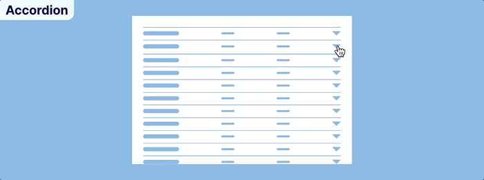
Accordions are a really simple way of hiding a lot of information.
Best for: FAQs and quick previews:
Bad for: having all the details on the page can increase loading time, so it should only be used for basic information with little formatting. It is also bad for times when users would want to send a link to a specific line item.
Truncate (show)
As mentioned before, truncating is when you only display some of the text on a page, then encourage the user to click on the ‘read more’ to see the full text.
4. Mix and match combos
The cool thing about these patterns is that you can mix and match the preview and full displays. Kinda Like socks or earrings. But some combos probably won’t work as well, like a secret sock and a wooly winter sock, or a card grid with a side drawer. So it’s not necessarily wrong, but it isn’t the most expected combination.
Some of the more common combos are below:
Card + Full page
From my anecdotal experience, the ‘card + full page’ display is the most common pattern. As a result, you will often see it on most e-commerce websites.
Card + Modal
Cards opening models are not as common as the above pattern but are still favored by many platforms. The advantage of using modals is that you don’t have to open a new page, and it keeps the user orientated. You will see this pattern used a lot on portfolio websites, galleries, streaming services, and some social media sites.
List + Full page
Banking sites and email apps love lists as they show a bit of detail in a small space. But like dynamite, big things come in small packages, and the full package needs a full page.
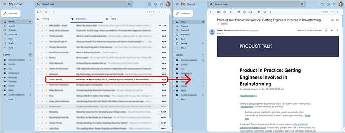
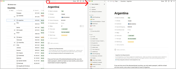
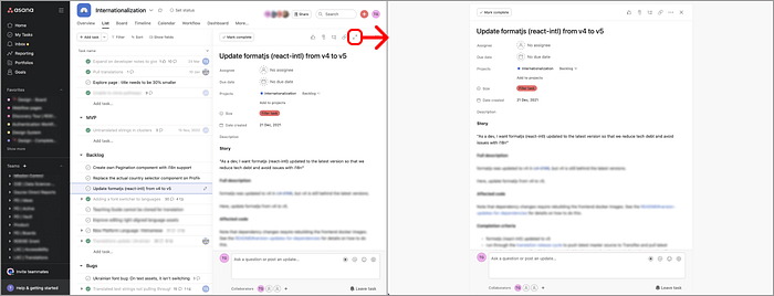
List + Multi
For robust interfaces that require users to input a lot of data, consider using two display types. Notion and Asana both use a side drawer/pane and full-page displays.
First, you see the side pane when you click on an item.
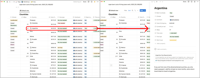
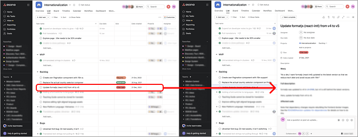
Then you can click through the full page if you want less distractions.
5. Closing thoughts
I just want to say thank you to Irvin Zhan for suggesting I write this article :) I hope this helps!
If you have any other suggestions for articles, please let me know! https://twitter.com/TessGadd
Recommend
About Joyk
Aggregate valuable and interesting links.
Joyk means Joy of geeK