

Create Button with Image in SwiftUI
source link: https://sarunw.com/posts/swiftui-image-button/
Go to the source link to view the article. You can view the picture content, updated content and better typesetting reading experience. If the link is broken, please click the button below to view the snapshot at that time.

A button in SwiftUI Is very flexible. You can use any view as its content.
In this article, I will show you how to create an image button and how to adjust its color.
How to create a button with image in SwiftUI
To create a button with an image in SwiftUI, you use an Image view as a label.
In this example, I use Symbols image as a button's content.
Button {

} label: {
    Image(systemName: "swift")
}
A button with an image as a label.
You can easily support sarunw.com by checking out this sponsor.

Sponsor sarunw.com and reach thousands of iOS developers.
How to change a button image color
The part where you should aware of when using an image in a button is the color.
All image has a rendering mode property which dictate how that image should be rendered.
There are two rendering modes.
- Original (
.original) which render an image as-is. - Template (
.template) which treat an image as a masking layer.
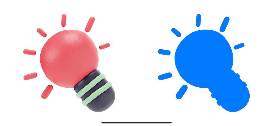
Left: original rendering mode, Right: template rendering mode.
This is where things get a little complicated.
- All SF Symbols are created with a Template rendering mode by default.
- Other images are created with a Default rendering mode (or whatever you set in an Asset Catalog).
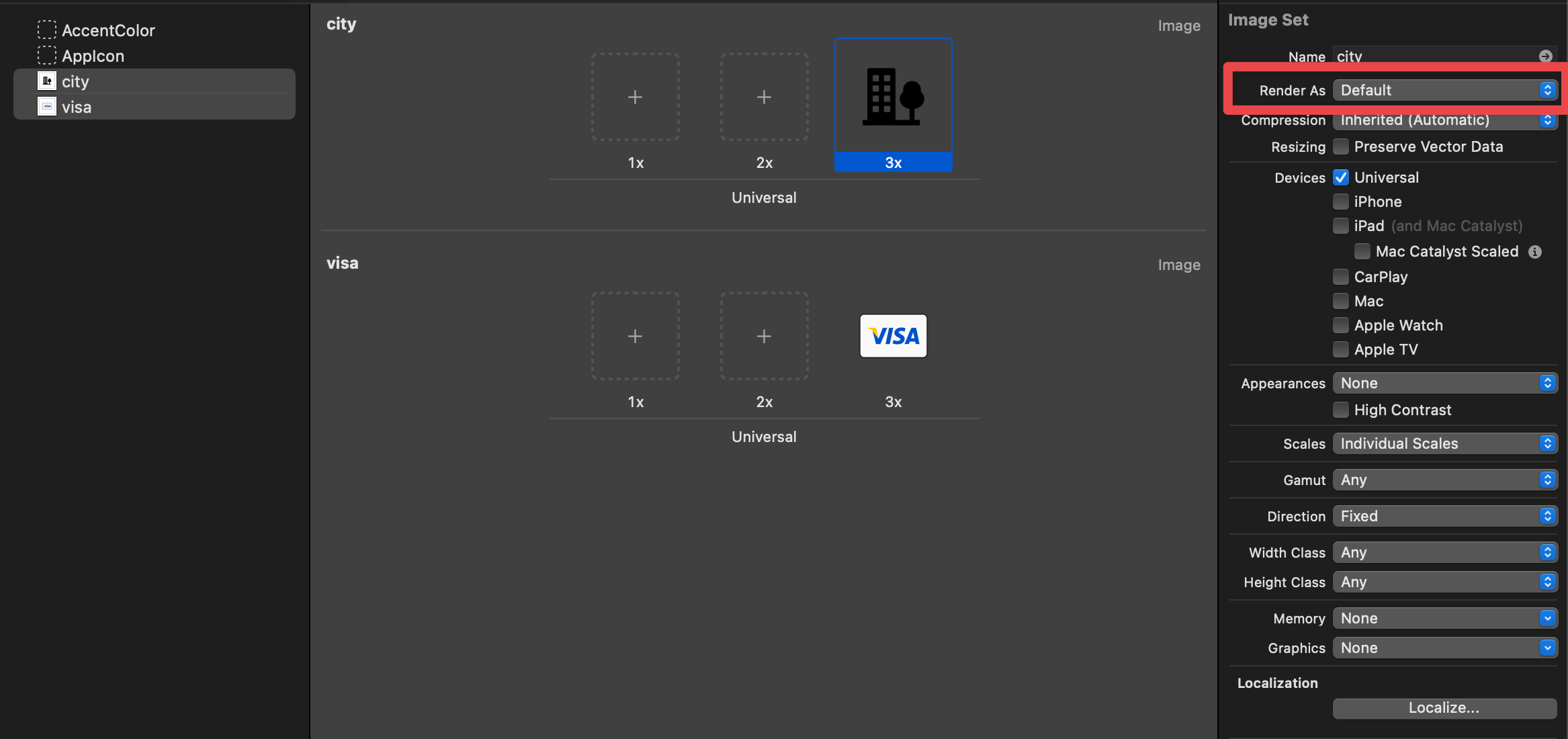
Let's see an example. Here are our image assets.
And here is an example where we use SF Symbols and normal images.
HStack {
    Button {

} label: {
        Image(systemName: "swift")
    }
    Button {

} label: {
        Image(systemName: "applelogo")
    }

Button {

} label: {
        Image("visa")
    }
    Button {

} label: {
        Image("city")
    }
}
Images with Template rendering mode pick up a button tint color (blue) and use that as its color.
For images with default rendering mode, a SwiftUI Button will use render them using Original rendering mode, which renders using their true color.

Buttons using SF Symbols and normal images.
This may or may not be the behavior you expected.
For the Visa image, you might ok to render it as-is, but you might want the City image to render in template mode.
You can control this behavior by changing the image rendering mode.
You can easily support sarunw.com by checking out this sponsor.
Sponsor sarunw.com and reach thousands of iOS developers.
How to change Image Rendering Mode
There are two ways to change an image rendering mode.
renderingMode modifier
You can set a rendering mode by using .renderingMode(_:) modifier.
We change the image rendering mode to template in this example.
Image("city")
    .renderingMode(.template)
Asset Catalog
You can also change an image rendering mode in the Asset Catalog.
To do that:
- Selecting an image you want to change the rendering mode in Asset Catalog.
- Change image rendering mode from the "Render As" option under the Attributed Inspector.
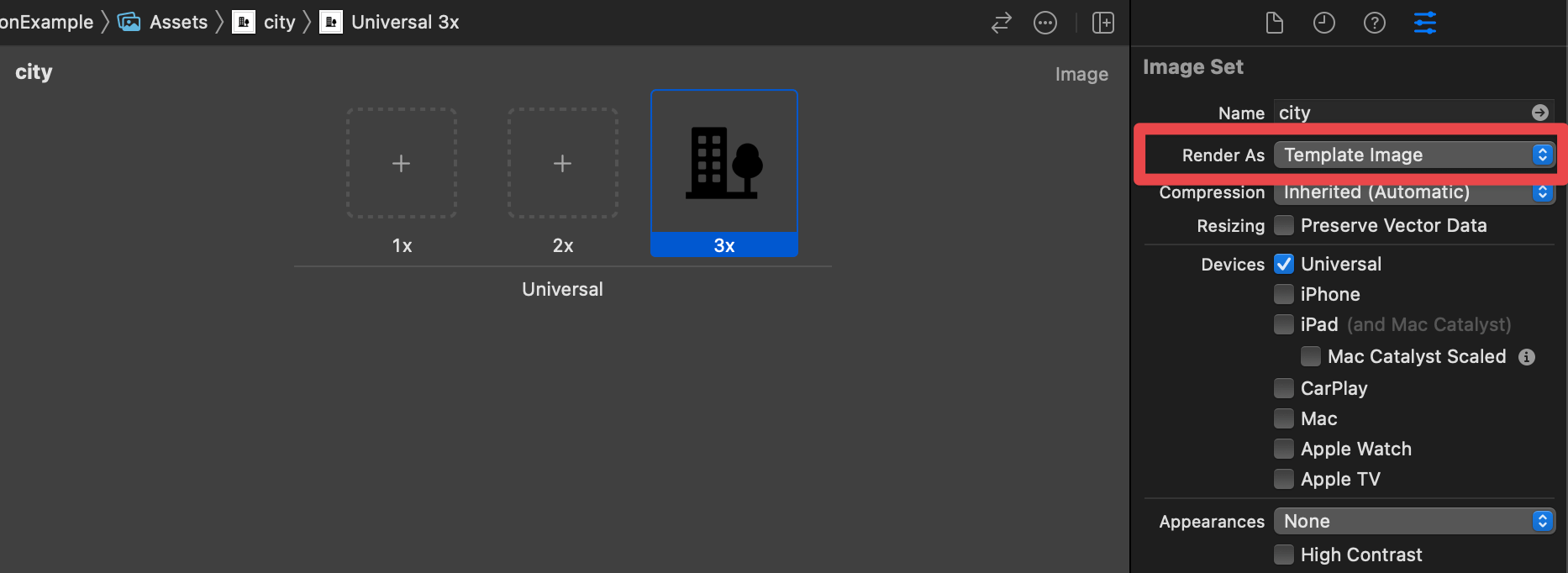
Asset Catalog.
Here is an example where we change our images to template rendering mode.
HStack {
    Button {

} label: {
        Image("visa")
            .renderingMode(.template)
    }

Button {

} label: {
        Image("city")
            .renderingMode(.template)
    }
}
Template image rendering mode.
Recommend
About Joyk
Aggregate valuable and interesting links.
Joyk means Joy of geeK