

vue自定义密码输入框解决浏览器自动填充密码的问题 - longxiaoming
source link: https://www.cnblogs.com/lxm-cnblog/p/17320432.html
Go to the source link to view the article. You can view the picture content, updated content and better typesetting reading experience. If the link is broken, please click the button below to view the snapshot at that time.

vue自定义密码输入框解决浏览器自动填充密码的问题
浏览器对于type="password"的输入框会自动填充密码,但有时出于安全或者其他原因,我们不希望浏览器记住并自动填充密码。通过网上查到的一些解决方案,可以总结出以下几种解决方案(主要用edge浏览器进行测试):
- 通过
autocomplete="off"/autocomplete="new-password"来关闭浏览器自动填充密码的功能, 但某些对于浏览器像edge,firfox等,这种方法并不起作用 - 通过
type="text"来解决,当focus时,通过js将type="text"改为type="password"。
<input type="text" onfocus="this.type='password'">
但同样对某些浏览器不起作用,如edge,在点击输入框时,仍会自动弹出填充密码的提示框。
- 某些浏览器可能只会识别第一个
type="password"的输入框,所以可以在前面添加一些隐藏的type="password"的输入框,来解决这个问题。
<form style="display:none">
  <input type="password">
</form>
<input type="password" style="display:none">
<input type="password">
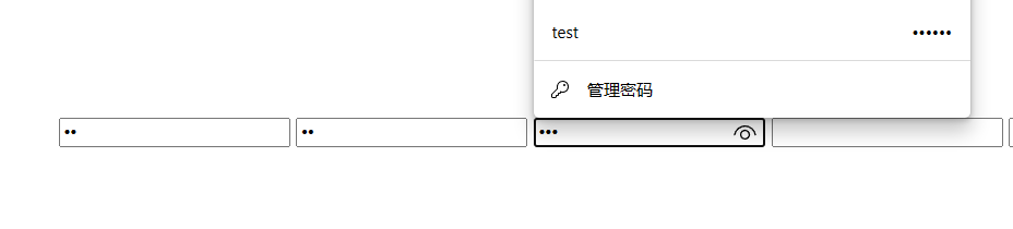
但同样并不是总是有效,拿edge测试时即使前几个密码输入框没有隐藏,最后一个输入框也会自动填充密码,如图:
- 通过
readonly属性来解决,初始化时将readonly设置为true,通过setTimeout来延时设置readonly为false。
<input id="passwordInput" type="password" readonly>
setTimeout(() => {
    document.getElementById('passwordInput').removeAttribute('readonly')
}, 100)
但同样并非总是有效,拿edge测试时,虽然点击输入框时并没有弹出填充密码的提示框,但是在输入框中输入密码然后退格到输入框为空时,又会重新弹出填充密码的提示框。
上述几种方法除了会弹出填充密码的提示框外,在页面跳转或刷新时(如edge浏览器),都会弹出保存密码的提示框,如图:

当然,应该还会有其他解决方案我暂时还没找到,如果有的话,欢迎留言。
自定义密码输入框组件解决方案
在尝试了上述几种解决方案后,发现效果都不是很好,所以我感觉只有让input的type属性始终为password,才能更有效的解决这个问题。可以考虑自定义一个密码输入框组件,通过某些方法去改变input的值的显示方式,来达到隐藏密码的效果。
目前想出了两种方法:一个是不改变input的值,仅仅隐藏input的内容,用另一个容器去显示密码或者显示*;另一个是将实际密码存在另一个变量中,将input的value值改成*来显示。
可以用两个input来实现,父容器是relative定位,两个input都是absolute,一个实际的输入框位于上层,设置为透明,另一个用于显示星号的输入框位于下层。
<div class="container">
  <input v-model="passwordDisplay">
  <input
    v-model="password"
    class="password"
    @input="passwordDisplay = password.replace(/./g, '*')">
</div>

<style scoped>
.container {
  position: relative;
}
.container input {
  position: absolute;
  left: 0;
  top: 0;
  font-size: 12px;
}
.password {
  opacity: 0;
}
</style>
效果如下图所示:

确实没有弹出密码填充的对话框,但样式上并不是很满意。因为实际的输入框被设置成了透明,且在密码显示框之上,所以光标无法显示出来,且无法进行选中一部分内容。
跟方案一差不多的方式,用input来接收用户输入的密码,但仅改变输入内容的透明度, 由于在opacity为0的情况下设置光标颜色无效,所以要将方案一中的opacity: 0改为:
.password {
  color: transparent;
  background-color: transparent;
  caret-color: #000; /* 光标颜色 */
}
但是这会有个问题,选中一部分内容时,会导致透明的内容选中后显现出来,如图所示:
这种情况下可以考虑监听选中事件,当选中一部分内容时,将后面的星号也选中,同时通过::selection伪类来设置选中的内容的背景色,让两个选中的内容颜色一致。要实现这种效果,input显然做不到修改部分内容的背景色,所以可以考虑用span代替input,向其innerHTML中插入带背景色的span:
<div class="container">
  <span
    ref="passwordInputDisplay"
    class="password password-input__behind"
  />
  <input
    v-model="password"
    class="password password-input__front"
    @focus="isActive = true"
    @blur="isActive = false"
    @input="passwordDisplay = password.replace(/./g, '*')">
</div>
<style scoped>
::selection {
  background-color: #409eff;
}
.container {
  position: relative;
}
.password {
  position: absolute;
  left: 0;
  top: 0;
  width: 100%;
  height: 100%;
  font-size: 12px;
  font-family: monospace; /* 必须用等宽字体 */
}
.password-input__behind {
  text-align: left;
  z-index: 1;
}
.password-input__front {
  color: transparent;
  background-color: transparent;
  caret-color: #000;
  z-index: 2;
}
export default {
  props: {
    value: {
      type: String,
      default: ''
    }
  },
  methods: {
    handleInput (e) {
      // 删除非法字符(只保留code>=32且code<=126的字符)
      const value = e.target.value
      const newValue = value.replace(/[^\x20-\x7E]/g, '')
      if (newValue !== value) {
        this.password = newValue
      }
      // 发布input事件,从而修改props中的value值
      this.$emit('input', this.password)
    }

  },
  created() {
    this.selectionEvent = () => {
      const display = this.$refs.passwordInputDisplay
      display.style.zIndex = 1
      display.innerHTML = this.passwordDisplay
      if (!this.isActive) { return }
      const selection = window.getSelection()
      // 如果选中的内容不为空, 则由passwordInputDisplay显示
      if (!selection.toString()) { return }
      const input = this.$refs.passwordInput
      const start = input.selectionStart
      const end = input.selectionEnd
      const highlightString = '<span style="background-color: #409eff; color: #fff;">' + this.passwordDisplay.slice(start, end) + '</span>'
      display.innerHTML = this.passwordDisplay.slice(0, start) + highlightString + this.passwordDisplay.slice(end)
      display.style.zIndex = 4
    }
    document.addEventListener('selectionchange', this.selectionEvent)
  },
  beforeDestory() {
    document.removeEventListener('selectionchange', this.selectionEvent)
  }
}
需要注意以下几点:
- 监听
select事件不能用input自带的onselect或@select,因为这只会在鼠标松开时触发,并不能实时相应选取区域的变化。所以要监听selectionchange事件。注意selectionchange事件在没选中内容时也会触发。 - 由于相比方案一显示了光标,光标的位置会受到实际字符宽度的影响,所以要使星号与其他字符宽度相等,必须使用如
monospace之类的等宽字体,且必须阻止中文字符的输入。 - 修改
innerHtml后需要改变密码显示框的z-index,否则仍然会被input中选中的内容覆盖。
效果如下图所示:

这里还有个问题,当输入内容超过了input的长度,显示上就会出现错误,可以考虑根据字体宽度计算出最大容纳的字符个数,阻止过多字符的输入。也可以在光标移动时同时移动后面的span,不过逻辑太过复杂没必要。
const width = this.$refs.passwordInput.clientWidth - 20 // 20为padding
const canvas = document.createElement('canvas')
const ctx = canvas.getContext('2d')
ctx.font = '16px monospace'
const fontWidth = ctx.measureText('A').width
this.maxLength = Math.floor(width / fontWidth)
这里用的是canvas进行计算字体宽度。
虽然最终实现了目标效果,不过逻辑上还是稍微复杂了点。
完整代码在: https://github.com/lxmghct/my-vue-components
src/components/PasswordInput/PasswordInput1.vue
只使用一个input,另外设置一个变量去保存真实密码。这种方法比上述方法逻辑上要稍微简单一些,唯一需要注意的就是当输入框中显示为星号时,如何区分哪些是新输入的内容,因为会有鼠标选中一段内容再删除或输入、粘贴的操作,而新输入的内容中也可能包含星号,所以不能处理的过于简单。最后采用的是监听selectionchange事件来随时更新光标所在位置,从而区分新输入的内容。
<input
  ref="passwordInput"
  v-model="passwordDisplay"
  autocomplete="off"
  @focus="isActive = true"
  @blur="isActive = false"
  @input="handleInput"
>
export default {
  methods: {
    handleInput () {
      // 获取新输入的字符
      const tempEnd = this.passwordDisplaylength - (this.password.length - thisselection.end)
      const newStr = this.passwordDisplay.slic(this.selection.start, tempEnd)
      // 更新输入框的值
      const currentPosition = this.$refspasswordInput.selectionStart
      this.password = this.password.slice(0,Math.min(this.selection.start,currentPosition)) + newStr + this.passwordslice(this.selection.end)
      this.selection.start = currentPosition
      this.selection.end = currentPosition
      this.$emit('input', this.password)
    }
  },
  created () {
    this.selectionEvent = () => {
      if (!this.isActive) { return }
      const input = this.$refs.passwordInput
      this.selection = {
        start: input.selectionStart,
        end: input.selectionEnd
      }
    }
    this.copyEvent = (e) => {
      if (!this.isActive) { return }
      const clipboardData = e.clipboardData || window.clipboardData
      clipboardData.setData('text', this.password.slice(this.selection.start, this.selection.end))
      e.preventDefault()
    }
    document.addEventListener('selectionchange', this.selectionEvent)
    document.addEventListener('copy', this.copyEvent)
  },
  beforeDestroy () {
    document.removeEventListener('selectionchange', this.selectionEvent)
    document.removeEventListener('copy', this.copyEvent)
  }
}
有几点需要注意:
- 输入框中选定的内容的起始和结束位置无法通过
window.getSelection().anchorOffset等参数获取(window.getSelection()的几个offset都是0), 只能通过input的selectionStart和selectionEnd可以拿到当前选中区域的起始和结束位置。 - 由于输入框内实际显示的是星号,所以复制时若不处理则复制的也是星号,所以需要监听复制事件,将实际密码写入剪贴板。剪贴板通过
e.clipboardData || window.clipboardData获取。
相比于方案二,这种方法无需要求一定要等宽字体,也无需另外去处理选中内容的事件,唯一多出的地方就是对输入框实际值的处理,包括输入和复制,而这里的逻辑显然比方案二中修改样式容易的多。
效果上跟方案二基本差不多,而且没有长度限制,这里用this.passwordDisplay = '\u2022'.repeat(this.value.length)把星号改成了圆点,如下:
完整代码在: https://github.com/lxmghct/my-vue-components
src/components/PasswordInput/PasswordInput2.vue
密码显示与隐藏
点击眼睛图标,切换密码的显示与隐藏状态。
export default {
  watch: {
    value () {
      this.updatePasswordDisplay()
    },
    showPassword () {
      this.updatePasswordDisplay()
    }
  },
  methods: {
    updatePasswordDisplay () {
      if (this.showPassword) {
        this.passwordDisplay = this.value
      } else {
        // this.passwordDisplay = '*'.repeat(this.value.length)
        this.passwordDisplay = '\u2022'.repeat(this.value.length) // 圆点
      }
    }
  }
}
眼睛图标可以用图标库或者导入图片,我这里用的是svg,眼睛图标的svg可以通过一些转换工具来实现,这里推荐一个网站: https://picsvg.com/
<div class="password-input__eye-wrap">
  <div
      class="password-input__eye"
      @click="showPassword = !showPassword"
  >
      <svg version="1.0" xmlns="http://www.w3.org/2000/svg"
      width="58.000000pt" height="50.000000pt" viewBox="0 0 58.000000 50.000000"
      preserveAspectRatio="xMidYMid meet">
          <g transform="translate(0.000000,50.000000) scale(0.100000,-0.100000)"
          fill="#000000" stroke="none">
              <path d="M228 390 c-61 -19 -148 -96 -148 -130 0 -21 61 -87 103 -110 50 -29
              127 -32 173 -8 39 21 114 98 114 118 0 19 -74 97 -111 115 -36 19 -98 26 -131
              15z m121 -40 c37 -18 91 -72 91 -90 0 -18 -54 -72 -91 -90 -70 -36 -138 -22
              -206 43 -18 17 -33 38 -33 47 0 19 53 71 95 93 41 22 98 21 144 -3z"/>
              <path d="M235 338 c-31 -18 -44 -40 -45 -75 0 -45 9 -62 42 -79 84 -43 168 60
              106 130 -27 30 -74 41 -103 24z m79 -34 c20 -20 20 -68 0 -88 -35 -35 -104 -6
              -104 44 0 50 69 79 104 44z"/>
          </g>
      </svg>
  </div>
</div>
<style scoped>
.password-input__eye-wrap {
    display: flex;
    align-items: center;
    justify-content: center;
}
.password-input__eye {
    width: 20px;
    height: 20px;
    display: flex;
    align-items: center;
    justify-content: center;
    cursor: pointer;
}
</style>
效果如下:
完整代码在: https://github.com/lxmghct/my-vue-components
src/components/PasswordInput/PasswordInput2.vue
觉得有帮助的可以在github上点个star~
通过将密码输入框的type设置为text,修改样式上的显示,来实现既可以让浏览器不自动填充密码,又可以隐藏密码的效果。
Recommend
About Joyk
Aggregate valuable and interesting links.
Joyk means Joy of geeK