

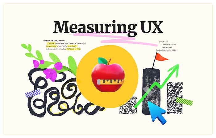
Measuring UX: Your First Step Towards Objective Evaluation
source link: https://uxplanet.org/measuring-ux-your-first-step-towards-objective-evaluation-a408b312777b
Go to the source link to view the article. You can view the picture content, updated content and better typesetting reading experience. If the link is broken, please click the button below to view the snapshot at that time.
Measuring UX: Your First Step Towards Objective Evaluation
Have you ever experienced a situation where a good design was rejected just because the decision maker woke up on the wrong side of the bed?
Or you’ve prepared a solution that has some minor flaws, but you think they’re not critical and your team can move forward with development. What if you’ve anchored yourself, and this bias could cost your project a fortune?
It’s still common in the industry for a UX designer to be hired for a few weeks/months to quickly prepare a series of mockups and then be assigned to another rush project. It’s not always possible to change your organization’s business process (selling heads), but you can influence it and try to measure your designs so that your “project for a month” turns into a “short-term product” with goals and measurable results.
UX benchmarking, scoring, and analyzing the results help to eliminate non-objective evaluation and human biases. In addition, this method transforms your “project” into a “product”.
Measuring UX can also be used for:
- Comparing previous and new versions of the product
- Comparing your product with competitors
- Getting industry evaluation standards (NPS, SUS, SEQ…)
I invite you to read this article, where you will find an easy-to-read guide on how to measure UX. For those who want to save time and get a ready-to-use solution, I charge a nominal price for a template that helps measure the following metrics: UMUX-Lite, Levels of Success, Time on Task, and SEQ.
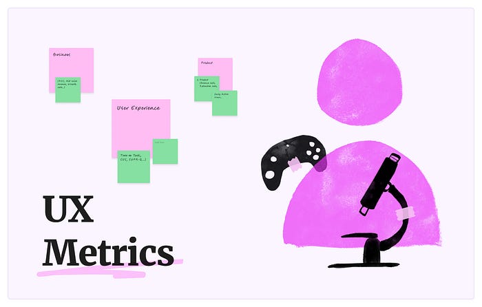
UX Metrics
There are 3 areas of metrics application:
- Business (ROI, Net sales revenue, Growth rate…)
- Product (Bounce rate, Retention rate, Daily Active Users…)
- User Experience (Time on Task, SUS, SUPR-Q…)
UX metrics measure and evaluate user performance or experience.
This article is focusing on UX metrics, their task/study-based classification, how to choose metrics, and a detailed overview of certain ones.
Task-based Metrics
Usability tests represent users’ attempts to accomplish a realistic goal, such as finding yellow snickers, ordering a pizza for a party, or submitting a claim that a package has been lost, etc.
This task benchmarking allows us to determine how well users completed a task, how long it took, and how many errors occurred. These task-based metrics measure the behavior of task experiences.
According to MeasuringU, task-based metrics fall into the following categories: Action Metrics, Attitudinal, Behavioral, Physiological, and Combined Metrics.
Tier 1 of task-based metrics (based on the rationality of usage and popularity):
- Success (Completion Rate or Levels of Success)
- Time on Task
- Eye-Tracking Metrics and others
Study-based Metrics
Users can easily and quickly complete a task, but still find your product unhelpful, which means that part of your user segment will not use it.
Study-based metrics evaluate users’ perception of usability, satisfaction, and behavioral intentions (Intent to Use/Purchase, likelihood to recommend, product-market fit).
According to MeasuringU, study-based metrics fall into the following categories: Satisfaction Metrics, Loyalty, Brand, Usability/Usefulness Metrics, Delight, Trust, and Special Purpose Questionnaires.
Tier 1 of study-based metrics:
- NPS or General Satisfaction
- SUS (UMUX-Lite / UX-Lite)
- Customer Effort Score and others

Choosing Metrics
It’s not an exaggeration to say that the process of choosing metrics deserves a separate article. However, considering this article as a starting point, I want to share with you a rational method of choosing metrics. Namely:
A rational method of choosing metrics:
- Get familiar with tier 1 metrics.
Despite solving a unique problem, each project has common fundamental characteristics. We will always keep our focus on user success, time to get things done, afterward satisfaction, etc… - Mix Task/Study-based metrics.
Combining Task-based and Study-based metrics provides the most comprehensive understanding of using your product. - Stick to your resources.
Measuring UX takes a while, even if you use a binary metric (Success) or do it at the study level rather than the task level (e.g., measure overall success vs. success for each task). First, do what you need to do, and then try to change your design process.
To illustrate this method, let’s conduct a thought experiment:
Choosing Metrics for an Online Marketplace Store
Picture the following: I am involved in a short-term project (based on my estimate and the client’s budget) as a UX designer. The project represents a local marketplace store that offers a variety of products with a user-friendly interface and good customer support (have you heard something like this before?).
Goals:
- Let’s consider the #1 feature for any store — the checkout process, where the user needs to fill in several fields, choose a payment and delivery method, and proceed to payment.
- The purpose of the test is to get an overall UX score, capture insights if any, and find out what users think about their satisfaction.
Constraints:
- We can conduct 6–8 remote moderated usability tests, each of which should not take more than 30 minutes.
- In total, we can spend 3–5 days on testing (preparation, conducting, and calculating the results)
Choosing metrics:
- The checkout process should take users a minimum of time to fill in all the necessary fields, but the accuracy of the data should not suffer.
— I would like to use Time on Task and Errors metrics. It would be even better to use Eye-Tracking to find where errors occur, but that would require much more resources (we can’t afford it for this example). - It’s undeniable that the more successful orders we have, the better.
— So we should measure the Task completion rate or its advanced version — Levels of Success. The advanced version allows us to segment users into complete success, successful with minor/major issues, and failure. - We got segments, let’s ask them about their satisfaction afterward.
— Good old NPS does this job perfectly. - At some point, participants become tired, and this negatively affects the reliability of the data (they may lie to us to just finish the test faster).
— To avoid this, let’s end the test with my personal favorite metric, UMUX-Lite, which allows us to measure overall usability by asking just two questions.
As a result, we are combining Time on Task, Errors, and Levels of Success (task-based) with NPS, and UMUX-L (study-based metrics).
This article elaborates on four metrics: UMUX-L, Levels of Success, Time on Task, and Single Ease Question (SEQ).
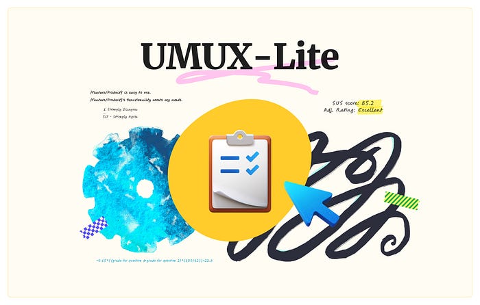
UMUX-Lite
Before talking about UMUX-Lite, it is worth mentioning its predecessor, The System Usability Scale. SUS is a ten-item, five-response questionnaire. In over 25 years of use, it has become an industry evaluation standard with extensive benchmarking data and is still used to at least interpret the data from other usability questionnaires to a single standard.
The disadvantage of asking ten questions was solved with the Usability Metric for User Experience (UMUX) and its 4 questions (two positives and two negatives). Then, the room for improvement gave us Usability Metric for User Experience Lite (UMUX-Lite).
UMUX-Lite is a shorter, two-question, all-positive questionnaire, that uses a 7 or 5-point scale. Despite its novelty, this method has undergone several studies of revised wording, and its latest version states:
Question 1: {Feature/Product} is easy to use.
1 - Strongly Disagree
…
5/7 - Strongly Agree

Question 2: {Feature/Product}'s functionality meets my needs.
1 - Strongly Disagree
…
5/7 - Strongly Agree
UMUX-Lite is a study-based metric, that usually, is administered after usability testing, but can also be used after the onboarding process, and even to get a minimum overall usability score compared to your competitors.
Score Calculation
Complete your usability testing by asking users to complete a two-question survey. If you are using my template, put the score you received for each question for each participant in the UMUX-Lite section.
Converting UMUX-L into SUS
My template utilizes the following formula and interprets a SUS score into an adjectival rating with color coding (poor-red… excellent-green).
=0.65*((grade for question 1+grade for question 2)*(100/12))+22.9
Tip:
The 7-point scale mentioned above allows users to be more precise in their choices compared to a 5-point scale. However, there is a small change you need to make if you want to use a 5-point scale: divide the amount by 8 instead of 12.
Reporting UMUX-Lite
Use the adjectival rating scale to report on the overall usability.

UMUX-Lite Template
https://intracerebrally.gumroad.com/l/measuringux
Useful Links

Statistics in UX
UMUX-Lite was easy to measure: ask two questions, receive and place scores, and the template does the rest. For other metrics, the process is different as it requires basic knowledge of how data are processed.
Please do not leave this article! 😅
I’m not going to teach you how to become a statistician, but instead, I’ll just drop a list of common words that I have to operate with to describe the measurement of other metrics.
- Confidence Interval (CI) is a range of values you expect your estimate to fall between lower and upper bounds (also known as Low and High bounds). CI is twice the Margin of Error.
- The margin of error is how far from the estimate we think the true value might be (in either direction).
- A Confidence Level measures the probability that the true value will fall within the range of values of the confidence interval. For example, a confidence level of 95% means that there is a 95% probability that the true value falls within the range of values of CI.
- Normal Distribution is a type of distribution that is symmetrical around its mean with most values near the central peak. It is visually depicted as a “bell-shaped curve.”
- Non-normal distribution does not follow a standard bell-shaped curve. Such data creates an asymmetrical, left or right (positive or negative) skewed graph. A non-normal distribution can lead to inaccurate and misleading results, requiring data normalization.
As UX practitioners, we need to possess a wide range of skills. Not all of them are as enjoyable as creating mockups in Figma. But I’m 100% sure you’ll get over it as soon as you calculate your first metric 🤟
Did you find this curious? I have something for you:

Levels of Success
Success or Task completion rate is the fundamental, binary task-based metric that counts the percentage of users who were able to complete the task or failed it. Its advanced version — Level of success, in addition, to complete success or failure, captures partial success, like success with one minor issue and success with a major issue.
Score Calculation
To score this metric, you need to observe the participant’s behavior and label it in the Raw Data section.
Conventionally, the LoS performers after each task for each user, but I strongly recommend starting practicing this metric at the study level. This implies you can label users’ accomplishments through all tasks, at the end of the study (like UMUX-Lite) and measure overall Success.
Tips:
- If users are completely stuck, help them complete the task, but label it as failed.
- Be aware of researcher biases and don’t let a subconscious desire to receive praise overshadow a fair assessment.
Calculating confidence intervals
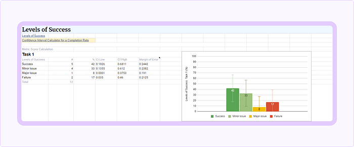
We need to determine how accurate the measurement is. The following steps describe how to determine confidence intervals, which display a fall of your estimate between a pair of values around the mean.
- Open the Confidence Interval Calculator for a Completion Rate, and calculate each Level of Success separately by using the Input Table section (and its “Passed” and “Total Tested” fields).
- Let’s imagine you conducted 12 tests, this “12” is Total Tested.
- Assume that 5 participants were able to complete the task successfully with no errors. This “5” is Passed.
- Keep default configs (Confidence level: 95%, Likely Population Completion Rate: Unknown).
- Calculate.
- On the right, the Results Table shows a variety of results. The Low, High, and Margin of Error records (in the Adj. Wald line) are your fall of the estimate.
- Place those values in the template sheet.
The resulting values for this example are:
- CI low — 0.1926 or 19% is a Negative error value
- CI high — 0.6811 or 68% is a Positive error value
- The Margin of Error — is 0.2442
There is no other way to narrow down such a wide error range (~49%) than to conduct more usability tests, but this inevitably increases the overall cost. However, even this error range performs incomparably better than any assumptions (e.g., most of our users are familiar with such tasks, thus no problems to expect…).
Visualizing Results
The easiest way to visualize data is to build a graph in MS Excel or its analogs. Owing to the overloaded interface and the need to pay for MS Excel, I chose Google Sheets as the primary data visualization tool. Unfortunately, Google Sheets does not allow us to set custom error bars. This lack isn’t critical for reporting Levels of Success or any metrics, where data is normally distributed but will take its toll later.
In particular, we will use the Margin of Error (0.2442) as a constant value to depict error bars.
Reporting Levels of Success
As indicated by NN/g, to report Levels of Success, you simply report the percentage of users who were at a given level and its confidence interval for that number. Such as:
5 out of 12 users (~42%) were able to complete the task successfully with no errors. Based on this result, we expect that between 19% and 68% of our general user population will complete the task with no error.
Levels of Success Template
https://intracerebrally.gumroad.com/l/measuringux
Useful Links
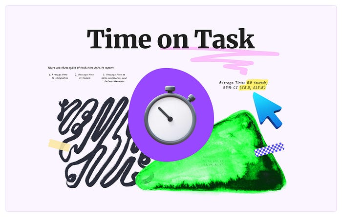
Time on Task
— Is an essential metric for measuring efficiency. Suits the most for comparing old/new designs and determining how long it will take an experienced user to complete a routine task in their product (Keystroke-Level Model).
There are 3 types of task time data to report:
- Average time to completion
- Average time to failure
- Average time on both completion and failure attempts
Score Calculation
In this example, we will measure the Average time on both completion and failure attempts, but if you need another type, just label each attempt and calculate it separately.
Tips:
- Prepare a prototype with clear start and end points (e.g., a start testing button and a gratitude window for testing the prototype).
- As stated in the Does Thinking Aloud Increase Task Time?, asking participants to think aloud does not significantly increase the total time of the task (on average the difference is about 16%), but it leads to the discovery of usability. So let them talk!
Capturing time data:
- Start a stopwatch as soon as participants trigger a Start Testing button, and stop when they reach a gratitude window for testing the prototype.
- Place a value (in seconds), for each task, for each participant in the Raw Data section.
Calculating confidence intervals:
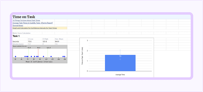
- Open the Graph and Calculator for Confidence Intervals for Task Times.
- Let’s imagine you conducted 10 tests, and your raw task times are 70, 79, 109, 52, 183, 133, 94, 91, 67, 72, 190, and 86 seconds (the order doesn’t matter).
- Place values (one per line) in the Enter Times section.
- Keep the default 95% Confidence level.
- Graph.
- On the right, in the Results section, you’ll find the 95% Confidence Interval values, which is your fall of the estimate. And the Geometric mean value, which works better than the arithmetical mean for small sample sizes (less than 25 participants) and for skewed data (our case).
- Place those numbers in separate cells in the template sheet. Other values can also be placed, but won’t be used for reporting.
The resulting values for this example are:
- CI low —73.5 sec
- CI high — 121.8 sec
- Geometric Mean — 94.6 sec
Visualizing Results
Time task data has a tendency to be positively skewed (the mean is to the right of the peak). This means the intervals are not symmetric around the mean. As mentioned earlier, Google Sheets doesn’t allow us to set user error bars, so we can’t accurately map the results.
This puts us in front of a choice:
- For the error bars, select the “Percentage” type and set its value to about 30%, which will roughly correspond to the obtained results.
- If your project does not tolerate such disregard for accuracy — use MS Excel.
Reporting Time on Task
To report Time on Task, use the geometric mean and confidence internals (overall or for a particular task). For example:
For Task #1, the average time on task is 95 seconds (~1.6 min), and we can be 95% confident that our general user population will complete the task within 74 and 122 seconds (1.2–2.0 minutes).
Time on Task Template
https://intracerebrally.gumroad.com/l/measuringux
Useful Links
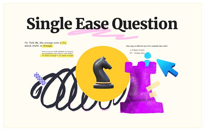
Single Ease Question (SEQ)
SEQ is a one-question, 7-point rating scale, task-based metric that assesses how easy or difficult users find a task. The score is given immediately after users have attempted the task.
SEQ’s current wording states:
How easy or difficult was it to complete this task?
1 - Very Difficult
…
7 - Very Easy
As stated by MeasuringU, the average SEQ score is around 5.5. This fact signifies that the SEQ data is not symmetrical and non normally distributed. However, we will not take into account the shape of the sample data, as we use a standard mean with a confidence interval around it (because the sampling distribution of means is near normal).
For reporting SEQ we will see what the mean and the interval endpoints correlate to adjective rating. More about this in the next block.
Score Calculation
I ask the SEQ question in Figma, right after a task, via a simple overlay form. This on-the-spot survey prevents users from skipping questions or being distracted by something else and allows them to control their choices and the responses they submit.
You may wonder now, how I do this — I think users don’t need to know that I’m faking the survey and manually mirroring the user’s grade in the template, simultaneously with the participant in Figma. This seemingly unnecessary step minimizes Observer bias but works only for moderated studies.
Tips:
- When users rate a task less than 5, ask “Why?” to get immediate diagnostic information.
- If your stakeholders (customer team, developers, BAs…) are involved in testing, keep the detailed mechanics of this metric secret, as this knowledge negatively affects their assessment (they may (sub)consciously avoid scoring the interface at 4 or less to simply avoid answering your following question — “Why?”).
- Tasks with a score of 5.0 or less necessitate further diagnosis and improvement.
Calculating the standard mean and confidence intervals
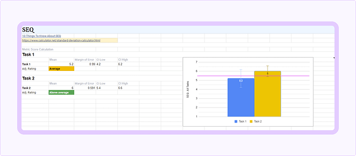
- Let’s imagine you conducted 12 tests, and your raw scores for Task #1 are 6, 7, 2, 5, 7, 3, 6, 4, 6, 7, 6, and 3 (the order doesn’t matter).
- Open Standard Deviation Calculator, switch the “It is a” to “Sample”, paste scores, and calculate.
- From the results, we take the Mean and Confidence interval (95%).
- Place those numbers in the template sheet.
- Repeat this calculation for other tasks and through all of them together (to find the overall SEQ).
The resulting values for this example are:
- The Mean is — 5.2
- The Margin of Error — is 0.99 (or 19.1%)
- CI low — 4.2
- CI high — 6.2
Visualizing Results
- In Google Sheets, you can use either “constant” (0.99) or “percentage” (19.1) to depict error bars.
- The template displays a horizontal line on the level of 5.5 as an indicator of the average.
Getting Adjectival Rating For SEQ
Using the mean and confidence intervals is enough to report results, but it’s easier to summarize the test with something clear and neat, like “Average” also known as adjectival rating (that one what we used for UMUX-L).
Frankly, I had a hard time figuring out how to convert the SEQ into the adjectival rating and asked for help directly from James R. Lewis, and I got:
- In Using Task Ease (SEQ) to Predict Completion Rates and Times article, in the SEQ and Completion Rates section, you can find Figure 2, which shows decile scores for the SEQ.
- Based on it we can set boundaries for our adjective rating:
SEQ 1.0–4.9 (1st to 30th deciles): Below average
SEQ 5.0–5.8 (40th to 60th deciles): Average
SEQ 5.9–7.0 (70th to 99th deciles): Above average - Going back to our example, we can interpret the SEQ score of 5.1 for Task #1 as Average.
Reporting SEQ
To report SEQ use the standard mean, confidence intervals, and adjective scale for all of them:
For Task #1, the average score is 5.2, which states as Average. And we can be 95% confident our general user population will provide a score within 4.2 (below average) to 6.2 (above average). These results signify that the feature necessitates further diagnosis and improvement.
SEQ Template
https://intracerebrally.gumroad.com/l/measuringux
Useful Links
I’d like to express my deepest gratitude to Mr. James R. Lewis for his help in calculating the results and their interpretation. Many thanks!

While preparing this article, I encountered certain questions that I believe it is useful to elaborate on:
Q: My organization believes that UX is not needed and/or it is not practiced systematically. What should I do to convince them that we need to measure UX?
— It’s a long and challenging path ahead to growing UX maturity in your organization. In this article, I can offer you to get acquainted with the main points and then try to conduct test runs to get your initial design scores that can serve as strong evidence.
Q: I’m designing a “Facebook/Youtube/Instagram…” killer. How to measure this monster?
— Assume that your users don’t use all the features of this monster at the same time. This way, you can measure each feature as a separate project with its own goals, constraints, and metrics.
Q: How many usability tests do I need to conduct to get a reliable result?
— Tough one! According to the mathematical model of the finding of usability problems, conducting 5 usability tests gives you 84% of the problems that exist with the UX for any given interface. Even, further revision shows that 5 tests guarantee 62.5% of the problems.
Personally, I recommend conducting 8–12 remote/in-person, moderated usability tests per your user segment. This sample size doesn’t cost a fortune, can be performed within 2–3 days, reveals behavioral insights, and provide decent results.
Usually, if a concept has significant flaws, you will discover them after 2–4 tests. In this case, I recommend saving time and returning to the concept refinement stage.
Any questions? I would be happy to answer them in the comments.
The Afterword
Measuring UX is an essential and must-have stage in your design process that with a reasonable effort, can give you an objective assessment of your product in a matter of days.
I wouldn’t be surprised if I missed something, so I’d love to catch up on it in the comments or in my personal email: [email protected]
P.S. Follow my Medium blog for infrequent but exciting articles on UX metrics and other topics.

#russiaisaterroriststate
This article was prepared during massive missile attacks.
I can only publish it thanks to the Armed Forces of Ukraine.
All proceeds from the template I offer will be donated to the Come Back Alive foundation.
Please keep on supporting Ukraine. Below are several most trusted local organizations for donations. Many thanks!
- ‘Come Back Alive’ foundation— they work since 2014; Accept Euro, U.S. dollar, and Bitcoin.
- Medical Batallion ‘Hospitallers’.
The article is prohibited to be translated, copied, or quoted in russian.
Recommend
About Joyk
Aggregate valuable and interesting links.
Joyk means Joy of geeK