
Revitalizing Too Good to Go App: A UX Design Case Study
source link: https://uxplanet.org/revitalizing-too-good-to-go-app-a-ux-design-case-study-48c3bfab90a5
Go to the source link to view the article. You can view the picture content, updated content and better typesetting reading experience. If the link is broken, please click the button below to view the snapshot at that time.
Revitalizing Too Good to Go App: A UX Design Case Study
In today’s digital age, user experience is everything. In order for an app to succeed, it needs to be visually appealing, user-friendly, and functional. One app that has been making waves in recent years is Too Good to Go, an app designed to reduce food waste by allowing users to purchase surplus food from local restaurants and stores at a discounted price.
However, while the app’s concept is certainly admirable, its user interface may leave something to be desired. As part of a learning project, this case study will explore the process of redesigning the interface of Too Good to Go to make it more visually appealing, user-friendly, and in line with the brand’s values.

The case study will cover a range of design principles and techniques, including existing design clone, heuristic analysis, visual competitive analysis, brand attributes, moodboard, colors, typography, style tile, and hi-fi prototype. By following a step-by-step design process, this case study will demonstrate how these principles and techniques can be applied to create a successful redesign of an existing app.
Let’s start! How?
Cloning the app
But, why?
As a UX/UI design student, I’ve found that cloning an existing app is a valuable exercise in learning the intricacies of app design. By dissecting and analyzing an app that is already in existence, I can gain a deeper understanding of what works and what doesn’t in terms of user experience and interface design.

Cloning an existing app allows me to see how certain design decisions were made, what design patterns were used, and how the app’s overall structure and flow were created. This can help me identify design elements that are successful and should be incorporated into my own designs, as well as areas for improvement or potential design alternatives.
I learned that creating an atomic design system is an effective way to design and build user interfaces that are modular, reusable, and consistent. The process begins by defining the core visual design elements, such as colors, typography, icons, and other visual components that will be used consistently throughout the interface.
After defining the core elements, I started to create a series of reusable components, such as buttons, forms, and cards, by combining the core elements in various ways. These components are designed to be modular and flexible, so they can be easily combined and rearranged to create new interfaces.

Heuristic Analysis
Through the process of cloning the app, I closely examined the design decisions and user interface components used in the original app. This analysis helped me identify any potential usability issues, inconsistencies, or areas for improvement in the app’s design. By applying established usability heuristics, I was able to conduct a thorough analysis of the app’s overall effectiveness in terms of user experience and interface design.
After conducting a thorough Heuristic analysis on the Too Good To Go app, there were several positive and negative insights that emerged.
On the positive side, the app effectively communicates with users in a friendly and clear manner, making it easy to understand each page’s content. Additionally, the app uses common terminology to refer to different groups of food and dietary preferences. Another positive feature is the “Search input,” which allows users to see related options for more efficient searching.

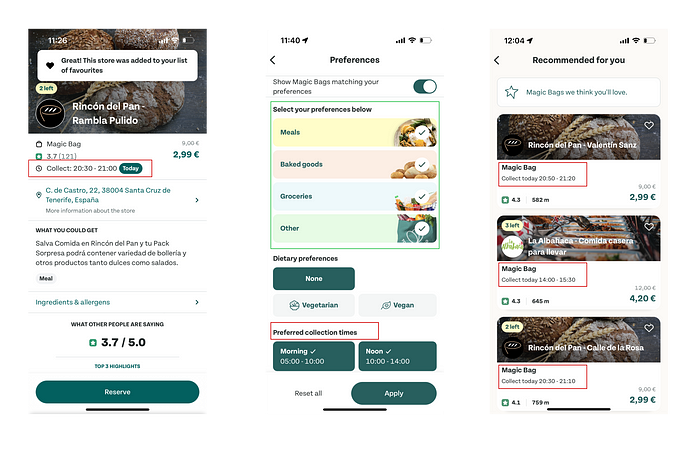
However, there were also some negative aspects found during the analysis. The app uses the term “Collection” to refer to the process of picking up an order from a local restaurant, but this term is not explained beforehand and not easily related to the action. This could be confusing for users who are not familiar with the term. The language used in the “Magic Bag” feature is also not explained beforehand, which could create confusion for some users. Lastly, the keyboard isn’t deactivated while clicking on the screen, and the only way to see the complete list of recommended locations is by scrolling down with the keyboard or clicking the search button.
Generally, by addressing the negative aspects and building upon the app’s positive features, the Too Good To Go app has the potential to provide a more user-friendly experience and increase its user base.
Visual Competitive Analysis
By conducting a visual competitive analysis of these apps, I gained a deeper understanding of the visual language and design patterns used in the market, as well as identified any trends, strengths, and weaknesses in terms of user experience and interface design. This information was then used to inform the redesign of the Too Good to Go app, helping to create a more effective and competitive design.
For example, by analyzing the visual design and user experience of the Olio and Phenix apps, I identified successful design patterns and user interface components that could be incorporated into the redesign of the Too Good to Go app. Additionally, analyzing the strengths and weaknesses of these competitors’ apps helped identify areas where the Too Good to Go app could differentiate itself and provide a unique user experience.

Overall, conducting a visual competitive analysis of other apps in the same market as the app being redesigned, such as Olio and Phenix, was essential for creating a successful redesign that was effective, competitive, and provided a unique user experience.
Brand Attributes
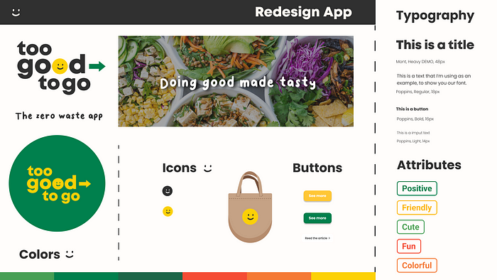
Firstly, let’s talk about why these attributes are important for a brand like Too Good to Go. Too Good to Go is an app that is all about making a positive impact on the world by reducing food waste. It is a friendly and approachable brand that encourages people to engage with it in a way that is both fun and meaningful. By incorporating attributes like Positive, Friendly, Cute, Fun, and Colorful, we can create a design that reflects these values and makes it easy for people to engage with the app.
Moodboard
The first step in the design process is to create a moodboard that reflects these new brand attributes. I chose images of smiling faces and colorful produce.

So after testing the mood board that reflects the new brand attributes of Positive, Friendly, Cute, Fun, and Colorful, we received some feedback from users. Here’s what people had to say:
- Joyful and colorful: People loved the bright and cheerful colors in the mood board, and felt that it conveyed a sense of happiness and joy. This is a great sign, as it means that our design is successfully communicating the brand attributes of being Positive and Fun.
- Fresh and natural: Users also appreciated the imagery of fresh and natural produce in the mood board. This feedback is particularly valuable, as it suggests that the design is aligning with the brand’s goal of reducing food waste and promoting sustainability.
- Happy and bright: The feedback that the mood board made people feel happy and bright is very promising. It suggests that the design is successfully conveying the brand’s values of being Friendly and Positive, and that users are likely to have a positive emotional response to the app.
- Cute and positive: Finally, users also responded positively to the cute and positive imagery in the mood board. This feedback is great, as it suggests that the design is effectively communicating the brand attributes of being Cute and Friendly.
The feedback I received from users was very positive, which is a great sign for the project. It suggests that my design is successfully conveying the brand attributes I have identified, and that users are likely to engage with the app in a way that is both fun and meaningful. Going forward, I can use this feedback to refine the design and create an app that truly embodies the values of Too Good to Go.
Style Tile

First of all, yellow, orange, and green are all bright and cheerful colors that align well with the brand attributes I have identified. Yellow is often associated with happiness, joy, and optimism, while orange is energetic and playful, and green conveys a sense of nature and sustainability. By using these colors in the app design, I was able to create a visually engaging interface that is both fun and positive, and that encourages users to engage with the app in a way that is both playful and meaningful.
In terms of typography, I selected Poppins as the main font for a number of reasons. Firstly, Poppins is a friendly and approachable font that aligns well with the brand attributes we have identified. Its rounded edges and open forms give it a playful and modern feel, and it is easy to read on both small and large screens. Additionally, Poppins is available in a wide range of weights and styles, which makes it a versatile choice that can be used in a variety of different contexts throughout the app.
In general, I believe that the combination of yellow, orange, and green as the primary colors, along with Poppins as the main typography, is a great way of representing the brand attributes I have identified.
I’m excited to see how users respond to the new design and believe that it will help to further the mission of Too Good to Go to reduce food waste and promote sustainability.
Hi-Fi Prototype

Finally, I was able to create a high-fidelity prototype of the app that incorporates all the design elements I have chosen, including the colors, typography, and imagery. As you can see, the prototype it’s very fun and engaging, with a colorful and playful interface that encourages users to explore the app and engage with its features.
Throughout the design process, I keep in mind the brand attributes we have identified and ensure that all the design choices we make are consistent with those attributes. By creating a design that is Positive, Friendly, Cute, Fun, and Colorful, I was able to create an app that not only reduces food waste but also provides a delightful user experience that encourages users to continue to engage with the app over time. So, let’s see how the redesign of the app is both playful and purposeful!

When designing the brand’s communication strategy, I took into account the need for a more spacious layout, making use of white space to improve visibility and highlight different sections and content. Through the Heuristic Analysis, I found that one of the main problems was the difficulty of understanding the information and following the overall flow of the content. To address this, I incorporated the brand attributes defined in previous steps to give the brand a more friendly and appealing appearance.
Why is it important for this brand to be more approachable and fun? Because that’s how we can reach more people who will actively use the app. As you can see in the video, I also added a new color-coded tagging system to make it easier and more straightforward to personalize the user profile from the browser and homepage.
Mostly, the proposed redesign takes into account the brand’s needs for better communication and user experience. By incorporating more white space, clearer navigation, and playful branding, we can make the app more engaging and user-friendly. The color-coded tagging system also provides a more direct and accessible way for users to customize their profiles.
Desirability testing
Collecting feedback through Desirability testing is incredibly important for this project and the new design of the Too Good to Go brand. Here’s why:
Firstly, Desirability testing allows me to understand how users perceive and interact with the app design.
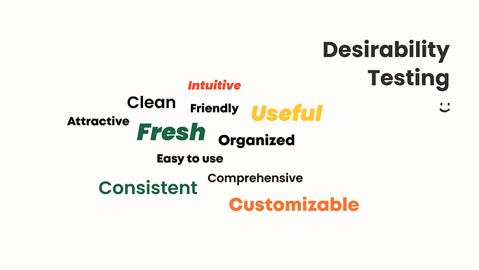
By collecting feedback on attributes such as Clean, Intuitive, Attractive, Fresh, Friendly, Useful, Organized, Easy to use, Consistent, Comprehensive, and Customizable, I can identify areas where the design is working well and areas where it may need improvement.
This information is invaluable, as it allows me to make data-driven decisions about how to refine and optimize the app design for maximum user engagement and satisfaction.
Secondly, Desirability testing helps me to identify potential pain points or areas of confusion for users. By understanding where users are struggling to navigate the app or complete tasks, I can make targeted improvements to the user interface and user experience. This, in turn, helps to reduce frustration and improve overall user satisfaction with the app.

Thirdly, Desirability testing allows me to validate my design decisions and ensure that the app is meeting the needs and preferences of the target audience. By collecting feedback on attributes such as Fresh, Friendly, and Customizable, we can ensure that the design is aligning with the brand attributes we have identified and that users are responding positively to the app’s overall look and feel.

The redesign process for the Too Good to Go app was a journey of discovery and innovation. By identifying key brand attributes and incorporating user feedback through Desirability testing, I was able to create a design that is joyful, fresh, friendly, and easy to use.
The combination of bright colors, playful typography, and intuitive user interface makes the app both visually engaging and highly functional, encouraging users to engage with the app in a way that is both positive and meaningful. I believe that this redesign will further the mission of Too Good to Go to reduce food waste and promote sustainability, and I’m excited to see how users would respond to the new design.
Ultimately, my goal was to create an app that is both aesthetically pleasing and highly effective in reducing food waste, and I believe that I have accomplished this through the redesign process.
Recommend
About Joyk
Aggregate valuable and interesting links.
Joyk means Joy of geeK