

Challenge 013–Profile Card Component🚀
source link: https://uxplanet.org/challenge-013-profile-card-component-9d6f9b954778
Go to the source link to view the article. You can view the picture content, updated content and better typesetting reading experience. If the link is broken, please click the button below to view the snapshot at that time.

Challenge 013–Profile Card Component🚀
SCSS — Challenge 001
Whewww, Let Us Begin the next Step of Our UI Development.
Suppose you are a first-time visitor Welcome! 🤩 First and foremost, let’s begin this with a small introduction to today’s article.👇
As some might know, I pivoted to UI development a few months back and started to do challenges using HTML and CSS. These Frontend Mentor Challenges have been done using Pure CSS. 👇
- Challenge 01:- NFT Preview Card Component
- Challenge 02:- Sigle Price Grid Component
- Challenge 03:- Huddle Landing Page with single introductory Section
- Challenge 04:- Clipboard Landing Page
- Challenge 05:- 3- Column-Preview Card Component
- Challenge 06:- Product Preview Card Component
- Challenge 07:- Sunnyside Agency Landing Page
- Challenge 08:- Stats Preview Card Component
- Challenge 09:- QR Code Component
- Challenge 010:- Testimonials Grid Section
- Challenge 011:- Article Preview Component
- Challenge 012:- Fylo Dark Theme Landing Page
With that intro, let me walk you through our next step.
As we have done with eleven challenges using Pure CSS, it is time for us to upgrade our skills to a bit more intermediate level. Therefore from today onwards, we will be completing the Challenges using SCSS.
With Thaaaat…..Let’s get into our Today’s Challenge.
As for today’s challenge, we will do a Newbie challenge from Front End Mentor. 👉Challenge 013– Profile Card Component

Before beginning, let me highlight a small note (as always):-
For some of you, this might be a challenge you can do with your eyes closed; for some of you, this might be a challenge you learn a new thing; for some of you, this might be the beginner step for SCSS. So this article is for anyone from pro to beginner who loves to learn and sharpen their skills.🤓 With that…..
LET THE CHALLENGE BEGIN

🔸Challenge Name:-
🔸 Description:-
Your challenge is building this landing page from the designs provided in the starter code. Your users should be able to:
- View the optimal layout for the page depending on their device’s screen size
🔸 Tools:-
HTML, SCSS & Figma
STEP 01 — Begin With the blueprint (HTML)🚀
First and Foremost, we will do a sketch/blueprint of the card component using HTML. Afterwards, according to the Design, we’ll make the look and feel of the Article Preview Component.
🔴 STEP 1.1 ➡ Basic structure of HTML
<!DOCTYPE html>
<html lang="en">

<!-- Head Section-->
    <head>
      <meta charset="UTF-8">
      <meta http-equiv="X-UA-Compatible" content="IE=edge">
      <meta name="viewport" content="width=device-width, initial-
       scale=1.0">
      <link href="https://fonts.googleapis.com/css2?
       family=Poppins:wght@300;400;500;600;700;800;900&display=swap"
       rel="stylesheet">
      <link rel="stylesheet" href="./css/styles.css">
      <title>Profile Card Component</title>
    </head>

<!-- Body Section-->
    <body>
    </body>
</html>
🔴 STEP 1.2 ➡ Create the Main Structure for the Profile Card Component

<div class="container">

<div class="topcirle"></div>
   <div class="bottomcircle"></div>
   <div class="topsection"></div>
   <div class="bottomsection"></div>
</div>
🔴 STEP 1.3 ➡ Create the structure for Each Section
01) Layout the Top Section of the card
<div class="topsection">
   <div class="topsection_image">
       <img src="./images/person-image.svg" alt="user images">
   </div>
</div>
02) Layout the Bottom Section of the card
<div class="bottomsection">
   <!-- User Information -->
   <div class="user">
     <div class="user_topdetails">
        <h1> Victor Crest </h1>
        <h2> 26 </h2>
     </div>
     <div class="user_bottomdetails">
        <h3> London </h3>
     </div>
   </div>
   <!-- Line -->
   <hr class="line">
   <!-- SEO info -->
   <div class="affliated">
      <div class="affliated_followers">
         <p class="amount"> 80K </p>
         <p class="topic"> Followers </p>
      </div>
      <div class="affliated_likes">
         <p class="amount"> 803K </p>
         <p class="topic"> Likes </p>
      </div>
      <div class="affliated_photos">
         <p class="amount"> 1.4K </p>
         <p class="topic"> Photos </p>
      </div>
  </div>
</div>

— — And with that, we have done with the blueprint. It’s time for us to check the output of our blueprint.👀👇 — —

— — OH GOD! It looks ugly.🤮 But rather than wasting our time on complaining, shall we get into work and make it more appealing — —
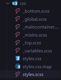
STEP 02 — Create the Files For Scss🚀
🔴 STEP 2.1➡ Create the styles file
01) Create a CSS folder in the project folder
02) Inside CSS folder create a folder call styles.scss
03) Then click on the Watch Sass extension which will help you to
    compile/transpile your SASS/SCSS files to CSS files at realtime
    with live browser reload.
04) Then link the styles.css file into the html file

🔴 STEP 2.2➡ Link the styles file
<link rel="stylesheet" href="./css/styles.css">
🔴 STEP 2.3➡ Create the global, variable and mixins files
01) global scss file
html {
  font-size:100%;
}
*,
*:after,
*:before {
  box-sizing: border-box;
  margin: 0px;
}
body {
  background-color: $blue;
}
.container{
  max-width: 1440px;
  margin: auto;
}
02) variable scss file
//Typography
$font-title: 'Poppins', sans-serif;
$font-body: 'Poppins', sans-serif;
//Color
$black: #000000;
$grey: #818498;
$darkgrey: #A7ABAE;
$white: #FFFFFF;
$blue: #19A1AD;
03) mixins scss file
$mobile-max-width:760px;
$mobile-min-width:300px;
$tablet-width:768px;
$laptop-width:992px;
$desktop-width:1024px;
$desktop-middle-width:1280px;
$desktop-large-width:1366px;
$desktop-extralarge-width:1600px;
@mixin mobile {
  @media only screen and (min-width: #{mobile-min-width}) and (max-
  width: #{mobile-max-width}) {
     @content;
  }
}
@mixin tablet-landscape {
   @media only screen and (min-width: #{$laptop-width}) and (max-
   width: #{$desktop-width}) {
     @content;
   }
}
@mixin tablet-portrait {
   @media only screen and (min-width: #{$tablet-width}) and (max-
   width: #{$laptop-width}) {
     @content;
   }
}
@mixin laptops {
   @media only screen and (min-width: #{$desktop-width}) and (max-
   width: #{$desktop-middle-width}) {
     @content;
   }
}
@mixin desktop {
   @media (min-width: #{$desktop-width}) {
     @content;
   }
}
@mixin middle-desktop {
   @media (min-width: #{$desktop-middle-width}){
     @content;
   }
}
@mixin large-desktop {
   @media (min-width: #{$desktop-large-width}) {
     @content;
   }
}
@mixin exlarge-desktop {
   @media (min-width: #{$desktop-extralarge-width}) {
     @content;
   }
}
03) Import global, variable and mixins files to the styles file
@import "variables";
@import "global";
@import "mixins";
🔴 STEP 2.4➡ Create the Scss files for Specific Sections
@import "top";
@import "bottom";
@import "maincontainer";
01) maincontainer:- styles for the main container
02) bottom:- styles for the bottom section
03) top:- styles for the top section
STEP 03 — Time to make it more appealing (SCSS)🚀
Here we start the styling for the mobile view first, then we’ll adjust the styling for the larger screens using media queries.
🔴 STEP 3.1➡ First, We’ll Start with the main container
.container {
  background-color: $white;
  border-radius: 20px;
  max-width:400px;
  min-height: 10px;
  flex-wrap: wrap;
  padding-bottom: 30px;
  margin-top: 200px;
  width:100%;
    .topcircle {
       position: fixed;
       left: 0px;
       top: -1px;
       z-index: -9;
    }
    .bottomcircle {
       position: fixed;
       right: 0px;
       bottom:0px;
       z-index: -9;
    }
}
🔴 STEP 3.2➡ Then, the top section of the card
.topsection {
    background-image: url("../images/bg-pattern-card.svg");
    background-position: top center;
    background-repeat: no-repeat;
    background-size: cover;
    display: flex;
    align-items: center;
    justify-content: center;
    height:140px;
       &_image {
        position: relative;
        top:60px;
       }
}
🔴 STEP 3.3➡ Ultimately, the bottom section of the card
<!-- Parent Wrapper -->
.bottomsection {
  margin-top: 70px;
Style the User Section
.user {
    display: flex;
    flex-direction: column;
    justify-content: center;
    align-items: center;
    margin-bottom: 10px;
       &_topdetails {
        display: flex;
        flex-direction: row;
             h1 {
              font-family: $font-title;
              font-size: 20px;
              margin-right: 5px;
             }
             h2 {
              font-family: $font-body;
              font-size: 20px;
              color:$darkgrey;
              font-weight: 400;
              margin-left: 5px;
            }

}
      &_bottomdetails {
           h3{
             font-family: $font-body;
             color:$grey;
             font-size: 15px;
             font-weight: 500;
           }
     }
}
Style the Line Section
.line {
    border: 1px solid #E0DDDD;
}
Style the Affiliated Section
.affliated {
   display: flex;
   flex-direction: row;
   justify-content: space-between;
   align-items: center;
   margin-left: 40px;
   margin-right: 40px;
   margin-top: 20px;
     &_followers,
     &_likes,
     &_photos {
       display: flex;
       flex-direction: column;
       align-items: center;
        .amount {
           font-family: $font-title;
           color: $black;
           font-weight: 700;
           text-transform: uppercase;
           font-size: 20px;
        }
        .topic {
           font-family: $font-title;
           color: $grey;
           font-weight: 500;
           font-size: 12px;
        }
     }
}
Ultimately Close the curly bracket of the bottom Section
}
— — LET’S SEE THE OUTCOME 💣. TADAAA..🤩 — —


Final Thought
As we have done with the challenge, I’ll end this article with the hope that you have gained and learned something. Thank You for checking this out.
Now your time has arrived to give a try to this challenge. Trust me, you would love the process.
Note:- I will descriptively walk you through the Scss component in my upcoming Scss article. Until then, If you have any questions, please feel free to ask in the comment section.
If you want to gain more knowledge, sharpen your skillset or need a small reminder, check out the following articles.👇🧠
Vessel of Knowledge in CSS https://medium.com/@nknuranathunga/vessel-of-knowledge-in-grid-1272764725a2
Understanding flexbox to make things easy:- https://levelup.gitconnected.com/understanding-flexbox-to-make-things-easy-adf90891ff25
Understanding Flexbox to make things easy 👏
If you are not willing to learn, no one can help you. If you are determined to learn no one can stop you
Learn the fundamentals of CSS within a few minutes:- https://bootcamp.uxdesign.cc/beginners-guide-to-css-9bc8298985c0
Beginner’s guide to HTML:-https://uxplanet.org/beginners-guide-to-html-and-css-letss-start-off-with-html-3d7ffd035182
If you like this give one or more claps and feel free to leave your thoughts and feedback in the comment section.
Thank you for checking this out and feel free to checkout my other articles by clicking the following link 👇
Nathasha - Medium
Read writing from Nathasha on Medium. UI/UX Engineer👩💻 Instead, more of who am I, let me tell you what I believe…
🔸Follow me on Twitter👀: @NathashaR97🔸
Recommend
About Joyk
Aggregate valuable and interesting links.
Joyk means Joy of geeK