

Designing Zenly: Part I
source link: https://medium.com/@julienmartin_/designing-zenly-part-i-ec7dc0a1e3ad
Go to the source link to view the article. You can view the picture content, updated content and better typesetting reading experience. If the link is broken, please click the button below to view the snapshot at that time.

Chapter I — DNA
Before joining the team as a full time Senior Product Designer in 2016, I had the chance to count Zenly as one of my client during my freelance time.
I had to pass in 2011 when Antoine & Alexis reached out to work on Alert Us, because I was too busy back then. I didn’t want to say no this time.
Logo
My first mission was to imagine and design what could be the new logo of Zenly.
Location sharing didn’t have to be so serious and poorly done, just like 99% of the location sharing apps back then.Wedidn’t request this unofficial analysis but in many ways, it was spot on.
I had already worked on several versions the past weeks but we still didn’t have the right candidate. One early evening in 2015 fall, I got a Skype call (again, 2015) from Antoine, Alexis and Nic, asking me if I can help them finalize the logo. They actually needed it that same night. Antoine and Alexis had to fly to NYC the following morning with a brand new pitch deck in their bags. This deck absolutely needed to display the new logo to help the whole narrative, to show something new, something crazy.

Logo explorations in 2015, and the final “popsicle” one. Also, yes, it’s a raccoon 🙄
We settled on the popsicle logo at 3AM.
I hear you asking:
“What does the popsicle mean?”
Here’s the truth: it doesn’t mean anything. It does fulfill exactly what we need from it though:
- It is highly recognizable and memorable.
- It looks great in 2D, in 3D, and in monochrome.
- It is playful, joyful—just like Zenly.
- It must be wtf—just like Zenly.
- Who doesn’t like ice creams?
We redesigned it multiple times since then but we always abided to these principles.

Zenly main app icon evolution
Zenmojis
One my other mission following the logo creation, was to design a full set of unique emojis, that could be really identified as Zenly brand. I never had designed illustrations and emojis before but I accepted the challenge nevertheless.
A no-brainer way to kickstart and explore emojis was to piggyback on the popsicle design, kind of like an extension of the logo vibe. So I did that, and it turned out pretty well.
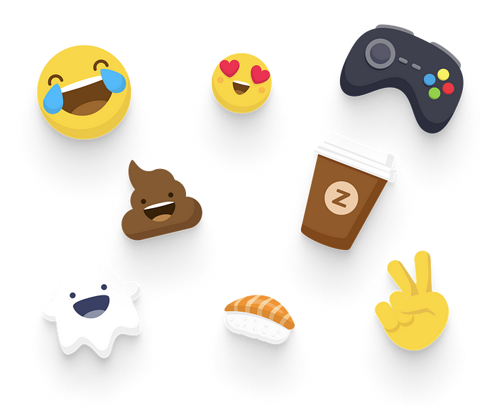
Zenly Emojis in 2015
Zenmojis were always a signature feature of Zenly, responsible for a lot of word-of-mouth in its inception. Reflecting back, the crazy color palette and the Zenmojis made us shamelessly assume our wtf-stance and direction with Zenly.
The goal of Zenmojis is to provide a fun, quick and convenient way to interact with your friends. Some are used in a conversation context (LMAO, etc), some others will be used in a directional intent — images are worth a thousand words:
- Sending Clocks and Poop Zenmojis when my friend is late.
- Sending Go! and Bike Zenmojis to let a friend know that I’m on my way.
- Sending Plane and Peace Zenmojis when a group of friends are at the airport.
When adding new friends in Zenly, we automatically send Yo Zenmojis both ways, as an icebreaker, to trigger a conversation and interactions as soon as possible.

Sending & Receiving Emojis in Zenly
On top of being a signature feature, Zenmojis were also the stepping stone and core of Zenly marketing and one of our first gamification attempts — to unlock Zenmojis packs, you would need to complete a few goals (mostly inviting friends to Zenly).
We would rely heavily on those Emojis in all our communication and comps — both physical and digital. One clear downside of doing so back then, is that users would download the app, send/play with Zenmojis with some friends, and ultimately churn after a few days or weeks. Emojis would not clearly show and express the true value of using Zenly and this would hurt our retention a bit. Later on, we would of course stick to Zenmojis as a feature in the app, but we would communicate a lot less about them and rely on them a lot less in our marketing needs.
One thing that really drove us until the very end is truly that we were so tired (still are tbh) of the dull and boring social and location sharing apps that were already out in the market. Zenly needed to stand out of the pack.
With that said, we had to create an app that wasn’t just visually appealing, but also provided an engaging experiences for its users. We didn’t want to settle for a basic utility app, but rather create something that was both fun and functional.
The DNA of Zenly was all about attention to detail and going beyond the ordinary to create an app that would bring a smile to users’ faces. This was reflected not only in the visuals, but also in its unique features and innovative interactions. Essentially, the goal was to create an app that felt more like a game or toy than a traditional social or utility app, something that users would enjoy using and want to come back to time and time again. I’m deeply convinced that in our industry, being a gamer or just being curious about games, is an unfair advantage.
I could easilywrite about this topic in length in how it influenced some of our mechanics at Zenly but also in many previous projects and products I had the chance to work on.
Andy Allen sets things straight.
Chapter II — Joining Zenly
Joining the company in 2016 was quite something. By the end of that same year, the team of almost 30, was already knee deep in creating a new version of the app— a version that would take the app to another level, basically laying grounds for many years to come.
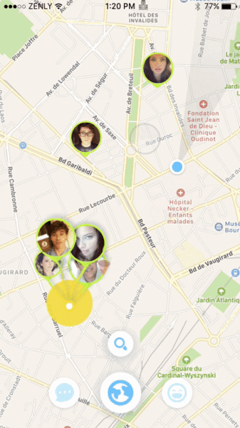
Maps & Friends
I joined the team as a product designer, in the Maps team. After years of freelancing, missing an actual team, and being deep in the product, joining was a no brainer, especially since I absolutely loved the app (still does!).
Working in the Maps team was tremendous and that came with a fair lot of challenges resulting in putting me out of my comfort zone instantly after I joined. My skills range is wide, I was working on mostly visual and art direction related stuff for a year now for Zenly, and now I found myself in one of the most challenging product team of the app — where the core experience was designed.
In the Maps team back then, we spent a lot of time iterating on Friends pins — their statuses, their animations, their sizes, how they behave depending on zoom levels, and much more. We had to think about it in “3D”.
“Peer-designing” and iterating on friend pins states
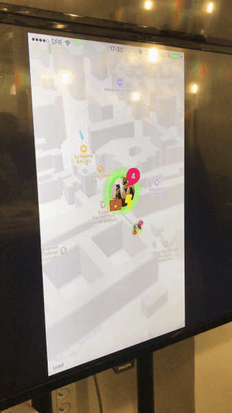
Gatherings
One of these Friends pin version where we spent a hefty amount of time iterating and that was quite challenging: the Gathering Pin. The problem to solve was the following:
How should groups of friends be displayed on a map, and more specifically, how do we make them stand out, like something special is happening, so users would want to interact with them all the time?


We tried dozens of designs and motions and we ultimately ended up with this very unique flame shader animation that became one of our most beloved feature. Just like everything else in the app, the shader evolved with time but stuck to its original role.

Gathering Pin Flame Shader (2017)
Go Mode
One feature that stood out in Zenly that truly embodied the app’s mission of being a social map app, is definitely Go Mode. It’s the perfect example of how a simple utility can become something fun and delightful to use.
As straightforward and as simple it could be, it not only shows where friends are, but also provides an effortless way to meet up with them in person.
However, what truly sets Go Mode apart is its Easter egg experience that adds an extra level of fun: asking Zenly to provide directions to a friend on the the other side of the planet will definitely “work” — but will unexpectedly display a “Jetpack” mode instead of showing one of those sad errors or empty states.
Go Mode was a key feature as it provided a practical way to meet your friends without sacrificing the fun and playful nature of the app.

Meet/Go Mode in Zenly
Chapter III — It’s not just about Maps
On top of working in the Maps team, I also started working on more “transversal” projects, such as the global look and feel of the new app as well as designing new features.
Profiles
One of these “features” turns out to be the … Profiles. When you think about profile views, chances are that they rarely are something that strikes you as being engaging, fun. At Zenly, we identified the Profile as being the perfect place to access features that will both engage you and also help you “do things” after you just signed up. Landing on empty maps, with no friends, is weird and not exactly the experience to provide to our users.
In 2016, the Profile views were very much straightforward, doing what you expect from it. I started working on what could be the perfect Zenly Profile, something that you would love to open everyday and something that you would even love to share out there.

This is how it turned out by the time we shipped the v3 version in March 2017. That same year and the following one, we made it a ton better and rolled out new features to be included in the Profile view. We also introduced bugs that were hard to trigger … that we decided to not fix since it made our users laugh.

ListView glitch shipped in Prod — 2017
Streaks
I won’t be able to cover every single one of these features, but one that really struck and that was (still is, actually) a tremendous vector of growth, is what we called Streaks, which is based on gifting new app icons to our users when they sucessfully completed a few goals. It might not sound really new or innovative today, but in 2016–2017, we were among the first to leverage the app icon swap, following iOS 10.3 release.
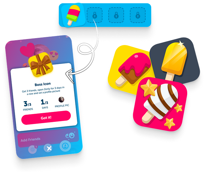
It is called Streaks because we ask our users to open the app once every day for X consecutive days, depending on the goals: the ultimate icon, the Legendary Golden one, initially took 50 days of openings and 30 friends, which required quite a dedication. Our japanese users were huuuge fans of this customization opportunity and they shared their achievements quite extensively, providing organic growth and “free” brand awareness early on.
Wrapping-up
By mid-2017, our growth was steady but we didn’t go through hyper growth — yet. One of the lessons we learnt back then, is that, redesigning your app will always come with a tsunami of hate messages following its release. It’s a constant. Remember Instagram, Facebook’s Feed, and many more? Well, we fully redesigned Zenly 3 times in 6 years and let me tell you, it’s always worth it.
At the HQ, we had the habit of framing our best hate messages early on, and this one, related to 2017 v3’s release, is a masterpiece:
“Highly disappointed in latest version. Zenly has lost sight of it’s primary function. I just want to see where my peeps are right now. Not chat, not silly animations, not play games, not see where they have been all day. Just where are they right now. This version reminds me of all the squished squirrels and rabbits on the roads. They couldn’t make up their minds and raced this way and that way. Then the cars ran right over them and they became a furry frisbee.
Zenly is apparently trying to throw in everything to become a social platform and attract a wealthy purchaser. That is not what I am looking for. Give me a Zenly lite version that simply does what it used to do. Just show me where my peeps are. That is all I want.”
On this fine conclusion, if you made it here, bravo, Part II is coming soon.
Reach out and let me know if you liked Part I or if you have questions:
Recommend
About Joyk
Aggregate valuable and interesting links.
Joyk means Joy of geeK