

5 tips to become better at CSS
source link: https://dev.to/sp90/5-tips-to-become-better-at-css-3d24
Go to the source link to view the article. You can view the picture content, updated content and better typesetting reading experience. If the link is broken, please click the button below to view the snapshot at that time.

I have been coding CSS for almost 24 years and i feel that other devs keep mentioning that CSS is hard so i thought maybe i could share a few things on the matter to make it easier for a other developers.
My main mental model around CSS is to make it as predictable as possible so adding an element you almost blindly can tell how it changes your page as a whole.
CSS is supposed to be easy and can be with the right knowledge about some key features.
- The box model
- Margins cancel each other out
- Layouts
- Use tables for styling tables
- Em's, Rem's and Px
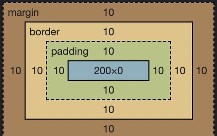
The box model
Okay so the easiest way to learn CSS is by understanding the box model and how you can make it your B*tch
Given this CSS on a div
div {
  border: 10px solid red;
  width: 200px;
  padding: 10px;
  margin: 10px;
}
This will be your default output where the center box is 200px wide as we stated in the styling
But if you instead add box-sizing: border-box
* {
  box-sizing: border-box;
}
You get this - can you see the difference?

So now the content box include the padding and border which resulted in the content box to go from 200px -> 160px because the colletive size of padding and border is 40px.
By doing this your layouts will be much more predictable and when you give your box a width: 200px its 200px not 240px.
Margins cancel each other out
Okay so this one I often see people forgetting and not a thing that is mentioned that often. So given this following CSS and markup
p {
  margin: 10px 0;
}
<p>some-text</p>
<p>some-other-text</p>
We should have 10px margin on both sides but a common mistake is thinking that the margins add up but actually cancel eachother out like this:

So for spacing elements i tend to use flex/grid and their gap property to have predictable spacing, mostly so i dont have to worry.
Layouting a page
So i have a few ways of working and looking back over the years there have been some terrible things we had to work around, if your familiar with the "clearfix" you know what i'm talking about.
Single row content
For single row content i tend to use flexbox and there are several reasons. Flex is by default so i have to write less. I dont need to care about how each element behaves - each element can relatively agnostic.
In this example i wanna create a top bar;

So it can be done in variaous ways, I tend to make sure all titles have no margins by default to make them more predictable.
Markup
<nav>
  <img src="http://placekitten.com/50/50" alt="">

  <h3>Some title</h3>

  <button>menu</button>
</nav>
Then I would style it something like this:
nav {
  display: flex;
  align-items: center;
  gap: 10px;
  background: #f1f1f1;
  padding: 10px;
}

nav img {
  height: 100%;
}
The reason I style the image to be 100% height is actually so if the designer later tells me can we set the height of the navigation bar to 50px then I just add that and now the menu will adapt to my needs.
Multi-line 2,3,n column layout
It's mostly for replicating rows and the likes i usually use grids for this.
For this example i wanna create a 3 column grid where we dont know how many elements goes into it because the element count changes.
Given this markup
<main>
  <div>1</div>
  <div>2</div>
  <div>3</div>
  <div>4</div>
  <div>5</div>
  <div>6</div>
  <div>7</div>
  <div>8</div>
</main>
We can style it like this:
main {
  display: grid;
  grid-template-columns: 1fr 1fr 1fr;
  gap: 20px;
}
NOTE: This requires each element to have some kind of content otherwise you wont be able to see them.
This is powerful because - lets say on tablet we only want 2 columns then we can do:
// Portrait tablet
@media only screen and (max-width: 768px) {
  main {
    grid-template-columns: 1fr 1fr;
  }
}

// Mobile
@media only screen and (max-width: 480px) {
  main {
    grid-template-columns: 1fr;
  }
}
I tend not to use the repeater because it just adds extra complexity without almost never being shorter than writing the whole thing out css repeat
Page layout
Lets create the layout below
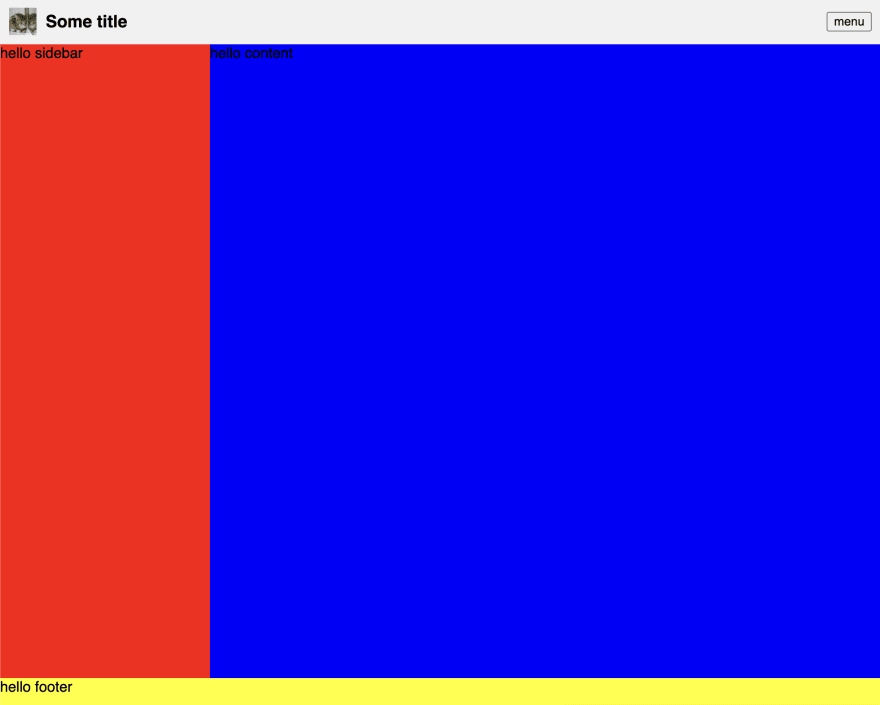
So we have the navigation before and now wanna create sidebar, footer and content on the page
For main (wrapper) we can do this:
main {
  width: 100vw;
  height: 100vh;
  display: grid;
  grid-template-areas:
    "nav nav"
    "aside content"
    "footer footer";
  grid-template-columns: 230px 1fr;
  grid-template-rows: 50px 1fr 30px;
}
It's mainly making sure it fills out the whole page and then we describe our layout in the shortest way possible.
Remember to attach each of the elements to the main layout
nav {
  grid-area: nav;
}

section {
  grid-area: content;
}

aside {
  grid-area: aside;
}

footer {
  grid-area: footer;
}
We can decide the height and width of all static elements and can easly add a custom element to the box.
Use tables for styling tables
I have tried so many times to use grid, flexbox, floats and there are just so much in tables when you get it right.
It's one of the things i think i spend the most time to right about styling and very often its much easier to use a table when you get it right.
Ofc it removes the use of flex in your cells but this can be adapted by wrapping your content.
I wanna extend on styling tables and aim to do another whole blog post on tables.
Em's, Rem's and Px
Back about 10 years ago it actually mattered which one you use, but scaling your OS text and browser window will actually scale everything for you. Which it didn't back in the day that was why em's/rem's was powerful.
But most designers would want 10px when they design 10px and obfuscating your styling with ems and rems makes it so much harder to style something and in extension to that the benefits are not benefits anymore.
So i would suggest people to start using predictable and good ol' px again to make your design more predictable.
I could go on for ever about styling but these are the 5 major things that i tend to run into which would make everyones life easier if you know and do them well.
Hope you liked it leave a comment if you have any questions and subscribe for more
//Cheers
Recommend
About Joyk
Aggregate valuable and interesting links.
Joyk means Joy of geeK