

Sign Up page | UX — From theory to practice.
source link: https://uxplanet.org/sign-up-page-ux-from-theory-to-practice-5ec3795e3f4c
Go to the source link to view the article. You can view the picture content, updated content and better typesetting reading experience. If the link is broken, please click the button below to view the snapshot at that time.

Sign Up page | UX — From theory to practice.
Sign Up page | UX — From theory to practice.
Registration form, this is the door that the user will open and enter your product. The registration form should be easy and fast so it doesn’t take up the user’s time.
Bear in mind that every item of data you communicate and store incurs cost and liability.
Creating a user registration form for a website can be a crucial step in providing users with access to personalized features or content. However, designing an effective registration form can be a challenging task, and mistakes are common.
Mistakes…
One common mistake that designers make is asking for too much information. Users may be hesitant to provide personal details, especially if they are not essential for the service or product being offered. To avoid overwhelming users with unnecessary fields, designers should aim to collect only the most important information required for the service, such as a username, email address, and password.
Another mistake is making the registration process too lengthy or complicated. If users have to go through too many steps or fill out too many fields, they may become frustrated and abandon the process. A straightforward and streamlined registration form that can be completed in a few minutes is ideal.
Designers should also ensure that the registration form is user-friendly and accessible. This means using clear and concise language, avoiding jargon or technical terms, and making sure the form is easy to navigate and understand.
Why a registration form is necessary…
In terms of why a registration form is necessary, it allows the website to create user accounts and store user data securely. This data can be used to provide personalized content or services, such as saved preferences or customized recommendations. Additionally, a registration form can help to prevent spam or abuse by requiring users to verify their email address or complete a CAPTCHA.
Elements important for the registration form
Several elements are essential for designing an effective registration form for a website. Here are some of the most important elements:
- Clear and concise form title and description: The title and description of the form should be clear and concise, indicating to users what information they need to provide and why. The language used should be simple and easy to understand.
- Minimal fields: The registration form should only ask for the necessary information.
- User-friendly design.
- Validation and error messaging: Validation should be done for each field, and error messaging should be displayed in case the user has not filled a field or entered incorrect data. The messaging should be clear and concise, and the user should be informed about the nature of the error.
- Password strength indicator: Including a password strength indicator helps users create a strong and secure password. This helps protect their account from hackers and cybercriminals.
- Mobile-responsive design: With a significant portion of web traffic coming from mobile devices, it’s crucial to ensure the registration form is mobile-responsive. This ensures that users can access and complete the form easily, regardless of the device they are using.
- Privacy policy and terms of service.
From theory to practice…

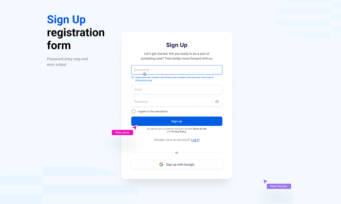
Sign Up page | User Name field.
1. “User Name” field.
- The first state is the default state and has no special options.
- The second state — when the user clicks on this field? it is necessary to display a tooltip with the requirements to create a “Username”. For example, the number of characters and characters, that can be used.
- The third state is a tooltip, if the name is busy, the system should suggest a close name.

Sign Up page | User Mail field.
2. “User Mail” field.
- The first state is the default state and has no special options.
- The second state is when the user clicks on this field. It shows the usual hover. After entering mail, you can add a mail entry confirmation icon (instead of specifying “required field”)
- The third state — an error tooltip, if the mail is specified with an error or the “@” symbol is missing, the system should display a message about it.

Sign Up page | Password field.
3. “Password” field.
- The first state is a normal input field with a “closed eye” icon. Why exactly “closed view” — when the user will enter the password it should not be seen by outsiders, and to verify it you can always “show”.
- Second state. When the user clicks on the password entry field, there should be a tooltip below with the text of what kind of password can be created. The error condition is when the user has entered a password, but it is too short and an error is displayed saying that the password should be longer. Therefore, such information should be entered at once.
- The third state. The password is entered with a mistake or too simple combination, etc.

Sign Up page | Email verification.
4. Email verification.
Email verification when registering with the site is an important step in the process of user security and protection. It helps to make sure that the email address specified by the user really belongs to him and is not fake or invalid.
When a user registers on the site and provides their email address, a confirmation email is sent to that address. This can be, for example, a link that must be clicked to complete the registration. If the e-mail address is not verified, the user cannot use some features of the site or cannot log into their account.
Thus, email verification helps protect users from abuse and prevents the creation of fake or fraudulent accounts. It also helps the site connect with the user if there are problems with their account or if important information needs to be sent to them.

Sign Up page | Forgot password.
5. Forgot password.
The “forgot password” feature is an important component of web design because it helps users regain access to their accounts if they forget their password. This feature usually includes the ability to send an email or SMS message with instructions on how to change the password.
The “forgot password” feature allows users to manage their accounts and protect them from unauthorized access. If a user cannot log into their account due to a forgotten password, they can use this feature to reset their password and gain access to their data and services on the site.
In this way, the “forgot password” feature increases user convenience and security, which in turn contributes to increasing customer loyalty and satisfaction with the website.
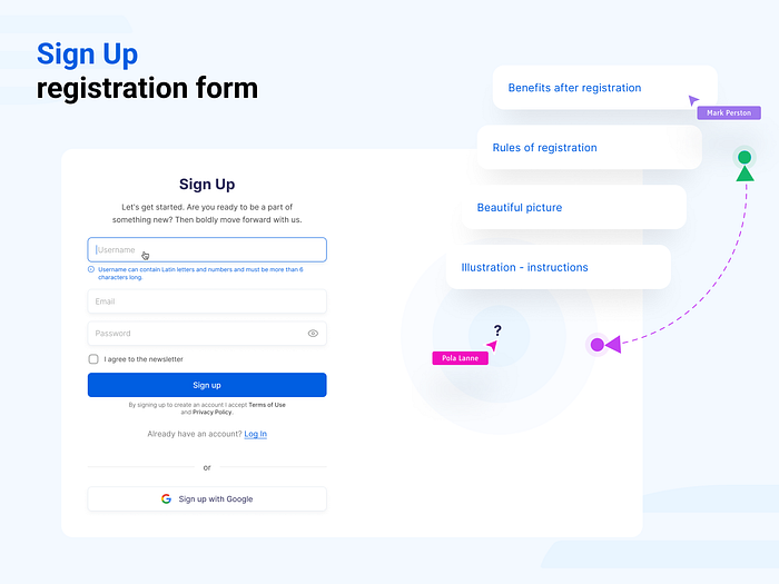
Sign Up page | Illustration.
6. Illustration.
The last part of the registration form is the accompanying information next to the registration form.
Most often on the left or right is a nice picture, and that’s it.
But it is more correct to use the space next to the registration form for important information:
- Benefits of registration. For example, registered users have no restrictions, can take part in prize draws or get additional discounts, etc.
- Rules and procedure of registration. In this case the rules are described, but more experienced designers create Illustration-Instruction.
- Illustration — instruction shows step by step how to register, what and how to connect. Small Anboarding for registration. This is very useful for Web 3.0 products
- Just an image or photo to decorate the registration page.
Conclusion
Registration form, this is the door that the user will open and enter your product. The registration form should be easy and fast so it doesn’t take up the user’s time.
Bear in mind that every item of data you communicate and store incurs cost and liability.
In web 2.0 it’s popular to sign in via social networks and google/apple, and in web 3.0 it’s e-wallet.
When registering it is very important to create a clear interface. Overall, designing an effective registration form requires careful consideration of the user experience, ensuring that the form is straightforward, user-friendly, and secure.
It all depends on what product you are doing a registration form and what goals you are pursuing, for example will be a guest access or demo — account, in what order will be the connection of an electronic purse and registration or creation of a user profile. All this affects the registration form, but everything described above will definitely help you in creating your own correct registration form.
Recommend
About Joyk
Aggregate valuable and interesting links.
Joyk means Joy of geeK