

6 CSS Features to Make a Responsive Website
source link: https://dev.to/stakedesigner/7-css-features-to-make-a-responsive-website-4h19
Go to the source link to view the article. You can view the picture content, updated content and better typesetting reading experience. If the link is broken, please click the button below to view the snapshot at that time.


44 2 1 3 2
6 CSS Features to Make a Responsive Website
Creating a responsive website has become more important than ever. With more and more people accessing the web on a variety of devices, it's crucial that your website looks great and functions well across different screen sizes. CSS (Cascading Style Sheets) plays a key role in creating a responsive website, and there are several new CSS features that can help you achieve this.
In this article, we'll explore 7 new CSS features that can help you make a responsive website, with examples of how you can use them in your own projects.
1.Flexbox
Flexbox is a layout mode in CSS that provides an efficient way to arrange items within a container. It allows you to create complex layouts that adapt to different screen sizes, without using floats or positioning. Here's an example of how you can use flexbox to create a responsive navigation bar:
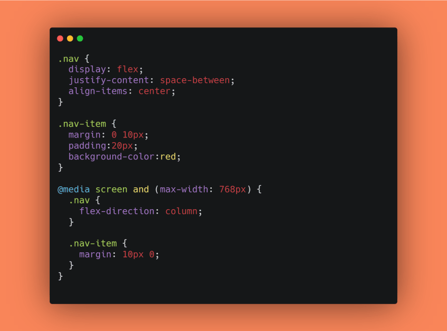
In this example, the .nav container uses display: flex to create a flexbox layout. The justify-content property is set to space-between, which spaces out the .nav-item elements evenly across the container. The align-items property is set to center, which centers the items vertically within the container.
In the media query, we switch the flex direction to column, which stacks the .nav-item elements vertically. We also change the margin to create spacing between the elements.
2.Grid
Grid is a new layout system in CSS that allows you to create complex, two-dimensional layouts with a high degree of flexibility. It allows you to create responsive designs that adjust to different screen sizes, without having to write separate styles for each breakpoint. Here's an example of how you can use the grid to create a responsive grid layout:

In this example, the .container element uses display: grid to create a grid layout. The grid-template-columns property is set to repeat(3, 1fr), which creates three columns of equal width. The grid-gap property is set to 20px, which creates spacing between the grid items.
In the media query, we change the grid-template-columns property to repeat(2, 1fr), which creates two columns of equal width.
3.Viewport units
Viewport units are a set of CSS units that are relative to the viewport's dimensions. They allow you to set sizes and positions that adapt to the viewport's size. Here's an example of how you can use viewport units to create a responsive hero image:
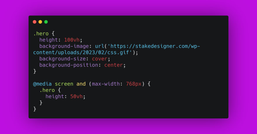
This first block of code targets an HTML element with the class "hero". It sets the height of the element to 100vh, which means that the height of the element will be equal to the height of the viewport. It also sets the background-image property to a URL that points to an image file, and sets the background-size **property to "cover" and the **background-position property to "center". This will cause the image to fill the entire hero element and be centered within it.
This second block of code uses a media query to apply a different set of styles to the** ".hero"** element when the screen width is 768 pixels or less. The media query is defined using the "@media" rule, which specifies that the enclosed styles should only be applied if the screen meets certain criteria. In this case, the criteria is that the screen width must be 768 pixels or less.
The styles inside the media query are applied only when the media query criteria are met. In this case, the height of the** ".hero"** element is set to 50vh, which means that it will take up half the height of the viewport. This will cause the hero section to be smaller on smaller screens, allowing more content to fit above and below it.
Overall, this code demonstrates how to use viewport units and media queries to create a responsive hero section that adjusts its height based on the size of the screen.
4.clamp()
CSS clamp() is a CSS function that allows you to specify a range of values that a property can take, based on the available space on the screen. This function is particularly useful when you want to create responsive designs that adapt to different screen sizes, without having to use media queries.
The clamp() function takes three arguments:
clamp(min, preferred, max)
- min: the minimum value the property can take, regardless of the available space on the screen.
- preferred: the preferred value for the property. If there is enough space on the screen, the property will take this value.
- max: the maximum value the property can take, regardless of the available space on the screen.
The clamp() function works by selecting the largest value that satisfies the following condition:
min(maximum, max(minimum, preferred))
Here's an example of how you can use the clamp() function to create a responsive font size:

In this example, the h1 element will have a font size that is between 2rem and 4rem, depending on the available space on the screen. If the screen width is less than or equal to 40em (i.e., 40 times the font size of the root element), the font size will be 2rem. If the screen width is greater than or equal to 100em, the font size will be 4rem. Otherwise, the font size will be between 2rem and 4rem, depending on the available space.
Here's how the clamp() function works in this example:
- If the screen width is less than or equal to 40em, the max() function returns the minimum value of 2rem, which is then clamped to 2rem.
- If the screen width is greater than or equal to 100em, the min() function returns the maximum value of 4rem, which is then clamped to 4rem.
- If the screen width is between 40em and 100em, the max() function returns the value that satisfies both the minimum value of 2rem and the preferred value of 5vw.
In this way, the clamp() function allows you to create responsive designs that adapt to different screen sizes, without having to use media queries or complex calculations.
5.Aspect Ratio
The aspect-ratio property is a CSS property that specifies the aspect ratio of an element's width to its height. It can be applied to any element, including images, videos, and containers.
The aspect ratio is defined as the ratio of the width of an element to its height. For example, a square has an aspect ratio of 1:1 because its width is equal to its height. An image with a width of 800 pixels and a height of 600 pixels has an aspect ratio of 4:3 because its width is four times its height.
Using CSS aspect ratio, you can set the desired aspect ratio for an element and ensure that it always maintains that ratio, even if the element is resized or viewed on a different device.
Syntax
The syntax for the aspect-ratio property is simple:
selector {
  aspect-ratio: width / height;
}
For example, to set an aspect ratio of 16:9 for a video element, you would use the following CSS:
video {
  aspect-ratio: 16 / 9;
}
Example: Setting Aspect Ratios for Images

In this example, we set the aspect ratio for all images to 3:2 using the aspect-ratio property. We also set the width of the container to 80% and centered it using margin: 0 auto.
Finally, we styled the images using display: block to remove any inline spacing, max-width: 100% to ensure the images don't exceed the width of their container, and height: auto to maintain the correct aspect ratio.
Example: Setting Aspect Ratios for Videos
Another common use case for CSS aspect ratio is setting the aspect ratio for video elements. By default, videos have an aspect ratio of 16:9, but you can change this using the aspect-ratio property.
6.Scroll Snap
Scroll snap is a CSS property that allows content to snap to a specific position when scrolling. This feature is particularly useful for creating smooth scrolling experiences, especially for touch-based devices like smartphones and tablets. With scroll snap, users can easily navigate through content without the need for excessive scrolling.
Scroll snap works by dividing the container into sections and defining the distance each section needs to be scrolled before it snaps into place. By doing this, the user can quickly and easily scroll through each section of content, without having to search for the right spot.
In this, we’ll explore how to use scroll snap with examples.
How to Use Scroll Snap
To use scroll snap, we first need to define a container for our content. We can do this using the CSS property "scroll-snap-type". This property has two values: "x" and "y", which correspond to horizontal and vertical scrolling, respectively.
.container {
  scroll-snap-type: y mandatory;
}
In the above example, we have defined a container with vertical scrolling and set the value to "mandatory". This means that each section of content will snap into place when it reaches the top of the container.
Next, we need to define the sections of content that we want to snap into place. We can do this using the CSS property "scroll-snap-align". This property has two values: "start" and "center", which define the alignment of the snapped content.
.section {
  scroll-snap-align: start;
}
In the above example, we have defined a section of content and set the value of "scroll-snap-align" to "start". This means that when the user scrolls through the container, this section of content will snap into place when it reaches the top of the container.
We can also use the "scroll-padding" property to create space between sections. This can help prevent content from getting cut off or overlapping when it snaps into place.
.container {
  scroll-padding: 50px;
}
In the above example, we have defined a container with 50 pixels of padding between each section of content.
Example
Here are a few examples of scroll snap in action:

In this example, we have a container with multiple sections of content. Each section snaps into place as the user scrolls through the container.
🍀Support
Please consider following and supporting us by subscribing to our channel. Your support is greatly appreciated and will help us continue creating content for you to enjoy. Thank you in advance for your support!
Thanks for reading!
If you have any questions, complaints or tips, you can leave them here in the comments. I will be happy to answer!
😊😊 See you later! 😊😊
Recommend
About Joyk
Aggregate valuable and interesting links.
Joyk means Joy of geeK