

On Container Queries, Responsive Images, and JPEG-XL
source link: https://cloudfour.com/thinks/on-container-queries-responsive-images-and-jpeg-xl/
Go to the source link to view the article. You can view the picture content, updated content and better typesetting reading experience. If the link is broken, please click the button below to view the snapshot at that time.

With the news that CSS Container Queries have shipped in nearly all stable, modern browsers, it’s time to revisit responsive images and ask how they fit in a container query world.
Permalink to Why do we need Container Queries?
Why do we need Container Queries?
We’ve been building responsive web designs since 2010 without container queries, why do we need them now? The truth is we don’t need them now—we needed them several years ago!
Responsive web design relied on media queries because that’s what we had available to us. Media queries make decisions based on the size of the viewport. And that’s fine when you’re designing the full page layouts. But media queries have always felt like a hack when you’re designing discrete sections within a page.
For example, if we’re designing a product tile for Walmart Grocery, we know how the tile should respond to the space allotted to it, but we don’t know in advance how that allotment will relate to the size of the viewport. And the more work we do with design systems and component-based development, the more likely we are to run into cases where we’re designing to the size of the container, not the size of the viewport.
Permalink to Components using Container Queries are Powerful
Components using Container Queries are Powerful
Max Böck created my favorite example of what container queries can enable in this demo of bookstore interface. The demo combines container queries with web components to create a compelling experience shown in this video below.
This fictional bookstore web site has three areas. There is one book in the featured section. It is larger and has a 3D spine. There are six books in the bestseller section with medium-sized images of book covers. And there is one book in the cart where a smaller thumbnail is used. The video shows how books transform as they are dragged from section to section.
You can also play with the demo on CodePen. I’ve embedded the pen below, but I recommend playing with it outside of the constraints of an embed. Special thanks to Max Böck for allowing me to use the video and CodePen in this article.
Each of the books in the demo is a web component. The web component has its own rules and behaves differently depending on the size of its container. Here is what the CSS for the container queries looks like:
/* Small Variant: Simple Cover + Title */
@container (max-width: 199px) {
    .book {
        padding: 0;
    }
}
/* Medium Variant: Multi-Column, with Author */
@container (min-width: 200px) and (max-width: 399px) {
    .book {
        display: grid;
        grid-template-columns: 1fr 1fr;
        gap: 1rem;
    }
}
/* Large Variant: 3D Perspective */
@container (min-width: 400px) {
    .book {
        position: relative;
        transform-style: preserve-3d;
        transform: rotateY(-25deg);
    }
}
Code language: CSS (css)
These three container queries cover the different ways the book component is used in the page. You can drag and drop books from section to section in the page and see how they transform in appearance. All of this functionality and styling happens automatically when someone adds the <book-element> component.
Container queries are amazing. We can build a component for others to use without knowing in advance where they will use it. Nor do we need to know the relationship between the viewport and the component in order to make the component responsive.
But what do we do with the responsive images in this example?
Permalink to Responsive Images Conflict with Container Queries
Responsive Images Conflict with Container Queries
For Max’s bookstore, ideally we’d base the size of the images and their sources on the size of the container. The size of the container is what determines if the image will be large with 3D perspective, or if it is going to be thumbnail.
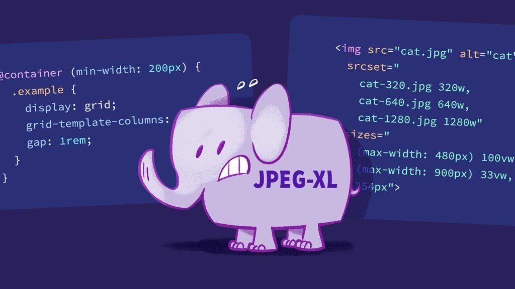
Unfortunately, responsive images syntax is based on the size of the viewport. In fact, the sizes attribute uses a subset of media queries, called media conditions, to tell the browser the size of the image at different viewport sizes. For example, the syntax for an image using srcset and sizes might look like:
<img src="cat.jpg" alt="cat"
  srcset="cat-320.jpg 320w, cat-640.jpg 640w, cat-1280.jpg 1280w"
  sizes="(max-width: 480px) 100vw, (max-width: 900px) 33vw, 254px">
Code language: Handlebars (handlebars)
If the same person creating the book component is also building the page, then perhaps they know where the images will be used and could update the component to provide the necessary connection between the size of the image and the viewport.
But there’s no guarantee the same person who creates a component is going to be the one implementing it in a page. The person using a component could work in another part of the same company—this is common for companies with design system teams.
Or they may work in different companies altogether. Shopify recently released a series of Commerce Components for use by Shopify customers. The people at Shopify who built these components have no idea how these components will be used on client sites.
We lose a lot of the power of container queries if the moment a component has an image, we have to revert back to viewport-based media queries for responsive image syntax.
Permalink to Why not use container queries for responsive images?
Why not use container queries for responsive images?
It is natural to think that the problem with images in container queries is a mere oversight. We used to only have media queries to design with. Now we have container queries. Images use media conditions are a subset of media queries. Ergo, we need a subset of container queries for images. Let’s call them container conditions and use those in our sizes attributes. Done. Ship it!
If only it were that simple.
To understand why it is difficult, we have to revisit the core challenge that led to the responsive images standard in the first place: the browser’s speculative downloading of images.
Permalink to Speculative Downloading
Speculative Downloading
When the browser first receives an HTML document, before it builds the DOM, and long before it calculates layout, a feature called the lookahead pre-parser scans the document looking for assets it can start downloading. This behavior is called speculative downloading because the browser can’t be certain that the assets that it downloads will be used.
But getting a head start on downloading assets, even if some items are downloaded by mistake, has a significant impact in web page performance. Andy Davies reports, “During their implementation Mozilla reported a 19% improvement in load times, and in a test against the Alexa top 2,000 sites Google found around a 20% improvement.” And in 2015, Ilya Grigorik found that ”~43% of image fetches are initiated by the speculative HTML scanner, which account for ~50% of transferred bytes.”
The speculative downloader has been an undeniable boon for web performance. Unfortunately, the speculative downloader is in intractable conflict with responsive design.
In a responsive web design, the layout and images are all fluid. The size of any given image cannot be determined until the page layout is calculated by the rendering engine. And that’s far too late for the speculative downloader which starts downloading images immediately.
That’s why the sizes attribute was created in the first place. It was a compromise between fluid images in a responsive design and the speculative downloader. It tells the browser the image size at different viewport widths. And because the browser always knows the viewport width, it can calculate the image size needed immediately and speculative downloader can start retrieving the best-sized image from the list of sources in the srcset.
Permalink to Container Queries and the Speculative Downloader Don’t Get Along
Container Queries and the Speculative Downloader Don’t Get Along
Unfortunately, component authors using container queries don’t know the size of the viewport—all they know is the size of the container they are designing for. Sara Soueidan explored some of these challenges in an article on Component-level art direction with CSS Container Queries. And Una Kravets opened an issue for this problem in the CSS Working Group two years ago. The ticket spurred a lot of discussion, but no agreed upon solution.
One possible solution that Yoav Weiss suggested is something akin to nested sizes attributes. In this scenario, there would be a sizes attribute on the container that tied the width of the container to the viewport. Then images inside the container would have their own sizes attributes based on the container’s size. It might look something like this:
<container viewport-sizes="
     (max-width: 480px) 100vw,
     (max-width: 900px) 33vw,
      254px">
   <img src="cat.jpg" alt="cat"
      srcset="cat-320.jpg 320w, cat-640.jpg 640w, cat-1280.jpg 1280w"
      container-sizes="
        (max-width: 900px) 100cqw,
        254px">
</container>
Code language: Handlebars (handlebars)
Both viewport-sizes and container-sizes are attributes I made up. I’m certain Yoav would propose something more elegant for the actual syntax. But these two fictional attributes help illustrate that the “sizes” attributes for the container would be mapping to the viewport width and that the “sizes” attribute for the image would map to the container width.
In theory, this would work. In reality, I’m not so confident.
First, we know that the person authoring a component that uses a container query isn’t likely to be the same person using the component in the page. Only the person putting the component in a page can possibly know the viewport size.
Teaching someone how to calculate what to put in the sizes attribute on a container can be difficult. Component authors often struggle with adoption—it is consistently one of the top issues reported on Sparkbox’s Design System survey—so the last thing they need is to ask component users to figure out viewport widths.
Second, we know that developers often set the sizes attribute incorrectly. The HTTP Archive 2022 Web Almanac notes:
We estimate that one-quarter of desktop pages are loading more than 83 KB of extra image data, based purely on bad
sizesattributes. That is to say: A better, smaller resource is there for the picking in thesrcset, but because thesizesattribute is so erroneous, the browser doesn’t pick it. Additionally, 10% of desktop pages that use sizes load more than a half-megabyte of excess image data because of badsizesattributes!
There are proposals in the Web Hypertext Application Technology Working Group (WHATWG) to use auto sizes for lazy-loaded images as a way to simplify the use of responsive images and increase the chances that responsive images syntax is used correctly.
Given these facts, it seems a stretch to think that we’ll have greater success with nested sizes attributes.
Permalink to Can Container Queries Ignore the Speculative Downloader?
Can Container Queries Ignore the Speculative Downloader?
Maybe if you’re using container queries, you shouldn’t worry about the speculative downloader because using the container query means that you’re explicitly deferring any layout decisions until the size of the container is known. Maybe it is better to lazy load all images in container queries?
Unfortunately, ignoring the speculative downloader isn’t a great option. Take Max’s bookstore example. The book element is being used for several images that would be seen above the fold. Making the browser wait to download those images would have a significant impact on Largest Contentful Paint measures and thus slow down our user experience.
Plus, saying we can only use images in container queries below the fold where they can be safely lazy-loaded would be a pretty harsh restriction on our shiny, new container query toy.
Permalink to Revisiting Responsive Images Assumptions
Revisiting Responsive Images Assumptions
Long before we settled on responsive images syntax, many of our discussions would inevitably turn to the idea of a magical image format that would contain all of the resolutions we required. It isn’t as far fetched as it sounds. At the time, JPEG-2000 had the ability to “display images at different resolutions and sizes from the same image file.” As I wrote back then:
It seems that no matter where you’d like to see responsive images go—
srcset,picture, whatever—that everyone agrees we’d all be happier with a new, magical image format.
But the dreams of a holy grail image format went nowhere. It was rumored that JPEG-2000 was patent encumbered, and we didn’t have any other formats on the horizon that offered similar advantages.
Not only that, but having a magical image format wouldn’t solve the problems with the speculative downloader:
Without the image breakpoints and without knowing the size of the image in the page, how would the browser know when to stop downloading the image?
Unless I’m missing something, it wouldn’t. The browser would start downloading the image file and would only stop once the layout had been determined. In the meantime, it may download a lot more data for a given image than is necessary.
Back then, this seemed like an unacceptable tradeoff for an image format that didn’t even exist. We were building responsive web designs right then. We needed a solution that worked with existing image formats, not something that would only work with a mythical image format and even then, might download extra data.
Over a decade later, I’m not certain we’d evaluate these tradeoffs the same way. We know how difficult it is to set up responsive images correctly. We have evidence that many websites are already downloading extra data because of mistakes in their srcset and sizes attributes. And that’s before we get to the challenges with container queries.
Given a decade of hindsight and anticipating our upcoming container query future, this no longer sounds so bad:
The browser would start downloading the image file and would only stop once the layout had been determined. In the meantime, it may download a lot more data for a given image than is necessary.
In fact, it sounds pretty idyllic.
Permalink to JPEG-XL: The Holy Grail Image Format?
JPEG-XL: The Holy Grail Image Format?
I don’t know if JPEG-XL is the magical image format we’ve been looking for this whole time. What I do know is that the possibilities are enticing.
JPEG-XL was created with responsive design in mind. Jon Sneyers, one of the creators of the image format, describes it thusly:
Especially for web delivery, it would be desirable to avoid having to store and serve multiple variants of the same image according to the viewer’s viewport width. Equally desirable is an option to progressively decode images, showing a low-quality image placeholder when only a few hundred bytes have arrived and adding more detail as the rest of the data shows up. JPEG XL ably supports both nice-to-haves.
JPEG-XL has none of the royalty issues of JPEG-2000. It is designed to be friendly to older versions of JPEG because you can “transcode existing JPEG files effectively and reversibly to JPEG XL without any additional loss.”
There are still things we’d need to figure out. Eric Portis told me that “Browsers still don’t have a great mechanism to partially load ‘just enough’ of the file in a performant way, when knowing what ‘just enough’ is, is layout-dependent.”
But even in that area, we’re better off than we previously were. A decade ago, we were still using HTTP/1.1 where we opened up and tore down HTTP connections. With HTTP/2 and HTTP/3, we’re now reusing connections which will help reduce the expense of progressively downloading images.
All of this is why Google’s decision to drop support for JPEG-XL in Chrome is so disappointing. Among other reasons, Google says they dropped support because:
- There is not enough interest from the entire ecosystem to continue experimenting with JPEG XL
- The new image format does not bring sufficient incremental benefits over existing formats to warrant enabling it by default
I doubt many developers knew that JPEG-XL was in Chrome. I try to keep on top of responsive images news, and I only found out about that it had been implemented in Chrome when the news broke that it had been removed.
As for JPEG-XL providing sufficient incremental benefit over other formats, Jon Sneyers provides a long list of things JPEG-XL can do that other image formats cannot. But from my point of view, what matters most is that JPEG-XL was the only image format on the horizon that might be able to get us out of the mess of responsive image syntax.
Just when container queries are making it clear that we need to revisit our assumptions in order to support the future of responsive web design, JPEG-XL was removed. This seems like a mistake.
Permalink to Is it time to fix our responsive images hack?
Is it time to fix our responsive images hack?
Responsive images syntax always felt like a bit of a hack to me. I don’t mean that in a derogatory way. Hacks can be elegant solutions to difficult problems.
In this case, that’s exactly what we did. We knew that the sizes attribute brought presentation information—the width of the image at various viewport sizes—into HTML where it didn’t belong. But that was an acceptable tradeoff to support responsive images and the browser’s speculative downloader. And I’m proud of the work we did in the Responsive Images Community Group to define the standard and convince browsers to support it.
But even at the time, I had some misgivings:
In the long run—if we find our holy grail—this conflict [between responsive images and the speculative downloader] is likely to resurface which makes me wonder about our current efforts.
I whole-heartedly agree with Steve Souders that “speculative downloading is one of the most important performance improvements from browsers,” and until a new image format materializes, it seems we should do everything we can to accommodate the pre-parser.
And at the same time, I can’t help but wonder, if we all want this magical image format, and if in some ways it seems inevitable, then are we jumping through hoops to save browser behavior that won’t work in the long run regardless?
As we embark again on trying to figure out how to solve the riddle of supporting designs that want to be fluid—that respond to the size of their container—while continuing to support the browser’s speculative downloader, perhaps we should take a moment to ask if we’re on the right path.
Or whether we’d be better off trying to find our elusive holy grail image format and solving this problem in a more sustainable way.
Recommend
About Joyk
Aggregate valuable and interesting links.
Joyk means Joy of geeK