

Making the Right Choice: How to Select the Perfect Font for Your UI
source link: https://uxplanet.org/making-the-right-choice-how-to-select-the-perfect-font-for-your-ui-e14e593f6aef
Go to the source link to view the article. You can view the picture content, updated content and better typesetting reading experience. If the link is broken, please click the button below to view the snapshot at that time.

Making the Right Choice: How to Select the Perfect Font for Your UI
via Unsplash
As a designer, I know the importance of choosing the right font for a project. It is critical as it defines your brand identity and sets the tone of the text, readability, and accessibility.
When I started my career as a graphic designer, I had a passion for collecting fonts. Each font had its own story and style, giving the project a unique personality. However, my perspective shifted when I entered UX and UI design. Instead of choosing a font based solely on personal preference or the client’s, I had to consider the user’s comfort and readability level.
Fonts can alter the meaning of the text from the means of perception.
- Ellen Lupton, Thinking with Type
Since text makes up 90% of the user interface, choosing a font becomes crucial in ensuring the best user experience.
So, whether you’re just starting in UX and UI design or a seasoned pro, read on to learn how to make the right font choice for your digital product-
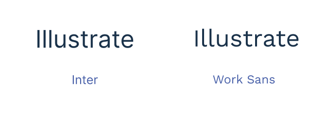
Consider the purpose of your UI: The font should align with the purpose and feel of your user interface. For example, a sans-serif font is suitable for a serious business app, while a decorative font is better for a playful children’s game.
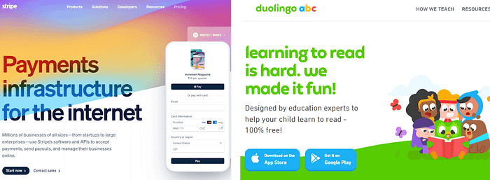
via Stripe(left) and Duolingo(right)
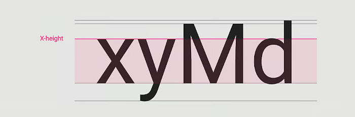
Readability: Reading a screen is harder than reading a paper. The font should be large enough to make the text easier to read on screen. It should be easy to read in different sizes and on different screens. Choose a font with a high x-height for a larger appearance for body text. Fonts like Tahoma and Verdana are designed to make the text look big.
via Material Design
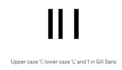
Legibility: Ensure the font has good legibility, with distinguishable letters and numbers. Check the difference between similar letters and numbers, such as lowercase “l” and uppercase “I”.
Consistent letterform design: Avoid typefaces with similar letterform designs for multiple letters. In some fonts, the characters “o”, “c”, “e” or “a” can be easily confused, which in turn makes words harder to identify. Humanist typefaces tend to have more varied character widths.
If people have trouble reading the font, they will transfer that feeling of difficulty to the meaning of the text itself and decide that the subject of the text is hard to do or to understand.
- Susan M. Weinschenk, 100 things every designer needs to know about people
Difference between capital height and ascenders- Raising Ascenders above capital heights can greatly improve individual character recognition.
Font for tables: If your UI consists of presenting table data of numbers, choose the fonts carefully while checking their vertical and horizontal alignment.

Horizontal alignment of the numbers
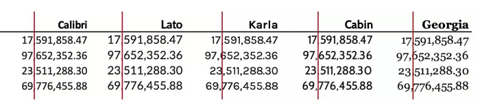
Vertical alignment of the numbers
Consistency: Use a maximum of two font styles in your UI for consistency, one for headings and one for body text. Consider using a variable font with a range of weights for mobile apps to reduce font file size.
Kerning: Check the spacing between letters in the heading font, especially for gaps between letters like “VE”, “TT”, and “ub”. Kerning may become an issue as the type size increases, especially for websites and mobile apps. For smaller type sizes, looser letter spacing improves readability as more space between letters increases the contrast between each letter shape.
I hope this article has helped guide you on your font selection journey for your UI. Remember, the right font choice can make all the difference in creating an engaging, user-friendly interface. Happy designing!
Recommend
About Joyk
Aggregate valuable and interesting links.
Joyk means Joy of geeK