

Creating a Viva Magenta sequence for data visualization
source link: https://uxdesign.cc/creating-a-viva-magenta-sequence-for-data-visualization-2fbc006f9d36
Go to the source link to view the article. You can view the picture content, updated content and better typesetting reading experience. If the link is broken, please click the button below to view the snapshot at that time.

Creating a Viva Magenta sequence for data visualization
Building a sequential color scheme with Pantone’s 2023 color of the year.
In this writing, I discuss how to build a single-hue sequential color scheme for data visualization with Pantone’s 2023 Color of the Year, Viva Magenta. Let’s get started by first reviewing the Pantone Color of the Year and a few color harmony fundamentals that help in building a sequential color scheme.
Pantone’s Color of the Year Concept:
The Pantone company produces the Pantone Matching System (PMS) and the Pantone Fashion, Home + Interiors (FHI) System, proprietary color spaces. PMS is used primarily in graphics for printing, packaging, and digital media. FHI is used in a wide range of other industries including fashion, cosmetics, fabric, plastics, and paints. When Pantone PMS inks are applied to a physical color reproduction process, it is frequently possible to accurately match the colors from your digital data visualization to hard copy output. I highlighted this journey from digital to hard copy in a previous Nightingale writing.

Visual Summary of the Pantone Color of the Year for 2000–2023. Image adapted from Wikipedia’s Pantone Color of the Year writing.
Since 2000, the Pantone Color Institute began defining a “Color of the Year” from its inventory of PMS and FHI colors. The color for a given year is selected by a secret panel after considering color trend analyses that span the entertainment industry, all areas of design, fine art shows and collections, social media, new technologies, emerging materials, and textures as well as lifestyles and socio-economic conditions. On December 1, 2022, Viva Magenta (Pantone 18–1750) was announced as the 2023 Pantone Color of the Year.
Pantone’s Color of the Year has influence on the development of products and consumer decisions in areas like graphic design, product packaging, fashion, industrial design, and home furnishings. As a result, in my visualization practice, I like to build and keep in inventory color schemes that correspond to the designated Pantone Color of the Year. Last year, I covered how I applied the 2022 Pantone Color of the Year to a data visualization if you would like to view that discussion.
Finding Viva Magenta’s Hex Code:
In working with digital color, it is helpful to know the hex code that corresponds to Viva Magenta (Pantone 18–1750). For those unfamiliar with the concept, a color hex code is a hexadecimal way to represent a color in RGB format by combining amounts of Red, Green, and Blue to note that specific color. Using “Viva Magenta” into Encycolorpedia yields A Google search on “viva magenta hex code” yields the following result: #BE3455.
I also used the free version of the Pantone Connect tool to produce the official Pantone results below. Pantone Connect tends to work best with the Chrome web browser. I have found several hang-ups using Safari. The free version of Pantone Connect is very limited since Pantone hopes you will subscribe to its paid subscription services. Fortunately, for the Pantone Color of the Year, data about the hex code is provided. I will use the #BE3455 hex code as the basis for creating my Viva Magenta single-hue sequential color scheme.

Finding the Hex Code (#BE3455) for Viva Magenta with Pantone Connect. A Google Search for “viva magenta hex code” will yield the same results.
A Few Color Harmony Basics:
Color harmony is the process of choosing colors on a color wheel that work well together in the composition of an image. Like concepts in music, these harmonies are based around color combinations on the color wheel that help to provide common guidelines for how color hues will work together. Isaac Newton is credited with creating the color wheel concept when he closed the linear color spectrum into a color circle in the early 1700s. Over the centuries, artists and color scientists amplified his concept to include color harmonies.
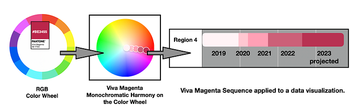
The Red-Green-Blue (RGB) color wheel is based on the concept that Red, Green, and Blue (RGB) are the color primaries for viewing displays like what we see on our desktop and mobile devices. A monochromatic color harmony combines one hue (a 100% saturated color) with various tints, tones, and shades of that hue to create a color scheme. A tint is defined as a hue mixed with White while a tone is a designated as a hue mixed with Gray and a shade is created when a hue is mixed with Black. On the color wheel, a monochromatic color harmony is depicted as colors that build a straight line from the center of the wheel towards the outside edge of the wheel. Below, I show (a) the RGB color wheel, (b) an illustration of a monochromatic color harmony concept for the Viva Magenta hue, and ( c) a depiction of the progression of a Viva Magenta monochromatic harmony on the color wheel.

Composite diagram of (a)the RGB color wheel on the left, (b) an illustration of a monochromatic color harmony concept for the Viva Magenta hue in the middle and ( c) a depiction of the progression of a Viva Magenta monochromatic harmony on the color wheel. on the right.
Sequential Color Schemes for Data Visualization:
In data visualization, sequential color schemes are designed for ordering numeric information where colors progress from low to high (or vice versa). A monochromatic color harmony can transition into a single hue sequential color scheme for data visualization. I will highlight this process further for Viva Magenta in upcoming sections of this writing.
My Process of Colorizing a Data Visualization:

My diagram of “The Process of Colorizing a Data Visualization”.
In a previous UX Collective writing, I described a five-stage process for colorizing a data visualization. These five phases, depicted in the circular diagram above, are: (1) Establish data classes and key colors for visualization; (2) Select color rule, color harmony per criteria of your data: (3) Build color scheme. A color suggestion tool might be helpful. (4) Check and revise due to color deficiency, contrasts, or any pre-existing conditions and (5) Apply color scheme to data visualization. Some modifications might result.
Let’s follow this process to build a Viva Magenta sequence and apply the sequence to a data set.
Applying a Viva Magenta Sequence to a Data Visualization:
(1) Establish data classes for visualization and key color for visualization
For my example, I have sales data for a region (Region 4) for a four-year period (2019–2022) and projections for 2023. I want to build a sequential bar chart to depict this data in the key color of Viva Magenta. I specifically want to end the sequence with the 2023 projections depicted with Viva Magenta (#BE3455), the 2023 Pantone color of the year.

The sales data for Region 4 over a four-year period from 2019 thru 2022 with 2023 projections. The Key color for the 2023 projections will be Viva Magenta (#BE3455), the 2023 Pantone color of the year.
(2) Select color rule, color harmony per criteria of your data.
Since this is ordered data, a sequential color scheme will be used where colors progress from low to high ending in Viva Magenta.
(3) Build color scheme. A color suggestion tool might be helpful.
I can use the freely available online Adobe Color (color.adobe.com) app to help build the Viva Magenta sequence. My first steps are to enter the Viva Magenta (#BE3455) as the center color in the Adobe Color app and select “Monochromatic” as my Color Harmony Rule. I show these results below.

Using the Adobe Color app to build the Viva Magenta sequence. The first two steps are to enter the Viva Magenta hex code, (#BE3455), as the center color in Adobe Color and select the Monochromatic color harmony rule.
As noted previously, I want to match the 2023 data point by ending the sequence with Viva Magenta (#BE3455), the2023 Pantone Color of the Year. As a result, I need to modify the Viva Magenta color scheme that Adobe Color provides me. To do this, I select the “Custom” option under the Color Harmony Rule menu so I can modify the color scheme by hand. Then I reposition Viva Magenta (#BE3455) — noted as the “C” color) as the far color on the right (the “E” position). I also relocate the “B” color — (#CA7387) into the “D” Color position. I show these results below.

Selecting the Custom option under the Apply Color Harmony Rule and Repositioning Viva Magenta #BE3455 to be the far right color or position E and the B color #CA7387 to be in the “D” Color position in Adobe Color.
My next step is to insert White #FFFFFF as the Hex code for the first three colors (A, B and C) on the left side of the color scheme. These three White (#FFFFFF) colors will appear over top of each other in the center of the Color Wheel. This allows me to eventually reposition, by hand, the first four colors of the sequence to obtain a progression from the center of the color wheel to Viva Magenta #BE3455. I show this insertion of White #FFFFFF as the Hex code for the A, B and C colors below

Inserting White #FFFFFF as the Hex code for the first three colors (A, B and C) on the left side of the color scheme. These White (#FFFFFF) colors will appear over top of each other in the center of the Color Wheel.
Using the color sensors that Adobe Color provides, I reposition the first four colors (A, B, C and D) on the left to have a progression from light to dark that ends with the far-right (E) color, Viva Magenta #BE3455. As this was done by hand, my results could differ slightly with your results if you try to replicate my efforts. This finalizes my Viva Magenta sequence. I show these results below with the Hex codes for each color noted.

Creating the final Viva Magenta Sequence in Adobe Color by positioning, by hand, the color A,B,C,D and E to end in Viva Magenta #BE3455. Each Hex code of the sequence is noted.
(4) Check and revise due to color deficiency, contrasts, or any pre-existing conditions.
As noted in my prior UX Collective and Nightingale writings on color, humans have three types of photoreceptors or cones. Each is sensitive to different parts of the visual spectrum of light to facilitate rich color vision. A red cone deficiency is classified as Protanopia. A green cone deficiency is classified as Deuteranopia. A blue cone deficiency is classified as Tritanopia. Software is available that simulates color deficiencies.
Since I have built the Viva Magenta sequence in Adobe Color, I can use the Adobe Color’s “Color Blind Safe” tool to check for color deficiencies. The “Color Blind Safe” tool can be found under the Accessibility menu at the top of the Adobe Color app. I show the results of this color deficiency check below. Adobe Color notes “No conflicts found. Swatches are color blind safe”. Individuals with Protanopia and Deuteranopia are unlikely to see the Viva Magenta sequence but can distinguish between the five colors in the color scheme. Individuals with Tritanopia are likely to view a set of colors like the Viva Magenta sequence. The color scheme passes initial color deficiency checks.

Color Deficiency Checks for the Viva Magenta sequence where Protanopia indicates loss of Red cone, Deuteranopia indicates loss of Green cone, and Tritanopia indicates loss of Blue cone. The Adobe Color accessibility tool indicates “No Conflicts found. Swatches as color blind safe.”.
Later, I will use the freely available Color Blindness Simulator (Coblis) tool to perform color deficiency assessment of the completed data visualization.
(5) Apply color scheme to data visualization. Some modifications might result.
Now, let’s apply the Viva Magenta sequence to a bar chart that shows Region 4 sales data for 2019 thru 2022 with 2023 projections as was shown in Step #1. I show these results below. As noted previously, the 2023 projections are depicted with Viva Magenta (#BE3455), the 2023 Pantone color of the year.

The Viva Magenta sequence applied to a bar chart that shows Region 4 sales for 2019–2022 with 2023 projections. Note that the 2023 projected data is shown with Viva Magenta (#BE3455), the 2023 Pantone Color of the Year.
To be more confident in addressing color deficiency, I run the bar chart through the Color Blindness Simulator (Coblis) tests. I show the results below.

Color Deficiency Checks for the bar chart with the Viva Magenta sequence. Here, Protanopia indicates loss of Red cone, Deuteranopia indicates loss of Green cone, and Tritanopia indicates loss of Blue cone. The data visualization passes color deficiency tests.
Like the earlier color blindness checks with Adobe Color, those with Protanopia and Deuteranopia are unlikely to see the actual Viva Magenta sequence but can differentiate between the five colors they view. Individuals with Tritanopia are likely to view colors similar to the Viva Magenta sequence. The bar chart passes color deficiency tests.
Concluding Remarks:

My Viva Magenta Sequence applied to a data visualization. Hex codes for each of the five colors are noted as #FFF3F6, #FFC7D1, #FFA0B5, #CC6079, and #BE3455. The Viva Magenta Hex code, #BE3455, ends the sequence.
In this writing, I have built a sequential color scheme based on Pantone’s 2023 Color of the Year, Viva Magenta, and applied it to data visualization. I began by describing Pantone’s Color of the Year concept and the selection of Viva Magenta as the 2023 color. I also showed that #BE3455 is the color Hex code for Viva Magenta.
Next, I went on to discuss how color harmony is the process of choosing colors on a color wheel that work well together in the composition of an image. With a specific focus on the tints, tones, and shades of a monochromatic color harmony, I showed how the free online Adobe Color app can be used to create a single hue (Viva Magenta) sequence for data visualization. I also used the Adobe Color app to check for color deficiencies in the sequence. Fortunately, the Viva Magenta sequence passed these initial color deficiency checks.
From there, I described my five-stage process for colorizing a data visualization. These steps include: (1) Establish data classes and key color for visualization; (2) Select color rule, color harmony per criteria of your data; (3) Build a color scheme. A color suggestion too might be helpful; (4) Check and revise due to color deficiency, contrasts, or any pre-existing conditions and (5) Apply color scheme to data visualization. Some modifications might result.
Using this colorizing process, I applied my Viva Magenta sequence to a bar chart that shows sales data for 2019 thru 2022 with 2023 projections. I specifically showed the 2023 projects in the Viva Magenta #BE3455 color. I also performed a final check for color deficiencies in the completed data visualization with the Color Blindness Simulator (Coblis).
The process of colorizing data visualizations and graphic designs can produce fascinating results. I have tried to share an approach to using the Pantone Color of the Year to create a single hue sequential color scheme here. You will likely make your discoveries while creating color schemes for your projects. For additional discussions on my approaches with various color suggestion tools, please see my prior UX Collective and Nightingale writings as well as my 2016 book on “Applying Color Theory to Digital Media and Visualization” published by CRC Press.
About the Author:
Theresa-Marie Rhyne is a Visualization Consultant with extensive experience in producing and colorizing digital media and visualizations. She has consulted with the Stanford University Visualization Group on a Color Suggestion Prototype System, the Center for Visualization at the University of California at Davis and the Scientific Computing and Imaging Institute at the University of Utah on applying color theory to Ensemble Data Visualization. Prior to her consulting work, she founded two visualization centers: (a) the United States Environmental Protection Agency’s Scientific Visualization Center and (b) the Center for Visualization and Analytics at North Carolina State University.
Recommend
About Joyk
Aggregate valuable and interesting links.
Joyk means Joy of geeK