

Using multiple icon packs across a single component
source link: https://uxplanet.org/using-multiple-icon-packs-across-a-single-component-ab5aa163cc84
Go to the source link to view the article. You can view the picture content, updated content and better typesetting reading experience. If the link is broken, please click the button below to view the snapshot at that time.

Using multiple icon packs across a single component

If you have a scaled team you will probably face messy workspace and files which have enough repeated, detached and missing components. One of the widely used component is icon. And in large teams it is mainly needed to use different icon packs for the context of projects.
To avoid confusion I will show a way to organize icons in Figma team library. In this way you will differentiate sources and use single icon component by Figma features such as, Variants, Instance swap property and Expose nested instances.
1. Choosing Icon Packs
Assume that you choose 3 icon packs — Material Icons, Material Design Icons and Font Awesome to use in different projects. Depends on the situation number of them could be increased in the future.

2. Creating Source Files
Project files
Let’s create source files for each one of the icon packs in a project named Icon Packs. It is required to create them separately because when they are published it is both easy and technically correct to modify a pack without interrupting the others.

Categories
While placing icons into the file always group them by category. For example, Material Icons have categories such as Action, Alert, Communication, Content, etc. You can create either Page or Frame for each category.

Both approaches have their advantages. Using Frame helps find and navigate easily around icons, yet using Page reduces overload if there is plenty of content inside one page.
Styles as variants
If icon has a few styles then it is better to create them as variants. For example, Material Icons has 5 styles — Filled, Outlined, Round, Sharp, Two Tone. By this way all styles of selected icon are clearly visible.

3. Creating Team Library
Publish team library
Let’s publish icon packs as a team library to reuse its components across all design files. Components live in the files which they are originally created. All components of the file are found in Assets tab above the layers panel.
Within the Assets tab we see a book icon. Clicking on this opens the team library window, at the top of the window there is a button to publish this file along with its components to a new team library.

Enable team library
After publishing library by default it is not activated to use across design files. To activate libraries for all team files they must be enabled from team settings.

4. Creating Single Icon Component
Components file
Styles and components files were mainly created separately based on atomic design principles. Now it is time to create unique icon component for using icon packs across of it.
Icon component
Components have min. and max. values for container dimensions and breakpoints. This size constraints vary on each component. Icons are mainly in 3 sizes — small, medium, large. Of course, the number of sizes can change depending on the UI kit and design system. For example, there are 6 sizes — x-small, small, dense, medium, large, x-large in Vuetify framework.
Icon variants
Variants is an ideal feature to show different icon sizes as a component set. Variants are created onto the instance of icon pack from team library.

Component properties
While using instance of icon component it is needed to swap icon packs. To create smooth experience help of component properties is incomparable.
Using Instance swap property provides to swap icon packs easily and Expose nested instances allow to see variants of selected icon in properties panel in the right sidebar.

5. Using Icon Component
Icon itself
Let’s see few examples of icon component’s use. On icon itself it is possible to see properties of component in right sidebar. With Size property we are able to control scale of an icon, while Icon property allow to swap icon itself from the pack. And nested instance of the current item show styles of the icon as Variants options.

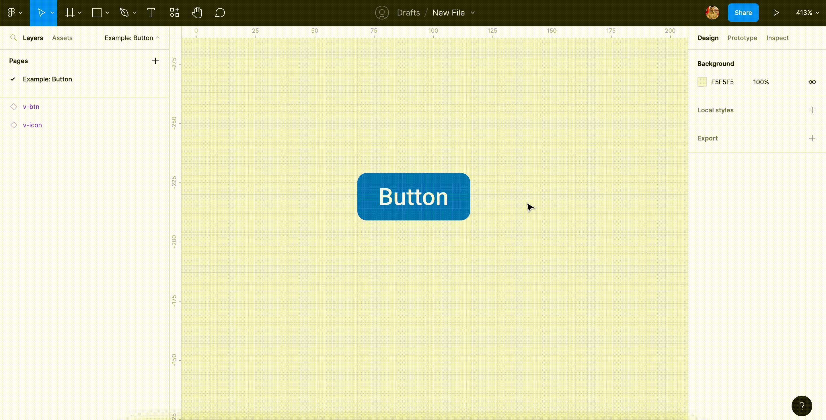
Inside button
By using component properties it is possible to see top-level and nested instances in right-sidebar. Instead of deep-selecting into each layer to find their component property controls, exposing nested instances allows you to click just the top-level component — in this case, button component and edit its instances from a single page.
Conclusion
Organizing libraries and components properly are very necessary in scaled teams. And consider to start classification from icon packs in the first place, because icons are used almost inside of all components. The libraries that are not clustered properly in time can cause you to run backwards.
Recommend
About Joyk
Aggregate valuable and interesting links.
Joyk means Joy of geeK