

Analyzing the UX of Elden Ring
source link: https://uxdesign.cc/the-ux-and-ui-of-elden-ring-42036ad0e24c
Go to the source link to view the article. You can view the picture content, updated content and better typesetting reading experience. If the link is broken, please click the button below to view the snapshot at that time.

Analyzing the UX of Elden Ring
A look at the UX/UI of the game of the year 2022, Elden Ring

The launching screen of Elden Ring
Two months ago I decided to dip my toes into the world of Elden Ring. I know, I’m a bit late to the party — the game was released in February 2022, and actually I tried to play it back then but after only a few hours of playing I put it down, deciding it was not for me. Until recently, when it won game of the year for 2022 at the game awards ceremony in December. That was when I decided to give it another try, thinking I had judged it too quickly.
The initial reason I decided it was not for me was because Elden Ring is not what I would call a casual game. Casual games are ones that you can jump in and out of when you have the time, and more often than not they don’t require a high level of skill to progress or be enjoyed. If you are that kind of player (and there’s nothing wrong with that, I count myself in that camp) then it’s hard to have a good time in Elden Ring.
In this article, I wanted to add my two cents to the discussion around Elden Ring and its UX design. A lot has been said online about this already, but being a designer I have a great appreciation for the work of UX designers in the gaming world, because they have their own sets of challenges which they have to solve, and seeing how they do so always fascinates me. I have also gone from not being a fan of the game to becoming completely obsessed with it and playing it through to the end. Here’s why I changed my mind.
UX designers ≠ game designers
Firstly though, I think it’s important to make one distinction. I do not work in the gaming industry and am only a gaming enthusiast who is also a UX designer. As with most UX design roles, the list of responsibilities get blurred depending on the job and company, but UX designers shouldn’t be confused with game designers. Game designers are the ones working on the gameplay, mechanics, and basically everything you can do in the game; UX designers are responsible for the player’s experience in the game, and the flow of interactions. The UI (user interface) is part of this experience. You can read more about the distinction between the roles in this article.
What is Elden Ring?
Coming to Elden Ring, the game experience doesn’t get much better than this — or more frustrating than this, depending on the type of gamer you are. Either way though, having played through to the end, it’s easy to see why this game won game of the year at the awards ceremony in December last year. Not only is it a visually stunning game, and have George R.R. Martin (author of Game of Thrones) who provided the worldbuilding, but it also has a massive open world which you can explore as you want and build your character as you want. You can tackle pretty much any enemy you wish, or go back to them when you’re more powered up; add to this a fascinating storyline and characters, and you get the recipe for the perfect game, in my humble opinion.
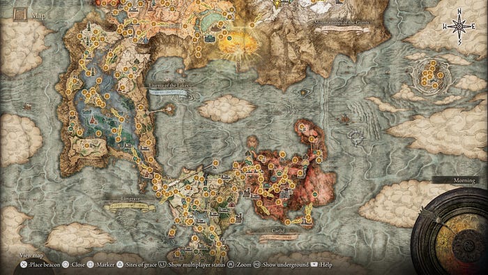
A screenshot of the world map in Elden Ring
As already mentioned, I didn’t immediately appreciate how good this game really is back when it launched in February 2022. Not having played Dark Souls games before, the grind of constantly dying everywhere you go did not appeal to me; in fact it seemed pointless and torturous. As I’ll explain further on this article, the interface and the UI elements don’t give you much in the way of explanation of objectives or storyline quests, which leaves the player on their own to discover most things for themselves. I have now come to fully appreciate this aspect of it; but in the beginning I found it difficult to play without any guidance which often resulted in the “You died” screen.
I only tried again after it won game of the year, thinking that maybe I didn’t give it enough time. I can’t tell you what was different the second time around, but suddenly I was hooked like I had never been hooked by anything before — be it game, movie, or book.
I recently finished the game after about 160 hours to get to and defeat the final boss, after about two months of playing almost everyday (I was between jobs, so I had the time. Don’t judge.)
So now that I’ve boasted about it so much, I have to point out that there are a few things that I have a bone to pick with. In particular, they have to do with the UX and UI of the game. This is something which has sparked debate in the gaming community as well as among game developers; this article describes a debate going on about the minimal user interface of Elden Ring. Or this article here on Medium which also talks about the debate and why it is flawed.
The general consensus is that Elden Ring is not perfect from a UX perspective, but we can acknowledge and appreciate what it is trying to do, which is to encourage players to explore the environment on their own rather than have their hand held on the entire journey and have everything spelt out for them (which is a formula that many other games tend to follow.)
How is the UX of Elden Ring effective?

The user interface while exploring the open world; the lack of UI puts the focus on the environment.
The layout of the screen is minimal in terms of displaying well, just about nothing. There are no messages, no hints or objectives to speak of. In fact, the only way to know what your storyline objective is, is to look at a “site of grace” (essentially checkpoints throughout your map) and see which way the light is pointing. This only gives you a hint of which direction to go in, nothing more. The basic compass doesn’t show anything other than the four cardinal directions. Character health bar and equipment only shows when prompted or when you’re facing an enemy.

Your only guide towards your objective: the faint light pointing in a direction at a “site of grace.”
The intention by the developers is to leave the player to discover the world on their own; this is unique because most other games will constantly nudge you as to what you should be doing to advance the game. Whereas in Elden Ring, you can go wherever and always find something worthwhile. Your character doesn’t say a single word the entire game, because essentially, you are the character. It creates a level of immersion that other games fail to achieve despite their best efforts.
Contrast this to a game such as Horizon Zero Dawn or Forbidden West (image below.) While I really enjoyed these games, the character is constantly talking out loud, prompting you to do something. Quests are always on display; after a while I felt exhausted and like I was just going through a checklist of things I have to do (which is essentially what it is), rather than just enjoying this beautiful world they had created. Which sounds like a bad metaphor of life, now that I think about it.
It just feels like I’m doing chores after a while, rather than immersing myself in it.

Main display in Horizon: Zero Dawn (image credit gameuidatabase.com)
What are the problems with the UX and UI of Elden Ring?
Having said what I think it does quite well, the UX and UI are not perfect. Here are some of the elements which I find problematic and could be better:
1. No pause function
Usually in a game, there is a way to hit pause and the action pauses, unless you’re playing an online game and in the middle of the action with other players. Although Elden Ring is played online, you can also play it offline. Usually opening the menu should pause the game, but in Elden ring it doesn’t because any enemies around you can still attack you. You can bring up the map but this also doesn’t actually bring the environment to a pause, even though it takes up the entirety of your screen.
The only way to pause the environment so that nothing attacks you is to rest at a “site of grace” which resets all enemies and serves as a checkpoint. I find this rather unintuitive especially if I quickly need to take my attention away from the game, and not having a way to hit pause is problematic. I later discovered a “trick” to pause the game, described here, which is a work-around the fact that you can’t really pause the game.

Resting at a site of grace is the only way to “pause” the game (image credit: gameuidatabase.com)
2. Character stats display

Character status menu (image credit: gameuidatabase.com)
If, like me, you’re not a Dark Souls player and this is your first experience with the Soulsborne games, then understanding how the character statistics work can be a nightmare.
Where do I start with the layout above. Looking at it gives me a slight headache, mostly because my brain tends to scramble when I am faced with too many numbers. My main issue here is the lack of contrast afforded by the font — if at least the main information was somehow bolder (all the stats on the first column to the left are what I would call main or overall stats), then it would make the viewing experience better here. Secondary stats are in the middle column, and the detailed stats are the right-hand column. The way it is laid out on this view however makes it difficult to establish this at a glance.
3. Lack of contrast (and accessibility in general)
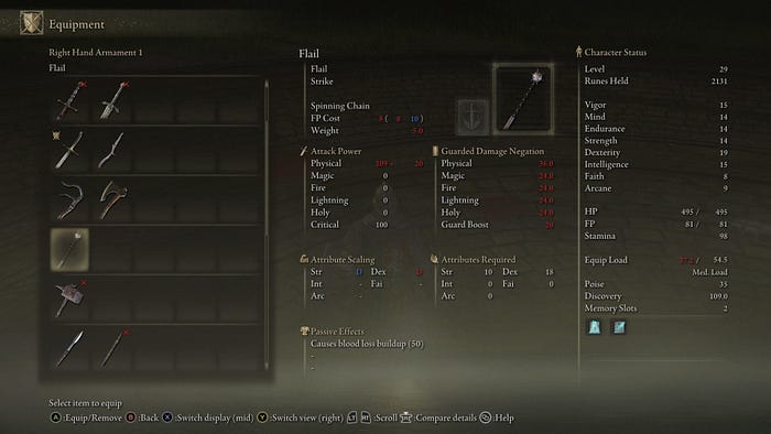
Equipment menu, where you can select your weapon of choice (image credit: gameuidatabase.com)
Moving on to another hard-to-understand menu, the above shows the equipment menu and how specific equipment strengthens or weakens your character. Some issues include:
- While we can assume that red is lower and blue is higher, those colour choices are problematic because of the low contrast from the dark background; the blue can be particularly hard to read at times.
- Overall the font size is too small and just downright hard to read at a distance, with not enough contrast to the gradient background.
- A further point is the meaning of some of these stats — what does 8 ( 8 10) next to FP cost mean? I am still not sure I can tell you, and I’ve spent many hours playing already.
- Another small issue is at the bottom of the screen where the control options are shown; packing them so close together makes them rather difficult to read.
4. Notifications which stop you in your tracks
This might be the biggest offense from a UX perspective, and that is these notifications which come up after you try to say open a door which cannot be opened — not only does this notification not go away by itself and you have to press a button to make it disappear, but it also prevents you from controlling your character until you make it disappear. This can be really annoying because a) sometimes I just don’t see the notification below and can’t figure out why my character won’t respond to commands and b) sometimes you get attacked from behind and can’t do anything to react because the notification prevents you from reacting.
Notifications with trivial information which block you from performing an action should be avoided in any scenario, because this causes friction in the user’s experience and raises their level of irritation.
Picking up a new item brings up this large notification, which won’t disappear until you acknowledge it (image credit: gameuidatabase.com)
As in the image above, there are also these notifications which come up when you pick up new items for the first time; they can also be annoying because of the amount of screen they take up, and they also need to be acknowledged in order to go away. It would have been better if they were placed to the side where they don’t cover the view of what you’re doing, or alternatively just disappear after a few seconds.
5. Structure of the inventory menu
There are countless items which you collect throughout the game and keep in your inventory. Unlike other games, you can access these items anytime and don’t have to visit a particular place on the map just to access these items.

Inventory menu (image credit gameuidatabase.com)
These items, from consumables to ingredients to weapons, can be combined in different ways to power up your character in countless ways; however, it’s not always easy to know which items go together, or even where to find a specific item I just picked up. You need to filter the view to read what this item does, yet there is ample space to just show this information in this view.
You can arrange items in the menu according to a sorting method, but this is not immediately obvious as I had to go through a few screens before being presented with this option at the very bottom of the screen (which again is difficult to make out due to the proximity of the options next to one another.)

Equipment menu and the options for sorting the items
You might notice on the bottom of this screen there is an option for “simple view.” This just remove the information about the item and the character status. Rather than simplify information it just hides some of it, which doesn’t really help.
Recommend
About Joyk
Aggregate valuable and interesting links.
Joyk means Joy of geeK