

Designing a robust right-to-left UI in Arabic | UX Collective
source link: https://uxdesign.cc/designing-a-robust-right-to-left-ui-in-arabic-hebrew-and-farsi-d1e662a09cfa
Go to the source link to view the article. You can view the picture content, updated content and better typesetting reading experience. If the link is broken, please click the button below to view the snapshot at that time.

Designing a robust right-to-left UI in Arabic, Hebrew and Farsi
Secret tips and tricks for UI and UX designers.

Photo by Maranda Vandergriff
There are more than 7100 languages spoken around the world today. While some have more unusual and complex linguistic rules than others, there’s one common feature uniting the vast majority of them — they’re all written from left to right. That’s why designers can design an interface that accommodates several languages simultaneously without extra effort.
There is, however, a small group of languages that require more in-depth research before jumping straight into UI design — languages written from right to left (in this article I will simply address them as RTL). The majority of RTL language speakers speak Arabic — about 700 million people. Another 110 million speak Persian (also called Farsi), while 9 million speak Hebrew. That adds up to the number of approximately 820 million people.
As a general rule, all functional elements in RTL graphical interfaces have to be mirrored from left-to-right to right-to-left. Although it sounds confusing at first, once you grasp all the basic rules, working on RTL designs isn’t much different from designing an app or website in English. The logic behind is the same — but mirrored.
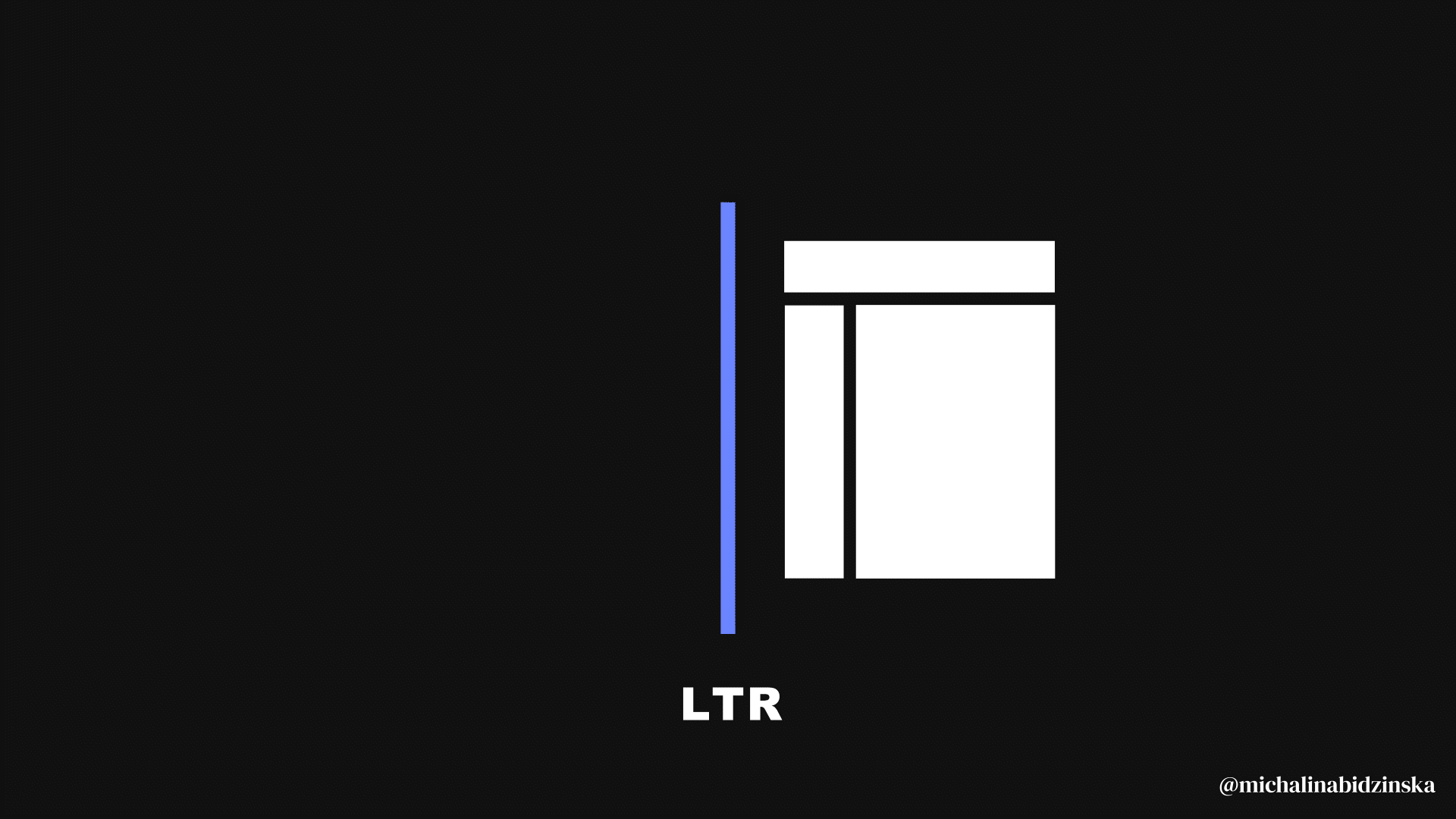
Differences between the LTR and RTL user interfaces.
What you will learn from this article
I had the pleasure of working on an interface for a RTL language users, and I know how demanding the discovery phase was because of the limited number of resources describing how to do this right. That’s the reason that motivated me to share some of my key insights in this article. At the same time, while I was browsing and comparing various interfaces dedicated to both LTR and RTL audiences, I also noticed that it’s not uncommon to run across various mistakes and misalignments between design systems and websites. That’s why you should collect as many references as possible during your discovery phase so that you’re better equipped to work on your guidelines and designs later on, and I hope that this article will be one of them.
The 4 steps that will help you design a robust UI for RTL language users
1) Let’s start with typography
If you’re working on a different language version of your app or website, you should always confirm that your default font supports your targeted language. Fortunately, many universal fonts support languages written from right to left very well. Thus, it’s very likely that you won’t have to spend extra time looking for alternatives. However, remember that typography can also be the trickiest part when designing an RTL interface. Just because a language is supported, it doesn’t mean that your font won’t harm the legibility of text once you add a translation. That’s why you must test your interface with native language speakers to validate your designs and confirm that your audience doesn’t experience any legibility problems.
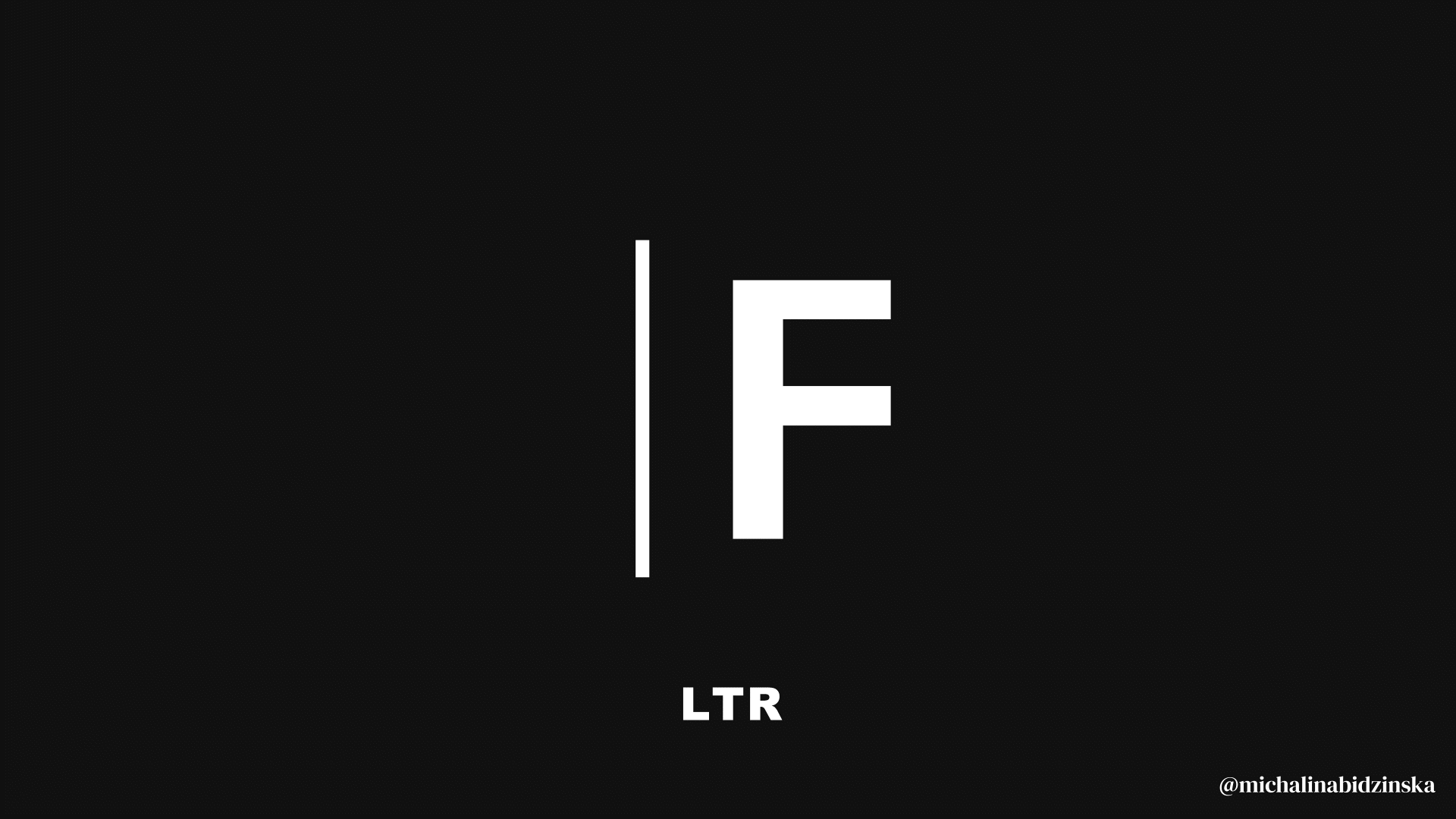
Eye-tracking pattern for RTL and LTR interfaces.
Since users of right-to-left GUI read text from right to left, wherever your text is left-aligned, you will have to make it right-aligned so that it follows the natural reading direction of your target users. An easy way to understand this is by thinking of the F-shaped reading pattern popularized by Nielsen Norman Group through their eye-tracking study. In the case of RTL interfaces, however, the F pattern is mirrored and resembles a flipped F letter, where users view content starting from the right corner of the screen instead of the left corner.
2) Iconography
Before we began editing our existing icons, it was important to ensure that the meaning of all the ones we had in our design library would be understandable to all users in a new region. Luckily, our research showed that most icons could remain unchanged, and apart from flipping their alignment from left to right, we didn’t have to work on any other special amendments. However, please be cautious that it may be not be the case in your interface. As designers, we must confirm that our work is understandable and appropriate for use in a different country.
In the Japanese market, there are many symbols that have often confused many international tourists. One notable example is the use of swastika symbol called manji (卍) as a mark symbolizing Buddhist temples. If you’ve recently visited Japan, you may notice that this symbol’s been slowly disappearing from all tourist maps because of its negative connotations to swastikas used by the Nazi.
If you’d like to learn more about this topic, I also wrote an article in the past explaining why cross-cultural design’s a fundamental aspect when launching a product in a new region. The swastika symbol’s a great example illustrating the importance of delving into individual differences and symbolism used across different cultures. Click on the link below to read this article if you’re interested:
During the research phase, I discovered that all icons associated with movement, such as cars, bikes, or airplanes, were advised to be flipped for RTL interfaces. In spite of that recommendation, our intial user testing sessions showed that although it’s a beneficial change, it’s not a strict requirement. After testing an interface containing both versions of icons mixed together — default and flipped — we didn’t notice any differences in how users perceived information. However, after showcasing both versions of the same icons side by side, the tested users picked the flipped version. Nevertheless, they confirmed that they did understand the meaning of both versions.
Iconography for RTL and LTR interfaces.
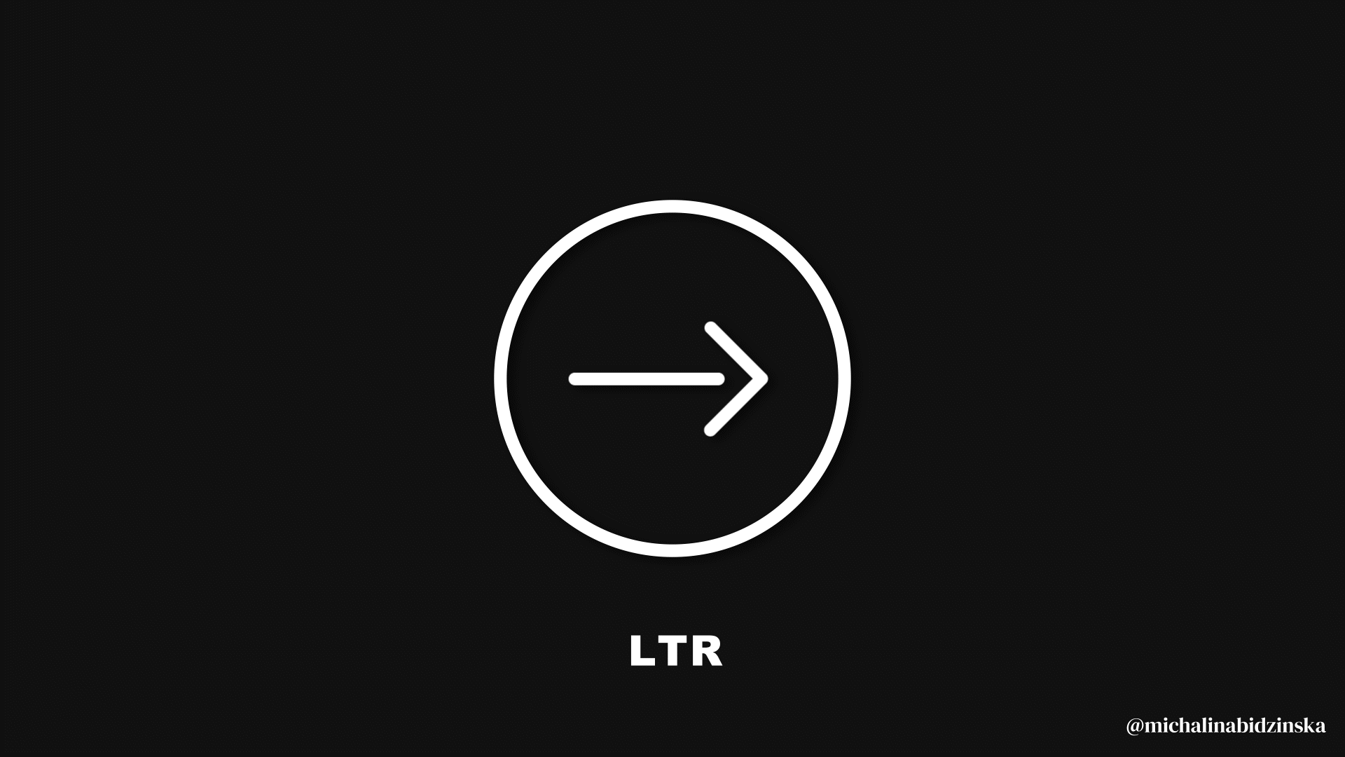
Apart from icons showing movement, I spotted one more tricky group of icons — the direction icons consisting of all kinds of arrows. If you’re currently using any icons pointing in a direction in your original LTR interface, you will have to flip them so that they point in the opposite direction. Consequently, if you’re using any direction icons in a more complex module, such as an image carousel, remember that your users will move between images in a right-to-left direction, which is the opposite of how it works for other languages. This also means that the icon placed on the left side and pointing to the left will be your default icon, taking the user to the next image.
3) Functional elements
Just like in the case of iconography and typography, all functional elements, such as call-to-action buttons or text links, have to be mirrored from LTR to RTL. This means that your primary CTA should appear on the right side of the screen instead of the left, while your secondary CTA should occupy the left side.
4) Validating your designs
Launching a product in countries with right-to-left interfaces requires plenty of research, testing with the target audience, and reviewing the designs before you share them with developers. If you’re a native speaker of a language written from right to left, you will surely be able to work with text more confidently. However, remember that no matter what, you’re not the user, and you should still validate your designs through user testing. Just because something is crystal clear to you, such as microcopy within a CTA button, it doesn’t mean that everyone will be able to read it. We all perceive colors differently and may have various problems with vision restricting us from seeing your designs the same way you see them.
5) International user testing tips
An interesting note that I found in Jakob Nielsen’s book International User Interfaces said that it’s crucial to find representative users, which means that they should reflect the culture and abilities of your wider user group in a different country.
It doesn’t matter if you conduct usability testing remotely or on-site because you’re likely to experience a language problem in either settings. If you recruit users who aren’t fluent in a language you speak, there may be a lot of crucial information that will likely get lost in translation. On the other hand, too fluent users that have spent a lot of time abroad may be more adapted to seeing various cultural or linguistic differences daily, and they may not be able to bring as much value to your insights as your representative users.
If you’re part of a larger organization or have more time and resources within your reach, aim to involve local experts who will help you recruit the most suitable participants for usability testing. Also, if you don’t speak the local language, you should closely collaborate with interpreters. They’ll support you while working on your research plan and during the actual user testing. They should also help you ensure that you set the right tone and ask the right way during your sessions. It’s often about the subtle ways you ask for feedback and some cultures may be less direct in criticizing out loud what they see.
In terms of the group size, it all depends on your budget. However, conducting user testing with 5 users will already give you an idea of the majority of issues in your interface. Although it doesn’t sound like a large number, this is also the size that Nielsen Norman Group recommends for a basic usability testing. In my case, a session with two people already provided some crucial insights that I could apply right away.
Key takeaways
Even if you don’t speak the target language, you can still successfully design a RTL website or mobile app. In my case, as a multilingual speaker used to working with various alphabets, I was able to notice some details that other team members missed, such as inadequate color contrast and differences in text leading. However, I would like to point out that I had no prior experience working with text written from right to left. That’s why from my experience, I can assure you that a proper understanding of all the hidden rules and openness to learning more about your target users through international usability testing will be enough to design a robust RTL interface in either Arabic, Hebrew, or Farsi. Once you kick off, you won’t notice that the process is any different from designing an interface in English or another language written from left to right.
Recommend
About Joyk
Aggregate valuable and interesting links.
Joyk means Joy of geeK