

Google News — Re-thinking Usability, Search Experience & Content Personalisa...
source link: https://uxplanet.org/google-news-re-thinking-usability-search-experience-content-personalisation-585a600dc142
Go to the source link to view the article. You can view the picture content, updated content and better typesetting reading experience. If the link is broken, please click the button below to view the snapshot at that time.

Google News — Re-thinking Usability, Search Experience & Content Personalisation
A UX case study on one of the most common news aggregators.

This article is organised into sub-sections as follows. If you’re short on time, you can jump to the relevant sections.😇
Disclaimer: This is a personal project. I was not commissioned by Google to redesign the Google News app!
Before I bore you with the details, here’s a short and snappy intro to the reimagined Google News (pardon my amateur After Effects skills)!

👉🏻 Context & Problem
- News aggregators have become essential go-to content platforms today because people need a one-stop destination for accessing news content across multiple sources and topics.
- With the amount of user-data that is leveraged today, these tech-enabled platforms are expected to be customisable and agile enough to cater to user-specific needs, giving them adequate control over the content they see.
- However, most existing news aggregator apps leave much to be desired when it comes to the overall ease of use, relevance of content, and user control over content/feed.
This is a big problem area that hampers the overall UX.
This case study looks at Google News — one of the most popular news aggregators on Play Store. Personally, I use Google News as my source of news content — which was an added incentive.
👉🏻 Project Goal
This study aims to make news content & its organisation more usable, relevant and customisable for users, giving them easy & adequate control over the kind of content they see.
We can break the goal down into smaller objectives:
- Understand user tasks, behaviour patterns and expectations while accessing news content via Google News
- Identify pain points across the range of tasks and functions identified above, including search.
- Identify users’ perception of the app’s content recommendations and ease of personalisation.
Project Duration: 3 weeks
Tools Used: Figma, Adobe Photoshop, Adobe After Effects, Google Forms, Google Sheets
👉🏻 Success Criteria
The following are potential metrics or KPIs that can be considered to evaluate the project impact. NOTE: I didn’t have accessible data for these metrics as part of this personal project; however these are the metrics I would have used if I were working inside the organization.
- Improved Satisfaction Ratings on the app store.
- Reduced drop-offs / uninstalls: Change in the rate of drop-offs / uninstalls (pre vs post-update)
- Improved Accessibility (in terms of features and functionality)
- Time taken to complete task (e.g. saving a story, sharing a story, accessing a saved story)
👉🏻 User Research Methodology
- As part of the secondary research, I looked at 82 verified customer reviews on Play Store (with 7k+ upvotes) from the last 6 months (Jul’22 — Dec’22) to identify major themes and pain points related to the overall themes stated in the goal. The 7k+ ‘helpful’ votes on these reviews signifies the number of users resonating with these problems and/or facing the same issues.
- Along with this, interviews were conducted with 4 regular users of Google News app (frequency of usage > 5 times per week) to observe usage patterns and discuss their experience & pain points.
11 major themes were identified from the research. Although all of these impacted the overall UX, not all were design-specific issues. Few were purely development issues (e.g. the auto-refresh experience when getting back from an article to the main feed), while few others didn’t seem compatible with the business vision of the organization (e.g. intrusive ads interfering with content, ease of opening articles in external browser).
After removing such issues and adding the qualitative inputs from user interviews, we zeroed down to the following 6 pain points — which we focus on as part of this case study. A detailed view of all 11 issues and the reasons why some of these were not selected as part of this study can be found here.
👉🏻 User Pain Points
We ranked the 6 pain points in order of their frequency of occurrence, as shown in the below graphic. Let’s talk about these issues in some more detail.

#1. Low control on content preferences, irresponsive and insufficient content filtering
There is no way for users to comprehensively restrict a particular content category they do not want to see (e.g. crime or celebrities).
- The closest option? In select sections of the app, users can mark a story as less relevant by going to the menu and the tapping on ‘Fewer stories like this’. After this, they get an option to ‘Choose why’ (which shows a bunch of topics related to the story and users can select the ones that are not relevant for them.
- These topics that are auto-generated aren’t always comprehensive. If the user wants to filter a specific phrase or keyword that is not shown here, there is simply no option to do so.
User quote: “…there is no way for me to see entertainment news without knowing for sure that I won’t see the Kardashians”.
User quote: “…I try to avoid political news and world events due to the impact that these topics have on my mental well-being, but it seems there are issues with this. When specifically filtering out “Doomsday” news, “Armageddon” still slips through.”
#2. Outdated news articles, slow refresh of news items on feed.
Often, up to 4-day old articles can remain in the feed even after multiple refreshes. Users have no option to sort content in order of time or to remove outdated articles.
User quote: “New news are not being updated and articles/events which happened 2–7 days or even a month back is again being shown in my news tab a lot. This really makes the app uncomfortable to use.”
#3. Saving and sharing stories isn’t easy enough
There are no single-click buttons for saving articles (for reading later), sharing or for suggesting ‘more like this’. Users either need to open the menu or the story for these simple functions.
User Quote: “Can you please add “save for later” and “more like this” buttons? Sometimes I don’t have time to read right that second but it captures my interest, only for all the stories I hearted to go missing after the auto-refresh.”
#4. Suboptimal search experience
The search experience within the app is extremely limited in functionality. There is no option to sort content by date, and searching for a particular topic throws up outdated articles at times (instead of showing the latest news). The articles are arranged as per relevance (as assigned by the ranking algorithm), and the user cannot customise the search results in any way.
User quote: “…does not have options to sort by date. So even the results dated a month back are displayed in the top 10 search results. For news related to a specific topic, especially when searched for a topic, there is a room for lot of improvements.”
#5. No way to distinguish articles that are behind paywalls or require a subscription
Users have no way to identify if a story is behind a paywall, until they click on it (to read). This unnecessarily wastes their time: they click on the story only to realise they can’t access the content, and then need to return to the main feed. In addition, they can’t filter out such articles. Premium news content is an increasingly common trend across sources, and the inability to identify premium content from regular content leads to frequent user frustration.
User quote: “I don’t have any way to block all paywalled articles. Only option is to block the source itself, which also has many free articles and hence doesn’t make sense.”
#6. No ‘Reader’ or ‘Listen’ feature
Unlike the native apps of some news sources, there is no option of listening to news articles — this denies content accessibility to users who can’t afford to read an article at a given time, either due to temporary disabilities (e.g. while commuting or under bright sunlight), permanent disabilities or other reasons (e.g. not wanting to read from a brightly lit screen at night).
User quote: ‘I want to listen to news articles when I am commuting, rather than having to read through it. I can’t do this.’
User quote: “…it’s easy to understand easy to navigate. My only gripe with it is it has no read aloud mode or an option to add that on.”
👉🏻 Observations & Insights from UX Research
While diving deeper into the pain points, we stumbled on a few insights that seem self-evident in hindsight, but do not seem to be prioritised in the existing product design.
- Not seeing repetitive & outdated content is as critical (to experience) as seeing the latest content. Users often limit themselves to the first tab (‘For You’) and rarely reach the end of the scroll feed. Thus, users often see repetitive stories (headlines that they have seen earlier) within the first few scrolls.
- Users want to feel a greater level of control over the kind of news content they see. This requires a much more nuanced and responsive mechanism to listen and cater to their preferences, enhancing trust.
- Users don’t always have the time to open and read articles. They need quicker and easier options to perform the most frequent tasks on the app (such as saving stories for later), and more than one way of consuming content (e.g. listening to them).
- Users need visibility on paywall-blocked or subscription-only articles before clicking on them, in order to save time. Many users feel tricked and frustrated by the current experience.
👉🏻 Competitive Audit
I undertook a competitive audit of 5 other news aggregator platforms to identify and evaluate the approach taken to solve for similar user problems. The following competitors were included
- Microsoft Start: News & More (Play Store Rating: 4.5)
- Smartnews: Local Breaking News (Play Store Rating: 4.2)
- Dailyhunt: News Video Cricket (Play Store Rating: 4.5)
- Inshorts: News in 60 words (Play Store Rating: 4.3)
- Feedly: Smarter News Reader (Play Store Rating: 4.1)
Note that the USP and primary focus of each of these aggregators is different, however there is a significant overlap in the basic features and functionalities. There were certainly some aspects that were better implemented in Google News (a ‘Full Coverage’ option, for example, which collates stories on the same topic from various sources), while there were others whose experience was much superior on other apps (search experience, trending news, social media interaction, etc).
The exercise helped identify better approaches to solve problems of a similar kind, as well as guidance on how to improve existing approaches. Here’s a snapshot of the audit:
👉🏻 Product Design Suggestions and High-Fidelity Prototypes
After looking at the insights, competitors’ offerings and exploring possible approaches to solve each of the 6 pain points, I arrived at the following suggestions for the app. There were a number of explorations that were considered for each problem before arriving at the final suggestion, which can be viewed here. Also, since I am not doing a UI makeover of the app but looking at specific functionalities, I have largely continued with the existing design system that the app adheres to.
#1. Make customisability of content preferences easier, quicker and more robust
- Swipe to suggest content preferences: Currently, people need to click on the 3-dot icon on a story card and then click ‘More like this’ or ‘Fewer like this’ to suggest their preferences — which requires 2-clicks. We propose an easier and more intuitive swipe functionality to quickly suggest content preferences, while still retaining the earlier route for consistency. Swiping left auto-triggers the ‘Choose why’ pop-up with the list of auto-generated topics.
- Filter custom phrases/topics from news feed: Currently, users cannot filter out custom words or phrases from content. To solve for this and give users more control, a free-text option (30 character limit, with predictive input) is added under the ‘Choose Why’ pop-up, to be used by customers as a last resort in case the auto-generated tag(s) don’t seem relevant or adequate.


#2. Give users reliable controls to view the latest, updated content
More refreshes don’t always translate to a lesser probability of seeing repetitive articles. We propose 2 features to give users better control
- An option within ‘News Settings’ to ‘not show articles older than X days’ in the feed, where X = 2 by default.
- Mark as Read feature: A ‘Mark as Read’ icon is shown on the overlaid bottom bar on opening a story, and the same option is also included in the kebab menu alongside each story card. Tapping this icon marks the story as read and it will not be shown any more on the feed. In addition, a ‘Mark all above as Read’ bulk option appears after the first 25 article. When a user taps on this, all stories above this point are marked as read and an auto-refresh is triggered (the read stories aren’t shown any longer). A temporary modal (with an undo option) is added to revert unintentional clicks.


#3. Saving and sharing stories made easy with a single click, ‘Saved stories’ section gets a UI makeover
- ‘Save for Later’ and ‘Share’ buttons are added on the story card. This reduces the effort for sharing and saving from 2-clicks to a single click.
- Seeing saved content is made easier by keeping it top of the page. In the existing UI, relatively static content such as ‘Topics’, ‘Sources’, ‘Local’ and ‘Saved Searches’ take too much space — to the point that the saved stories don’t even appear above the fold. We propose a complete UI overhaul of the ‘Following’ tab to prioritize saved content (above-the-fold). The section is renamed to ‘Favorites’, and the icon in the bottom navigation bar is moved to the right for quicker recall.


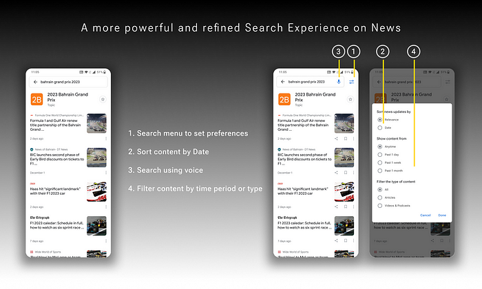
#4. Build a more powerful and refined Search experience
We introduce a more robust search experience with the functionality to
- Sort search results by ‘Relevance’ or ‘Date’, with default being Relevance (existing).
- Search using Voice via a speech-to-text option within search
- Filter content by time period (anytime / past day / past week / past month) and content type (articles / podcasts & videos, etc.). NOTE: Filtering by time period is already present in the web search version.
#5. Provide strategtic differentiation for premium content
To help users distinguish premium/paid content from the regular, free content, we add an icon on story cards featuring premium content, next to the logo of the news source. Users, if they haven’t subscribed to that source, can choose to subscribe by clicking on the story. If they don’t want to subscribe, they can ignore and scroll down for other content. This minimises wastage of time and frustration while still showing users the ‘hook’ (thumbnail image & headline). The option to block or filter out premium content is incompatible with the long-term business vision, and is hence, not considered.
NOTE: As part of the technical feasibility, this step would require information sharing between the news source and Google.

A more strategic move (and this is a business call, not a design call) would becreating an ad-free, subscription-based service called ‘News+’, in which subscribers can access most (if not all) of the premium content across different sources. Some caveats with this approach that would need further investigation:
- Unlike the case of YouTube, news content is not owned by the aggregator, but by the respective sources. Not showing ads on their webpages within the aggregator app would require a suitable revenue-sharing arrangement.
- There could still be some sources that won’t be part of this model (similar to audio books that don’t adhere to Audible’s credits system).
#6. Add the functionality to listen to news
A ‘Read’ or ‘Narrate’ Floating Action Button (FAB) is added on the story page to provide more options to access content.

👉🏻 Learnings & Takeaways
- Many of the suggestions in any re-design project would invariably depend on technical feasibility. While it is known that similar solutions exist on other content platforms, the cost to benefit of implementing a new feature right away (e.g. the ‘Tap to Listen’ feature) in terms of development cost vs the potential benefits will largely depend on the existing product vision and how it gels within the overall business goals. A DFV framework can be leveraged for the same.
- User interests need to be married to business realities for coherent product design. Sometimes users may voice needs that are incompatible with the current business model, in which case a balance needs to be struck. In this project for example, the needs of ‘not seeing ads’ and ‘being able to open content in an external browser outside the app’ do not align well with the broader business interests of the company which is built on ad revenue.
- Not everything is a design problem. There are developmental problems, and there are business problems, all of which affect the overall user experience. Designers are expected to bring these to the table, and then collaborate with respective owners to explore scalable solutions.
- Availability of Heat Map data would help improve re-design decisions: Heat maps are probably one of the best ways to understand and analyze current user behaviour (e.g. to know which are the two most frequently used options in a given menu). Unfortunately (and obviously), these are not publicly available and can be leveraged only by internal teams.
And that brings us to a wrap of this case study. Thank you for your patience!😊
Enjoyed this post? If yes, please show some appreciation by clicking on the “clap” button. Fun trivia — you can hit it up to 50 times! It helps the content reach out to more like-minded people.
If you love my work and want to support my efforts, you can buy me a coffee with ko-fi. Thank you for your kindness and generosity!
Please share your thoughts and feedback in the comments below. This will help me improve and also inspire me to create more.
I try to publish regularly on Medium. Follow this account to receive similar content in future, and click here to get each post directly in your email. You can find me on Linkedin and Twitter as well.
Recommend
About Joyk
Aggregate valuable and interesting links.
Joyk means Joy of geeK