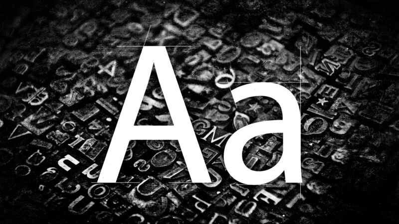

Time(s) for a change: State Department picks a new official typeface
source link: https://arstechnica.com/gaming/2023/01/times-for-a-change-state-department-picks-a-new-official-typeface/
Go to the source link to view the article. You can view the picture content, updated content and better typesetting reading experience. If the link is broken, please click the button below to view the snapshot at that time.

just don't call it a font —
Time(s) for a change: State Department picks a new official typeface
From February, US diplomats and their staff will no longer use Times New Roman.
Jonathan M. Gitlin - 1/18/2023, 11:01 PM

Official correspondence from America's diplomats is getting a bit of a spruce-up next month. From February 6, the US Department of State will adopt Microsoft's sans-serif Calibri in 14-point size "for all paper submitted to the Executive Secretariat," according to The Washington Post's diplomacy reporter John Hudson.
The move sparked a somewhat tendentious discussion in the Ars virtual office earlier today. In the cable, the State Department refers to Times New Roman and Calibri as fonts. But teeeeeeechnically, it should have referred to Times New Roman and Calibri as typefaces. A font, rather, is how you manipulate that typeface—changing the size or weight, the character spacing, or making it italic, for example.
"If we’re being pedantic (AND I AM!), a font is a clade of a typeface, I think? And yes, while switching typefaces might mean you are also switching the style of text you’re using, it’s not a semantically meaningful phrase," said a rather pedantic colleague.
But as a less-pedantic colleague pointed out, "This is one of those glasses pushing up things that people who work with it all ignore on a regular basis."
A third blamed the confusion on early word processors, "which listed different typefaces as 'fonts' and fonts as 'font styles.'"
AdvertisementOther parts of the federal government have previously expressed preferences regarding typefaces. If you're submitting a grant to the National Institutes of Health, for instance, there are some rules and guidelines on how to format that application.
Nothing smaller than 11-point text, no more than 15 characters per linear inch, and no more than six lines per vertical inch are allowed to prevent loquacious investigators from trying to fit a dissertation into an R01. For typefaces, Arial, Georgia, Helvetica, and Palatino Linotype are recommended but not required—our nation's leading biomedical research funding agency is ambivalent about serifs versus sans-serifs, apparently.
Aesthetics were not the primary reason for this change. In The Washington Post, Hudson writes that "[t]he secretary’s decision was motivated by accessibility issues and not aesthetics, said a senior State Department official familiar with the change." Sans-serif typefaces are easier to read than their more baroque relatives, particularly on a screen. Additionally, sans-serif fonts are less likely to create problems for people who need to use optical character recognition and text-to-speech tools.
Calibri is a relatively new typeface, arriving at the turn of the century from Dutch type designer Lucas de Groot. In 2007, it replaced Times New Roman as the default typeface for Microsoft Word in recognition that, going forward, most documents would be read on screens rather than print.
In January, Secretary Antony Blinken directed his staff to find a more accessible typeface, and as the default sans-serif typeface in Microsoft Office, Calibri was obviously appealing. Calibri might not be the default Microsoft Word font forever, though. In 2021 we learned that the company was already searching for replacements.
Recommend
About Joyk
Aggregate valuable and interesting links.
Joyk means Joy of geeK