

Important UX KPIs and how to measure them
source link: https://uxplanet.org/important-ux-kpis-and-how-to-measure-them-cdbddd610870
Go to the source link to view the article. You can view the picture content, updated content and better typesetting reading experience. If the link is broken, please click the button below to view the snapshot at that time.

Important UX KPIs and how to measure them
KPI stands for “key performance indicator.” In the field of user experience (UX), KPIs are metrics that are used to measure the effectiveness of a product or website in meeting the needs and goals of its users. Common UX KPIs include metrics such as user satisfaction, task completion rate, and bounce rate. These metrics can be collected through methods such as surveys, analytics, and user testing. By regularly monitoring and analyzing these KPIs, UX designers can improve the overall usability and effectiveness of a product or website.

cover
Why should you measure UX KPIs?
As more and more companies collect large amounts of data in the 21st century, it’s important to remember that not all data is relevant. As Yuval Noah Harari writes in his book “Homo Deus,” “In ancient times having power meant having access to data. Today having power means knowing what to ignore.” Many organizations rely on metrics such as visitor numbers to evaluate the success of their website, but these metrics do not necessarily indicate real business success. Measuring the right KPIs, such as user satisfaction and conversion rates, can help identify areas for improvement and make data-driven decisions to optimize the user experience. Without continuously tracking these relevant KPIs, it can be challenging to quickly identify issues that may impact conversion rates, such as an increase in form questions on a login page.
When to set up KPI for UX
KPIs for UX should be set up at the beginning of the design process, before the product or website is launched. This allows designers to establish measurable goals and objectives for the product or website, and to continuously monitor and evaluate the user experience throughout the development process.
Some key moments when setting up KPI’s for UX:
- During the research phase
Identify the objectives and goals of the product or website, and the user needs and behaviors that will inform the design. - During the design phase
Set up metrics to measure the effectiveness of the design in meeting the goals and objectives established during the research phase. - During the development phase
Continuously monitor and evaluate the user experience using the metrics established in the design phase, and make any necessary adjustments to the design. - After launch
Continuously monitor and evaluate the user experience using the metrics established in the design phase, and make any necessary adjustments to the design.
It’s important to note that the metrics used to measure the effectiveness of the design should be aligned with the objectives and goals of the product or website, and should be relevant to the users.
What are (UX) KPIs?
KPIs, or key performance indicators, are metrics that quantify the success of a project, department, or company. They provide insight into areas of success and failure by translating success factors into numerical data. These indicators can vary for each project and should be tailored to meet the specific needs of the project.
Sure, we can change the example of Superman to Iron Man and adjust the related KPIs. For example, the KPIs relevant to Iron man could be:
- Number of villains defeated per mission
- Time taken to suit up
- Energy level of arc reactor
Just like before for the sales department of a company, the conversion rate (e.g. 10 customer visits → two contract conclusions) is still highly relevant. UX KPIs differ from other KPIs in that they have the difficult task of translating human behavior, opinions, and feelings into numbers.
UX KPIs differ from other KPIs in that they aim to translate human behavior, opinions, and feelings into numerical data. UX experts distinguish between behavioral and attitudinal UX KPIs. Behavioral UX KPIs focus on what users do, such as task success rate and time-on-task, while attitudinal UX KPIs focus on what users say, such as system usability scale (SUS) and net promoter score (NPS). Other examples of UX KPIs include search vs navigation and user error rate.

Behavioral UX KPIs
Behavioral UX KPIs are numerical measurements of how users interact with and engage with a product. These KPIs can help identify potential issues and track the performance of the design over time. Two examples of behavioral UX KPIs are task success rate and time on task.
Task success rate
Task success rate, also known as task completion rate, is a commonly used metric for measuring user experience. It is calculated by determining the percentage of users who were able to successfully complete a task in a study. This metric helps designers identify usability issues and areas for improvement.
One way to calculate task success rate is by using the following formula:

task success rate formula
Some examples of tasks that can be used to measure user experience include:
- Finding a specific item on a website
- Completing a purchase on an e-commerce platform
- Navigating to a specific page on a mobile app
Measuring the success rate of these tasks, or the percentage of users who were able to complete them, is a straightforward way to gather data on usability and communicate findings to stakeholders. It’s important to keep in mind that the specific context of a project can impact what constitutes a “good” success rate. However, as a general benchmark, studies have shown that a success rate of around 78% is considered good.
Time task
Measuring the time it takes for users to complete a task, known as time on task or task completion time, is an important metric for evaluating the usability of a product. It provides insight into the efficiency of the design and can indicate potential issues such as difficulty finding information or confusion in the user flow.
In general, a shorter time on task is preferred as it suggests a better user experience. However, there may be exceptions to this, such as when the task is meant to keep users engaged and a longer time on task is desired.
Different methods and techniques can be used to measure task time depending on the evaluation method and type of project, but one common method is to calculate the average time spent on each task.

Average time on task formula
For example, if 10 users complete a task, and the total time spent on the task by all 10 users is 300 seconds, the average time on task would be 30 seconds (300 seconds / 10 users = 30 seconds).
When measuring the time spent on a task and identifying a longer duration than expected, it is important to understand the reason behind it. One possible cause could be poor navigation leading users to getting lost in the design. Another reason could be that users did not fully understand the task, in this case rephrasing the task or instructions could improve results. It is crucial to keep in mind the context in which the metric was recorded and consider all possible factors that may have contributed to the longer time spent on the task.
User error rate
The user error rate is a measure of the number of mistakes made by users while performing a task. These mistakes could include clicking on a non-clickable heading, entering incorrect information in a form, or navigating to the wrong page. There are two common ways to calculate the user error rate:
- Average error occurrence rate
This method is used when a task allows for one potential error or multiple error opportunities, but you want to track only one of them. To calculate this, divide the number of errors that occurred by the number of error opportunities.

- Total error rate
This method is used when there are multiple possible errors per task or you want to measure multiple errors. To calculate this, divide the number of errors by the total number of attempts.

A high user error rate can indicate that the design is confusing or misleading, leading to users getting lost or leaving the website. Measuring the user error rate allows you to understand the user’s pain points and improve the overall user experience. According to Jakob’s Law, users have certain expectations for how a website should function based on their experiences on other websites, so it’s important to measure and improve the user error rate.
Search vs navigation
Search and navigation are both important aspects of user experience on a website or application, and therefore, have their own set of KPIs to measure their effectiveness.
For Search:
- Search query rate: measures the percentage of users who use the search bar
- Search success rate: measures the percentage of successful searches, based on the number of users who found what they were looking for
- Time to find: measures the average time it takes for users to find what they are looking for after they submit a search query
- Search abandonment rate: measures the percentage of users who leave the website without finding what they were looking for
For Navigation:
- Navigation click rate: measures the percentage of users who click on the navigation links
- Navigation success rate: measures the percentage of successful navigations, based on the number of users who reached their desired destination
- Time to complete task: measures the average time it takes for users to complete a task after clicking on a navigation link
- Bounce rate: measures the percentage of users who leave the website after only viewing one page.
It’s important to keep in mind that these are general KPIs and the specific ones may vary depending on the goals of the website or application.
Attitudinal UX KPIs
In addition to measuring user behavior on a website or application, it’s also important to gather feedback on the overall user experience. These types of metrics, known as attitudinal UX metrics, provide insight into user satisfaction, perceptions, and opinions about the product. Examples of attitudinal UX metrics include user satisfaction surveys, Net Promoter Score (NPS), and usability testing feedback. These metrics offer a more subjective perspective on the user experience and can provide valuable information for improving the design and overall user satisfaction.
System Usability Scale (SUS)
The System Usability Scale (SUS) is a widely used tool for evaluating the usability of products and services. Developed by John Brooke in 1986, the SUS is a quick and reliable method for measuring usability.
It is a post-test questionnaire that is given to participants after a usability test has been completed. It comprises of ten questions that assess the usability and learnability of a system. Participants are asked to answer each question on a five-point scale, ranging from “strongly agree” to “strongly disagree”. The SUS score is calculated by summing the responses to each question and dividing by the total number of questions. The resulting score provides a measure of overall usability.
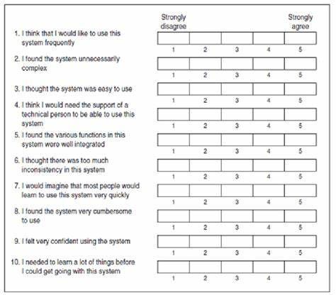
source: https://www.researchgate.net/figure/The-System-Usability-Scale-SUS-questionnaire_fig6_271336759
The System Usability Scale (SUS) is a widely used tool for evaluating the usability of products and services. The following ten questions can be used to create the SUS questionnaire, which should be tailored to the specific product or feature being evaluated:
- I think that I would like to use this system frequently.
- I found the system unnecessarily complex.
- I thought the system was easy to use.
- I think that I would need the support of a technical person to be able to use this system.
- I found the various functions in this system were well integrated.
- I thought there was too much inconsistency in this system.
- I would imagine that most people would learn to use this system very quickly.
- I found the system very cumbersome to use.
- I felt very confident using the system.
- I needed to learn a lot of things before I could get going with this system.
To calculate the SUS score, follow these steps:
- Convert the scale into numbers, for example, “Strongly disagree” corresponds to 1 and “Strongly agree” corresponds to 5.
- For each of the odd-numbered questions, subtract 1 from the score (X).
- For each of the even-numbered questions, subtract their value from 5 (Y).
- Sum all these numbers (X+Y) and multiply by 2.5.
The SUS score ranges from 0 to 100, indicating the perceived usability of a system. Based on research, a SUS score above 68 is considered above average and anything below 68 is considered below average.
Customer Satisfaction Score (CSAT)
The Customer Satisfaction Score (CSAT) is a widely used metric for measuring the level of satisfaction of users with a specific product, feature, user experience, or business as a whole.
CSAT surveys are a flexible and easy to implement tool, that can be used to measure overall experience or focus on specific aspects of the user journey. The survey asks customers a single question such as “How satisfied are you with the product/feature/website?” and allows respondents to rate their satisfaction level on a scale from 1 (very unsatisfied) to 5 (very satisfied).
To calculate the CSAT score, you need to take the number of satisfied customers (those who rated you 4 or 5) divided by the total number of responses, and then multiplied by 100.
By conducting a customer satisfaction survey on a regular basis, you can track the overall user satisfaction and see how customer satisfaction changes in response to changes in the product, such as new features or user experience updates.
How to report UX KPIs
When presenting progress on a key performance indicator (KPI) in a KPI report, it is important to consider the broader context of how design impacts the business. According to the text, as a designer who values the use of data, it is important not to evaluate metrics in isolation, but rather to provide context and meaning to the numbers being reported. To effectively communicate the value of UX KPIs, the report should not only detail the metrics being tracked, but also explain the reasoning behind tracking those specific metrics, any actions being taken to improve them, and how the resulting data contributes to the overall success of the company.
Recommend
About Joyk
Aggregate valuable and interesting links.
Joyk means Joy of geeK