

Design system breakdown: checkbox & radio
source link: https://uxdesign.cc/design-system-breakdown-checkbox-radio-7d8a389b0e85
Go to the source link to view the article. You can view the picture content, updated content and better typesetting reading experience. If the link is broken, please click the button below to view the snapshot at that time.

Design system breakdown: checkbox & radio
Part 2 of a deep dive series on specific design system components
Checkbox and Radio components typically share so much DNA, that when we prioritized them early in Castor’s development, we built them in parallel with a lot of shared research and specs. Here I’ll cover some of the design decisions, and tradeoffs that went into both of these components.
Design goals
We started as we always do, by performing a visual audit of our products containing checkbox and radio controls. We found some common patterns with varying visual implementations that seemed perfect candidates for consolidating into one consistent pattern, while improving accessibility and usability of these controls.
Our goals were:
- Raise the bar for accessibility
- Replace existing custom implementations with a consistent component
Accessibility
Accessibility is often our starting point, our baseline for what we really want to improve. Our audit revealed that many of our existing implementations had touch-areas that were too small, some with low contrast (especially in dark mode), and almost all of them lacked highly visible focus states.
Size & Touch area
With some experimentation, we quickly discovered that checkbox/radio look incredibly, incredibly weird if you make the visible control the size of the touch area (in our case, 48px tall). At that size, they were too easily confused with short-width text inputs when unchecked, and just look comically oversized in the contexts we had when checked, compared to what people are used to.
I do need to shout out the GOV.UK design system and their 40x40 checkboxes though. In their context that’s largely form-filling, and with a general aesthetic that supports it it makes total sense.
Our audited implementations were still way too small though (16x16, 13x13 in some cases), so we played with a few visual variations until we found a size that felt clear, without being overwhelming. We also looked at other design systems, and found large checkboxes were actually very rare. Lightning and Ant Design had really small ones by default, Material was 16x16 with a 40px touch area, and Atlassian had options for sizes all the way up to large, but it scaled strangely, ending up with a 4px thick border at the large size which made the larger sizes feel out of place with other elements.

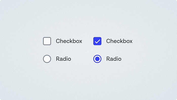
After some experimentation, 22x22 ended up feeling like the sweet spot for the visible control, but we ensured that 48px touch areas would be inherently built into the control.
Visual style
We landed on a decision to make the borders 2px instead of the 1px of our other controls. While less consistent, we felt the results were coherent, and helped people differentiate these controls from other input types a little better. I think the fact that all our icon sets are 2px stroke width helps this feel better than it otherwise might have. The strokes all have minimum 3:1 contrast on our lowest-contrast background, and higher on 90% of the typical surface background colors we use them on.
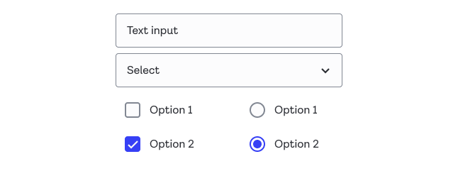
Alignment was an interesting one. Because of the additional padding, the checkboxes end up being indented further than other controls. One thing we considered was removing the left padding if a text label was present, as the additional width given by the label would compensate for the width, but it felt overcomplicated, so we just rolled with the padding as standard.
Focus states
For focus states, we took the same approach we did for buttons, and ensured they were visible on click as well as on keyboard selection. A lot of teams choose to hide focus states on mouse click, but by designing focus states we felt were pleasing to look at regardless of context, there was no reason to do that, which is a small but meaningful usability win.
The extra padding around the outside gave us plenty of room for an external focus indicator, without suffering from the problems I mentioned in the Button breakdown around overlapping or clipped focus indicators. In hindsight, I think the double border approach on the selected radio (not pictured) is a bit weird as you get quite a lot of concentric rings, but it’s clear and visible enough, so we didn’t get too hung up on it. Done is better than perfect and all that.

Building on top of browser default behaviors, we didn’t need to change anything in terms of keyboard navigation or state management. Radio button groups act as a single group that you tab into, with cursor keys changing the option and announcing the new selected state for screen readers.
Variants
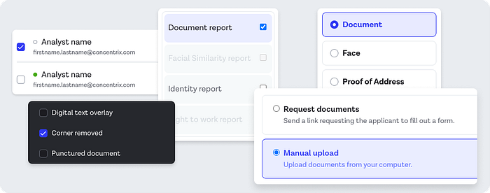
Our audit showed us that these components were being used in a bunch of different contexts, with different content either to the left or the right of them, and a variety of text styles and layouts. For simplicity, we decided not to overstuff the component with all these variations, and decided that a non-label version could just be composed manually with custom content if something non-standard was needed.
The two styles that were used a lot were left aligned, with a single line of standard text (and maybe a longer description), and the same, but with a border framing the individual result. These borders would color the item depending on its selected state, and were used in enough places to make this a worthwhile variant to include.
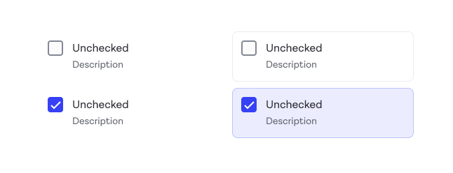
Now this isn’t to say it’s worth your time to include bordered versions, but if you have some pattern that comes up 3–4 times across multiple products, maybe consider supporting it.
Dark mode
Following the decision to have primary buttons/actions be white in Dark mode, as I outlined in the buttons article, we were sort of forced to follow suit with these controls too. The benefit was we had no problems with selected contrast like we did with prior implementations.
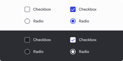
Having said that, the white primary color is a decision we’ve since revisited, and have new designs that use a less saturated shade of blue that contrasts well enough with dark backgrounds, though it’s not released yet.
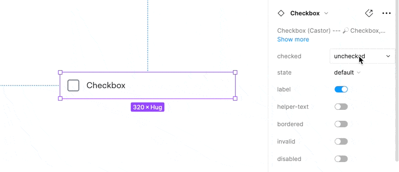
Figma components
Below you can see an example of the final Figma component for Checkbox. Radio is identical except that ‘checked’ is a toggle, as there’s no partial/indeterminate state on Radio’s.
Note: This was built before the latest round of Figma features, so there are a few things I’d architect differently now, such as using text override properties. The text wraps nicely when the width is changed.
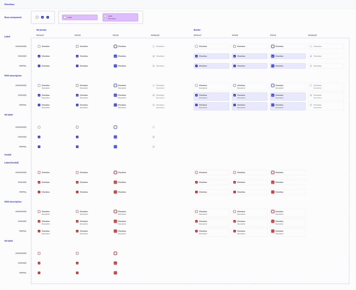
The final variant set for checkbox looks like this:
We successfully got the checkbox component in use across eight of our product codebases (our 3rd most popular component behind Button and Icon), and five products for Radio.
Recommend
About Joyk
Aggregate valuable and interesting links.
Joyk means Joy of geeK