

Don’t do these things on your login page
source link: https://blog.prototypr.io/dont-do-these-things-on-your-login-page-78497189aa01
Go to the source link to view the article. You can view the picture content, updated content and better typesetting reading experience. If the link is broken, please click the button below to view the snapshot at that time.

Don’t do these things on your login page
Login page annoyances that will make me never want log in.
Background
A login page is like a front door of a house. It sets the mood and expectation of how things will go on the inside.
Rickety doorknob? No doormat to wipe your dirty shoes? Or worse, you’re not sure if the doorbell works? All of these little annoyances will lose the trust of your guests, no matter how good that baked ham is.
Similarly, think about the last inadequate experience you had accessing an AirBnB. I’m guessing that first impression lingered, or even remained with you during your entire stay.
So how do we avoid bad first impressions? Reducing any potential annoyances of course. Below are 5 common annoyances I’ve come across over the last year during login.
1. Having no ability to view the password value
I’m not a security expert, so there may be reasons why some sites knowingly decide not to have show/hide password functionality, like 1password. On the other hand, LastPass, Okta and many others do have a Show button so it can be done.
This delighter has turned into table stakes over the past 5 years and is particularly useful on mobile.
Duolingo’s login page on web makes matters worse by putting in the forgot password functionality where the show/hide password functionality usually is.

2. Distracting marketing content
Login is a prerequisite to an infinite amount of tasks in an app. And yet designers have no idea what task a user wants to accomplish at the time of login.
The absence of our intent doesn’t give apps an excuse to spam us with deals or new feature updates. Adding visual noise to a singular-action screen is disruptive and can even come off as desperate.
As an example, Bank of America clutters their mobile login page with credit card deals that I’d probably rather see after I log in.

These deals clearly are not catered to me if they do not (yet) know who I am.
My former employer, LogicManager, unfortunately went a step further and put a chat bot on top of the marketing content.

The login form, marketing content and chat bot all appear at different times, making the whole experience super clunky.
If marketing or project managers HAVE to get the word out on something try to have them leverage the marketing site (website) or onboarding patterns. Yes, harder said than done.
3. Confusing ‘log in’ and ‘login’ copy
For this one, let’s just get to what you need to know:
- “login” is a noun, and will usually take the shape of a compound noun in help docs or description text.
- “log in” is a verb that you should see in buttons.
So the page that users “log in” to can be referred to as a “login” page.
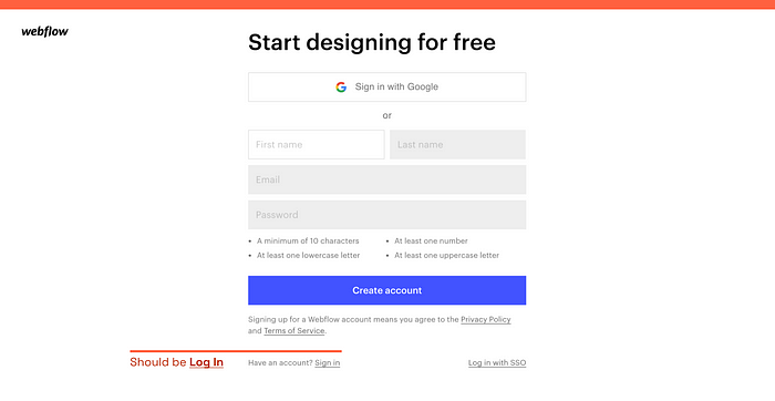
As much as I love the aesthetics of Webflow, the header on their login page is incorrect.
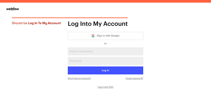
To make matters worse, they use the term “sign in” on connected pages. These similar, but ultimately different, terms add (albeit minor) cognitive load, but (more importantly) can frustrate a product team.
4. Making field widths too small
Some people have long names, and thus long emails. Furthermore, safe passwords are (generally) long. After reading this article I’d say the Email and Password field should accommodate 35+ characters before the field has to scroll.
Wanderu’s field widths aren’t criminally bad, but they aren’t great either.

At the same time, I feel intimidated when the fields are too wide.

It might be unfair to pick on Athletic Knit, an old school apparel company, but it’s a good example 😎
5. Making the password dots too small
I don’t know about you, but I occasionally look at the password dots to confirm if I had made an early mistake. If the dots are super small it becomes quite difficult to discern how many are there. WeWork’s login page has some aspects to admire, but boy are their dots hard to focus on.

Some near misses
Carta’s login page is oh so close, but they have their Terms of Service and Privacy Policy in front of the Log in button.

Since this is a login experience and not a signup experience I think it’s best to put this info below the primary button — only if you actually need it.
I, as with people leveraging screenreaders, may be interested in this info once (if at all), and would never be checking it on every log in.
Recommend
About Joyk
Aggregate valuable and interesting links.
Joyk means Joy of geeK