

Sizing typography in design systems
source link: https://uxdesign.cc/sizing-typography-in-design-systems-1cfc84a81ffe
Go to the source link to view the article. You can view the picture content, updated content and better typesetting reading experience. If the link is broken, please click the button below to view the snapshot at that time.

Sizing typography in design systems
These t-shirts don’t fit.

Photo by Keagan Henman on Unsplash
Depending on the manufacturer, some T-shirts are created bigger or smaller than others. A Large T-Shirt from one company is more like a Medium from another. Therefore, the size on the label is not an accurate gauge of how comfortably the shirt will fit. Sometimes, you have to try the T-Shirt on before you know, and the same is true of typography.
In print, typesetters would define a small set of Headline sizes, such as Large, Medium, and Small, and confidently construct pamphlets, newsletters, and magazines. Because the size of the typography was relative to the static bounds of the paper, T-Shirt sizing worked very well.
However, we are not so fortunate in the age of responsive digital design! Unlike the fixed size of a magazine page, a screen layout changes dynamically with the size of a browser window. Still, the typography must look good and readable at any size the user wants.
T-Shirt Sizing
T-Shirt sizing is the most popular method of defining multiple typography sizes in Design Systems. Sizes like this are familiar to most designers and engineers.
- headline/XL
- headline/L
- headline/M
- headline/S
- headline/XS
Five Headline sizes seem more than enough to handle the job for any imaginable scenario! But is it true? How can we know for sure?
Size is Relative
T-Shirt sizes such as Large, Medium, and Small for typography appear as a reasonable categorization method. However, these concepts quickly break down where responsive layouts are concerned because they are only meaningful in context to their container. To understand the issue, consider the philosophical meaning of Large.
What is ‘Large’?
The Chimelong Ocean Kingdom in Zhuhai, China, holds the Guinness world record for being the largest aquarium in the world. If we were to give it a T-Shirt size as a comparison to other aquariums, we’d need a lot of ‘X’s in front of the ‘L’!
Yet, for one Antarctic Blue Whale, The Chimelong Ocean Kingdom aquarium is a tiny environment indeed, no matter how big the aquarium is compared to others.
Suppose we apply this analogy to typography designed for the web. The size of the headline/XL on a desktop computer monitor works as expected because, like our Blue Whale, it has a veritable ocean of pixels to swim in comfortably.
However, using headline/XL on a mobile phone in portrait mode is similar to placing a Blue Whale inside an unbelievably tiny aquarium. But that’s OK, we say!
With T-Shirt sizing, we substitute all headline/XL with headline/M or headline/S on a mobile phone. Done! Next problem, please!
But was the problem solved? Maybe we only created a new problem we weren’t looking at. From a Systems Thinking perspective, we need to ensure one solution doesn’t create another problem in a different area.
All Truths Come From a Certain Perspective
“You’re going to find that many of the truths we cling to depend greatly on our own point of view.” — Obi-Wan Kenobi
T-Shirt typography sizing is typically created from a web-centric point of view (assuming 1400px or greater viewport width). When a mobile designer adopts a typography system designed for the web, the designer must transpose all Headlines downwards to fit their environment.
For instance, if mobile needs the Headline to appear as Extra Large, the designer must remember to choose headline/M. Likewise, the mobile designer must remember to select headline/S so it appears Medium on a 340px wide viewport, and so on. This mental re-mapping is not only unintuitive, it’s also inconsistent and error-prone. But the problem doesn’t end there.
Consider web headlines that span half, 1/4th, or even 1/8th of the viewport width. Which one is Headline/L or Headline/M? How do we communicate these decisions to a larger team if consistency is important?
Our goal as Design Systems professionals is to create Intuitive, Consistent, and Scalable names. Therefore, we should aspire to create a better solution than T-Shirt sizing alone can provide.
Column sized typography
Underneath every good design lies invisible elements that form the structure of the overall product. We call this a grid system. Designers have been using grids for hundreds of years to create manuscripts, books, magazines, newsletters, and brochures with visually pleasing effects.
To accomplish the same in a digitally responsive world, we need to understand specific boundary layers to put the system into universal and practical use. This means knowing all the use cases today and every likely use case in the future.
Think Small, Think Big, Think Edges.
Think Small
There are many ways to define grids. Despite differences, all grids obey a relatively constant minimum space that typographic elements need to be readable, specifically for body copy.
The Rule of LIDS is a handy method to discover your designs’ minimum width constant. If you’ve never heard of it, that’s OK. I only recognized it as I was writing this article.
Take the smallest body copy the design allows and type the first four words of Lorem ipsum, or “Lorem ipsum dolor sit,” on a single line. That is the minimum space constant for column pairs. — The Rule of LIDS.
If the smallest body copy of your product is 14px Times, we see the text ‘Lorem ipsum dolor sit’, will wrap at 100px and 120px wide, but at 140px, all four words fit comfortably on a single line. It’s preferable to give a +/- 10px tolerance because this constant will flex at mobile sizes.

Having found the constant minimum width for our smallest body typography, we create column pairs that define that space.

Times, Helvetica, and Futura using 14px body copy
Using a column pair (two columns instead of one) is essential for the ability to span three columns, a common layout treatment when images are placed to the left or right of headlines.

The Rule of LIDS applies for Headlines, but only “Lorem ipsum dolor” needs to fit a single line (not ‘sit’). Headlines need to be bigger than the body copy, or they don’t look like Headlines.
Decisions on the constant minimum width can have dramatic effects on how many columns you can fit into specific screen sizes. All viewports need to be considered.
However, it’s helpful to understand that everything is interrelated, from the smallest elements to the largest. This creates visual continuity, which is essential for good design.
Think Big
Now that we’ve considered the smallest things possible, we can examine everything from the other end of the spectrum. The biggest!
Starting with five sizes of headlines (XL, L, M, S, XS) appeared reasonable. However, we didn’t know if those definitions were too many or too few and how we might know the difference.
With a constant minimum width of 140px, 16 columns fit nicely within a 1400px viewport. Using a column-based approach, we find nine headline sizes are able to handle any layout conceivable, which is considerably more than our assumed five.
16 Column
Viewport width 1296px — 976px (flex margin). Nine headline sizes.

Using nine T-Shirts is awkward and confusing. The 16col treatment would be named headline/XXXL and the 2col headline/XXXS. However, naming the typography relationally to its number of columns is far more intuitive.
- headline/16col
- headline/14col
- headline/12col
- headline/10col
- headline/8col
- headline/6col
- headline/4col
- headline/3col
- headline/2col
This naming convention considers every Headline to be ‘regular’ within the context of a defined number of columns and is effortless to communicate which Headline is correct for any layout.
Simply put, if the bounding box of the Headline spans X number of columns, that is the correct one to use!
Breakpoints
A breakpoint is the range of predetermined screen sizes that have specific layout requirements. With column-based typography, we simply remove columns and reflow our content to best fit. Here are 12, 10, 8, 6, and 4-column treatments for your consideration.
With 16 Columns, we found nine different sizes for Headlines were possible, but this number shrinks dramatically with fewer columns available given discreet breakpoints.
12 Column
Viewport width 1296px - 976px (160px margins). Seven headline sizes.

10 Column
Viewport width 976px — 816px (80 max margin). Six headline sizes.

8 Column
Viewport width 816px — 656px (80 max margin). Five headline sizes.

6 Column
Viewport width 656px — 496px (80 max margin). Four headline sizes.

4 Column
Viewport width <496px (18 max margin). Three headline sizes.

The 4 Column is specific to handle phone size in portrait mode. This system is the only layout that flexes the column widths. Therefore, our column-paired constant minimum width changes, but not as much as you think.
Because the constant minimum width difference is relatively close (A 320px wide viewport has a column pair of 132px whereas a 430px wide column pair is 187px, which is a difference of 55px), typography flows (mostly) as expected.

Even the smallest phone column pair width is 8px smaller than our originally defined minimum constant of 140px, which is within the tolerance of The Rule of LIDS.
Think Edges
We’ve defined a universal set of sizes for Headlines for web and mobile with one simple rule.
Always use the headline/[X]col that matches the number of columns its bounding box spans, and you’ll have the right size!
Does this system work in a real-world design environment? Let’s examine a layout on mobile by strictly interpreting the rules of headline/4col and headline/3col.
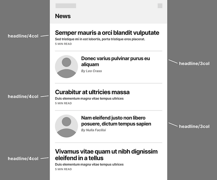
This works well on a webpage with six or more columns, but I have concerns about the mobile portrait view.
When we have a single vertical row on a mobile phone, the headline/4col is too prominent compared to the headline/3col, which gives the appearance that articles set to headline/4col are more important. This is notthe visual communication we want.
We need a way to fine-tune headline sizes and keep our rules simple. The most flexible way to do this is by introducing /regular and /small to our column-based typography.

Design is a soft science, yet this treatment is more visually pleasing to me. All headlines have the same level of importance. To achieve this result at scale, we need to introduce straightforward rules, so everyone is confident using them.
- Always use the headline/[X]col that best matches the number of columns its bounding box spans.
- Always use the /regular variant unless otherwise specified...
- a) On mobile (4col) table views, when any row could use headline/3col/regular, then every headline/4col uses the headline/4col/small variant to appear with the same visual weight.
Not bad! Only three rules and a single exception that mobile needs to consider. This is simple and understandable!
Applying game design logic to your design system, discusses the importance of constructing your Design System as you would create a game. Another way to consider this is to imagine a dial containing two knobs. The outer dial is for big adjustments (2col, 3col, 4col, etc.), and the inner dial is for fine adjustments (normal, small, large).

Fine adjustment variants are rarely used and default to Normal most of the time, but in the case of mobile portrait view, adding Small and defining its use is worth the extra definition (IMHO).
Likewise, adding Large allows the designer to communicate something is more important, such as the main article on the front page. This variant is not immediately necessary, but it’s good to know if the need presents itself and it’s easily added. That is the flexibility we are looking for.
Because headline/3col/regular and headline/4col/small are identical, some may be concerned they are redundant. They might consider changing the rules to optimize typography to the fewest choices possible, and it is tempting! But resist the urge to optimize no matter how compelling. Certainly, not now.
Premature Optimization
Donald Knuth believed that programmers attempting to create efficiencies too early in the process was the ‘root of all evil’.
“The real problem is that programmers have spent far too much time worrying about efficiency in the wrong places and at the wrong times; premature optimization is the root of all evil...” Donald Knuth, The Art of Computer Programming
Counterintuitively, embracing inefficiency delivers flexibility.
For instance, creating designs directly in code is very efficient. But it only takes a simple change to require everything to be recoded from scratch (the root of all evil). Design tools such as Figma are inherently inefficient (design first, then code), but their value is they are infinitely flexible. When the design is approved, then programmers need only code it once.
Optimizing typography at this point would be like pouring concrete paths without studying how foot traffic naturally flows. We shouldn’t be surprised to see desire paths popping up, which makes the Design System far less systemic.
From a Design System perspective, there are few things more terrifying than the need for ‘just one more size’ between a T-Shirt sized Medium and Large when the system has already been paved.
Summary
We’ve covered a lot of ground! I hope Design Systems Professionals find Column-Based typography makes naming easier. Here are some points to keep in mind.
- T-Shirt sizing works well for typography when the design is relative to static boundaries, but responsive web design makes definitions much more challenging.
- Concepts such as Large, Medium, and Small are only meaningful in the context of the object's container.
- The Rule of LIDS is a method to discover your designs’ minimum width constant, which expresses the width of two columns.
- Naming typography by the number of columns it spans (its container) is a more intuitive and scalable solution. headline/2col/, headline/3col/, headline/4col/, headline/6col/, etc.
- Adding variants such as /normal, /small, /large to any column-based typography allows us more flexibility than T-Shirt sizing alone can provide.
- Give yourself flexibility by embracing inefficiency. Don’t optimize typography until you see the entire picture from every angle, then trim away the excess!
Column-based typography is helpful for classifications of typography such as Headlines, Subheadlines, Body, Ledes, Pull-Quotes, and others. Any typography bounded horizontally and wraps vertically can benefit from this naming convention.
Edge cases
It’s important to note not all typographic categories define up to 16col treatments as Headlines might. For instance, Body needs only two or three definitions maximum, most likely breaking on the 2col and 6col with the rule saying always use the closest column number available, but never a higher one.
Also, dividing Body into /normal, /small, /large variants as we did with Headlines would not be nearly as helpful! Consider the concept of /default, /bold, /italic, /bold_italic, which covers the unique treatments of that category.
Using the previous rule, body/2col/italic can be used on 2col, 3col, 4col, or 5col, but switches to body/6col/italic for 6col and above. However, if we found it necessary to have two sizes of Body in the same layout, then our definitions would look more like this…
- body/2col/normal/[default, bold, italic, bold_italic]
- body/2col/large/[default, bold, italic, bold_italic]
- body/6col/normal/[default, bold, italic, bold_italic]
- body/6col/large/[default, bold, italic, bold_italic]
It may seem like a lot, but fonts offer far more weights than what we’ve defined here. Using Column-based typography, we create a far richer environment to adapt to change.
Further considerations
Some classifications of typography do not work well with column-based definitions. Consider Titles, Sub-Titles, and Labels.
Unlike Headlines, these treatments are bounded by a vertical constraint. In other words, they are unique because they are designed to be contained within a single row.
Consider Labels beneath icons in tab bars or inside buttons and Titles within a Navigation bar. Ideally, all rest on a single line and never wrap on the vertical. Body should not be used in these cases, even if the font size is identical, because the leading needs to be much smaller in that rare case where a wrap is needed.
Broadly speaking, all vertically constrained typography is considered System fonts, where T-Shirt sizing would be better suited. Brand fonts are horizontally constrained typography such as Headlines, Subheadlines, Body, Ledes, and Pull-Quotes and are best defined by the columns they occupy.
Additional Reading
Recommend
About Joyk
Aggregate valuable and interesting links.
Joyk means Joy of geeK