

Yogdaan: a solution for modern day donations
source link: https://uxplanet.org/yogdaan-a-solution-for-modern-day-donations-dde417898759
Go to the source link to view the article. You can view the picture content, updated content and better typesetting reading experience. If the link is broken, please click the button below to view the snapshot at that time.

Yogdaan: a solution for modern day donations

- Hey folks, the stance on donation is very personal and moral. Everyone has their own moral compass they abide by. One fact that we cannot disagree on is that unfortunately, some of us have it better off than the others as a society in general.
- This particular case study is about the breakdown of my design solution for a product application that assists users in donating resources to charities.
- The main reason behind working on this project was the underlying motivation that I had. Having closely worked with India on a campaign in Pune I realized a lot of gaps in the donation space that could be optimized for both he users and the beneficiaries.

- I attempted to solve the problem for donating as per convenience from a users point of view.
- I set the objective to design a solution that benefits the local NGOs and charities as well in terms of both resources and discoverability.
- To bridge the gap between the user donating and the beneficiary I designed a delivery mode option within the app. Thus a user can either go and donate in person or have a pick-up arranged that would deliver their donation to the respective charity.
If I had to talk about my design process for the entire project I would start at a zoomed out level and present you with an overview.

Let’s dive into the breakdown of this project now…
Research and analysis
- It is evidently so important to know the metrics and behind the scenes of what you are trying the accomplish vs what is the on ground reality of the problem you are trying to solve.


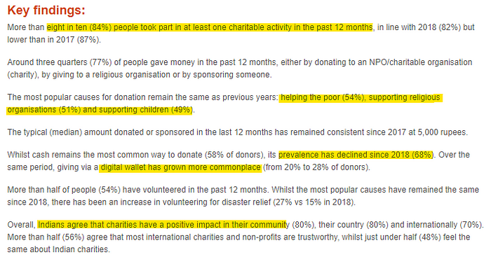
- These articles and data points that I gained from a preliminary level of research helped formulate the direction I wanted to base the rest of my research in.
- I covered users that fit the market gap for an app that would make donation convenient for them. I worked towards finding their various pain points or the inconvenience that they face while going through the process of donating out of their own goodwill.
- I prepared a survey form and distributed it to a set of users to gain insights from their collective responses:

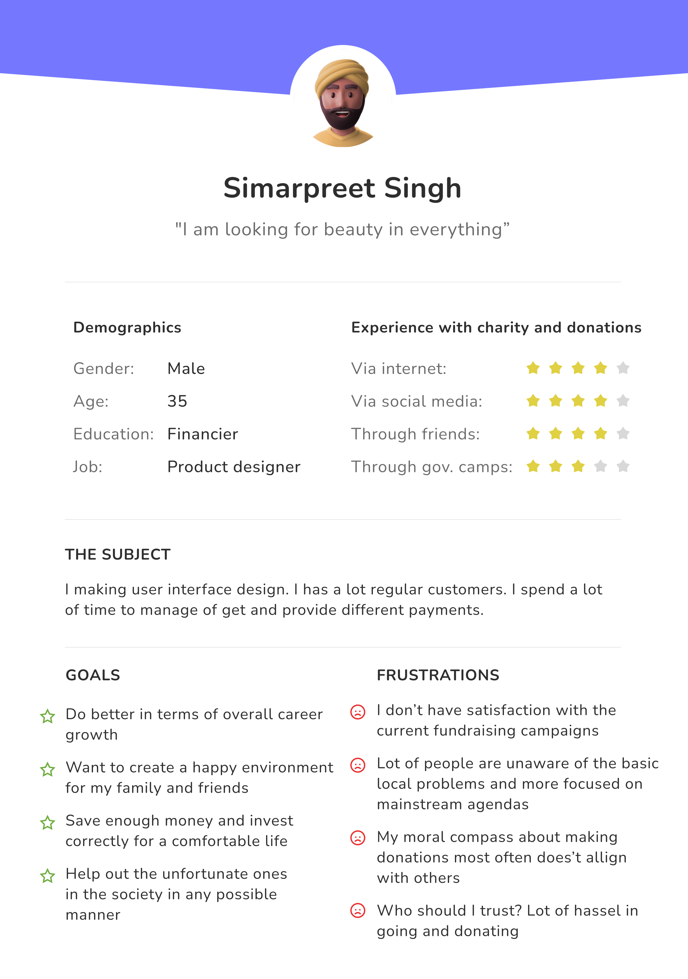
- Based on the primary and secondary research I decided to formulate User personas that would summarize the pain points that I need to cover while designing a solution.
- I came up with three user personas from different age groups within the potential user audience.


- Formulating mood board and running an inspiration drive on the internet for apps and projects that solve this problem or work in a close space to donation and crowdfunding.
- This was helpful in getting closer to the problem statement as I got an idea about how people have already attempted to design a solution.
- Two main apps that cut this category in the same space are ShareThemeal and Milaap, on whom I did a comparative analysis.
- There were a lot of fundraising platforms as well that I drew inspirations from like Ketto, ImpactGuru, Make a wish, etc.
Information architecture for the project

- Setting up the I.A. for the project was an important stop to get a clear picture about the sections that the app can operate with.
- How these sections are linked and connected basically forms the mental model on how to layout various pieces of structured data together, such that it makes sense to the user.
- I.A. helped me to interact logically with the idea of a solution that I wanted to design for the user.
User journey/flow
- Having empathy for the user is a key essence of designing an experience. Once the Information architecture is laid out for the project it helps in mapping the user journey.
- User journey or flow is a typical presentation of how a user is expected to interact with the app and within the sections of the app.


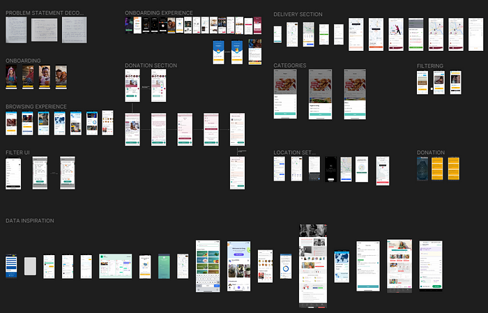
Wireframing
- This process helped me to brainstorm some ideas quickly as to how the visuals of the app would fit within the constraints of the data that I need to focus on.
- Here are some low-fi pen and paper wireframes that got me going.

- These rough low-fidelity wireframes acted as a reference for me when I started designing in figma and placing elements according to these blueprints was way easier rather than a blank canvas.
- Next, I designed some hi-fidelity wireframes that which was helpful to clearly distinguish a user flow from one section to another.
- It was helpful to assign specific data to a particular screen after seeing the reference wireframe ready for it.


- I used the miro app for creating these wireframes, it provides a quick drag and drop elements for easy and fast approach towards wireframing for design projects.
Visual design breakdown
Some key highlights from the process of visual designing were as follows-
* Setting up the brand guidelines🤔

- To start the exploration and collecting inspiration for the visuals of the project having certain parameters in research is a good way to go forward and sort things out.
* Selecting a color style guide 🌈

- After visualizing what the user might perceive in the sense of colors it is important to establish a good balance between the typography and the resulting visuals, one element should not overshadow the other.
* Typography for the project📝

- After establishing such systems it was time to ideate towards the logo for the project such that it covers these guidelines and conveys the message in a subtle manner.
* Logo ideas with various iterations👀

- The box shape is a primary reminder to the concept of donation by the choice and convenience of the user, It has a hint of “Y” shaped as a heart as well to evoke emotion of empathy.

- To pair the logo design with a suitable text type was my initial instinct, I experimented with fonts like “Lateef”, “Fredeko”, “Nunito” but as my iterations took place it lead to me combining the whole logo as a text infused with design instead of a separate text field.
Iterations and feedback loops
- I designed several versions of designs for each flow iterating at every step to improve the final outcome working along with all the feedback.
- I will give a breakdown of various sections of the app and the iterations I made to arrive at the final screen.
Onboarding section iterations✈️

- Feedback that helped me think through these iterations:
- Sometimes when designing for a professional and a serious mood illustrations should not be considered for the onboarding presentation, think about the age bracket of the users that are going to be using this.
- Design an onboarding experience such that the user is just the right amount of curious and aware about how the app is supposed to function.
- Think of ways to save time and effort for the user.
Final design flow for onboarding the user✈️


Iterations of the home screen on the app🏠

- Feedbacks that helped me think through these iterations:
- Support data with evident visuals so that the user can build some context about the charity.
- The categories need to be visually perceived as clickable and made cause specific.
- The cards for the donation need to have more breathing space for the content inside them.
- Some visuals that should add value to the message of helping these charity and convince users to make a donation.
Final design for the home screen 🏠


Iterations for the browsing/discover section of the app🔎

- Feedbacks that helped me think through these iterations:
- If the user is exploring then the design should be less confusing because any friction while browsing will cause a bad after effect on the UX of the app.
- The filtering options should have equal balanced contrast and only the selected category must stand out.
- Does the design really need cards in the discover section? Does the user needs to see a CTA of donate now so early?
- The options in the discover section should not look monotonous and don’t make the CTA repetitive.
Final design of the discover section🔎


Iterations for the screen to display charity information 📃


- Feedbacks that helped me think through these iterations:
- The profiles of the trustee and the founder should look aligned with the entire design and should not disturb the visual hierarchy.
- Title of the charity on the images does not stand out to the user.
- There should be more user-friendly CTAs try limiting the number and make a clear indication.
- If the requirements listed not clickable then the user should not be mislead by the visuals.
- No one will expect to scan their eyes horizontally in a chat support system, try something that maintains the overall flow of the conversation style design.
Final design for the charity profile screen📃


Iterations for the add items for donation and review items + select mode of delivery screens🧺

- Feedbacks that helped me think through these iterations:
- The user should have limited options to go through when adding items the approach to categorize everything will add friction to the flow.
- The add button should be aligned visually and should feel like a part of the component rather than standing out.
- Clearly indicate the primary CTA from the secondary CTA so that the user is not distracted.
- Add distinct sections so that the users are aware about the decision that they have to make.
- The modes of delivery should stand out and look visually clickable, think of ways to make the user easily go through the flow of adding the items for donation and then making a choice of how to deliver.
Final designs for the screens🧺


Iterations for the pick up flow section🚚

- Feedbacks that helped me think through these iterations:
- The user should feel motivated to fill in the address and there should be minimal friction.
- The delivery option cards should stand out as primary CTA and should feel clickable.
- Do not overload the user with a lot of decisions and tasks on a single screen this would create a bad user experience.
Final designs for the pick up section🚚


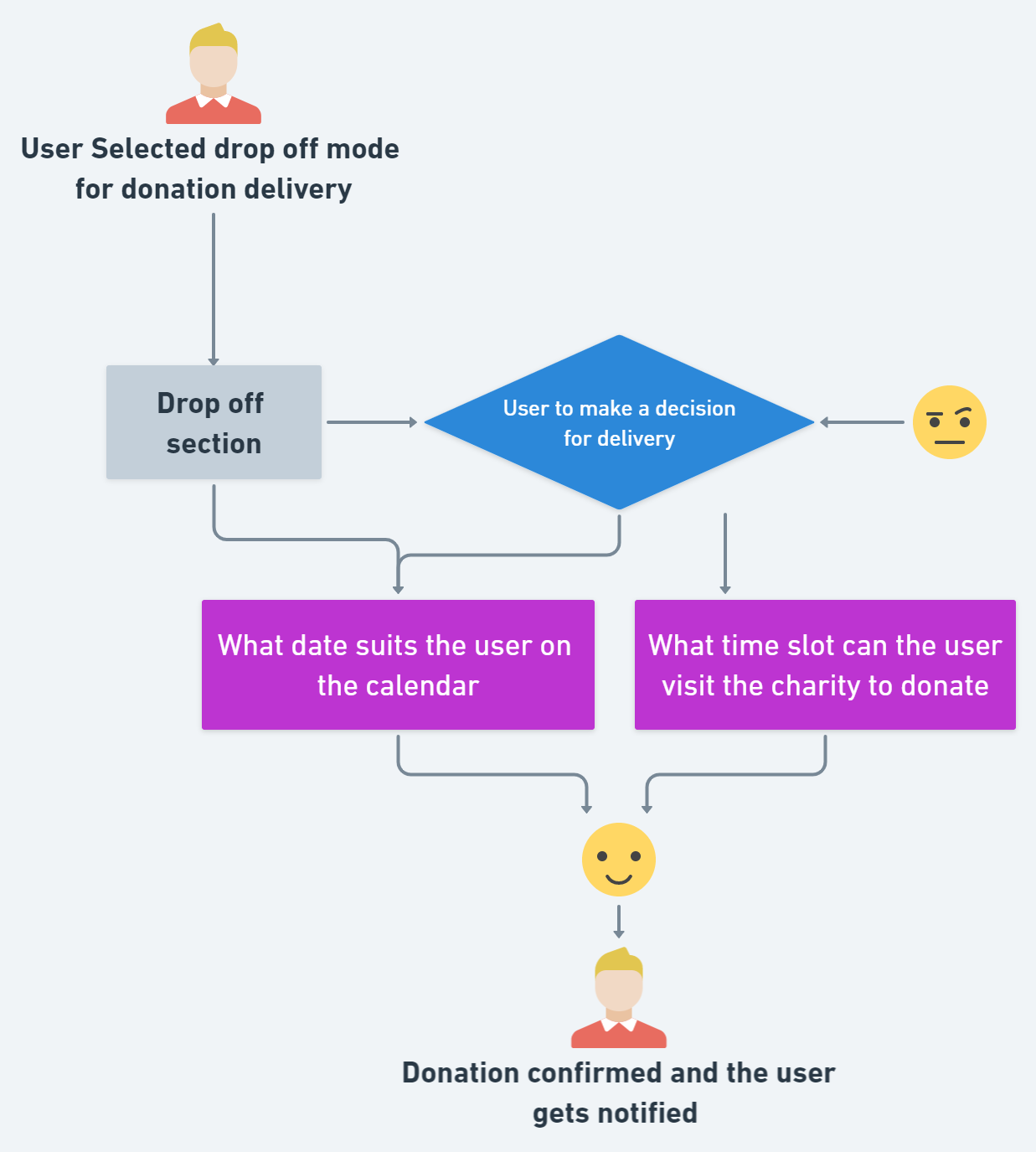
Iterations for the drop off flow section🗓️

- Feedbacks that helped me think through these iterations:
- Make the experience as simple as possible, the user should be accustomed to the booking flow, just like scheduling any other appointment.
- The receipt styled UI wont work, it gives more of a shopping experience perception.
- The user should have the option to edit the date and time at their convenience. Important data points that are valid should be mentioned.
Final designs for the drop off section🗓️


Some more screens for certain edge cases👀


Conclusions and learnings from the project🤔
- At every step of the process of designing the solution try to empathize with the users. It always helps to zoom out and redefine the problem statement.
- Keep the tasks as simplified as possible for the user, the aim is to have a simple interaction with the product that gets the job done.
- Feedbacks help in the process of iterations and helps in gaining perspective about design.
- A shoutout📢 to the whole ecosystem of 10k designers built by and my mentors who played a crucial role in helping me get this project to the finish line , and .
- If you have a project in mind where I could contribute or collaborate with your vision feel free to reach out to me🐣
- Find me on twitter 🐤
- Lets connect on linkedin 🧑💻
- Design portfolio📂
Recommend
About Joyk
Aggregate valuable and interesting links.
Joyk means Joy of geeK