

基于K-means聚类算法进行客户人群分析 - 华为云开发者联盟
source link: https://www.cnblogs.com/huaweiyun/p/17002696.html
Go to the source link to view the article. You can view the picture content, updated content and better typesetting reading experience. If the link is broken, please click the button below to view the snapshot at that time.

摘要:在本案例中,我们使用人工智能技术的聚类算法去分析超市购物中心客户的一些基本数据,把客户分成不同的群体,供营销团队参考并相应地制定营销策略。
本文分享自华为云社区《基于K-means聚类算法进行客户人群分析》,作者:HWCloudAI 。
- 掌握如何通过机器学习算法进行用户群体分析;
- 掌握如何使用pandas载入、查阅数据;
- 掌握如何调节K-means算法的参数,来控制不同的聚类中心。
案例内容介绍
在本案例中,我们使用人工智能技术的聚类算法去分析超市购物中心客户的一些基本数据,把客户分成不同的群体,供营销团队参考并相应地制定营销策略。
俗话说,“物以类聚,人以群分”,聚类算法其实就是将一些具有相同内在规律或属性的样本划分到一个类别中,算法的更多理论知识可参考此视频。
我们使用的数据集是超市用户会员卡的基本数据以及根据购物行为得出的消费指数,总共有5个字段,解释如下:
- CustomerID:客户ID
- Gender:性别
- Age:年龄
- Annual Income (k$):年收入
- Spending Score (1-100):消费指数
- 如果你是第一次使用 JupyterLab,请查看《ModelAtrs JupyterLab使用指导》了解使用方法;
- 如果你在使用 JupyterLab 过程中碰到报错,请参考《ModelAtrs JupyterLab常见问题解决办法》尝试解决问题。
1. 准备源代码和数据
这步准备案例所需的源代码和数据,相关资源已经保存在OBS中,我们通过ModelArts SDK将资源下载到本地,并解压到当前目录下。解压后,当前目录包含data和src两个目录,分别存有数据集和源代码。
import os
from modelarts.session import Session
if not os.path.exists('kmeans_customer_segmentation'):
    session = Session()
 session.download_data(bucket_path='modelarts-labs-bj4-v2/course/ai_in_action/2021/machine_learning/kmeans_customer_segmentation/kmeans_customer_segmentation.zip',
                         path='./kmeans_customer_segmentation.zip')
 # 使用tar命令解压资源包
 os.system('unzip ./kmeans_customer_segmentation.zip')
Successfully download file modelarts-labs-bj4/course/ai_in_action/2021/machine_learning/kmeans_customer_segmentation/kmeans_customer_segmentation.zip from OBS to local ./kmeans_customer_segmentation.zip
2. 导入工具库
matplotlib和seaborn是Python绘图工具,pandas和numpy是矩阵运算工具。
此段代码只是引入Python包,无回显(代码执行输出)。
!pip install numpy==1.16.0
import numpy as np # linear algebra
import pandas as pd # data processing, CSV file I/O (e.g. pd.read_csv)
import matplotlib.pyplot as plt
import seaborn as sns
from sklearn.cluster import KMeans
import warnings
import os
warnings.filterwarnings("ignore")
Requirement already satisfied: numpy==1.16.0 in /home/ma-user/anaconda3/envs/XGBoost-Sklearn/lib/python3.6/site-packages
[33mYou are using pip version 9.0.1, however version 21.1.3 is available.
You should consider upgrading via the 'pip install --upgrade pip' command.[0m
3. 数据读取
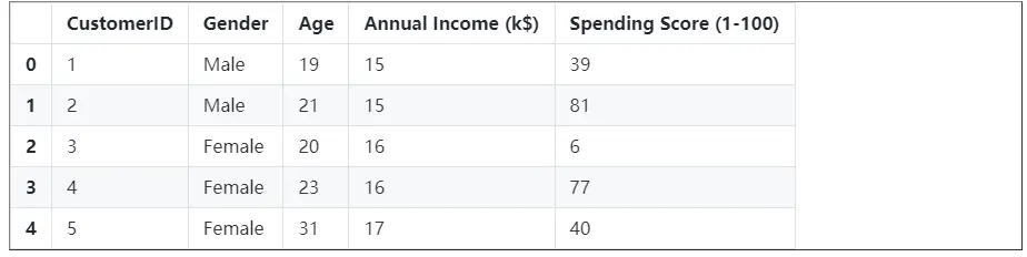
使用pandas.read_excel(filepath)方法读取notebook中的数据文件。
- filepath:数据文件路径
df = pd.read_csv('./kmeans_customer_segmentation/data/Mall_Customers.csv')4. 展示样本数据
执行这段代码可以看到数据集的5个样本数据
df.head()<style scoped> .dataframe tbody tr th:only-of-type { vertical-align: middle; }
.dataframe tbody tr th {
    vertical-align: top;
}
.dataframe thead th {
    text-align: right;
}
</style>
执行这段代码可以看到数据集的维度
df.shape
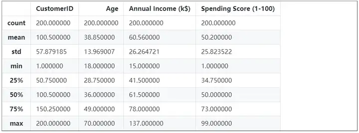
(200, 5)5. 展示各个字段的统计值信息
调用pandas.DataFrame.describe方法,可以看到各个特征的统计信息,包括样本数、均值、标准差、最小值、1/4分位数、1/2分位数、3/4分位数和最大值。
df.describe()<style scoped> .dataframe tbody tr th:only-of-type { vertical-align: middle; }
.dataframe tbody tr th {
    vertical-align: top;
}
.dataframe thead th {
    text-align: right;
}
</style>
6. 展示各个字段的数据类型
pandas.DataFrame.dtypes()方法可以展示各个字段的类型信息。
可以看到每个字段的类型信息。
df.dtypes
CustomerID                 int64
Gender                    object
Age                        int64
Annual Income (k$)       int64
Spending Score (1-100)     int64
dtype: object
查看是否有数据缺失,如果有,则需要填补。
实验中使用的这份数据很完善,没有任何一个属性的值为null,因此统计下来,null值的数量都是0
df.isnull().sum()
CustomerID 0
Gender                    0
Age                       0
Annual Income (k$) 0
Spending Score (1-100) 0
dtype: int64
7. 展示主要属性的数量分布
这段代码使用matplotlib绘制了数据中三个主要属性的统计直方图,包含年龄、收入、消费指数。
可以看到三张统计直方图,形状都与正态分布类似,说明数据量足够,数据抽样的分布也比较理想。
plt.style.use('fivethirtyeight')
plt.figure(1 , figsize = (15 , 6))
n = 0
for x in ['Age' , 'Annual Income (k$)' , 'Spending Score (1-100)']:
    n += 1
 plt.subplot(1 , 3 , n)
 plt.subplots_adjust(hspace =0.5 , wspace = 0.5)
 sns.distplot(df[x] , bins = 20)
 plt.title('Distplot of {}'.format(x))
plt.show()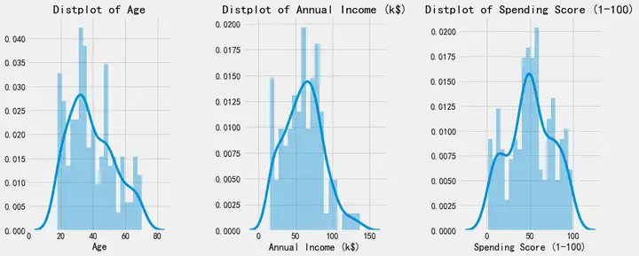
8. 展示男、女客户数量的分布
这段代码使用matplotlib绘制条状图,展示男、女样本数量的分布。
可以看到一张条状图。
plt.figure(1 , figsize = (15 , 5))
sns.countplot(y = 'Gender' , data = df)
plt.show()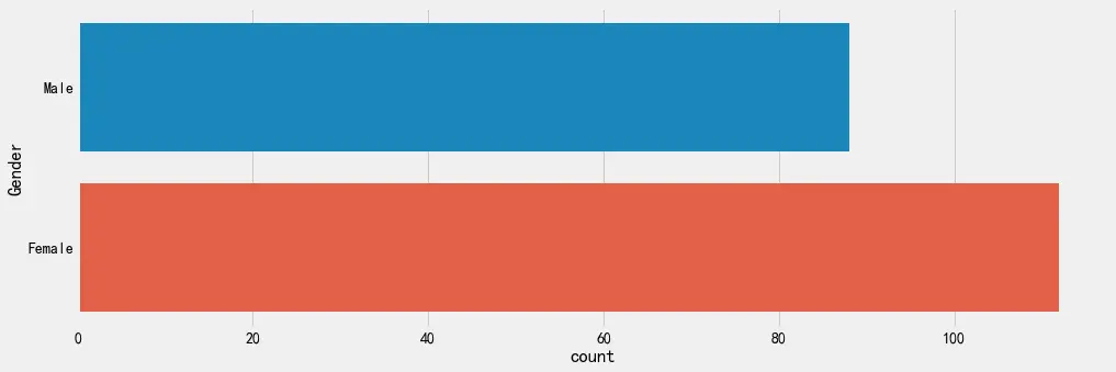
9. 观察不同属性之间的关系
展示任意两个属性之间的统计关系图。
此段代码执行后,会有9张统计图,展示了任意两个属性之间的统计关系。
plt.figure(1 , figsize = (15 , 7))
n = 0
for x in ['Age' , 'Annual Income (k$)' , 'Spending Score (1-100)']:
 for y in ['Age' , 'Annual Income (k$)' , 'Spending Score (1-100)']:
        n += 1
 plt.subplot(3 , 3 , n)
 plt.subplots_adjust(hspace = 0.5 , wspace = 0.5)
 sns.regplot(x = x , y = y , data = df)
 plt.ylabel(y.split()[0]+' '+y.split()[1] if len(y.split()) > 1 else y )
plt.show()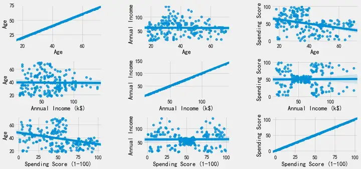
此段代码执行后,会有1张统计图,以性别为参照,展示了年龄和收入之间的对应统计关系
plt.figure(1 , figsize = (15 , 6))
for gender in ['Male' , 'Female']:
 plt.scatter(x = 'Age' , y = 'Annual Income (k$)' , data = df[df['Gender'] == gender] ,
                s = 200 , alpha = 0.5 , label = gender)
plt.xlabel('Age'), plt.ylabel('Annual Income (k$)')
plt.title('Age vs Annual Income w.r.t Gender')
plt.legend()
plt.show()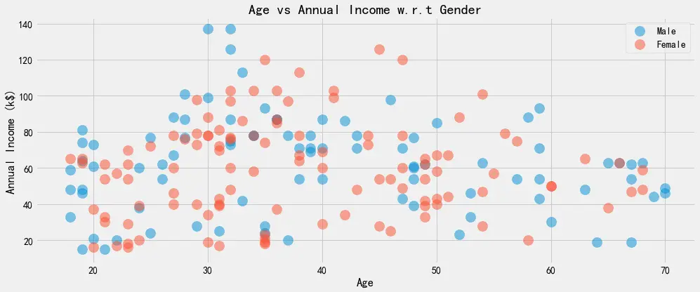
此段代码执行后,会有1张统计图,以性别为参照,展示了收入和消费指数之间的对应统计关系
plt.figure(1 , figsize = (15 , 6))
for gender in ['Male' , 'Female']:
 plt.scatter(x = 'Annual Income (k$)',y = 'Spending Score (1-100)' ,
                data = df[df['Gender'] == gender] ,s = 200 , alpha = 0.5 , label = gender)
plt.xlabel('Annual Income (k$)'), plt.ylabel('Spending Score (1-100)')
plt.title('Annual Income vs Spending Score w.r.t Gender')
plt.legend()
plt.show()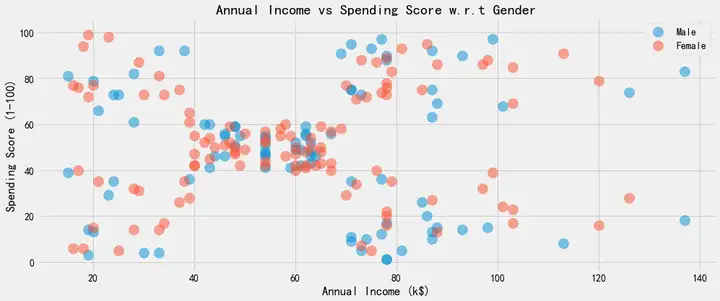
10. 观察不同性别的客户的数据分布
观察不同性别的客户的数据,在年龄、年收入、消费指数上的分布。
此段代码执行后,会有六幅boxplot图像。
plt.figure(1 , figsize = (15 , 7))
n = 0
for cols in ['Age' , 'Annual Income (k$)' , 'Spending Score (1-100)']:
    n += 1
 plt.subplot(1 , 3 , n)
 plt.subplots_adjust(hspace = 0.5 , wspace = 0.5)
 sns.violinplot(x = cols , y = 'Gender' , data = df, palette='Blues')
 sns.swarmplot(x = cols , y = 'Gender' , data = df)
 plt.ylabel('Gender' if n == 1 else '')
 plt.title('Boxplots & Swarmplots' if n == 2 else '')
plt.show()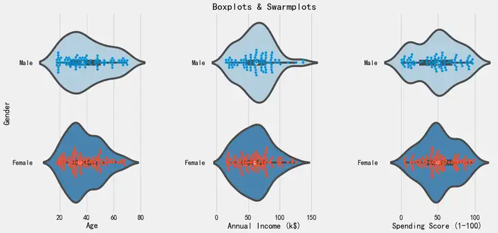
11. 使用 K-means 对数据进行聚类
根据年龄和消费指数进行聚类和区分客户。
我们使用1-10个聚类中心进行聚类。(此段代码无输出)
'''Age and spending Score'''
X1 = df[['Age' , 'Spending Score (1-100)']].iloc[: , :].values
inertia = []
for n in range(1 , 11):
    algorithm = (KMeans(n_clusters = n ,init='k-means++', n_init = 10 ,max_iter=300,
 tol=0.0001, random_state= 111 , algorithm='elkan') )
 algorithm.fit(X1)
 inertia.append(algorithm.inertia_)
观察10次聚类的inertias,并以如下折线图进行统计。
inertias是K-Means模型对象的属性,它作为没有真实分类结果标签下的非监督式评估指标。表示样本到最近的聚类中心的距离总和。值越小越好,越小表示样本在类间的分布越集中。
可以看到,当聚类中心大于等于4之后,inertias的变化幅度显著缩小了。
plt.figure(1 , figsize = (15 ,6))
plt.plot(np.arange(1 , 11) , inertia , 'o')
plt.plot(np.arange(1 , 11) , inertia , '-' , alpha = 0.5)
plt.xlabel('Number of Clusters') , plt.ylabel('Inertia')
plt.show()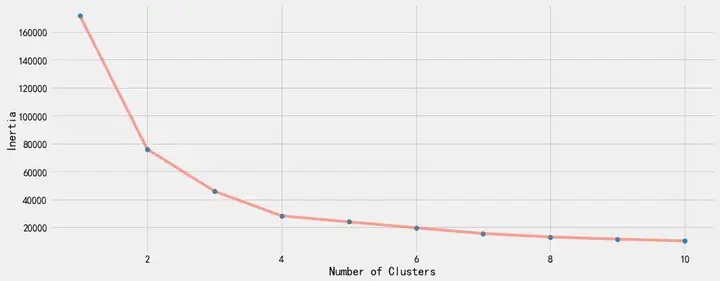
我们使用4个聚类中心再次进行聚类。(此段代码无输出)
algorithm = (KMeans(n_clusters = 4 ,init='k-means++', n_init = 10 ,max_iter=300,
 tol=0.0001, random_state= 111 , algorithm='elkan') )
algorithm.fit(X1)
labels1 = algorithm.labels_
centroids1 = algorithm.cluster_centers_
我们把4个聚类中心的聚类结果,以下图进行展示。横坐标是年龄,纵坐标是消费指数,4个红点为4个聚类中心,4块不同颜色区域就是4个不同的用户群体。
h = 0.02
x_min, x_max = X1[:, 0].min() - 1, X1[:, 0].max() + 1
y_min, y_max = X1[:, 1].min() - 1, X1[:, 1].max() + 1
xx, yy = np.meshgrid(np.arange(x_min, x_max, h), np.arange(y_min, y_max, h))
Z = algorithm.predict(np.c_[xx.ravel(), yy.ravel()])
plt.figure(1 , figsize = (15 , 7) )
plt.clf()
Z = Z.reshape(xx.shape)
plt.imshow(Z , interpolation='nearest',
           extent=(xx.min(), xx.max(), yy.min(), yy.max()),
 cmap = plt.cm.Pastel2, aspect = 'auto', origin='lower')
plt.scatter( x = 'Age' ,y = 'Spending Score (1-100)' , data = df , c = labels1 ,
            s = 200 )
plt.scatter(x = centroids1[: , 0] , y =  centroids1[: , 1] , s = 300 , c = 'red' , alpha = 0.5)
plt.ylabel('Spending Score (1-100)') , plt.xlabel('Age')
plt.show()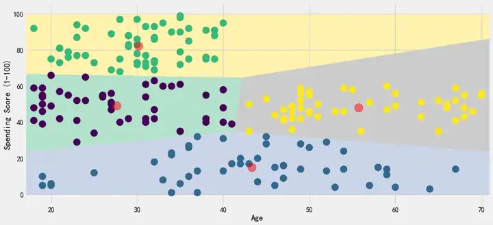
根据年收入和消费指数进行聚类和区分客户。
我们使用1-10个聚类中心进行聚类。(此段代码无输出)
'''Annual Income and spending Score'''
X2 = df[['Annual Income (k$)' , 'Spending Score (1-100)']].iloc[: , :].values
inertia = []
for n in range(1 , 11):
    algorithm = (KMeans(n_clusters = n ,init='k-means++', n_init = 10 ,max_iter=300,
 tol=0.0001, random_state= 111 , algorithm='elkan') )
 algorithm.fit(X2)
 inertia.append(algorithm.inertia_)
观察10次聚类的inertias,并以如下折线图进行统计。
可以看到,当聚类中心大于等于5之后,inertias的变化幅度显著缩小了。
plt.figure(1 , figsize = (15 ,6))
plt.plot(np.arange(1 , 11) , inertia , 'o')
plt.plot(np.arange(1 , 11) , inertia , '-' , alpha = 0.5)
plt.xlabel('Number of Clusters') , plt.ylabel('Inertia')
plt.show()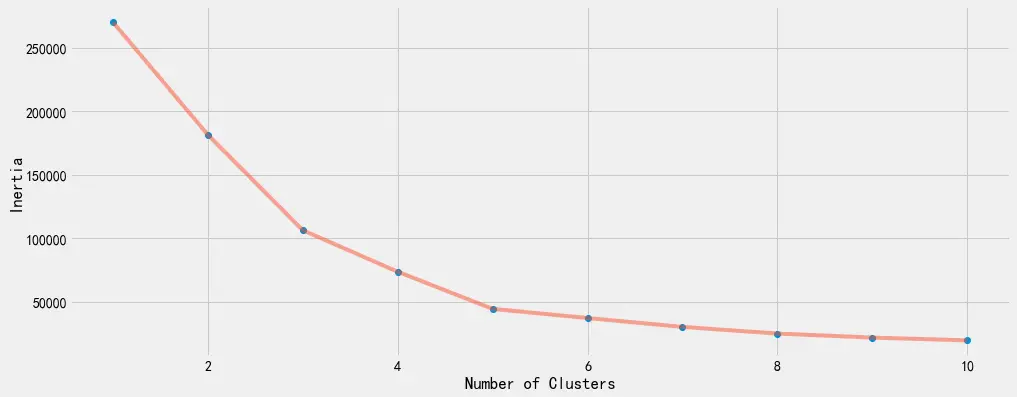
我们使用5个聚类中心再次进行聚类。(此段代码无输出)
algorithm = (KMeans(n_clusters = 5 ,init='k-means++', n_init = 10 ,max_iter=300,
 tol=0.0001, random_state= 111 , algorithm='elkan') )
algorithm.fit(X2)
labels2 = algorithm.labels_
centroids2 = algorithm.cluster_centers_
我们把5个聚类中心的聚类结果,以下图进行展示。横坐标是年收入,纵坐标是消费指数,5个红点为5个聚类中心,5块不同颜色区域就是5个不同的用户群体。
h = 0.02
x_min, x_max = X2[:, 0].min() - 1, X2[:, 0].max() + 1
y_min, y_max = X2[:, 1].min() - 1, X2[:, 1].max() + 1
xx, yy = np.meshgrid(np.arange(x_min, x_max, h), np.arange(y_min, y_max, h))
Z2 = algorithm.predict(np.c_[xx.ravel(), yy.ravel()])
plt.figure(1 , figsize = (15 , 7) )
plt.clf()
Z2 = Z2.reshape(xx.shape)
plt.imshow(Z2 , interpolation='nearest',
           extent=(xx.min(), xx.max(), yy.min(), yy.max()),
 cmap = plt.cm.Pastel2, aspect = 'auto', origin='lower')
plt.scatter( x = 'Annual Income (k$)' ,y = 'Spending Score (1-100)' , data = df , c = labels2 ,
            s = 200 )
plt.scatter(x = centroids2[: , 0] , y =  centroids2[: , 1] , s = 300 , c = 'red' , alpha = 0.5)
plt.ylabel('Spending Score (1-100)') , plt.xlabel('Annual Income (k$)')
fig = plt.gcf()
if not os.path.exists('results'):
 os.mkdir('results') # 创建本地保存路径
plt.savefig('results/clusters.png') # 保存结果文件至本地
plt.show()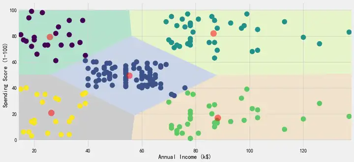
至此,本案例完成。
Recommend
About Joyk
Aggregate valuable and interesting links.
Joyk means Joy of geeK