

Design Tokens — a Design System Superpower!
source link: https://uxplanet.org/design-tokens-a-design-system-superpower-dab07a5f0035
Go to the source link to view the article. You can view the picture content, updated content and better typesetting reading experience. If the link is broken, please click the button below to view the snapshot at that time.

Design Tokens — a Design System Superpower!

Design Tokens, though it has been in the industry for a while, it’s only recently that it has picked up the pace. Most of the design systems have already started using them. And at Zeta’s DS for web enterprise products, we’ve embraced the power of design tokens since its inception.
What are Design Tokens?
Design Tokens are named entities that represent atomic design values, and convey design decisions.
What does that mean? 🤔 Simply put design tokens are key-value pairs, where the key is a human-readable name given to design primitive values of colors, spacing, font size, etc. But they are much more than just variable holdings values. Because they incorporate design decisions and conveys an intent of use.
For example:
blue-60 = #2A4FF0 can be considered a simple key-value pair. Whereas,
background-primary-color = #2A4FF0 would be a typical token because the naming makes it clear that it represents the primary color and is intended to be used for backgrounds.
Design tokens are more of a methodology of creating and using the same styles in design and dev environments.
What can be represented with Design Tokens?
They can be used to represent all types of design values, like colors, spacing, typography (font family, size, weight, line height, letter spacing, etc), shadows, radius, sizing, opacity, transitions, etc.

Why use Design Tokens?
Design tokens store style values in technology-agnostic, human-readable names instead of using them as hard-coded values like hex codes, pixel values, etc. This allows the styles to be used consistently and scalably across tools, teams, code, designs, and platforms.
Architecting Tokens
Tokens can be created based on the level of abstraction you’d like to have for your system and if you’d like to create themes or modes. Typically there could be up to three levels of abstraction. With each level, the complexity increases but it opens up a higher degree of advantages.
- Basic Structure
The most basic structure is creating a flat key-value pair set for all your tokens. Example:
primary-color = #2A4FF0, secondary-color = #F7C28F, etc. - Two Tier Structure
If you need more flexibility and higher reusability of your primitives, the two-tier structure works better. Here level 1 (commonly referred to as ‘Global Variables’) defines all the base values. The naming of the globals is kept simple and is merely a human-friendly name given to a value. It doesn’t carry much meaning. These are then referenced by another set of tokens (commonly referred to as ‘Alias Tokens’) where the names are more meaningful and indicate a design decision. It is the most commonly used structure currently across various teams and organizations. Example:
LEVEL 1: blue-60 = #2A4FF0
LEVEL 2: primary-border-color = {blue-60}, primary-icon-color = {blue-60} - Three Tier Structure
Here the third layer of component tokens is created over the above two-tier structure. These define the context of use and enable more effective theming and color modes. At Zeta, we use the three-tier structure. Example:
LEVEL 1: blue-60 = #2A4FF0
LEVEL 2: primary-background-color = {blue-60}
LEVEL 3: button-primary-background-color = {primary-background-color}

Theming, Modes, and Density with Tokens
Another huge advantage of tokens is their ability to efficiently create various visual styles. Be it, themes, color modes, or interface density.
- Themes can include visual differences like colors, typography, radius, spacing, etc.
- Modes refer to the typical light and dark modes
- Interface density generally works with higher or lower spacing and sometimes font sizes.
At Zeta, the way such visual styles are applied is by leveraging the three-tier tokens structure. The mapping between the component and the alias tokens remains the same, therefore the component style files don’t need to be updated.
Example: To change the color theme of the primary button, where the component token is:
button-primary-background-color = {background-primary-color}
THEME 1: {background-primary-color} = {blue-60} = #3367CC
THEME 2: {background-primary-color} = {green-60} = #29818D

Tokens Pipeline and Workflow
How does all of it work? How to create, apply and maintain the tokens?
It can be done in multiple ways, depending on the hierarchy of your tokens, the team setup, the level of visibility you’d like to create, etc.
At Zeta, we have come up with the following workflow. It gives the designers the long-awaited responsibility and the control to define the actual styles that go in the developed products — while being in their natural habitat of Figma. It relives the front-end dev teams to redefine the styles in CSS. And yet brings end-to-end visibility to everyone.
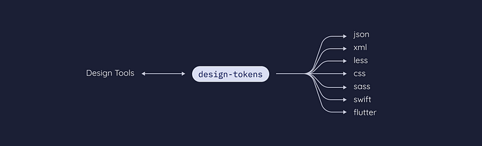
We use the open-source Figma Tokens plugin (aka Tokens Studio for Figma) to create the tokens. Which are then imported in Figma as styles and exported to GitHub as JSON (the plugin auto-converts the tokens to JSON). From GitHub, the tokens JSON is parsed via Style Dictionary with a couple of native and an in-house transformer to create CSS variables.

Way Ahead
The way design tokens are named and architected and the way the workflow is set up between design and the dev tools is all rapidly evolving. Every organization has a unique way of defining and working with tokens. The W3C Group is working towards creating the standards around i. And a host of tools are being created to streamline the workflow.
Thank you for reading! :)
Recommend
About Joyk
Aggregate valuable and interesting links.
Joyk means Joy of geeK