

UI Elements that Every Designer Should Know
source link: https://www.uxpin.com/studio/blog/user-interface-elements-every-designer-should-know/
Go to the source link to view the article. You can view the picture content, updated content and better typesetting reading experience. If the link is broken, please click the button below to view the snapshot at that time.

User Interface Elements Every Designer Should Know
UI elements or user interface elements are the most integral part of product design, regardless of whether it’s a web design or mobile, desktop, or Augmented Reality or Virtual Reality app. UI elements are the core building blocks for all products.
As a UI designer or web developer, it’s crucial to have a deep understanding of UI elements and how users interact with them. It will help you create a better application/website structure.
Designers don’t usually draw UI elements anew when they’re building web pages or mobile apps. They usually start with a ready repository of UI elements, and if they’re backed with code, interactive UI components.
UXPin Merge allows you to bring those components to UXPin’s design editor and build fully functional UIs in minutes instead of hours, thus optimizing the workflow of the whole product team. Learn more about UXPin Merge.
Reach a new level of prototyping
Design with interactive components coming from your team’s design system.

Table of contents
What are UI Elements?
To put it simply, user interface elements are the building blocks of apps and web sites. They are what users interact with when they are using the product. They click on a button to sign up, they use navigational components to switch between pages, etc.
UI elements are what allows for good user experience and well-designed functionalities.
UX design rests on design patterns that your users are familiar with. If you break a design pattern, users may get lost or confused at least. Designers use well-known UI elements to prevent that.
Learning what are UI elements is not enough. You also need to know the context of use. Let’s see why.
The Importance of UI Elements in UX Design
Let’s say we receive a requirement of presenting the user with six options to choose from. For their preferred countries to work. Many UI elements can serve the purpose:
- List: It allows for the selection of multiple countries.
- Dropdown: This usually allows for the selection of a single element.
- Checkbox: An alternative way for selecting none, one, or multiple countries.
- Radio: It allows for the selection of a single element.
So, what would you pick?
Is there anything else that offers more value? Can you use your custom-designed radio buttons?
To resolve these questions, you require a proper understanding of various UI elements.
Interested? Let’s start!
3 Types of UI Elements
Ideally, we can group UI elements into 3 major categories.
- Input elements
- Output elements
- Helper elements
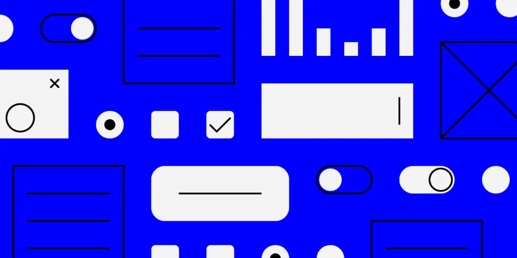
Input elements
Input elements are responsible for handling different user inputs. Sometimes they’re also part of the input validation process. Some of the most used input elements include:
- Dropdowns
- Combo boxes
- Buttons
- Toggles
- Text/password fields
- Date pickers
- Checkboxes
- Radio buttons
- Confirmation dialogues
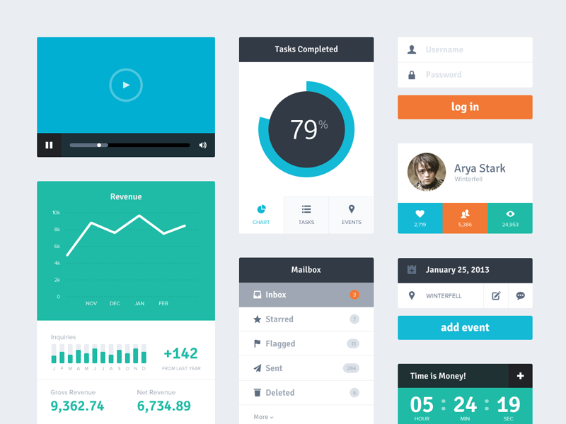
Source: Dribbble.com
Output elements
Output elements are responsible for showing results against various user inputs. They also show alerts, warnings, success, and error messages to the users. Output elements aren’t neutral by nature. They rely on inputs and various operations.
Source: Google Doc
Helper elements
All other elements fall into this category. The most widely-used helper elements include:
- Notifications
- Breadcrumbs
- Icons
- Sliders
- Notifications
- Progress bars
- Tooltips
We can also group helper elements into 3 categories.
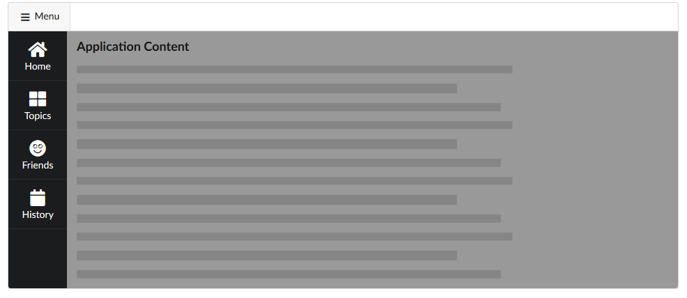
Navigational UI elements
Navigational components simplify moving through the site, desktop or mobile app or any other digital product. Navigational helper UI elements include things like navigation menus, list of links, breadcrumbs, to name but a few.
Source: UXPin
Informational UI elements
Responsible for representing information. These include, for example, tooltips, icons, and progress bars.

Source: Toptal
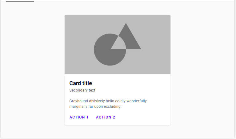
Groups or containers UI elements
Responsible for holding various components together. Widgets, containers, and sidebars for part of this category. The Newsletter subscription widget of UXPin blog is also a good example of a container.

9 Common Input UI Elements
Here are nine of the most common input elements that every designer should know about. This list includes buttons, checkboxes, text fields, and you’re certain to find them in the most popular design systems, listed under UI components.
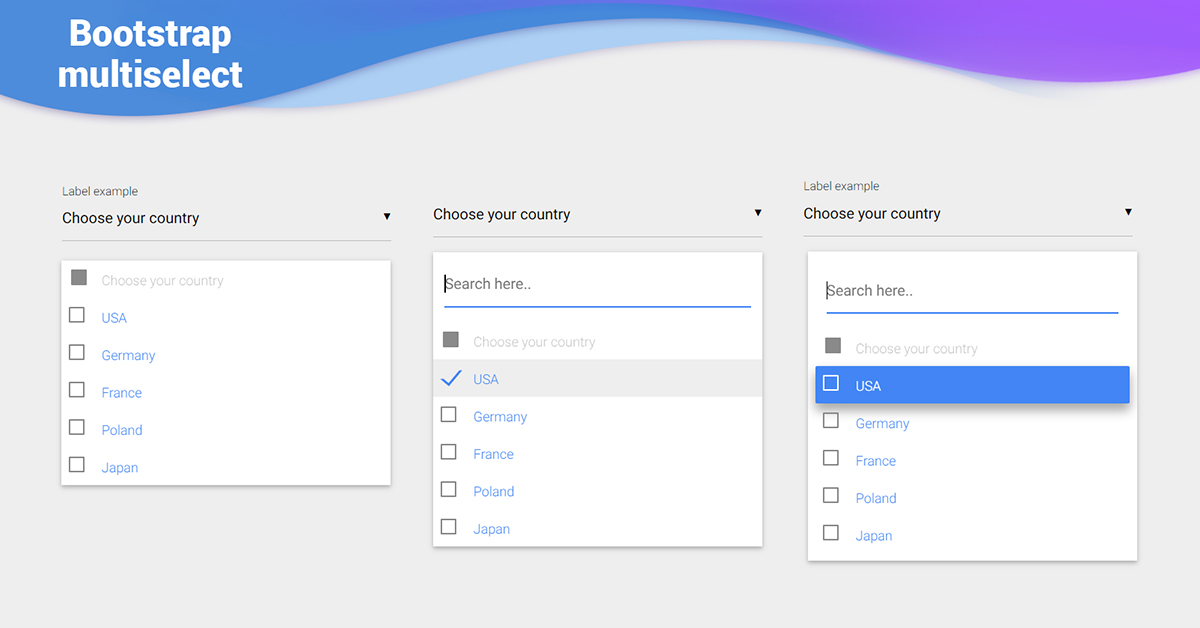
Checkboxes
Checkboxes allow the user to select one or more options from an option set. It is best practice to display checkboxes vertically. Multi-columns are also acceptable considering the available space and other factors.
Source: Github.com
Dropdowns
Dropdowns allow users to select one item at a time from a long list of options. They are more compact than radio buttons. They also allow you to save space. For better UX, it’s necessary to add a label and a helper text as a placeholder. I.e. “Select One, Choose, etc.”
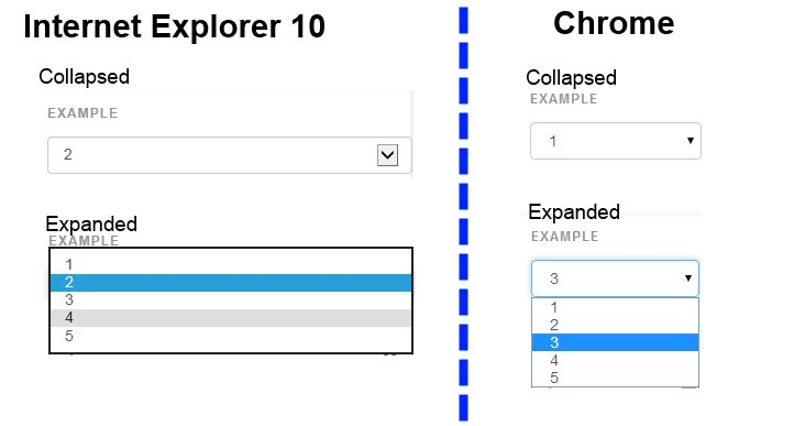
Source: Stackoverflow
Combo boxes
Combo boxes allow users to either type a custom value directly or select a value from the list. It is a combination of a drop-down list or list box and a single-line input field.
Source: mdbootstrap
Buttons
Buttons allow the users to perform an action with touch or click. It is typically labelled with text, icon, or both. Buttons are one of the most important parts of a UI. So it’s important to design a button that the user will actually click.
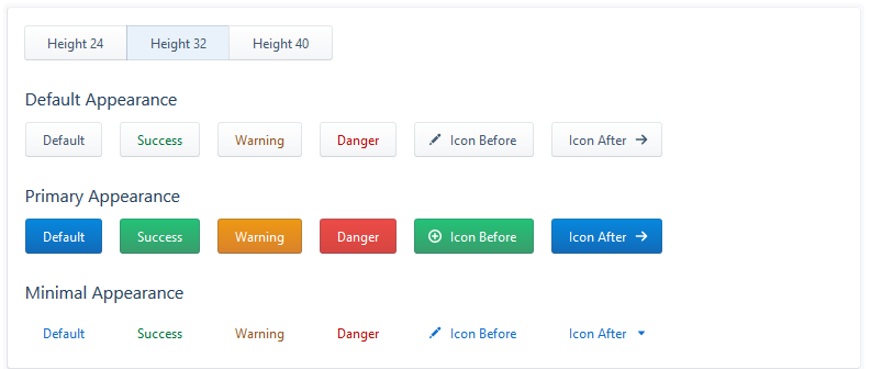
Source: Evergreen UI
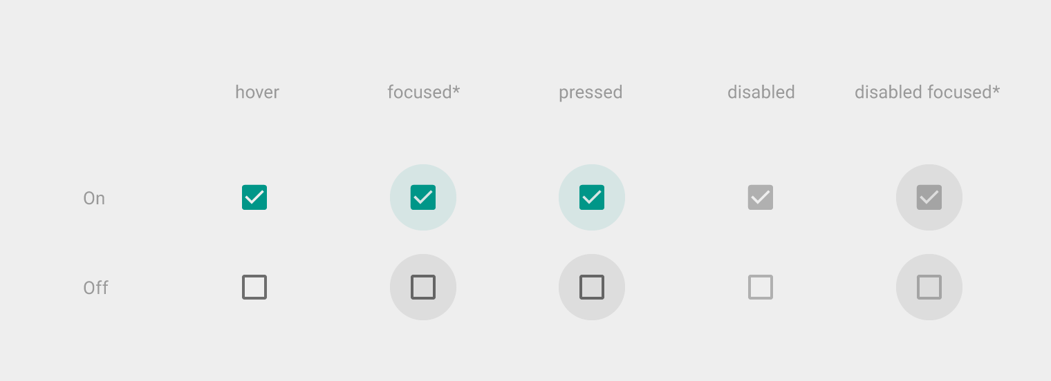
5. Toggles
Toggles allow the user to change a view/value/setting between two states. They are useful for toggle between on and off state or switching between list view and grid view.
Source: Youtube
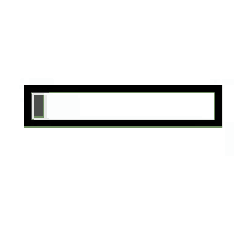
Text and password fields
Text fields and password fields allow users to enter text and password respectively. Text fields allow both single-line and multi-line inputs. Multi-line input fields are also known as “textarea”. Password fields generally allow single lines for a password.
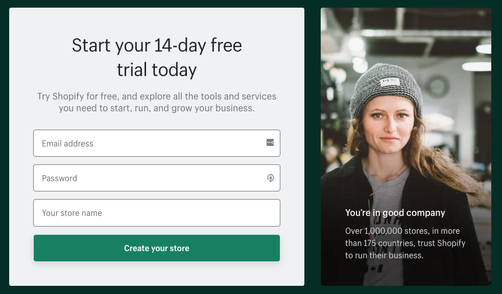
Source: Shopify.com
Date pickers
A date picker allows users to pick a date and/or time. By using a native date picker from the platform, a consistent date value is submitted to the system.
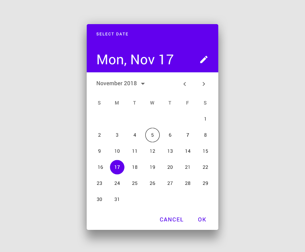
Source: Material Design
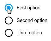
Radio buttons
Radio buttons allow users to select only one of a predefined set of mutually exclusive options. A general use case of radio buttons is selecting the gender option in sign-up forms.
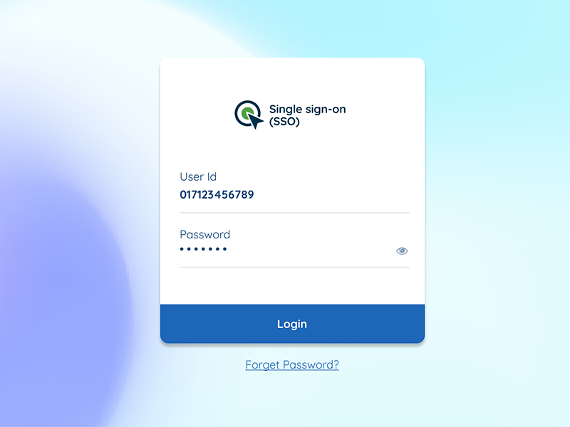
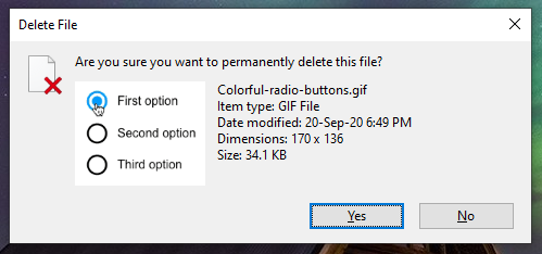
9. Confirmation dialogues
Confirmation dialogues are responsible for collecting user consent for a particular action. For example, collecting user consent for a delete action.
4 Common output elements
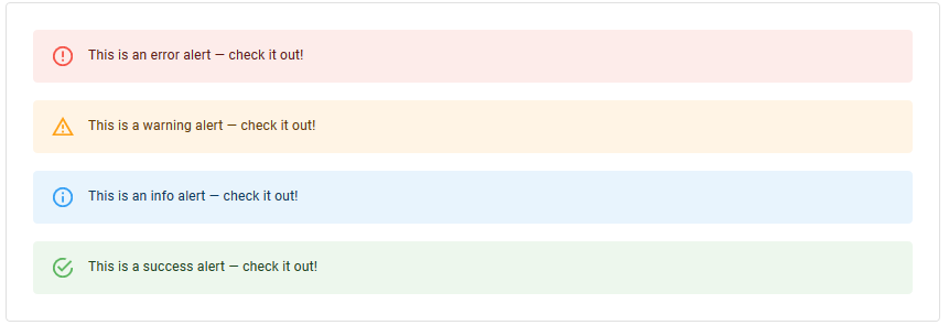
Alert UI Element
An alert presents a short, important message that attracts the user’s attention. It notifies users about these statuses and outputs.
Source: material-ui.com
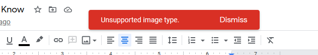
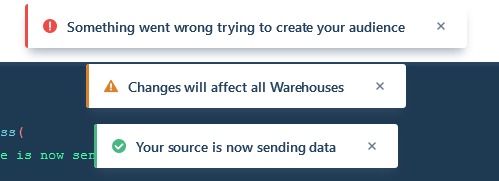
Toast UI element
This refers to a UI feature where an event (user input, server response, calculation etc.) triggers a small text box to appear on the screen. Ideally, it appears at the bottom on mobile and bottom left or right side on the desktop.
The difference between “Alert” & “Toast” is that the former doesn’t dismiss itself and the latter does after a certain time.
Source: Evergreen UI
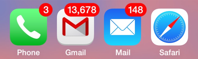
Badge
This feature generates a small badge to the top-right of its child(ren). In general, it represents a small counter or indicator. This can be something like the number of items over the cart icon or online indicator over a user avatar.
Charts
Charts are a common way of expressing complex data sets because they depict different data varieties & data comparisons.
The type of chart used in UI depends primarily on two things: the data we want to communicate, and what we want to convey about that data
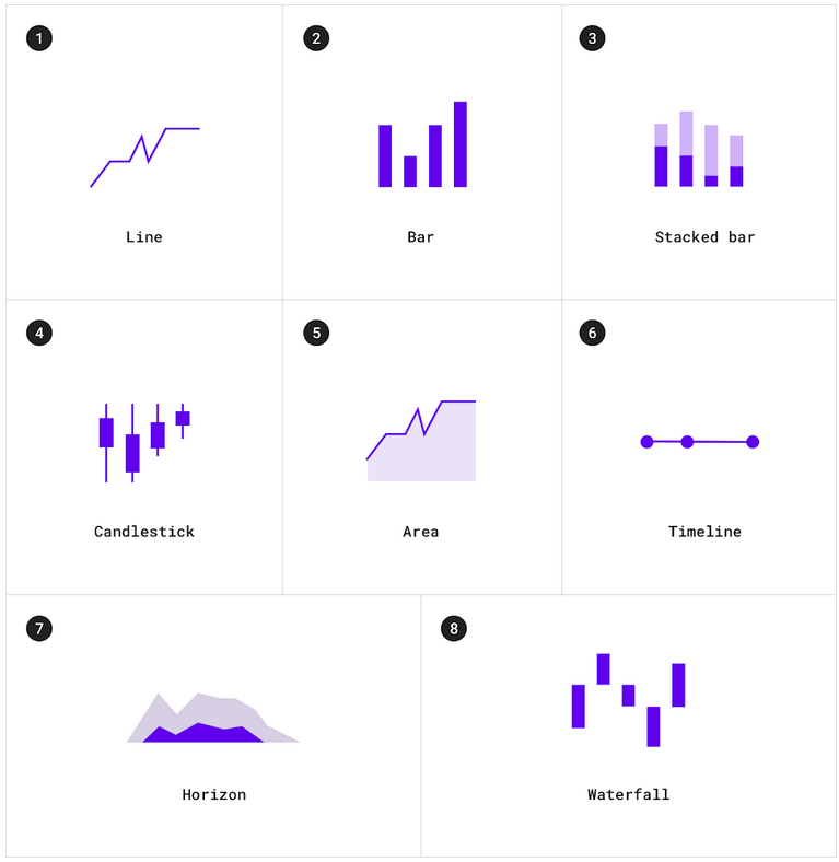
Different types of charts. Source: material.io
Common Helper UI Elements
Navigational UI elements
Those elements aid navigation. They are
- Navigation menus
- List of links
- Breadcrumbs
- Search fields
- Pagination
Navigation menus
This is a navigational UI element with several values that the user can select. They are taken to another area of the website/app from there.
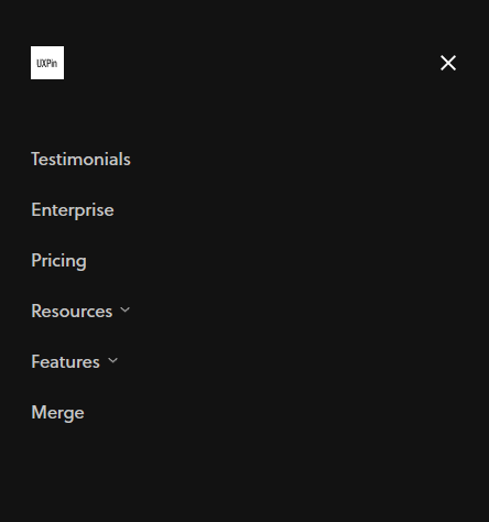
Source: UXPin
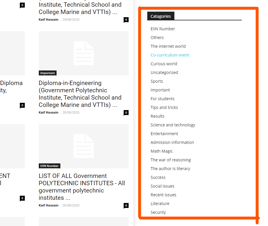
List of links
As the name suggests, a list of links consists of links. Sidebar with a category list is a good example of this. Links can be both internal and external.
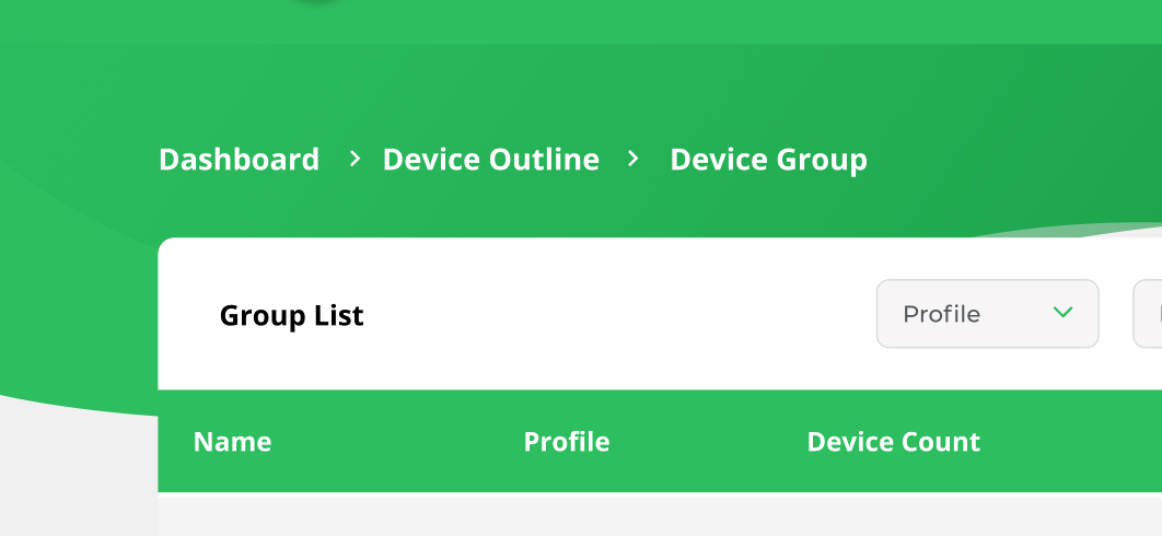
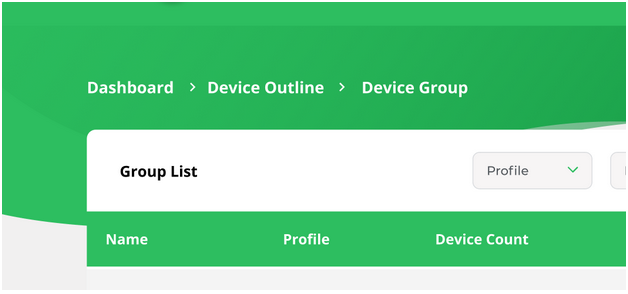
Breadcrumbs
Breadcrumbs allow users to see their current location within the system. It provides a clickable trail of proceeding pages to navigate with.
Search fields
A search bar is usually made up of two UI elements: an input field and a button. It allows users to enter a keyword and submit it to the system expecting the most relevant results.

Source: Google Chrome Browser
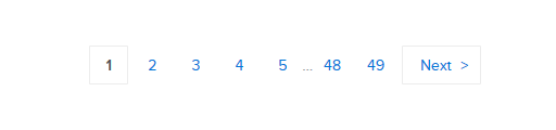
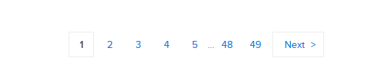
Paginations
This feature divides the content between pages and allows users to navigate between them.
Informational UI elements
That category of UI elements transfers information. It comprises:
- Tooltips
- Icons
- Progress bars
- Notifications
- Message boxes
- Modal windows
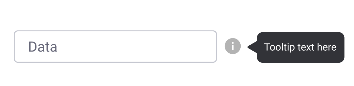
Tooltips
A tooltip shows users hints when they hover over an element indicating the name or purpose of the item.
Icons
It’s a simplified symbol that is used to help users to navigate the system, presenting the information and indicating statutes.
Source: Dribbble
Progress bars
A progress bar indicates the progress of a process. Typically, progress bars are not clickable.
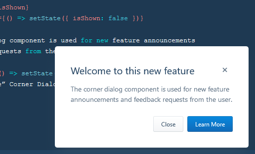
Notifications
It is an update indicator that announces something new for the user to check. Typically shows completion of a task, new items to check etc.
Message boxes
It’s a small window that provides information to users but typically doesn’t prevent users from continuing tasks. Message boxes perform tasks like showing warnings, suggestions, etc.
Source: Evergreen UI
Modal windows
It’s used to show content on top of an overlay. It blocks any interaction with the page — until the overlay is clicked, or a close action is triggered.
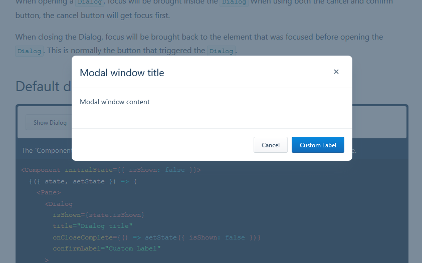
Source: Evergreen UI
Group and Containers
How would you separate certain elements from the rest? That is what groups and containers are for.
Widgets
It’s an element of interaction, like a chat window, components of a dashboard, or embeds of other services.
Source: Dribbble.com
UI Containers
Containers hold different components together. This includes text, images, rich media etc. Cards in modern UI design are one of the best examples of containers.
Source: Material.io
Sidebars
Sidebars also contain other groups of elements and components. But that can be switched between collapse and visible state.
Source: Semantic-UI
Search bar
The search bar holds the search field and search options. Typically, the search bar features a search field and filtering option. Twitter’s advanced search is a great example.
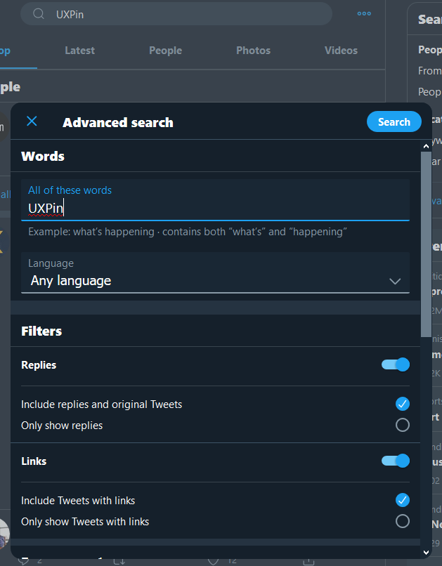
Source: Twitter
Prototype with Interactive UI Elements in UXPin
Now that you understand what common UI elements are and how they work, it’s time to put your knowledge to practice. UXPin offers all the features you need to design and organize your UI elements, simplifying the process of designing.
What if you have ready-made UI elements that come from a component library of your developers? Use UXPin Merge technology to bring them to UXPin editor and design fully interactive and consistent prototypes using those UI components that you share with your product team. Learn more about UXPin Merge.
Recommend
About Joyk
Aggregate valuable and interesting links.
Joyk means Joy of geeK