

Principles of visual hierarchy in UI Design
source link: https://uxplanet.org/principles-of-visual-hierarchy-in-ui-design-fbcd31f88088
Go to the source link to view the article. You can view the picture content, updated content and better typesetting reading experience. If the link is broken, please click the button below to view the snapshot at that time.

Principles of visual hierarchy in UI Design
First of all, I would like to introduce you to a new type of blog called Principles of UI Design, where I will provide examples and explain UI Design fundamentals. Focusing mainly on UI design principles and concepts.

In this article, we’re going to talk about the principles of visual hierarchy in UI design. Visual Hierarchy is a powerful technique that can help you create a better experience for your users and solve key problems with your product. It provides structure to guide users through a product, which can improve their experience and help you create well-designed interfaces.
Size is used to grab the attention of the user. The bigger the design element the more it grabs attention. Size can add emphasis to a design frame or content, making it more significant.

Interior design concept shot by Matt Wojtaś
A great example of size can be found in the interior design image above. The first thing that catches your eye is the text that explains what the company does.
Color
Bright colors stand out more than muted or dull colors. Color helps set the mood for your app or website. They can reflect the personality of your brand. They can attract users, and they can better communicate your message.

Food Delivery App by Azie Melasari
The bright color of the example above helps draw attention to the important elements on the screen. The primary color serves as a call to action. By using the primary color on buttons & text prices users are able to anticipate how things will work and understand what action to take.
Alignment
Alignment is used to provide visual structure. Elements aligned on the same path can help them feel associated with each other, making it easier to scan. Alignment is used to form unity in design elements.

Blog App UI Design by Ilya Studio
Like in the example above, the text is aligned to the left providing a better reading experience for the user. Centered text can be used for call-to-actions.
Aligning components makes the design cleaner and more structured. Alignment helps the user better understand the connections between different elements without the need for external helpers.
Repetition
Repetition is the reusing of the same or similar design elements. It is used to keep the eyes of the user familiar with the design elements of the app or website.

Coffee ordering app by Shakti tanwar
Repetition can be in many forms Typography, Color, Size, Lines, Shapes, etc. The buttons in the design above have a dark color which makes them stand out. The Color of the button is used consistently on both screens and on different features such as the filter and the “add to cart” feature which are all call-to-action buttons. Using the same color throughout the app leads the user in a clear direction.
By using repetition we are being consistent and improving the experience for the user and making them feel comfortable as we are making users anticipate how things work.
Proximity
Proximity is the idea that similar design elements close together are perceived to be related. Elements that are placed apart mean that they belong to a separate group.
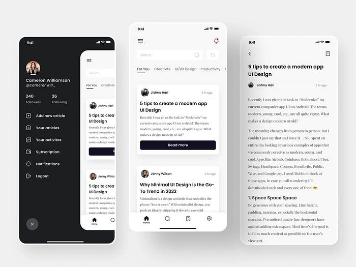
Blogging App Design by Shakti tanwar
Proximity can be determined by whitespace or color. Take the screen in the middle for example. Two elements contain blog information. The two elements are related but also they are separated by whitespace. By presenting information in scannable blocks, the user is able to scan and read the information provided to them. By using whitespace, we guide the user’s eyes from one blog content to another.
Whitespace
White space, also known as “negative space,” is empty space around the content and functional elements of a page. The basic role of white space is to let your design breathe by reducing the amount of text and functional elements that users see at once.

Sansa chair by Joël Dos Santos
The use of whitespace or negative space can be seen among different UI elements, for example. In paragraphs, buttons, icons, pictures, etc. You can use any color, pattern, or texture for whitespace, it does not necessarily have to be white.
In the example given, whitespace is used between different UI elements, such as text, to enhance readability. Take a look at the screen on the left. Since the chair is the largest element on the page, and there is a lot of whitespace around it, it seems to be the focus of attention. An element becomes more noticeable with more negative space around it.
Essentially, the user’s attention is drawn to an element with more negative space simply because there is nothing else in that area that draws their attention. Meanwhile, the right screen has elements spaced out for the user to be able to process the information easily.
Texture & Style
Textures give importance to the website elements: they grab attention and direct it toward a particular heading, icon, title, or action button. Basically, textures highlight the most important elements of one website.

Forest Restoration App Concept by Judith Ekedi Jangwa
Texture also depends on who you are designing for so always do your research to know who your target audience is. Because it creates an emotional impact on your users, that’s because it is designed to build a relationship between the user and the design. As a result, some users may find your product comfortable, while others might find it boring or uninteresting.
Conclusion
Visual Hierarchy in UI Design is a concept that helps us to develop products and optimize user experiences. It acts as a point of reference for creating a hierarchy with visual elements. Visual Hierarchy concept has several objectives such as making ideas more clear, giving structure, breaking information into several elements, and so on.
Let me know if this article was helpful by leaving a comment.
Thank you for reading;
Bye for now👋
Recommend
About Joyk
Aggregate valuable and interesting links.
Joyk means Joy of geeK