

Combining tint and a shade for a binary Data Visualization
source link: https://uxdesign.cc/combining-tint-and-a-shade-for-a-binary-data-visualization-af80c912fb0d
Go to the source link to view the article. You can view the picture content, updated content and better typesetting reading experience. If the link is broken, please click the button below to view the snapshot at that time.

Combining tint and a shade for a binary Data Visualization
Visualizing two Data Variables with a Monochromatic Color Harmony
In this writing, I discuss how to use a tint and a shade from a monochromatic color harmony to visualize two data variables. Color suggestion tools like ColorBrewer provide recommendations starting at three data classes while Adobe Color provides a five-color palette. Here, I show how combining a light color (often called a tint) and a dark color (frequently called a shade) from a sequential color scheme can provide engaging results for binary data. One example includes paired data, a special case of multivariate quantitative data where each data point in one sample is uniquely matched to a data point in a second example. Let’s get started by reviewing the concepts of monochromatic color harmony and how it relates to sequential color schemes for data visualization.
The Monochromatic Color Harmony:
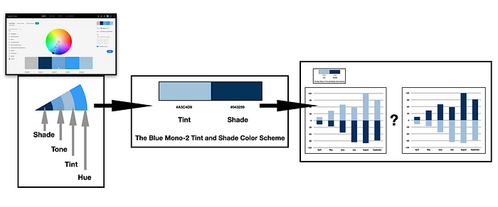
A monochromatic color harmony is created by using one hue with various tints, tones, and shades of that hue. A tint is defined as a hue mixed with White while a tone is designated as a hue mixed with Gray and a shade is created when a hue is mixed with Black. The harmony is noted on the color wheelby the individual colors forming a straight line from the center of the color wheel to the given hue. In my previous Blues of Color Harmony writing, I used the Adobe Color web app to create a monochromatic color harmony in the key of Blue (#369BF5 — hex code). I show this color harmony below. For those unfamiliar with the concept, a color hex code is a hexadecimal way to represent a color in RGB format by combining amounts of Red, Green, and Blue to note that specific color.

A Monochromatic Color Harmony in the Key of Blue (#369BF5),
created using the Adobe Color web app.
Below, I show the resulting Blue Monochromatic color harmony that moves from Tint (#A3C4D9) to Hue (#369BF5) to Tone (#6AA5D9) to Shade (#043259). Each color hex code is also noted.

The Blue Monochromatic Color Harmony that moves from Tint to Hue to Tone to Shade with Color Hex codes noted.
Creating a Sequential Color Scheme for Data Visualization:
In data visualization, sequentialcolor schemes are designed for ordering numeric information where colors progress from low to high (or vice versa). I can quickly modify the Blue Monochromatic colorharmonyfor data visualization purposes by removing the Key Color of Blue #369BF5) to smoothly progress from light to dark. This results in a three-step sequential color scheme that I name Blue Mono-3. I show this result below.

The Blue Mono-3 Sequential Color Scheme that moves from Light to Dark with the respective Tint, Tone, and Shade elements noted.
Building a Bar Chart Visualization with the Tint and Shade from Blue Mono-3:
My next step is to use the Tint and Shade from the Blue Mono-3 sequence to build a data visualization. I show this Blue Mono two-step scheme below with the Tint#A3C4D9 and Shade #043259 colors.

The Blue Mono-2 Color Scheme with Tint#A3C4D9 and Shade #043259 colors.
Next, I create a two-variable bar chart visualization with the Apple Numbers app. I use the Tint#A3C4D9 and Shade #043259 Blue Mono colors to produce the results shown below.
There are two options available for this bar chart visualization using the Blue Mono-2 Tint Shade colors. One option locates the Blue Tint #A3C4D9 as the top color in the bar chart (the image on the left) while the second option places the Blue Shade #043259 as the top color in the visualization (the image on the right). These two options are shown below.

The Blue Mono-2 Tint#A3C4D9 and Shade #043259 color scheme applied to a two variable Bar Chart. Two possible options are shown. One option locates the Blue Tint #A3C4D9 as the top color (the image on the left) while the second option places the Blue Shade #043259 as the top color (the image on the right).
The choice is yours depending on your preferences and the aspects of the given project underway.
Testing the Blue Mono-2 Data Visualization for Color Deficiencies:
In humans there are three types of photoreceptors or cones where each is sensitive to different parts of the visual spectrum of light to facilitate rich color vision. If one or more of the set of cones does not perform properly, a color deficiency results. A red cone deficiency is classified as Protanopia. A green cone deficiency is classified as Deuteranopia. A blue cone deficiency is classified as Tritanopia. Software is available that simulates color deficiencies. The Color Blindness Simulator (Coblis) tool is a freely available online app that serves this purpose.
Let’s use Coblis to examine how the Blue Mono-2 Tint#A3C4D9 and Shade #043259 bar charts appear under Protanopia, Deuteranopia and Tritanopia color deficiency tests. I show these results below.
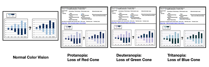
Color Deficiency Checks for the Blue Mono-2 Tint#A3C4D9 and Shade #043259 Bar Charts where Protanopia indicates loss of Red cone, Deuteranopia indicates loss of Green cone, and Tritanopia indicates loss of Blue cone.
These results indicate that for the Blue Mono-2 Tint#A3C4D9 and Shade #043259 color scheme, individuals with Protanopia, Deuteranopia or Tritanopia will see data visualization results very similar to someone with Normal Color Vision.
Exploring another Tint and Shade Combination:
Given the fascinating color deficiency results achieved with the Blue Mono-2 Tint#A3C4D9 and Shade #043259 scheme I decided to explore another monochromatic tint and shade color scheme. In a previous UX Collective writing , entitled When brown becomes a shade of orange in data visualization, I built a Brown Sequence from a monochromatic color harmony shown below.

The Brown Sequential Color Scheme built from a monochromatic color harmony.
My next step is to apply the Tint #BF8D7A and Shade #735449 colors to the previous bar chart visualization example. The Brown two-step scheme with the Tint #BF8D7A and Shade #735449 is shown below.

The Brown-2 Color Scheme with Tint #BF8D7A and Shade #735449 colors.
Now, I apply the Brown-2 color scheme to the bar chart example. As with the Blue-Mono-2 color scheme, there are two options with the Brown-2 colors. One option locates the Brown Tint #BF8D7A as the top color in the bar chart (the image on the left) while the second option places the Brown Shade #735449 as the top color in the visualization (the image on the right). These two options are shown below.

The Brown-2 Tint #BF8D7A and Shade #735449 color scheme applied to a two variable Bar Chart. Two possible options are shown. One option locates the Brown Tint #BF8D7A as the top color (the image on the left) while the second option places the Brown Shade #735449 as the top color (the image on the right).
Let’s use Coblis again to examine how the Brown-2 Tint #BF8D7A and Shade #735449 bar charts appear under Protanopia, Deuteranopia and Tritanopia color deficiency tests. I show these results below.

Color Deficiency Checks for the Brown-2 Tint #BF8D7A and Shade #735449 Bar Charts where Protanopia indicates loss of Red cone, Deuteranopia indicates loss of Green cone, and Tritanopia indicates loss of Blue cone.
These results indicate that for the Brown-2 Tint #BF8D7A and Shade #735449 scheme, individuals with Protanopia, Deuteranopia or Tritanopia will not see the exact Brown color scheme but will see a data visualization with similar results to someone with Normal Color Vision.
Using Single Hue Sequential Color Scheme to Build a Similar Tint and Shade Combination:
Rather than create a monochromatic color harmony, it is also possible to create a similar Tint and Shade color combination with an existing sequential color scheme. The figure below shows a Single Hue sequential color scheme with 5 classes in the Key of Blue from ColorBrewer. ColorBrewer is a freely available color suggestion system for geographic mapping and data visualization. I have removed the geographic boundaries to emphasize the color regions. ColorBrewer notes the hex codes of their color schemes with lower case letters. Here, I have used upper case letters to be consistent with my earlier notations. Either approach appropriately defines the specified color. The five Blue colors from light to dark are #EFF3FF, #BDD7E7, #6BAED6, #3182BD, and #08519C.

A 5-class Blues Single Hue Sequential Color Scheme from ColorBrewer,
a freely available color suggestion system.
My next step is to select the second from the left light Blues color (#BDD7E7) and the far-right darkest Blue (#08519C) to create a two variable color scheme like my previous Blue Mono Tint and Shade combination. The lightest color in the 5-class Blues single hue sequence, #EFF3FF, is more of a White color than a Blue tint. I name this color scheme the CB2-Blues. I show these results below.

Selecting the Light Blue (#BDD7E7) and the Dark Blue (#08519C) colors from ColorBrewer’s 5-class Blues Single Hue Sequential Color Scheme. I named this color scheme CB-2Blues.
I can now apply the CB-2Blues color scheme to the previous two-variable bar chart visualization. I show these results below. As with the Blue Mono-2 Tint Shade example there are two options available for this bar chart visualization. One option locates the Light Blue (#BDD7E7) color as the top color in the bar chart (the image on the left) while the second option places the Dark Blue (#08519C) color as the top color in the visualization (the image on the right). These two options are shown below.

Applying the CB-2Blues Light Blue (#BDD7E7) and Dark Blue (#08519C) colors to the two variable Bar Chart. Two possible options are shown. One option locates the Light Blue (#BDD7E7 color as the top color (the image on the left) while the second option places the Dark Blue (#08519C) color as the top color (the image on the right).
Let’s use Coblis again to examine how the CB-2Blues Light Blue (#BDD7E7) and Dark Blue (#08519C) bar charts appear under Protanopia, Deuteranopia and Tritanopia color deficiency tests. I show these results below.

Color Deficiency Checks for the CB-2Blues Light Blue (#BDD7E7) and Dark Blue (#08519C) Bar Charts where Protanopia indicates loss of Red cone, Deuteranopia indicates loss of Green cone, and Tritanopia indicates loss of Blue cone.
Like the Blue Mono-2 Tint#A3C4D9 and Shade #043259 color scheme, the color deficiency checks for the CB-2Blues Light Blue (#BDD7E7) and Dark Blue (#08519C) Bar Charts indicate that individuals with Protanopia, Deuteranopia or Tritanopia will see data visualization results very similar to someone with Normal Color Vision.
Concluding Remarks:

Summary of results from using the Blue-Mono-2, the Brown-2,
and the CB-2 Blues Color schemes to Colorize a Bar Chart Visualization.
This writing was designed to help you with reducing your sequential color scheme to address colorizing two data elements such as paired data. Paired data is a special case of multivariate quantitative data where each data point in one sample is uniquely matched to a data point in a second example. Color suggestion tools like ColorBrewer provide recommendations starting at three data classes while Adobe Color provides a five-color palette. I have shown how using a tint and a shade from a monochromatic color harmony produces engaging results for binary data that also pass color deficiency tests.
First, I explored a Blue monochromatic example that was created with Adobe Color. I entitled the resulting color scheme Blue Mono-2 Tint#A3C4D9 and Shade #043259 and applied it to bar chart visualization. Interestingly, the color deficiency checks showed that individuals with Protanopia, Deuteranopia or Tritanopia are likely to view the colorized data visualization results with a similar perspective to someone with Normal Color Vision. Next, I applied a Brown-2 Tint #BF8D7A and Shade #735449 color scheme to the same bar chart visualization. The color deficiency tests for the Brown scheme indicated that individuals with Protanopia, Deuteranopia or Tritanopia will not see the exact Brown color scheme but will see a data visualization with similar results to someone with Normal Color Vision.
Finally, I showed how to create a similar tint and shade effect using a five step Blue sequential color scheme from ColorBrewer. The result combined the Light Blue (#BDD7E7) and Dark Blue (#08519C) colors andI named this color scheme the CB-2Blues. I applied CB-2Blues to the bar chart example. To my delight, the color deficiency checks for the CB-2Blues color schemeindicated that individuals with Protanopia, Deuteranopia or Tritanopia will see data visualization results very similar to someone with Normal Color Vision.
The process of colorizing data visualizations and graphic designs can produce surprising results. I have tried to share one of my findings here. You will likely make your discoveries while creating color schemes for your projects. For additional discussions on my approaches with various color suggestion tools, please see my prior articles for UX Collective and Nightingale as well as my 2016 book on “Applying Color Theory to Digital Media and Visualization” published by CRC Press.
About the Author:
Theresa-Marie Rhyne is a Visualization Consultant with extensive experience in producing and colorizing digital media and visualizations. She has consulted with the Stanford University Visualization Group on a Color Suggestion Prototype System, the Center for Visualization at the University of California at Davis and the Scientific Computing and Imaging Institute at the University of Utah on applying color theory to Ensemble Data Visualization. Prior to her consulting work, she founded two visualization centers: (a) the United States Environmental Protection Agency’s Scientific Visualization Center and (b) the Center for Visualization and Analytics at North Carolina State University.
Related Entries:
Recommend
About Joyk
Aggregate valuable and interesting links.
Joyk means Joy of geeK