

When designing, don’t forget the broader context
source link: https://uxdesign.cc/your-product-among-other-things-ad3c263a79c7
Go to the source link to view the article. You can view the picture content, updated content and better typesetting reading experience. If the link is broken, please click the button below to view the snapshot at that time.

Your product, among other things
When designing, don’t forget the broader context
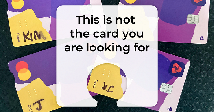
Natwest recently sent my partner and I new bank cards. We have different levels of personal accounts, as well as a joint account with a card each in our name. The four designs are shown below.
Can you spot the differences?

Neither can we. So we created some.
The cards on the left are mine and the “J” written on the one in the bottom left corner is for “Joint account”. The cards on the right are my partner’s. His name begins with a J.
Fortunately, Natwest printed our names on the back of each card. I don’t know what visually impaired people with more than one Natwest card are meant to do about this.
That’s just one of several accessibility issues at play here.
The cognitive cost of customer loyalty
One of the realities of being a loyal customer anywhere is that you may willingly end up with multiple of identical products. That can be a desirable thing, such as when you want a complete set of something, like plates. Or socks. Or any other fungible commodity.
Fungible - non-fungible
Fungible goods as mutually interchangeable in that, in principle, you could swap in any unit for any other unit of the…
It’s less ideal when you need to disambiguate things. Especially products that, by design, are non-fungible. Why would I ever want to have my bank cards look (and feel) exactly the same? Why wasn’t this considered in the UX design process? Or if it was, why wasn’t it prioritised? Dis-carded, if you will.
Your design in the real world
This is more than mere annoyance or humorous observation. Products only begin their lives in the meticulously designed packaging they arrive in. They leave the perfect fit of their casings and go do what they were designed to do, among all the other objects and their jobs to be done.
This is where things start to get real messy.
It’s why we buy stuff for our stuff. And we must mark, modify, or disambiguate some stuff from other stuff. To reduce our cognitive load while at the grocery checkout.
The less that we as designers consciously plan for these scenarios, the more unwanted design friction we create and must deal with later.
I can’t imagine that the person or team who designed the new Natwest card envisioned the little yellow corners marred by sharpies. Or that their customers might embrace an impromptu practice of wabi-sabi — the appreciation of perfect imperfection. These four cards must be marked to be usable, and by doing so, perhaps they can become more beautiful. Or at least, disambiguated.
That’s why I love Fockups:
It’s a site that allows you to display your design in a variety of terrible contexts…as street trash, on a misaligned digital billboard, against the backdrop of your dirty pants as you look at your phone while on the toilet.
It’s a joke, but not really. After all, the party must end sometime and your once-promising design will eventually go with it.
The mundanity of modernity
It’s important to design for disaster, but also for the ordinary reality of everyday life. For what comes after the launch and before the Focked-up aftermath.
That means that as a designer, you need to consider the broader context in which your product really lives. And all the other stuff it lives with.
People have more than one bank card. There are often incentives to have more than one account at the same bank. Having more than one card is not only likely, but encouraged.
I do not know the reasons why Natwest decided all their new bank cards should be identical and faceless, regardless of account type or other factors. There’s probably a good reason — one that makes sense for another type of stakeholder, with their unique vantage point. It’s clearly not for me, the lowly customer.
I’m reminded of this every time I physically use the card. At every purchase I literally embody the mindset of someone who doubts, who fumbles at the till, pausing to verify that yes, this is the purchase I want to make, with this card.
I glance back at my wallet and I’m tempted to pay with yet another card. It’s only a sliver of bright blue peeking out from a pocket but it’s enough for the feelings of familiarity and safety to wash over me. My name is on the front and I know what I’m doing. I trust this card.
I have doubts about my new Natwest cards. But I know my own handwriting. The perfect imperfection comforts me. It has come down to this. I finish the transaction and leave.
Kim is a life-long overthinker who has overcome many challenges to turn her mental energy into a superpower for getting things done and feeling great about it. She’s on a mission to help others do the same. Join the expert thinkers who are gaining clarity and focus with weekly insights in the Hold That Thought newsletter.
Thinking of joining Medium? Sign up here to get full access to every story and support Kim’s work directly (plus thousands of other writers, too).
Recommend
About Joyk
Aggregate valuable and interesting links.
Joyk means Joy of geeK