

Down the wrong path: the disaster of the latest Duolingo UI update
source link: https://uxdesign.cc/down-the-wrong-path-the-disaster-of-the-latest-duolingo-ui-update-a4cdd1e6ea1c
Go to the source link to view the article. You can view the picture content, updated content and better typesetting reading experience. If the link is broken, please click the button below to view the snapshot at that time.

Down the wrong path: the disaster of the latest Duolingo UI update
The world’s largest language learning platform recently rolled out a major update to its 50M active monthly users. The new “path UI” aims to simplify the learning experience, but it comes with some major usability flaws.
I have been using Duolingo for almost a decade, which is long enough to remember that Duo didn’t always look as cute as today. Over this time, the platform underwent major changes, most of which seemed a little annoying at first, but grew on me quickly. However, I believe the 2022 release is a major step in a wrong direction.
The major selling point of the new interface is its simplicity. The learning path brings together exercises, stories and personalised practice blocks into a single linear feed, so the user can hop from one task to the next without needing to navigate multiple tabs choosing what to practice.

Side-by-side view of the old (left) and new (right) Duolingo UI
First of all, things aren’t this simple. While my feed now has a variety of exercises, I still have a separate Practice Hub tab with additional workouts, speaking and listening tasks, and stories (which are similar to the old stories, except my progress on these has been reset). There are unit rewinds and mistake reviews too, with no obvious links to the units and exercises in my feed. Ah, there also used to be a tab with audio content and podcasts, which is now simply gone.

The new interface claims to simplify learning by brining all exercises, inclusing stories, into a single feed, but there are still a lot of additional tasks scattered around the app.
To simplify things further, Duolingo did away with the skill levels. In the old interface, you had to complete 5–6 exercise sets (or do a test to skip a level) to earn a crown and progress to the next level, until reaching gold, which you could upgrade to platinum by completing further tests. Complicated, I know. This meant that a learner would need to complete around 40 rounds of exercises (15–20 tasks each) to “master” a skill, which is fair from a learning perspective and incredibly daunting from a usability point of view.

Skill levels in the previous version of Duolingo interface. Users had to complete 5–6 exercise sets to earn a crown and progress to the next level.
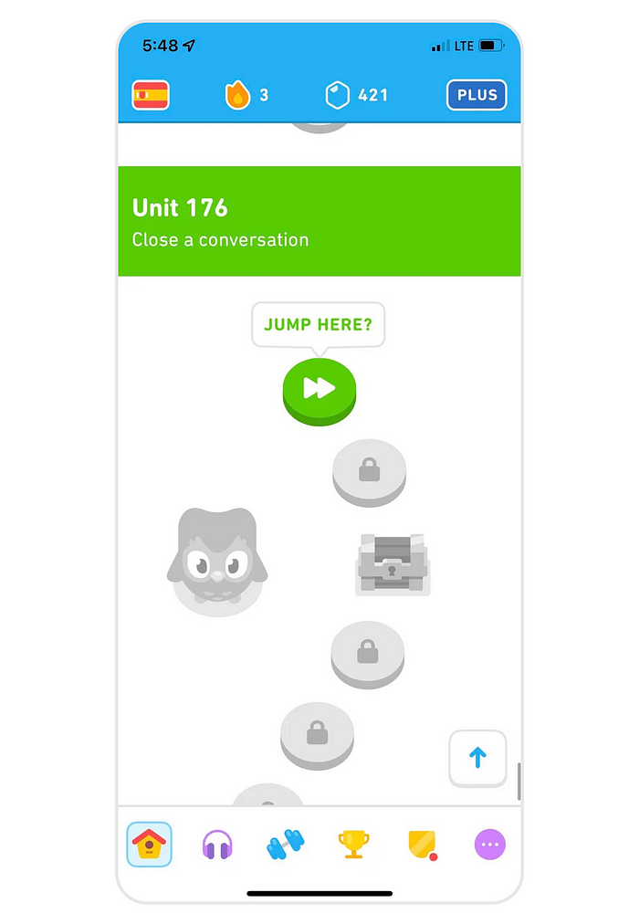
The new UI flattened this hierarchy, so each skill level is now represented by a separate milestone in the feed. The user encounters “Conversation 1”, completes a couple of exercises to “master” the skill, then caries on until they eventually reach “Conversation 2” somewhere further down the line. So far, so good?
This improvement comes at a cost: the new timeline is incredibly long! The old interface had 10 units with about 10 exercises each, but Duolingo took the six levels hiding behind each exercise and laid them flat, adding in stories and personalised practices and ending up with a whopping 200 units with 10+ exercises each! That’s a lot of scrolling, so they added a floating button that takes you back to your current location and called it a day.

In the new Duolingo interface, each skill level is represented by a separate step on the timeline. French course currently has 200 units, which results in an incredibly long timeline!
This brings us to the next issue: Duolingo assumes learners will follow the path that has been designed for them, completing daily exercises and hopping from one skill to the next, but learning isn’t linear. In an attempt to simplify the experience, Duolingo made the interface nearly unusable for anyone who wants to be a little more deliberate about what, when and how they practice. What if I want to master all five levels of the Conversation skill in one go? Or do a single task of each skill and move on? Revisit older topics? Focus on reading or listening?… The path UI is incredibly hard to navigate: the scrolling takes ages (I spend around 20 seconds each time I want to get from the bottom of unlocked content, which is marked as my current location at unit 130 back to unit 34, which is what I’m actually practicing at the moment), and there are no obvious visual cues to help you quickly find the location.
The old interface used colours to indicate the various levels you reached in a particular skill, so you could quickly scroll through the list looking for purple or blue (levels 0 and 1 respectively) if you wanted to practice new skills) or searching for orange or gold (levels 4 and 5) if you were ready to take the final test. The new interface took these signifier and assigned them to characters, so it’s a colourful mess with no meaning.
In the old interface, colour used to represent skill level achieved by the user. In the new version, it’s randomly assigned to a character like Duo and used purely for decorative purposes.
For a tool that focusses on progress and growth, it’s surprisingly hard to see the big picture. Unless you are prepared to scroll for hours on end, it’s hard to see how much content there is, what has been unlocked, reviewed or mastered.
Finally, while the platform condensed a lot of learning materials into a single feed, they kept two separate tabs that focus entirely on competition and gamification of learning. There are weekly leaderboards that promote users who earn most XP, as well as daily challenges, monthly badges and friends quests. These encourage you to study hard, or, more likely, pay some money for infinite hearts, streak freezes, XP boosters and other tools that help you stay in the game without working too hard.

The new interface still has two separate tabs focussed on competition of gamification of learning.
Of course, there are some positives: a linear feed with an illusion of faster progress makes practice more appealing, and successful gamification of learning is why 50M people use Duolingo every month. But I can’t help wonder, where does this path lead? Learning isn’t simple or linear, it’s challenging and personal. By forcing all users down the same path, moving them from one daily XP challenge to the next, when does Duolingo stop being a learning and become a gaming platform?

Recommend
About Joyk
Aggregate valuable and interesting links.
Joyk means Joy of geeK