

Learn UI Design Series: Grids
source link: https://uxplanet.org/learn-ui-design-series-grids-2cc53bb93a9b
Go to the source link to view the article. You can view the picture content, updated content and better typesetting reading experience. If the link is broken, please click the button below to view the snapshot at that time.

Learn UI Design Series: Grids
Part 3 of 7

A successful web or mobile experience depends on the proper positioning and organization of UI graphic elements. Layouts are used by designers to add structure to their work, give users a sense of predictability and familiarity, and introduce structure.
Grids act as a base that helps product teams arrange UI elements so as to maintain a pleasing visual balance from page to page. It enables UI design teams to produce more appealing and consistent user interfaces.
If you don’t know, then let me tell you that I have already started a 66-day “Learn UI Design Series” on Twitter.
I am going to share one topic or lesson each day for the next 66 days.
And the next 9 days are:
Day 25: Column Grid

Day 26: Manuscript Grid

Day 27: Modular Grid

Day 28:Hierarchical Grid

Day 29: Baseline Grid

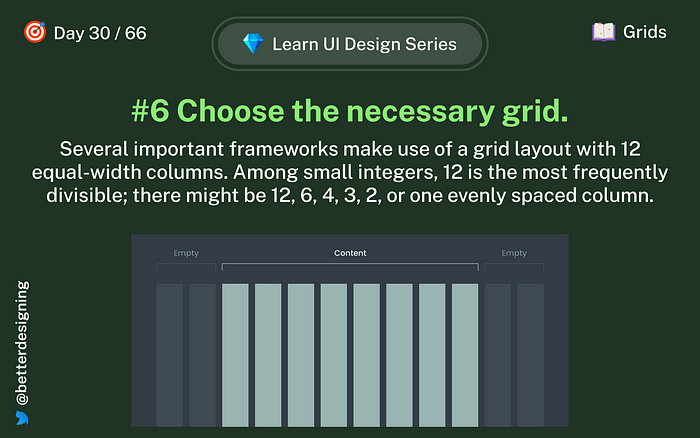
Day 30: Choose the necessary grid
Day 31: Limitations

Day 32: Horizontal & Vertical Spacing

Day 33: Mobile Grid Systems

If you want to stay up to date or don’t want to miss any, follow me on Twitter for quick and insightful design tweets.
We are at day 40 👇
Thanks for reading, and I am open to feedback.
Subscribe here to get new articles delivered right to your inbox!
Recommend
About Joyk
Aggregate valuable and interesting links.
Joyk means Joy of geeK