

How to produce a winning app redesign - Mind the Product
source link: https://www.mindtheproduct.com/a-case-study-how-to-produce-a-winning-app-redesign/
Go to the source link to view the article. You can view the picture content, updated content and better typesetting reading experience. If the link is broken, please click the button below to view the snapshot at that time.

How to produce a winning app redesign
BY Adelina Mihala ON NOVEMBER 3, 2022
In this guest post, Adelina Mihala talks about her time as a Senior Product Manager at Wallapop. One of the major projects she led was the redesign of the app’s information architecture and navigation UX & UI. She shares the steps they followed and key lessons learned.
App redesigns are scary. And they should be.
We’ve all heard about failed multi-million dollar redesigns that the users hated.
Two factors cause such failures:
- Failing to listen to users and instead adding unwanted features or redesigning out of the false idea that “a product’s design needs to keep up with the trends”.
- Not de-risking the launch by performing thorough testing at each phase of the process.
A failed redesign is expensive and has a big negative impact on user trust, satisfaction and business metrics.
Here’s the story of how we turned a scary redesign into one that produced winning results when we redesigned the information architecture (IA) and navigation at Wallapop.
Wallapop is the leading marketplace for buying and selling used goods in Spain. It has more than 15 million monthly active users and over 80 million items. It recently entered the Italian and Portuguese markets.
Decide to redesign your product for the right reasons
You shouldn’t embark on a redesign journey because you think you need a shake-up to follow the latest design trends. This just wastes time and money.
At Wallapop, the decision to redesign the app’s IA and navigation came after thoughtful consideration and executive team approval.
By 2020, our iOS and Android apps were seven years old. Our focus until then had been on growth and fast delivery of more features and services.
Through feedback loops like user interviews, NPS surveys, and app reviews, we realized that the navigation wasn’t intuitive for users, who were struggling to complete even easy tasks.
Adding new functionalities to the app was increasingly painful using the original IA and navigation. It was slowing product development and reducing the value we delivered to users. Every team was solving their own set of problems and thinking about how to make newly launched features more visible to users.
After seven years, we had an incoherent and confusing app experience where “Back” was the most tapped button. We also relied on a side menu for the main navigation of the user interface which was unable to nest subsections and was already reaching its scalability limits.
It was clear we had to solve this problem sooner than later.
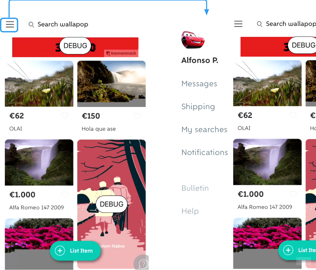
Fig. 1 Wallapop’s side-bar component in the original main navigation
Apply rigor to planning to keep track of everything
A product redesign can be overwhelming, especially at the start when you know there will be months until you can launch it. It’s not like the fast iterations and experiments we are used to. You can’t do partial roll-outs of your redesigned navigation. You can, however, start with a rigorous plan to reduce uncertainty and risk.
Start by defining the goals and how you will measure success
Be specific about what you want to achieve with the redesign.
For Wallapop, the main goal was to “create a system that empowered the users to interact with and seamlessly use the app”.
We translated this overarching goal into four principles:
- The navigation will cater to different types of personas and user journeys.
- Users can complete their tasks with minimal effort, with an easy learning curve.
- The IA and navigation will support app scalability and are easy to maintain.
- The navigation experience is homogeneous on both apps.
Then we defined the main success metrics to uplift:
- Usage of core features
- Conversion Rate to Purchase and Uploading Item
- Engagement (Stickiness of active users, buyers, and sellers)
- Satisfaction (Customer Effort Score)
Agree on the scope and communicate it across the organization
To avoid “scope creep”, a product manager must align with stakeholders. After conversations with the relevant people, state the scope in writing and communicate it to your team up and across the organization.
Be aware that you may not have complete visibility of the features affected by your redesign before you start. Additional requirements may arise once the team starts development. In our case, we realized the navigation update would require a change to how deep links work across the app, a must-have feature that went unnoticed in the initial design phase.
Identify and communicate progress on reaching the milestones
As a product manager, you know the importance of communicating project progress with different levels of granularity to varying audiences inside the organization.
I first mapped out the milestones we had to reach and defined provisional deadlines with the team.
For a navigation redesign, the most important milestones are:
- Gather evidence and insights
- Analyze the current IA and navigation
- Test the users’ mental models
- Perform competitor benchmarks and draw inspiration from the broader industry
2. Conceptualize target navigation
- Create the basic concept and test it with users
- Start tech spikes to determine the implementation strategy
- Detail the solution design
- Incorporate and validate the new visual design in the concept
3. Implement and analyze target navigation
- Validate the implementation roadmap
- Define the launch strategy and potential iterations
- Analyze results and decide the outcome (roll-out, iteration, etc.)
We communicated progress by adapting the information to each audience.
For example, we would share a bi-weekly status summary, while at the team level, we would have checkpoints after each sprint.
Here is a slide from a company demo explaining our next steps after we validated the basic concept.
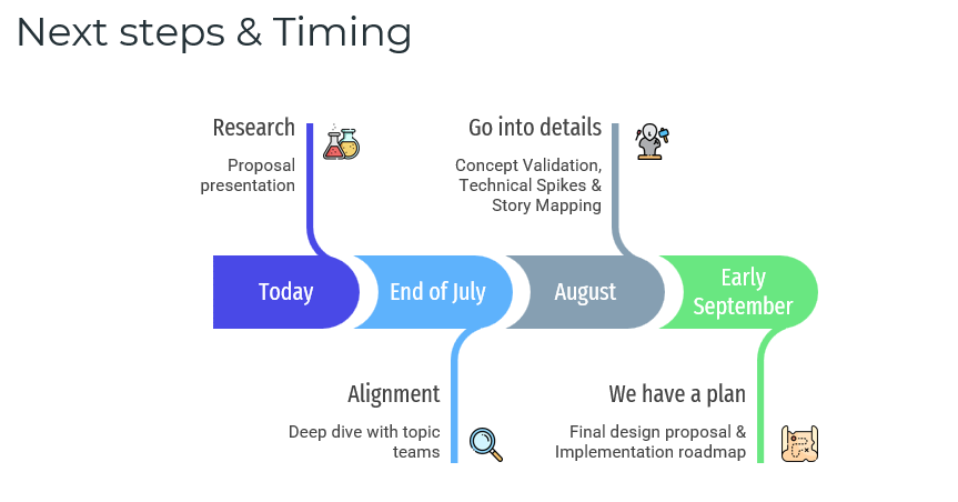
Fig. 2 Steps between the concept proposal and the “Ready for Development” project state
Sequence research methods to identify user problems
To paraphrase Einstein, for a successful redesign, you need to dedicate 90% of your effort to understand the problems and 10% to defining the solution. So that’s what we did.
Tree test your current navigation
To reach the first milestone, we mapped out the existing IA and performed a tree test to identify the pain points of our buyers and sellers with the current content organization. You can use this test to extract the areas where users have the most critical issues performing given tasks.
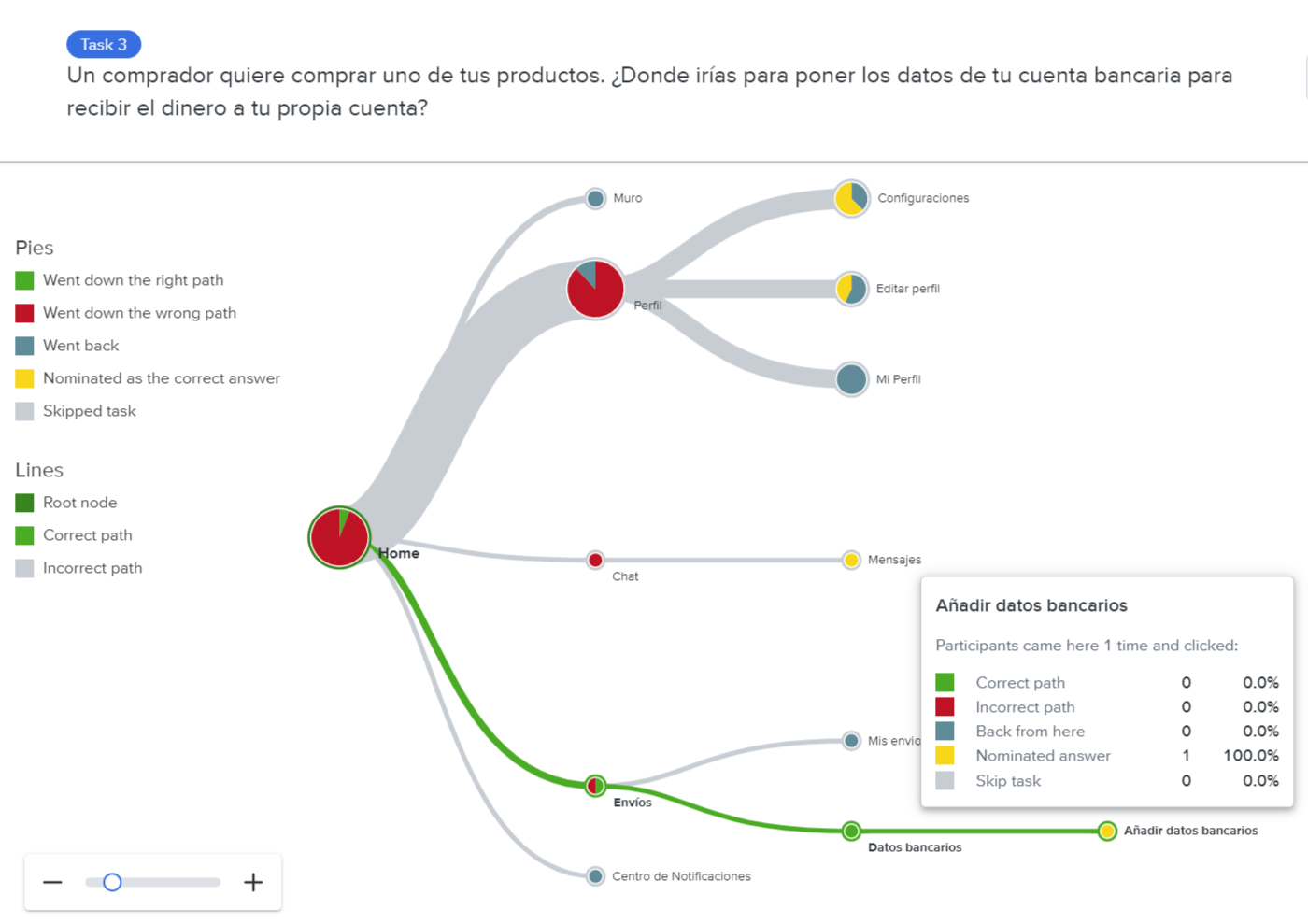
Fig. 3: Sample task to test easiness to find a section of the original IA. Only 1 user out of 10 found the correct answer.
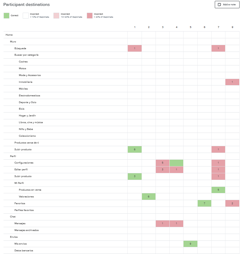
Fig 4. Sample results of the tree test applied to the original IA to identify the biggest gap versus the users’ mental model.
Triangulate evidence to increase confidence
We also analyzed the user reviews and NPS responses mentioning usability issues in the previous six months to identify patterns in the problems reported.
We looked at quantitative data to complement the user insights and identified the most accessed app features. We combined our findings with a correlation analysis of the interactions that led to a higher engagement to make sure we prioritized these in the new navigation.
Next, we studied the navigation, vocabulary and iconography of other marketplaces and leading mobile apps and performed card sorting exercises (moderated and unmoderated). We did this to understand users’ “mental models” – as Nielsen Norman puts it – to gauge how users would group content and sections.
Test early and often before settling on the final version
Based on these insights, we defined a few concepts to organize the content and tree-tested them.
The next step was to stress-test the best-performing concept based on four scenarios of transaction difficulty (easy versus complex buying and selling processes).
After several iterations, we ended up with this structure:
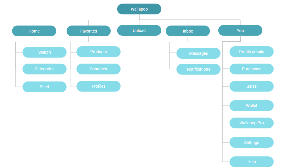
Fig. 7 Wallapop app new IA (1st and 2nd level)
Next, we tested all the copy and visual elements. We applied the same iterative process.
For example, we got from the first version of the Profile section (left side) to the final version (right side) by performing successive user tests.
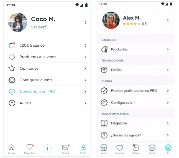
Fig. 8 First versus last version of the new User Profile tab
Parallelize work to reduce time to market
Since redesigning the IA and the navigation was a massive project, we needed to work simultaneously to reduce the time to market. Therefore, once the final decision of what would go in the top navigation was clear, the tech team started doing spikes to remove unknowns and to plan how to implement the new version.
Define a holistic launch strategy to maximize impact and build a coherent experience
When you launch a change of this magnitude, you must take all necessary precautions and coordinate all aspects of the release.
Put the final solution to test
By necessary precautions, I mean you should plan various testing phases to catch potential frictions and bugs early on.
We began with a phase of internal testing. Our colleagues used the new version for a week and reported any issues they detected.
Next, we opened a beta test with 10 buyers and sellers and performed a diary study. They recorded audio and videos for several days while using the new navigation to complete a series of tasks.
This beta test gave us the confidence to move to the A/B testing phase.
Inform and educate users about the new navigation
To support the launch, we collaborated with other internal teams and supported the product launch with:
- a walkthrough that explained the changes
- new App Store assets and reviews monitoring
- Help Center entries for the core features
What we achieved and learned
The A/B test results were better than expected. With the new navigation, Wallapop buyers and sellers were using the apps more frequently (+1,8% DAU/MAU) and had higher engagement: (+2,2% buyer stickiness,+5,3% seller stickiness).
More users were using the core app sections like the Feed, Favorite items, and Saved searches, and we saw an uplift in the Buying and Selling funnels.
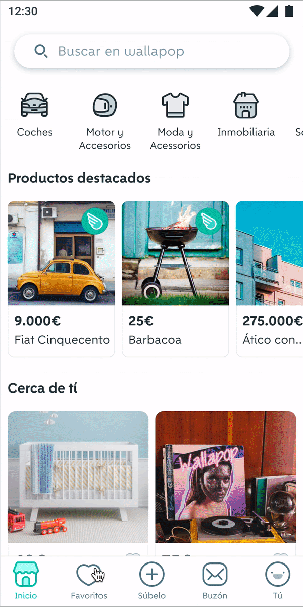
Fig. 12 Overview of the new navigation
However, not everything ran smoothly. We had some hiccups along the way, like when we discovered that changing the navigation implied changing how the majority of the deep links worked, and we had to squeeze this into the project’s scope.
We also received negative reviews from people who didn’t like the change asking us to “go back to the old version”.
But when we balanced the uplift in the main metrics, the proportion of positive qualitative feedback, the improvement in task completion, and that we didn’t hurt any control metric, it was clear that the new navigation was a success. We rolled it out to all the users.
I think the most meaningful learning was that the new navigation’s success wouldn’t have been possible without the involvement and effort of nearly everyone in the company.
Another learning is that it reinforced what we already knew: that testing repeatedly and iterating is what ensures you will stay on the right path.
Key takeaways
Redesigning an app will always be a critical challenge. But having the right approach can produce positive results at all levels, from conversion to engagement and, finally, to user satisfaction.
Following these steps will ensure you don’t stray away from delivering an improved experience that users will love and promote around them:
- Redesign an app based on objective evidence since it’s a complex and costly project. It took us eight months in total.
- Allocate enough time and effort to identify user pain points and apply an iterative mindset to reduce the risk of failure.
- Perform research and development steps simultaneously, if it’s feasible, to reduce time-to-market.
- Define how you will market the change to ensure the users prefer it over the previous version.
Finally, I think you can apply these learnings to any complex project involving many stakeholders and the deployment of a substantial change, not just a navigation redesign.
There’s more where that came from! Access more great insights on Mind the Product

Recommend
About Joyk
Aggregate valuable and interesting links.
Joyk means Joy of geeK