

Drop-Downs or Radio Buttons? Never Make This Mistake Again
source link: https://uxplanet.org/drop-downs-or-radio-buttons-never-make-this-mistake-again-abaa799df8cd
Go to the source link to view the article. You can view the picture content, updated content and better typesetting reading experience. If the link is broken, please click the button below to view the snapshot at that time.

Drop-Downs or Radio Buttons? Never Make This Mistake Again
If you care about your users, then you should learn that we have a few best practices to accelerate your assertiveness in the world of UX/UI Design.

Use your phone for a better experience with this article, or minimaze the webpage in a mobile shape. I am sorry I had to leave the images very big, otherwise the mobile expirience would be pretty bad.
Hi, guys! I hope you are doing well. Today we will talk about drop-down menus and Radio buttons.
Before we get started, I would like to highlight a few important facts about drop-down menus to have in mind and evaluate before using them.
Drop-downs slow the user down because first, they have to open the drop-down, look for an option, and finally pick it. which means 2 clicks, plus scrolling and analyzing options.
- The user might misclick an option without intention, being forced to start the process all over again. Also, if they click outside the dropdown by mistake, the same problem happens.
Okay, now that you have this in mind, let's move on.
Everyone knows the most Basic rule: ''If you have less than 5 options you should go for the radio button and if you have 5 or more, you should use drop downs''.
But usability goes way beyond this basic knowledge, and today we will learn about a few more possibilities and when you should use one or another to provide a better experience to your users.
Radio buttons — ( 7 practical examples)
1- Use when it is important that the user see all the options available, before picking one of them 👇

2- When the default options do not give a clue about the other options 👇

3- When the user needs to compare options because it is easier to compare when visible side by side👇

The example above brings radio buttons, with the need for comparison and only 2 options, the drop downs bring more than 15 options.
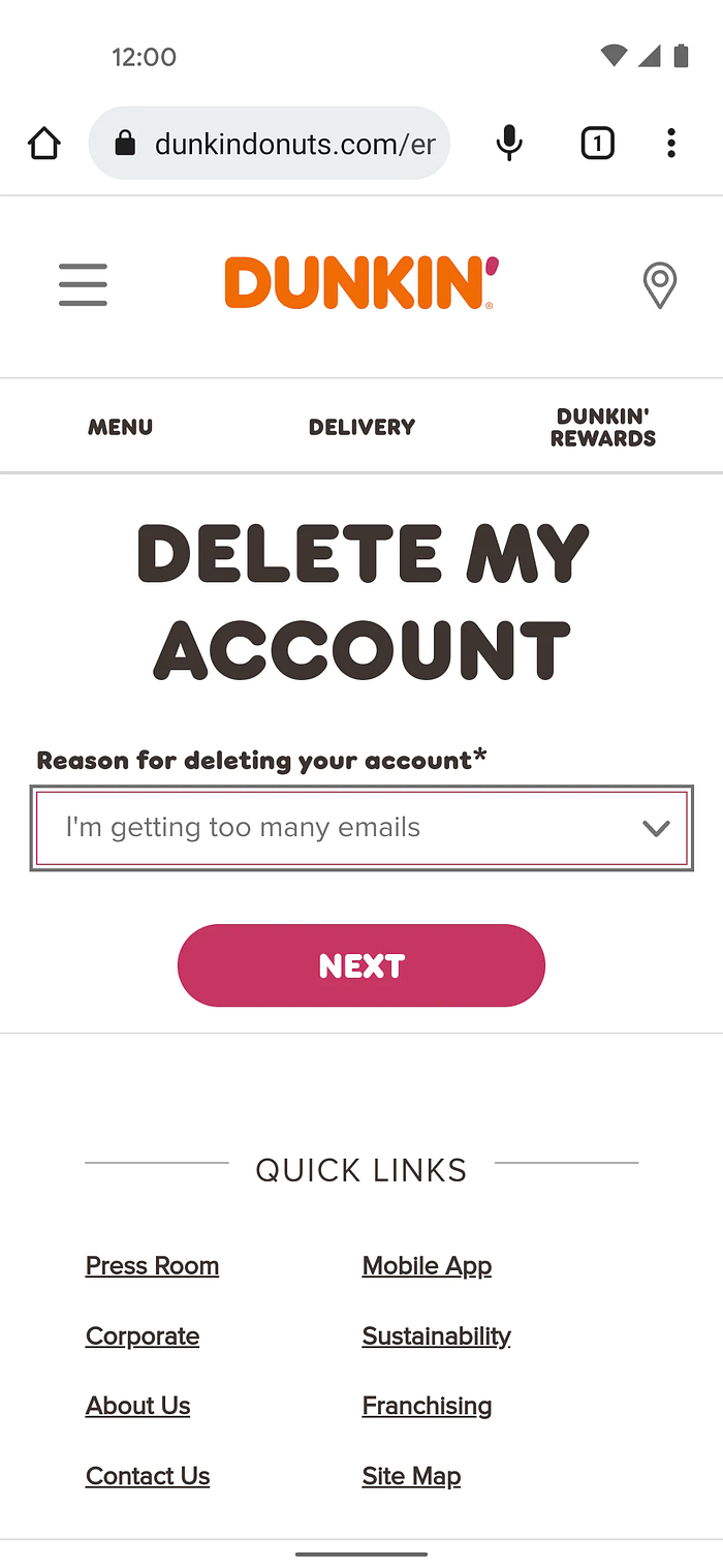
4 — When you have fewer than 5 options 👇

5— When it helps the user to scam through the options easier 👇

6 — To help your user to achieve what is needed in only one click 👇

7 — When you have more than 5 options, but you have space 👇

This means, if you have space, and fewer than 15 options, going for radio buttons will be always safer and better for the user.
In this exemplo, the radio buttons also make it easier for the user to scan through the options available.
When to use drop-down menus — ( Giving you 7 examples )
1- When you want to give users an optimal option selected by default 👇

In this case, the US dollar was the Default option, as the user was using the App in the US, we would also use the rule of more than 15 items here, but you got the idea.
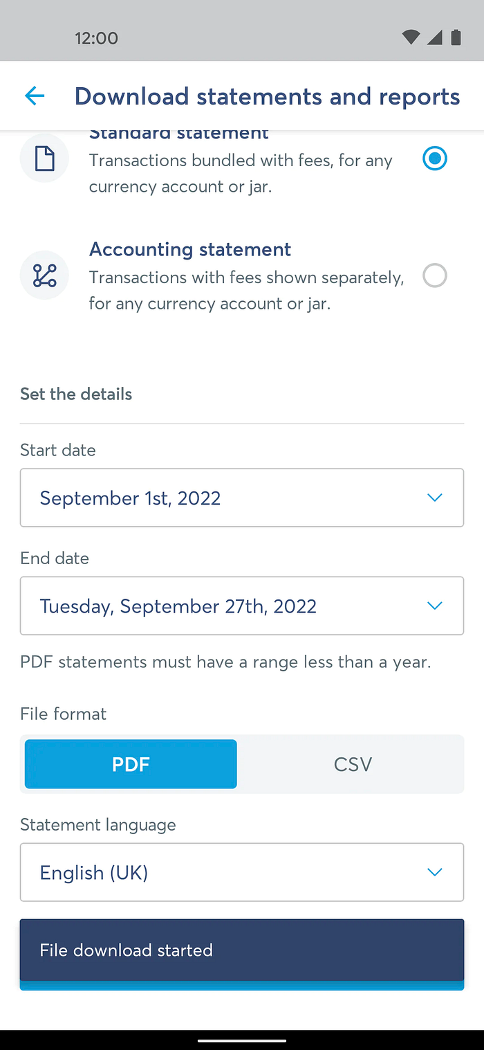
2 - When you have from 5 to 15 options or more and don’t have space to display them all 👇


5- When the alternative options are confusing or dangerous for non-experienced users 👇

6 — When seeing the selected item is more important than viewing the other available options available👇

7 — When you already have the right option in your database and you just need the user to confirm 👇
In case we have the default option for language, it is very common to see language, address, phone number, e-mail, etc.
Conclusion
Be cautious by using drop downs, because:
- They slow users down, first the user has to select the drop-down, then pick an option to be able to submit. (the target is far from the user)
- Users may overlook the option, and forget to change the default.
- It is easy to dismiss, accidentally deviating the cursor from the box closes the dropdown and the user has to start all over again.
Even though drop downs take more than one click, in the examples above you were able to see that they increase the usability of products in many cases.
It is always good to know your users and product before making a choice, even for the radio buttons, when you have a default option selected, make sure it is the most appropriate for the given context.
I know many designers leave the first option selected by default, and I have seen forms where we don't have any selected option at all, but theNN/g doesn't recommend leaving it unselected.
I can't exhaust all the possibilities only in this article, but, little by little we can create a repertory to improve users' experience.
So, yes! That's it for today, and remember, we can start with best practices, and in some cases, we might find out that they aren't suitable for a certain product or users, and it is ok, as I always say, learn the rules, then be able to break them and own the reason why you designed that way.
Thanks for reading, and as always I will see you in the next article.
If you enjoyed these tips, don't forget to subscribe, so you can receive more in your e-mail, every time I post.
✔️Follow me, to stay updated
👏🏻Clap if you enjoyed the article
If you found this article helpful, please, let me know by clapping 😊
See you in the next article 👋🏻
Recommend
About Joyk
Aggregate valuable and interesting links.
Joyk means Joy of geeK