

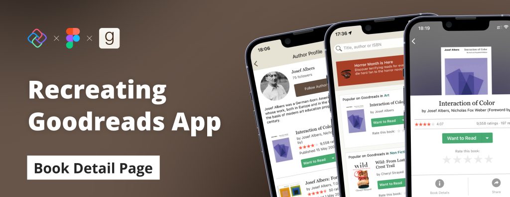
Replicating Goodreads App Book Detail Page in Figma and Uno Platform
source link: https://platform.uno/blog/replicating-goodreads-detail-page-in-figma-with-uno-platform/
Go to the source link to view the article. You can view the picture content, updated content and better typesetting reading experience. If the link is broken, please click the button below to view the snapshot at that time.

Replicating Goodreads App Book Detail Page in Figma and Uno Platform
In the previous articles, I demonstrated the step-by-step processes of recreating the Home and Author pages of the Goodreads app using Figma and the Uno Platform Material Toolkit and how to generate the UI code using Uno Platform’s Figma Plugin. In this segment, I will be recreating our final UI, the Book Profile Page, before moving on to the last part of series; how to consume the code produced by the Uno Platform plugin.
STEP 1: Page Templates and Navigation
By now, if you’ve followed along with our previous two articles, to start the new UI recreation task, you need to drag, drop, and detach the Page template component from the Assets tab which comes as part of the UI library provided in the Uno Material Toolkit.
Once that is done, and you’ve renamed your template, we can focus on the navigation components of our UI. Both the Top and Bottom TabBar come as part of the standard page template.
Top Navigation Bar
For the top Navigation bar, as it already comes as part of the template page, all we need to do is make the custom edits so that it mimics the look of the GoodReads app.
Start by removing the title.
Swap instances on both the leasing and trailing icons.
Change the vertical resizing to fix and make it a value of 220.
Drag and drop an image component from the UI library onto the canvas.
While selected on your image component, toggle on absolute position before placing it into the center of the Nav Bar.
Finally, select the Nav Bar and Image and create an Auto Layout. (Shift + A)

Bottom TabBar
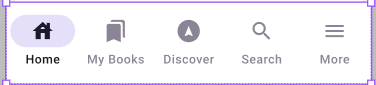
Since our Bottom TabBar remains the same throughout all of our pages, we can copy it from our previous designs, paste it where our existing Bottom TabBar is, and remove the default TabBar.
STEP 2: Content.Scrollable and Uno Material Toolkit Components
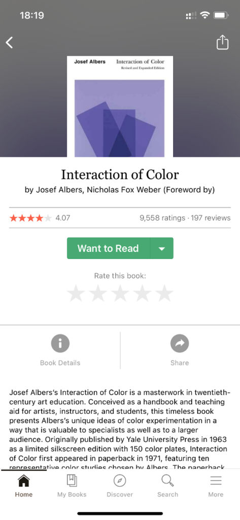
The Book profile page of the Goodreads app consists of a core sub-view that houses a vertically stacked scrollable view with the following items:
Book Title
Book Author
Horizontally-oriented stack showing ratings and review summaries
A button to execute adding the book to your “want to read” list
A rating control allows the user of the app to rate the book.
A horizontal stack allows users to interact with the book by sharing or getting more information on the book.
A Text block giving a summary of the book.
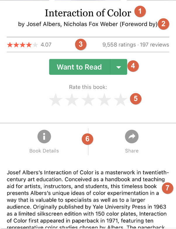
To recreate all seven items, we will use several components from the Uno Platform Material toolkit, such as the Text block, Rating control, Reviews, and Button, to name a few; I modified the styling on the items via the Design tab located to the right of the Figma Project page.
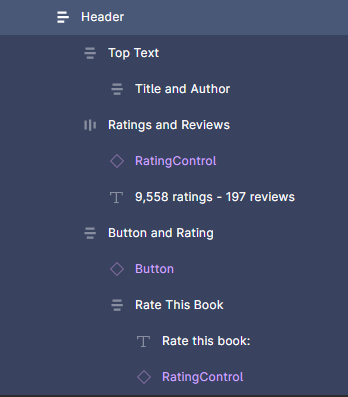
Step 2: Header
To start, we will divide the content section into two. The top section, which we will name the header, will house components 1 – 5. Our bottom section, which we will name the footer, will nest the remaining two components, 6-7.
1-2. Book Title & Author
For the title and author, use basic Text and color styles to make edits. Once complete, add an Auto Layout to these two components.

3. Ratings and Reviews
We will add a rating control component to the canvas and basic Text to the right of it for the Rating and Reviews. Make the proper text and color edits and then with both selected, create a horizontal Auto Layout.
4. Button
Add a button below the Ratings and Reviews, and edit the Text, text color, and button color using the color and text Styles.
5. Rating Control
For the “Rate this book” – we will use basic Text and a rating control with the label toggled off below it. Create an Auto Layout for the rating control paired with its text and once that is complete, create another Layout that will nest the frame just created with the button.

Select the 3 Auto-Layouts created and create another one housing all three and rename it “Header”
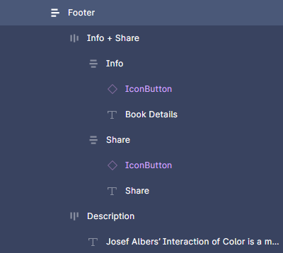
Step 2: Footer
Before beginning our footer section, select the Divider component from the assets list and add it below your Header section.
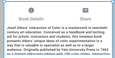
1. More Info and Share button
We will use Icon Buttons paired with Text for both the Info and share interactions. First, drag an Icon Button from the UI library to your canvas, swap instances for the icon, and edit your Text. Next, duplicate it for the other button, select both, and using Shift + A, create a Horizontal auto layout.
2. Book Summary
A Text block or basic Text will be used to summarize the book. Next, select both the Interactions Auto Layout and the description Auto-Layout, and with both selected, create another Auto Layout we will name Footer.
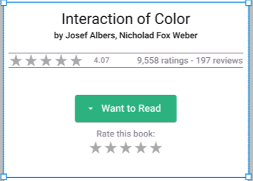
Final Result
Once we render our design using the Uno Platform Plugin, below is what our final result should look like.
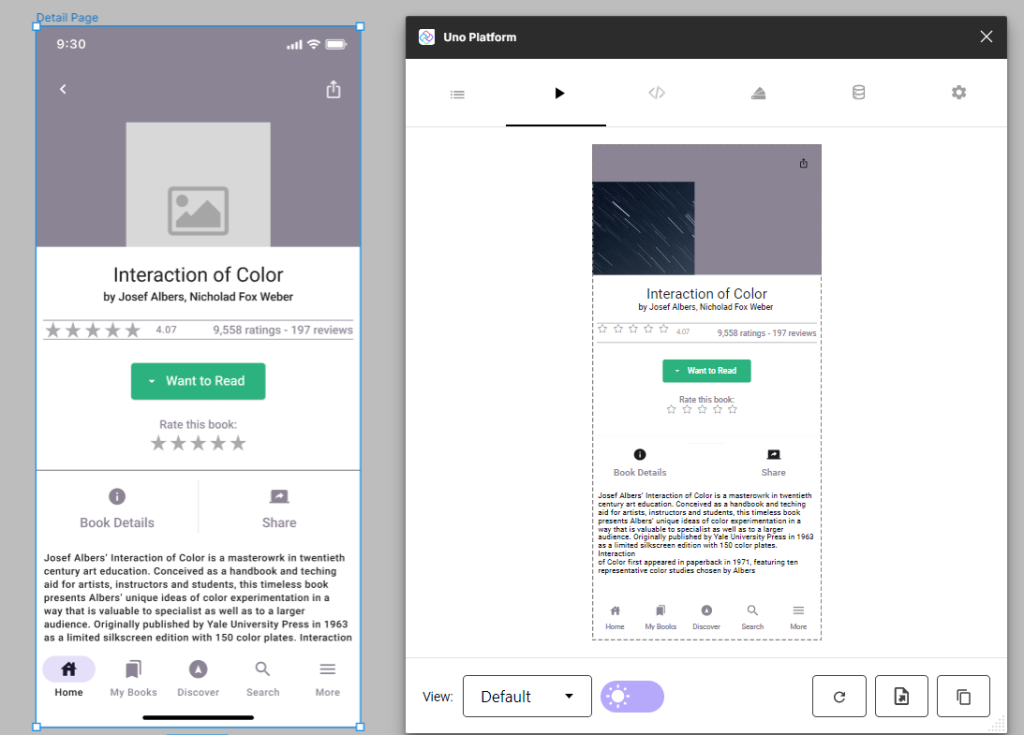
Please Note
As the Uno Platform for Figma Plugin remains in Preview, we understand there will be certain limitations to contend with. As we see in our final result, the image does not render in its proper location, and the navigation components, though correctly implemented in the design, are not correctly generated. These issues are being worked out, and these tutorials will be amended as they are sorted out.
Generated XAML
In the XAML tab of the plugin, you will find the generated code. Not only can you make edits to the code and refresh the render with your edits, you can also copy/export the code into your preferred IDE to further build on.
<utu:AutoLayout Background="{ThemeResource BackgroundBrush}">
  <utu:AutoLayout.Resources>
    <x:String x:Key="Icon_Arrow_Drop_Down">F1 M 0 0 L 3.75 3.75 L 7.5 0 L 0 0 Z</x:String>
    <x:String x:Key="Icon_Assistant_Navigation">F1 M 11 0 C 4.929999828338623 0 0 4.929999828338623 0 11 C 0 17.070000171661377 4.929999828338623 22 11 22 C 17.070000171661377 22 22 17.070000171661377 22 11 C 22 4.929999828338623 17.070000171661377 0 11 0 Z M 14.569999694824219 16 L 11 14.420000076293945 L 7.430000305175781 16 L 7.060000419616699 15.629999160766602 L 11 6 L 14.949999809265137 15.629999160766602 L 14.569999694824219 16 L 14.569999694824219 16 Z</x:String>
    <x:String x:Key="Icon_Bookmarks">F1 M 16 17 L 18 18 L 18 2 C 18 0.8999999761581421 17.100000023841858 0 16 0 L 5.989999771118164 0 C 4.889999747276306 0 4 0.8999999761581421 4 2 L 14 2 C 15.100000023841858 2 16 2.899999976158142 16 4 L 16 17 Z M 12 4 L 2 4 C 0.8999999761581421 4 0 4.899999976158142 0 6 L 0 22 L 7 19 L 14 22 L 14 6 C 14 4.899999976158142 13.100000023841858 4 12 4 Z</x:String>
    <x:String x:Key="Icon_House">F1 M 17 6.300000190734863 L 17 1 L 14 1 L 14 3.5999999046325684 L 10 0 L 0 9 L 3 9 L 3 17 L 8 17 L 8 11 L 12 11 L 12 17 L 17 17 L 17 9 L 20 9 L 17 6.300000190734863 Z M 8 7 C 8 5.899999976158142 8.899999976158142 5 10 5 C 11.100000023841858 5 12 5.899999976158142 12 7 L 8 7 Z</x:String>
    <x:String x:Key="Icon_Info">F1 M 10 0 C 4.480000019073486 0 0 4.480000019073486 0 10 C 0 15.519999980926514 4.480000019073486 20 10 20 C 15.519999980926514 20 20 15.519999980926514 20 10 C 20 4.480000019073486 15.519999980926514 0 10 0 Z M 11 15 L 9 15 L 9 9 L 11 9 L 11 15 Z M 11 7 L 9 7 L 9 5 L 11 5 L 11 7 Z</x:String>
    <x:String x:Key="BitmapIcon_Ios_Share">F1 M 12 4 L 10.579999923706055 5.420000076293945 L 8.989999771118164 3.8299999237060547 L 8.989999771118164 15 L 7.010000228881836 15 L 7.010000228881836 3.8299999237060547 L 5.420000076293945 5.420000076293945 L 4 4 L 8 0 L 12 4 Z M 16 9 L 16 20 C 16 21.100000023841858 15.100000023841858 22 14 22 L 2 22 C 0.8899999856948853 22 0 21.100000023841858 0 20 L 0 9 C 0 7.889999985694885 0.8899999856948853 7 2 7 L 5 7 L 5 9 L 2 9 L 2 20 L 14 20 L 14 9 L 11 9 L 11 7 L 14 7 C 15.100000023841858 7 16 7.889999985694885 16 9 Z</x:String>
    <x:String x:Key="Icon_Menu">F1 M 0 12 L 18 12 L 18 10 L 0 10 L 0 12 Z M 0 7 L 18 7 L 18 5 L 0 5 L 0 7 Z M 0 0 L 0 2 L 18 2 L 18 0 L 0 0 Z</x:String>
    <x:String x:Key="Icon_Screen_Share">F1 M 20 14 C 21.100000023841858 14 21.989999771118164 13.100000023841858 21.989999771118164 12 L 22 2 C 22 0.8899999856948853 21.100000023841858 0 20 0 L 4 0 C 2.8899999856948853 0 2 0.8899999856948853 2 2 L 2 12 C 2 13.100000023841858 2.8899999856948853 14 4 14 L 0 14 L 0 16 L 24 16 L 24 14 L 20 14 Z M 13 10.470000267028809 L 13 8.279999732971191 C 10.22000002861023 8.279999732971191 8.389999985694885 9.129999995231628 7 11 C 7.560000002384186 8.329999923706055 9.109999895095825 5.67000013589859 13 5.130000114440918 L 13 3 L 17 6.729999542236328 L 13 10.470000267028809 Z</x:String>
    <x:String x:Key="Icon_Search">F1 M 12.5 11 L 11.710000038146973 11 L 11.430000305175781 10.729999542236328 C 12.410000324249268 9.589999556541443 13 8.110000014305115 13 6.5 C 13 2.9100000858306885 10.089999914169312 0 6.5 0 C 2.9100000858306885 0 0 2.9100000858306885 0 6.5 C 0 10.089999914169312 2.9100000858306885 13 6.5 13 C 8.110000014305115 13 9.589999556541443 12.410000324249268 10.729999542236328 11.430000305175781 L 11 11.710000038146973 L 11 12.5 L 16 17.489999771118164 L 17.489999771118164 16 L 12.5 11 L 12.5 11 Z M 6.5 11 C 4.009999990463257 11 2 8.990000009536743 2 6.5 C 2 4.009999990463257 4.009999990463257 2 6.5 2 C 8.990000009536743 2 11 4.009999990463257 11 6.5 C 11 8.990000009536743 8.990000009536743 11 6.5 11 Z</x:String>
  </utu:AutoLayout.Resources>
  <utu:AutoLayout utu:AutoLayout.PrimaryAlignment="Stretch">
    <utu:AutoLayout Background="{ThemeResource OnSurfaceVariantBrush}" utu:AutoLayout.CounterAlignment="Start" utu:AutoLayout.PrimaryLength="222" utu:AutoLayout.CounterLength="390">
      <utu:NavigationBar Background="{ThemeResource OnSurfaceVariantBrush}" Style="{StaticResource NavigationBarStyle}">
        <utu:NavigationBar.PrimaryCommands>
          <AppBarButton>
            <AppBarButton.Icon>
              <PathIcon Data="{StaticResource BitmapIcon_Ios_Share}">
                <PathIcon.Resources>
                  <x:String x:Key="BitmapIcon_Ios_Share">F1 M 12 4 L 10.579999923706055 5.420000076293945 L 8.989999771118164 3.8299999237060547 L 8.989999771118164 15 L 7.010000228881836 15 L 7.010000228881836 3.8299999237060547 L 5.420000076293945 5.420000076293945 L 4 4 L 8 0 L 12 4 Z M 16 9 L 16 20 C 16 21.100000023841858 15.100000023841858 22 14 22 L 2 22 C 0.8899999856948853 22 0 21.100000023841858 0 20 L 0 9 C 0 7.889999985694885 0.8899999856948853 7 2 7 L 5 7 L 5 9 L 2 9 L 2 20 L 14 20 L 14 9 L 11 9 L 11 7 L 14 7 C 15.100000023841858 7 16 7.889999985694885 16 9 Z</x:String>
                </PathIcon.Resources>
              </PathIcon>
            </AppBarButton.Icon>
          </AppBarButton>
        </utu:NavigationBar.PrimaryCommands>
      </utu:NavigationBar>
      <Image Source="https://picsum.photos/174/213" Stretch="UniformToFill" utu:AutoLayout.CounterAlignment="Start" utu:AutoLayout.PrimaryLength="213.91765" utu:AutoLayout.CounterLength="174" />
    </utu:AutoLayout>
    <ScrollViewer utu:AutoLayout.PrimaryAlignment="Stretch">
      <utu:AutoLayout Background="{ThemeResource OnPrimaryBrush}" Padding="0,8">
        <utu:AutoLayout Spacing="8" Padding="8,0" utu:AutoLayout.CounterAlignment="Start">
          <utu:AutoLayout Padding="30,10" utu:AutoLayout.CounterAlignment="Start" utu:AutoLayout.CounterLength="374">
            <TextBlock Foreground="{ThemeResource OnBackgroundBrush}" TextAlignment="Center" Text="Interaction of Color" utu:AutoLayout.CounterAlignment="Center" Style="{StaticResource HeadlineSmall}" />
            <TextBlock Foreground="{ThemeResource OnBackgroundBrush}" TextAlignment="Center" Text="by Josef Albers, Nicholad Fox Weber " utu:AutoLayout.CounterAlignment="Center" Style="{StaticResource TitleSmall}" />
          </utu:AutoLayout>
          <utu:AutoLayout Spacing="35" PrimaryAxisAlignment="Center" Orientation="Horizontal" BorderBrush="{ThemeResource OnSurfaceVariantBrush}" BorderThickness="0,1">
            <muxc:RatingControl Caption="4.07" MaxRating="5" utu:AutoLayout.CounterAlignment="Center" utu:AutoLayout.PrimaryAlignment="Stretch" Style="{StaticResource RatingControlStyle}" />
            <TextBlock Foreground="{ThemeResource OnSurfaceVariantBrush}" TextAlignment="Center" TextWrapping="Wrap" Text="9,558 ratings - 197 reviews" utu:AutoLayout.CounterAlignment="Center" utu:AutoLayout.PrimaryAlignment="Stretch" Style="{StaticResource TitleSmall}" />
          </utu:AutoLayout>
          <utu:AutoLayout Spacing="20" Padding="30,20" PrimaryAxisAlignment="Center" utu:AutoLayout.CounterAlignment="Start" utu:AutoLayout.CounterLength="374">
            <Button Foreground="{ThemeResource OnPrimaryBrush}" Background="{ThemeResource SecondaryVariantDarkBrush}" Content="Want to Read" utu:AutoLayout.CounterAlignment="Center" CornerRadius="4" Style="{StaticResource ElevatedButtonStyle}">
              <um:ControlExtensions.Icon>
                <PathIcon Data="{StaticResource Icon_Arrow_Drop_Down}" Foreground="{ThemeResource OnPrimaryBrush}" />
              </um:ControlExtensions.Icon>
            </Button>
            <utu:AutoLayout utu:AutoLayout.CounterAlignment="Center">
              <TextBlock Foreground="{ThemeResource OnSurfaceVariantBrush}" TextAlignment="Center" Text="Rate this book:" utu:AutoLayout.CounterAlignment="Center" Style="{StaticResource TitleSmall}" />
              <muxc:RatingControl MaxRating="5" utu:AutoLayout.CounterAlignment="Center" Style="{StaticResource RatingControlStyle}" />
            </utu:AutoLayout>
          </utu:AutoLayout>
        </utu:AutoLayout>
        <utu:Divider Style="{StaticResource DividerStyle}" />
        <utu:AutoLayout utu:AutoLayout.CounterAlignment="Start">
          <utu:AutoLayout Padding="0,12,0,22" PrimaryAxisAlignment="Center" Orientation="Horizontal" utu:AutoLayout.CounterAlignment="Start" utu:AutoLayout.CounterLength="390">
            <utu:AutoLayout utu:AutoLayout.CounterAlignment="Center" utu:AutoLayout.PrimaryAlignment="Stretch">
              <Button utu:AutoLayout.CounterAlignment="Center" Style="{StaticResource IconButtonStyle}">
                <PathIcon Data="{StaticResource Icon_Info}" />
              </Button>
              <TextBlock Foreground="{ThemeResource OnSurfaceVariantBrush}" TextAlignment="Center" Text="Book Details" utu:AutoLayout.CounterAlignment="Center" Style="{StaticResource TitleMedium}" />
            </utu:AutoLayout>
            <utu:Divider utu:AutoLayout.PrimaryLength="64" Style="{StaticResource DividerStyle}" />
            <utu:AutoLayout utu:AutoLayout.CounterAlignment="Center" utu:AutoLayout.PrimaryAlignment="Stretch">
              <Button utu:AutoLayout.CounterAlignment="Center" Style="{StaticResource IconButtonStyle}">
                <PathIcon Data="{StaticResource Icon_Screen_Share}" />
              </Button>
              <TextBlock Foreground="{ThemeResource OnSurfaceVariantBrush}" TextAlignment="Center" Text="Share" utu:AutoLayout.CounterAlignment="Center" Style="{StaticResource TitleMedium}" />
            </utu:AutoLayout>
          </utu:AutoLayout>
          <TextBlock Foreground="{ThemeResource OnSurfaceBrush}" TextWrapping="Wrap" Text="Josef Albers’ Interaction of Color is a masterowrk in twentieth
century art education. Conceived as a handbook and teching
aid for artists, instructors and students, this timeless book
presents Albers’ unique ideas of color experimentation in a
way that is valuable to specialist as well as to a larger
audience. Originally published by Yale University Press in 1963
as a limited silkscreen edition with 150 color plates. Interaction
of Color first appeared in paperback in 1971, featuring ten
representative color studies chosen by Albers" Margin="10,0" Style="{StaticResource LabelMedium}" />
        </utu:AutoLayout>
      </utu:AutoLayout>
    </ScrollViewer>
  </utu:AutoLayout>
  <utu:TabBar Style="{StaticResource BottomTabBarStyle}">
    <utu:TabBarItem IsSelectable="True" Content="Home" Style="{StaticResource BottomTabBarItemStyle}">
      <utu:TabBarItem.Icon>
        <PathIcon Data="{StaticResource Icon_House}" />
      </utu:TabBarItem.Icon>
    </utu:TabBarItem>
    <utu:TabBarItem IsSelectable="True" Content="My Books" Style="{StaticResource BottomTabBarItemStyle}">
      <utu:TabBarItem.Icon>
        <PathIcon Data="{StaticResource Icon_Bookmarks}" />
      </utu:TabBarItem.Icon>
    </utu:TabBarItem>
    <utu:TabBarItem IsSelectable="True" Content="Discover" Style="{StaticResource BottomTabBarItemStyle}">
      <utu:TabBarItem.Icon>
        <PathIcon Data="{StaticResource Icon_Assistant_Navigation}" />
      </utu:TabBarItem.Icon>
    </utu:TabBarItem>
    <utu:TabBarItem IsSelectable="True" Content="Search" Style="{StaticResource BottomTabBarItemStyle}">
      <utu:TabBarItem.Icon>
        <PathIcon Data="{StaticResource Icon_Search}" />
      </utu:TabBarItem.Icon>
    </utu:TabBarItem>
    <utu:TabBarItem IsSelectable="True" Content="More" Style="{StaticResource BottomTabBarItemStyle}">
      <utu:TabBarItem.Icon>
        <PathIcon Data="{StaticResource Icon_Menu}" />
      </utu:TabBarItem.Icon>
    </utu:TabBarItem>
  </utu:TabBar>
</utu:AutoLayout>
Next Steps
If you are new to Uno Platform and the Uno Figma plugin, following our step-by-step guide is the best way to set up your environment and get started.
Share this post:
Related Posts

For the second page of our Goodreads tutorial, we recreate the Author Page using Uno …

Figma is a great tool UX/UI designers use to create stunning interactive renders of UIs …

We’re pleased to announce the release of the third preview of our Figma plugin, a …
Recommend
About Joyk
Aggregate valuable and interesting links.
Joyk means Joy of geeK