

Introducing the New WinUI Busy Indicator Control
source link: https://www.syncfusion.com/blogs/post/winui-busy-indicator-control.aspx?utm_campaign=alvinashcraft_blog_edmoct22
Go to the source link to view the article. You can view the picture content, updated content and better typesetting reading experience. If the link is broken, please click the button below to view the snapshot at that time.

Introducing the New WinUI Busy Indicator Control
We at Syncfusion are happy to announce the inclusion of the new WinUI Busy Indicator control in the 2022 Volume 3 release.
The WinUI Busy Indicator control is used to display a predefined animation when an operation runs in the background of an application and the user waits for its completion. It can be customized in terms of size, color, duration, and content.
Its key features are:
Let’s cover each briefly and see the steps to get started with the WinUI Busy Indicator control.
Animation types
It supports the following seven prebuilt animation types, and you can pick the one that satisfies your need:
- Dotted Circle
- Dotted Circular Fluent
- Dotted Linear
- Double Circle
- Linear Box
- Linear Oscillating Box
- Single Circle
You can see each animation type in action in the following graphic.
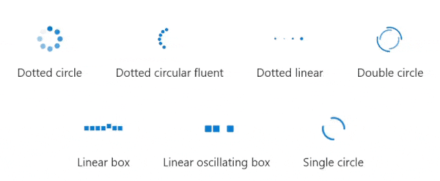
Busy Indicator Animation Types
Busy content
You can set a custom message that indicates the busy status of the control to users. You can also place the busy content at the top, bottom, left, or right of the Busy Indicator, as well as customize it using the DataTemplate support.
Refer to the following images.
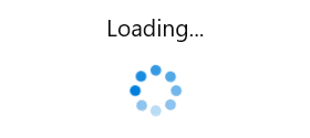 Placing Busy Content at the Top of the WinUI Busy Indicator
 Customizing the WinUI Busy Indicator’s Content with Template Support
Duration
The WinUI Busy Indicator control allows users to customize the animation speed with values ranging from 0 to 1.
 Busy Indicator with Custom Duration
You can customize the size of the Busy Indicator with values ranging from 0 to 1.
 Busy Indicator with Custom Size
Color
Also, customize the color of the indicator based on your requirements.
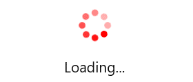 Busy Indicator with Custom Color
Getting started with the WinUI Busy Indicator control
Now that we’ve seen the features of the WinUI Busy Indicator control, let’s see the steps to get started with it.
Step 1: Create a WinUI application.
First, follow the guidelines in the Create your first WinUI 3 (Windows App SDK) project documentation to create a simple WinUI project.
Step 2: Add the Syncfusion.Notifications.WinUI NuGet package.
Then, install the latest Syncfusion.Notifications.WinUINuGet package in your project from the NuGet Gallery or from the installed location, C:\Program Files (x86)\Syncfusion\Essential Studio\WinUI\xx.x.x.xx\NuGetPackages.
Note: xx.x.x.xx denotes the version of the installed Syncfusion WinUI Notifications package.
Step 3: Add the namespace.
Now, include the Syncfusion.UI.Xaml.Notifications namespace in your XAML file with the following code.
xmlns:syncfusion="using:Syncfusion.UI.Xaml.Notifications"
Step 4: Initialize the Busy Indicator control.
Finally, initialize the WinUI Busy Indicator control with the required animation type and content as shown in the following code example.
<Page
   x:Class="GettingStarted.MainPage"
     xmlns="http://schemas.microsoft.com/winfx/2006/xaml/presentation"
     xmlns:x="http://schemas.microsoft.com/winfx/2006/xaml"
     xmlns:local="using:GettingStarted"
     xmlns:d="http://schemas.microsoft.com/expression/blend/2008"
     xmlns:mc="http://schemas.openxmlformats.org/markup-compatibility/2006"
     xmlns:syncfusion="using:Syncfusion.UI.Xaml.Core"
     mc:Ignorable="d"
     Background="{ThemeResource ApplicationPageBackgroundThemeBrush}">

 <Grid>
  <syncfusion:SfBusyIndicator  IsActive="True"
                               AnimationType="DottedCircle"
                               BusyContent="Loading…" />
 </Grid>

</Page>
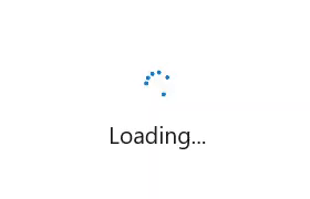
After executing the above code, we will have a page populated with the Busy Indicator control like in the following output image.
 WinUI Busy Indicator Control
Conclusion
Thanks for reading! I hope you enjoyed learning about the new Syncfusion WinUI Busy Indicator control and its features available in our 2022 Volume 3 release. Also, check out our Release Notes and What’s New pages to see all the new updates in this release. Try them out and leave your feedback in the comments section below!
You can download and check out our WinUI demo app in the Microsoft Store.
For current customers, the new version is available for download from the License and Downloads page. If you are not yet a Syncfusion customer, you can try our 30-day free trial to check out our newest features.
You can also contact us through our support forums, support portal, or feedback portal. We are always happy to assist you!
Related blogs
Recommend
About Joyk
Aggregate valuable and interesting links.
Joyk means Joy of geeK